What Are CSS Pseudo-Classes?
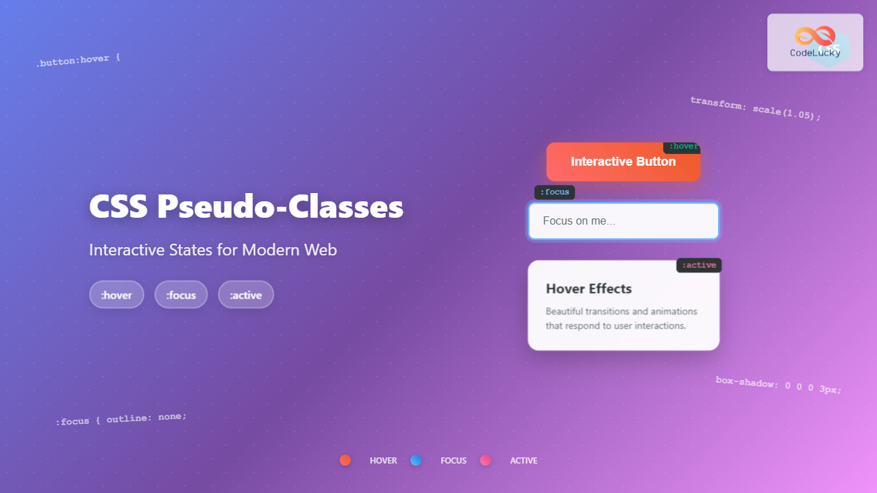
CSS pseudo-classes are selectors that target elements based on their current state or position, rather than their attributes or content. They allow you to style elements dynamically as users interact with your webpage, creating engaging and intuitive user experiences.
The three most commonly used interactive pseudo-classes are :hover, :focus, and :active. These pseudo-classes respond to user interactions like mouse movements, keyboard navigation, and clicks, making your website feel responsive and alive.
Understanding the :hover Pseudo-Class
The :hover pseudo-class activates when a user hovers their mouse cursor over an element. It’s perfect for creating visual feedback that guides users and enhances the interactive experience.
Basic :hover Syntax and Usage
The basic syntax for the hover pseudo-class is straightforward:
selector:hover {
    /* CSS properties */
}
Simple Button Hover Effect
Here’s a practical example of a button with hover effects:
.hover-button {
    background-color: #007bff;
    color: white;
    padding: 12px 24px;
    border: none;
    border-radius: 6px;
    cursor: pointer;
    font-size: 16px;
    transition: all 0.3s ease;
}

.hover-button:hover {
    background-color: #0056b3;
    transform: translateY(-2px);
    box-shadow: 0 4px 8px rgba(0,123,255,0.3);
}
Advanced Hover Effects
You can create more sophisticated hover effects by combining multiple CSS properties:
Interactive Card
Hover over this card to see the smooth animation effect with scale, shadow, and color changes.
.card-hover {
    background: white;
    border-radius: 12px;
    padding: 20px;
    box-shadow: 0 2px 10px rgba(0,0,0,0.1);
    transition: all 0.4s cubic-bezier(0.4, 0, 0.2, 1);
    cursor: pointer;
}

.card-hover:hover {
    transform: translateY(-8px) scale(1.02);
    box-shadow: 0 20px 40px rgba(0,0,0,0.15);
}

.card-hover h4 {
    color: #333;
    transition: color 0.3s ease;
}

.card-hover:hover h4 {
    color: #007bff;
}
Mastering the :focus Pseudo-Class
The :focus pseudo-class is crucial for accessibility and keyboard navigation. It activates when an element receives focus, either through keyboard navigation (Tab key) or programmatic focus.
Why :focus Matters for Accessibility
Focus states are essential for users who navigate websites using keyboards, screen readers, or other assistive technologies. Proper focus styling ensures your website is accessible to all users.
Input Field Focus Examples
.focus-input {
    padding: 12px 16px;
    border: 2px solid #ddd;
    border-radius: 8px;
    font-size: 16px;
    transition: all 0.3s ease;
    outline: none;
}

.focus-input:focus {
    border-color: #007bff;
    box-shadow: 0 0 0 3px rgba(0,123,255,0.25);
    background-color: #f8f9ff;
}
Button Focus States
Buttons should have clear focus indicators for keyboard users:
.focus-button {
    background-color: #28a745;
    color: white;
    padding: 12px 24px;
    border: none;
    border-radius: 6px;
    cursor: pointer;
    transition: all 0.3s ease;
    outline: none;
}

.focus-button:focus {
    box-shadow: 0 0 0 4px rgba(40,167,69,0.4);
    background-color: #218838;
}
Understanding the :active Pseudo-Class
The :active pseudo-class activates when an element is being activated by the user, typically during the brief moment when a mouse button is pressed down or a key is pressed.
Button Active States
.active-button {
    background-color: #dc3545;
    color: white;
    padding: 12px 24px;
    border: none;
    border-radius: 6px;
    cursor: pointer;
    transition: all 0.1s ease;
}

.active-button:active {
    background-color: #bd2130;
    transform: scale(0.98);
    box-shadow: inset 0 2px 4px rgba(0,0,0,0.2);
}
Combining Multiple Pseudo-Classes
The real power comes from combining these pseudo-classes to create comprehensive interactive experiences. Here’s how to handle multiple states effectively:
.multi-state-button {
    background: linear-gradient(135deg, #667eea 0%, #764ba2 100%);
    color: white;
    padding: 15px 30px;
    border: none;
    border-radius: 8px;
    cursor: pointer;
    transition: all 0.3s ease;
    outline: none;
}

.multi-state-button:hover {
    transform: translateY(-2px);
    box-shadow: 0 8px 25px rgba(102,126,234,0.4);
}

.multi-state-button:focus {
    box-shadow: 0 0 0 4px rgba(102,126,234,0.5);
}

.multi-state-button:active {
    transform: translateY(0);
    box-shadow: 0 3px 10px rgba(102,126,234,0.3);
}

/* Combining hover and focus */
.multi-state-button:hover:focus {
    box-shadow: 0 8px 25px rgba(102,126,234,0.4), 0 0 0 4px rgba(102,126,234,0.5);
}
Advanced Interactive Components
Navigation Menu with Pseudo-Classes
.nav-link {
    display: block;
    color: #ecf0f1;
    text-decoration: none;
    padding: 15px 20px;
    transition: all 0.3s ease;
    position: relative;
}

.nav-link:hover {
    background-color: #34495e;
    color: #3498db;
}

.nav-link:focus {
    background-color: #34495e;
    outline: 2px solid #3498db;
}

.nav-link::before {
    content: '';
    position: absolute;
    bottom: 0;
    left: 50%;
    width: 0;
    height: 2px;
    background-color: #3498db;
    transition: all 0.3s ease;
    transform: translateX(-50%);
}

.nav-link:hover::before {
    width: 80%;
}
Interactive Card Grid
Design
Beautiful, modern interfaces that engage users and create memorable experiences.
Development
Clean, efficient code that brings your designs to life with smooth interactions.
Optimization
Performance-focused solutions that load fast and work seamlessly across devices.
.interactive-card {
    background: white;
    border-radius: 12px;
    padding: 20px;
    box-shadow: 0 2px 10px rgba(0,0,0,0.1);
    transition: all 0.4s cubic-bezier(0.4, 0, 0.2, 1);
    cursor: pointer;
    border: 2px solid transparent;
}

.interactive-card:hover {
    transform: translateY(-5px);
    box-shadow: 0 15px 35px rgba(0,0,0,0.15);
    border-color: #007bff;
}

.interactive-card:focus {
    border-color: #007bff;
    box-shadow: 0 15px 35px rgba(0,0,0,0.15), 0 0 0 3px rgba(0,123,255,0.25);
}

.interactive-card:active {
    transform: translateY(-2px);
    box-shadow: 0 8px 20px rgba(0,0,0,0.12);
}
Best Practices and Performance Tips
1. Always Use Transitions
Smooth transitions make interactions feel natural and polished. Use the transition property to animate changes between states:
/* Good practice */
.button {
    transition: all 0.3s ease;
}

/* Even better - specify exact properties */
.button {
    transition: background-color 0.3s ease, transform 0.2s ease, box-shadow 0.3s ease;
}
2. Consider Performance
Some CSS properties are more performance-intensive than others. Prefer animating transform and opacity over properties that trigger layout recalculations:
/* Performance-friendly */
.element:hover {
    transform: translateY(-2px);
    opacity: 0.9;
}

/* Avoid animating these properties frequently */
.element:hover {
    width: 300px; /* Triggers layout */
    height: 200px; /* Triggers layout */
}
3. Accessibility Considerations
Always provide focus states and consider users who prefer reduced motion:
/* Respect user preferences */
@media (prefers-reduced-motion: reduce) {
    .animated-element {
        transition: none;
    }
}

/* Always include focus states */
.button:focus {
    outline: 2px solid #007bff;
    outline-offset: 2px;
}
4. Mobile Touch Considerations
Remember that mobile devices don’t have hover states. Consider using :focus and :active for mobile interactions:
/* Mobile-friendly approach */
.button:hover,
.button:focus {
    background-color: #0056b3;
    transform: translateY(-2px);
}

.button:active {
    transform: translateY(0);
}
Common Pitfalls and Solutions
Problem: Flickering Animations
Sometimes elements can flicker during transitions. This usually happens when hover states conflict:
/* Problem: Element moves out of cursor range */
.card:hover {
    transform: translateY(-50px); /* Too much movement */
}

/* Solution: Moderate movement */
.card:hover {
    transform: translateY(-8px); /* Just enough for effect */
}
Problem: Focus States Not Visible
Never remove focus indicators without providing alternatives:
/* Bad - removes focus entirely */
button {
    outline: none;
}

/* Good - custom focus styling */
button {
    outline: none;
}

button:focus {
    box-shadow: 0 0 0 3px rgba(0,123,255,0.4);
}
Conclusion
CSS pseudo-classes :hover, :focus, and :active are fundamental tools for creating engaging, accessible web interfaces. By mastering these pseudo-classes and following best practices, you can create websites that not only look great but also provide excellent user experiences across all devices and input methods.
Remember to always test your interactive elements with both mouse and keyboard navigation, consider performance implications of your animations, and respect user preferences for motion. With these techniques in your toolkit, you’ll be able to create modern, responsive interfaces that delight users and meet accessibility standards.
Start experimenting with these examples in your own projects, and don’t be afraid to combine different effects to create unique interactive experiences that match your brand and design goals.

