What Are CSS Class Selectors?
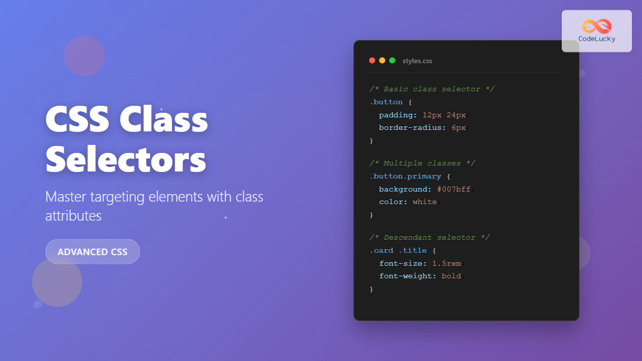
CSS class selectors are fundamental tools that allow you to target and style HTML elements based on their class attribute. Unlike ID selectors that target unique elements, class selectors can be applied to multiple elements, making them incredibly versatile for consistent styling across your website.
The class selector uses a period (.) followed by the class name to target elements. This approach provides a clean separation between content structure (HTML) and presentation (CSS), following best practices in web development.
Basic CSS Class Selector Syntax
The syntax for CSS class selectors is straightforward and follows this pattern:
.class-name {
    property: value;
    property: value;
}
Here’s a simple example demonstrating how class selectors work:
HTML:
<p class="highlight">This paragraph has a highlight class.</p>
<p>This paragraph has no class.</p>
<div class="highlight">This div also has the highlight class.</div>
CSS:
.highlight {
    background-color: #ffeb3b;
    padding: 10px;
    border-radius: 4px;
}
Visual Output:
This paragraph has a highlight class.
This paragraph has no class.
Multiple Classes on Single Elements
HTML elements can have multiple classes separated by spaces. This powerful feature allows you to combine different styling rules and create more flexible designs.
HTML:
<div class="box primary large">Multiple classes example</div>
<div class="box secondary small">Another combination</div>
CSS:
.box {
    border: 2px solid #ddd;
    padding: 15px;
    margin: 10px 0;
    text-align: center;
}

.primary {
    background-color: #007bff;
    color: white;
}

.secondary {
    background-color: #6c757d;
    color: white;
}

.large {
    font-size: 18px;
    padding: 20px;
}

.small {
    font-size: 14px;
    padding: 10px;
}
Visual Output:
Class Selectors vs ID Selectors
Understanding the difference between class and ID selectors is crucial for effective CSS development:
| Aspect | Class Selectors | ID Selectors |
|---|---|---|
| Syntax | .class-name | #id-name |
| HTML Usage | class=”class-name” | id=”id-name” |
| Reusability | Multiple elements | Single element only |
| Specificity | Lower (0,0,1,0) | Higher (0,1,0,0) |
| Best Use | Styling groups of elements | Unique identifiers, JavaScript hooks |
Advanced Class Selector Techniques
Descendant Selectors with Classes
You can combine class selectors with descendant selectors to target elements within specific containers:
CSS:
.sidebar .menu-item {
    padding: 8px 12px;
    border-bottom: 1px solid #eee;
}

.sidebar .menu-item:hover {
    background-color: #f0f0f0;
}
Class Selector Combinations
Target elements that have multiple specific classes using chained class selectors:
CSS:
.button.primary.large {
    background-color: #007bff;
    padding: 15px 30px;
    font-size: 18px;
    border: none;
    border-radius: 6px;
    color: white;
    cursor: pointer;
}
HTML:
<button class="button primary large">Click Me</button>Visual Output:
Interactive Example: Dynamic Class Application
Interactive Demo:
CSS Classes Used:
.highlight-red {
    background-color: #ff6b6b !important;
    color: white !important;
}

.highlight-blue {
    background-color: #4ecdc4 !important;
    color: white !important;
}

.large-text {
    font-size: 18px !important;
    font-weight: bold !important;
}
Best Practices for CSS Class Selectors
Naming Conventions
Following consistent naming conventions improves code maintainability:
- BEM (Block Element Modifier): .block__element–modifier
- Kebab-case: .primary-button, .navigation-menu
- Semantic naming: .error-message instead of .red-text
- Avoid presentational names: Use .warning instead of .yellow-box
✅ Good Examples:
.navigation-menu
.primary-button
.error-message
.user-profile
.product-card
❌ Avoid:
.redButton
.div1
.bigText
.leftSide
.style1
Performance Considerations
While class selectors are generally efficient, following these practices can optimize performance:
- Avoid overly complex selector chains
- Use specific classes rather than universal selectors when possible
- Keep selector specificity low to avoid !important declarations
- Group related styles logically in your CSS
Common Use Cases and Examples
Button Styling System
CSS:
.btn {
    display: inline-block;
    padding: 8px 16px;
    border: none;
    border-radius: 4px;
    cursor: pointer;
    text-decoration: none;
    font-size: 14px;
    transition: all 0.3s ease;
}

.btn-primary {
    background-color: #007bff;
    color: white;
}

.btn-secondary {
    background-color: #6c757d;
    color: white;
}

.btn-success {
    background-color: #28a745;
    color: white;
}

.btn-large {
    padding: 12px 24px;
    font-size: 16px;
}

.btn-small {
    padding: 4px 8px;
    font-size: 12px;
}
HTML:
<button class="btn btn-primary">Primary Button</button>
<button class="btn btn-secondary btn-large">Large Secondary</button>
<button class="btn btn-success btn-small">Small Success</button>
Visual Output:
Card Component System
CSS:
.card {
    border: 1px solid #dee2e6;
    border-radius: 8px;
    padding: 20px;
    margin: 10px 0;
    background: white;
    box-shadow: 0 2px 4px rgba(0,0,0,0.1);
}

.card-header {
    font-size: 18px;
    font-weight: bold;
    margin-bottom: 10px;
    color: #333;
}

.card-body {
    color: #666;
    line-height: 1.5;
}

.card-featured {
    border-color: #007bff;
    box-shadow: 0 4px 8px rgba(0,123,255,0.2);
}

.card-compact {
    padding: 12px;
}
Visual Output:
Troubleshooting Common Issues
Specificity Problems
When styles don’t apply as expected, specificity might be the issue. Here’s how to resolve common problems:
Problem: Class styles not applying
Solution: Check if more specific selectors are overriding your class. Use browser developer tools to inspect the element and see which styles are being applied.
Class Name Errors
- Ensure class names match exactly between HTML and CSS
- Class names are case-sensitive
- Avoid spaces in class names (use hyphens or underscores)
- Don’t start class names with numbers
Modern CSS and Class Selectors
CSS Custom Properties with Classes
Combine CSS custom properties (variables) with class selectors for maintainable theming:
:root {
    --primary-color: #007bff;
    --secondary-color: #6c757d;
    --border-radius: 8px;
    --spacing-unit: 16px;
}

.theme-primary {
    background-color: var(--primary-color);
    color: white;
    padding: var(--spacing-unit);
    border-radius: var(--border-radius);
}

.theme-secondary {
    background-color: var(--secondary-color);
    color: white;
    padding: var(--spacing-unit);
    border-radius: var(--border-radius);
}
CSS Grid and Flexbox with Classes
Class selectors work seamlessly with modern layout systems:
.grid-container {
    display: grid;
    grid-template-columns: repeat(auto-fit, minmax(250px, 1fr));
    gap: 20px;
}

.flex-center {
    display: flex;
    justify-content: center;
    align-items: center;
}

.responsive-text {
    font-size: clamp(14px, 2vw, 18px);
}
Conclusion
CSS class selectors are indispensable tools for modern web development. They provide the flexibility to create reusable, maintainable styles while keeping your HTML clean and semantic. By mastering class selectors, you can build robust design systems that scale efficiently across large projects.
Remember to follow naming conventions, keep specificity manageable, and leverage modern CSS features like custom properties and advanced layout systems. With these techniques, you’ll be well-equipped to create professional, maintainable stylesheets that stand the test of time.
Practice implementing these concepts in your projects, and don’t hesitate to experiment with different combinations of class selectors to discover new styling possibilities. The more you work with class selectors, the more intuitive and powerful they become in your web development toolkit.

