
Form elements are the backbone of user interaction on the web, and managing their visual states is crucial for creating intuitive user experiences. CSS pseudo-classes :disabled and :enabled provide powerful tools for styling form elements based on their interactive state, helping developers create more accessible and user-friendly interfaces.
Understanding :disabled and :enabled Pseudo-Classes
The :disabled and :enabled pseudo-classes target form elements based on their ability to receive user input. These pseudo-classes automatically apply based on the presence or absence of the disabled attribute in HTML elements.
What Makes an Element Disabled or Enabled?
An element is considered disabled when it has the disabled attribute, making it non-interactive and preventing user input. Conversely, an element is enabled when it lacks the disabled attribute and can receive user interaction.
Basic HTML Structure
<input type="text" placeholder="Enabled input" />
<input type="text" placeholder="Disabled input" disabled />

<button type="button">Enabled Button</button>
<button type="button" disabled>Disabled Button</button>
Supported Form Elements
The :disabled and :enabled pseudo-classes work with various form elements, each serving different purposes in user interfaces:
- Input elements: text, email, password, number, checkbox, radio, file, etc.
- Button elements: button, submit, reset types
- Select elements: dropdown menus
- Textarea elements: multi-line text input
- Fieldset elements: grouping form controls
- Optgroup and Option elements: within select dropdowns
Basic Styling Examples
Let’s explore fundamental styling techniques for disabled and enabled form elements:
Essential CSS Styling
/* Styling enabled form elements */
input:enabled,
button:enabled,
select:enabled,
textarea:enabled {
    background-color: #ffffff;
    border: 2px solid #007bff;
    color: #333333;
    cursor: pointer;
    transition: all 0.3s ease;
}

/* Hover effects for enabled elements */
input:enabled:hover,
button:enabled:hover,
select:enabled:hover,
textarea:enabled:hover {
    border-color: #0056b3;
    box-shadow: 0 0 0 3px rgba(0, 123, 255, 0.25);
}

/* Styling disabled form elements */
input:disabled,
button:disabled,
select:disabled,
textarea:disabled {
    background-color: #f8f9fa;
    border: 2px solid #dee2e6;
    color: #6c757d;
    cursor: not-allowed;
    opacity: 0.65;
}

/* Remove hover effects on disabled elements */
input:disabled:hover,
button:disabled:hover,
select:disabled:hover,
textarea:disabled:hover {
    box-shadow: none;
}
Interactive Form Example
Here’s a comprehensive example demonstrating the visual differences between enabled and disabled form elements:
Interactive Form State Demo
Advanced Styling Techniques
Beyond basic styling, you can create sophisticated visual effects for disabled and enabled states:
Advanced Visual Effects
/* Gradient backgrounds for enabled elements */
button:enabled {
    background: linear-gradient(135deg, #667eea 0%, #764ba2 100%);
    color: white;
    border: none;
    padding: 12px 24px;
    border-radius: 25px;
    transition: all 0.3s cubic-bezier(0.4, 0, 0.2, 1);
}

button:enabled:hover {
    transform: translateY(-2px);
    box-shadow: 0 10px 20px rgba(0, 0, 0, 0.2);
}

/* Subtle animations for disabled elements */
input:disabled {
    position: relative;
    background: repeating-linear-gradient(
        45deg,
        #f8f9fa,
        #f8f9fa 10px,
        #ffffff 10px,
        #ffffff 20px
    );
    animation: subtle-pulse 2s infinite;
}

@keyframes subtle-pulse {
    0%, 100% { opacity: 0.6; }
    50% { opacity: 0.8; }
}

/* Custom focus styles for enabled elements */
input:enabled:focus,
select:enabled:focus,
textarea:enabled:focus {
    outline: none;
    border-color: #4f46e5;
    box-shadow: 0 0 0 3px rgba(79, 70, 229, 0.1);
    background-color: rgba(79, 70, 229, 0.02);
}

/* Icon indicators using pseudo-elements */
input:disabled::after {
    content: '🔒';
    position: absolute;
    right: 10px;
    top: 50%;
    transform: translateY(-50%);
    font-size: 14px;
    opacity: 0.7;
}
Accessibility Considerations
When styling disabled and enabled form elements, accessibility should be a primary concern. Proper implementation ensures that users with disabilities can understand and interact with your forms effectively.
Color Contrast and Visual Cues
Maintain sufficient color contrast between text and background colors for both disabled and enabled states. The Web Content Accessibility Guidelines (WCAG) recommend a minimum contrast ratio of 4.5:1 for normal text.
⚠️ Accessibility Best Practices
- Color Independence: Don’t rely solely on color to indicate disabled state
- Cursor Changes: Use
cursor: not-allowedfor disabled elements - Opacity Guidelines: Maintain readable text even with reduced opacity
- Focus Management: Ensure disabled elements don’t receive focus
- Screen Reader Support: Use appropriate ARIA attributes when needed
Accessible Styling Example
/* High contrast disabled styling */
input:disabled,
button:disabled {
    background-color: #e9ecef;
    border: 2px solid #adb5bd;
    color: #495057;
    cursor: not-allowed;
    opacity: 1; /* Don't rely on opacity alone */
}

/* Clear visual distinction without color dependency */
input:disabled {
    background-image: repeating-linear-gradient(
        45deg,
        transparent,
        transparent 2px,
        rgba(0,0,0,0.1) 2px,
        rgba(0,0,0,0.1) 4px
    );
}

/* Ensure focus is never trapped on disabled elements */
input:disabled:focus,
button:disabled:focus {
    outline: none;
    box-shadow: none;
}
JavaScript Integration
Dynamic form interactions often require JavaScript to toggle between disabled and enabled states. Here’s how to effectively combine CSS pseudo-classes with JavaScript:
Dynamic State Management
// Toggle disabled state
function toggleElementState(element) {
    element.disabled = !element.disabled;
}

// Enable multiple elements
function enableElements(selector) {
    document.querySelectorAll(selector).forEach(el => {
        el.disabled = false;
    });
}

// Disable multiple elements
function disableElements(selector) {
    document.querySelectorAll(selector).forEach(el => {
        el.disabled = true;
    });
}

// Conditional enabling based on form validation
function validateAndEnable(formId, submitButtonId) {
    const form = document.getElementById(formId);
    const submitBtn = document.getElementById(submitButtonId);

    form.addEventListener('input', () => {
        const isValid = form.checkValidity();
        submitBtn.disabled = !isValid;
    });
}
Real-World Use Cases
Understanding practical applications helps implement these pseudo-classes effectively in production environments:
1. Progressive Form Validation
Enable form sections progressively as users complete previous steps, providing clear visual feedback about their progress.
2. Conditional Field Dependencies
Disable certain form fields until specific conditions are met, such as enabling a “Company Name” field only when “Business Account” is selected.
3. Loading States
Temporarily disable form submission buttons during AJAX requests to prevent duplicate submissions.
4. Permission-Based Interfaces
Disable form elements based on user permissions or roles, maintaining the interface structure while preventing unauthorized actions.
Common Pitfalls and Solutions
Avoid these frequent mistakes when implementing disabled and enabled pseudo-classes:
❌ Common Mistakes
- Over-relying on opacity: Using only opacity changes can make text unreadable
- Inconsistent cursor states: Forgetting to change cursor to “not-allowed” for disabled elements
- Ignoring keyboard navigation: Allowing disabled elements to receive focus
- Poor color contrast: Making disabled text too faint to read
- Missing hover state removal: Leaving hover effects active on disabled elements
✅ Best Practices
- Maintain readability: Ensure disabled text remains legible
- Use multiple visual cues: Combine color, pattern, and cursor changes
- Test with screen readers: Verify that state changes are announced properly
- Provide clear feedback: Make the reason for disabled state obvious
- Test keyboard navigation: Ensure logical tab order excludes disabled elements
Browser Support and Compatibility
The :disabled and :enabled pseudo-classes enjoy excellent browser support across all modern browsers, including Internet Explorer 9 and later. This makes them safe to use in production environments without fallbacks.
Browser Support Matrix
- Chrome: Full support since version 1
- Firefox: Full support since version 1
- Safari: Full support since version 3.1
- Edge: Full support since version 12
- Internet Explorer: Full support since version 9
Performance Considerations
CSS pseudo-classes are highly optimized and have minimal performance impact. However, consider these optimization strategies for large-scale applications:
- Efficient Selectors: Use specific selectors to avoid unnecessary style recalculations
- Transition Optimization: Limit transitions to transform and opacity properties when possible
- Avoid Complex Animations: Keep animations simple for disabled state indicators
- Group Similar Styles: Combine selectors for common styling patterns
Conclusion
CSS :disabled and :enabled pseudo-classes are essential tools for creating intuitive, accessible, and visually appealing form interfaces. By implementing proper styling techniques, maintaining accessibility standards, and following best practices, you can significantly enhance user experience while ensuring your forms work well for all users.
Remember that effective form design goes beyond visual styling—it encompasses accessibility, usability, and clear communication of element states. The combination of thoughtful CSS implementation and JavaScript integration creates powerful, user-friendly web applications that stand the test of time and provide excellent experiences across all devices and user abilities.
Start implementing these techniques in your next project, and observe how proper disabled and enabled state styling can transform user interactions with your web forms. The investment in proper implementation pays dividends in user satisfaction and accessibility compliance.
Related Posts

HTML Text disabled Property: Text Input Disabled
HTML Text disabled Property: Making Input Fields Inactive The HTML disabled property is a boolean attribute that, when present on...

HTML Button disabled Property: Button Disabled
HTML Button disabled Property: A Comprehensive Guide The HTML disabled property for the <button> element is a boolean attribute that,...

HTML Fieldset disabled Property: Disable Fieldset Elements
HTML Fieldset disabled Property: Disable Fieldset Elements The disabled property in HTML's <fieldset> element is used to disable all form...
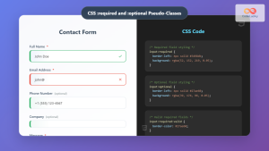
CSS :required and :optional Pseudo-Classes: Master Form Field Validation Styling
Form validation is a crucial aspect of web development, and CSS pseudo-classes provide powerful tools to enhance user experience through...

HTML Submit disabled Property: Submit Button Disabled
HTML Submit disabled Property: Submit Button Disabled The disabled property in HTML is a boolean attribute that, when present on...

HTML TextArea disabled Property: Textarea Disabled
HTML TextArea disabled Property: Controlling Input in Textareas The HTML <textarea> element is a fundamental component for collecting multi-line text...

CSS :valid and :invalid Pseudo-Classes: Complete Guide to Form Validation Styling
Form validation is a crucial aspect of web development that ensures data quality and improves user experience. While JavaScript provides...

HTML Search disabled Property: Search Input Disabled
HTML Search Input disabled Property: Comprehensive Guide The disabled attribute in HTML is a boolean attribute that, when present, prevents...

CSS Pseudo-Classes: Master :hover, :focus, :active for Interactive Web Elements
What Are CSS Pseudo-Classes? CSS pseudo-classes are selectors that target elements based on their current state or position, rather than...

HTML Select disabled Property: Select Disabled
HTML Select disabled Property: Select Disabled The disabled property in HTML's <select> element is used to prevent the user from...

HTML Radio disabled Property: Radio Disabled
HTML Radio disabled Property: A Comprehensive Guide The disabled property in HTML is a boolean attribute that, when present, prevents...
HTML PushButton disabled Property: Button Disabled
HTML PushButton disabled Property: Button Disabled The disabled property in HTML is a boolean attribute that, when present, prevents the...


