
Form validation is a crucial aspect of web development, and CSS pseudo-classes provide powerful tools to enhance user experience through visual feedback. The :required and :optional pseudo-classes allow developers to style form fields based on their validation requirements, creating intuitive interfaces that guide users through form completion.
Understanding :required and :optional Pseudo-Classes
The :required pseudo-class targets form elements that have the required attribute, while :optional targets form elements that don’t have this attribute. These pseudo-classes work with various form elements including input fields, textareas, and select elements.
Browser Support
Both pseudo-classes enjoy excellent browser support across modern browsers:
- Chrome 10+
- Firefox 4+
- Safari 5+
- Edge 12+
- Internet Explorer 10+
Basic Syntax and Usage
The syntax for these pseudo-classes follows the standard CSS pseudo-class format:
/* Target required fields */
input:required {
    /* styles */
}

/* Target optional fields */
input:optional {
    /* styles */
}

/* Combine with other selectors */
input[type="email"]:required {
    /* styles for required email inputs */
}
Practical Examples
Basic Required Field Styling
Here’s a fundamental example showing how to style required and optional fields differently:
Example 1: Basic Styling
/* CSS */
input:required {
    border-left: 4px solid #e74c3c;
    background-color: #fdf2f2;
}

input:optional {
    border-left: 4px solid #27ae60;
    background-color: #f2fdf2;
}
Advanced Styling with Pseudo-Elements
You can create more sophisticated designs by combining pseudo-classes with pseudo-elements:
Example 2: Asterisk Indicators
/* CSS */
label:has(+ input:required)::after {
    content: " *";
    color: #e74c3c;
    font-weight: bold;
}

label:has(+ input:optional)::after {
    content: " (optional)";
    color: #7f8c8d;
    font-size: 0.9em;
}

input:required:focus {
    outline: 2px solid #e74c3c;
}

input:optional:focus {
    outline: 2px solid #27ae60;
}
Interactive Form with Validation States
This example demonstrates how to combine :required/:optional with :valid/:invalid for comprehensive form styling:
Example 3: Complete Validation Styling
/* Required field styling */
input:required {
    border-color: #3498db;
}

/* Valid required fields */
input:required:valid {
    border-color: #27ae60;
    /* Add checkmark icon */
}

/* Invalid required fields */
input:required:invalid:not(:placeholder-shown) {
    border-color: #e74c3c;
    /* Add error icon */
}

/* Optional field styling */
input:optional {
    border-color: #95a5a6;
}

/* Label indicators */
.form-group:has(input:required) label::after {
    content: " *";
    color: #e74c3c;
}

.form-group:has(input:optional) label::after {
    content: " (optional)";
    color: #7f8c8d;
}
Working with Different Form Elements
Select Elements
The :required and :optional pseudo-classes also work with select elements:
Textarea Elements
Textareas can also be styled using these pseudo-classes:
Best Practices and Accessibility
Color and Contrast
When styling required and optional fields, ensure adequate color contrast for accessibility:
- Use WCAG 2.1 AA compliant color combinations
- Don’t rely solely on color to convey information
- Provide additional visual cues like icons or text labels
Progressive Enhancement
Always provide fallback styling for browsers that don’t support these pseudo-classes:
/* Fallback for older browsers */
input[required] {
    border-color: #e74c3c;
}

/* Modern browser enhancement */
input:required {
    border-color: #e74c3c;
    box-shadow: inset 0 1px 3px rgba(231, 76, 60, 0.1);
}
Focus Management
Combine these pseudo-classes with focus states for better user experience:
input:required:focus {
    outline: 2px solid #e74c3c;
    outline-offset: 2px;
}

input:optional:focus {
    outline: 2px solid #27ae60;
    outline-offset: 2px;
}
Common Pitfalls and Solutions
Styling Empty Required Fields
Be careful when styling invalid required fields. Use the :not(:placeholder-shown) pseudo-class to avoid styling empty fields:
/* Avoid this - styles empty fields */
input:required:invalid {
    border-color: red;
}

/* Better approach */
input:required:invalid:not(:placeholder-shown) {
    border-color: red;
}
Specificity Issues
When combining multiple pseudo-classes, be aware of CSS specificity:
/* More specific selector wins */
input:required:focus:valid {
    border-color: green;
}

input:required {
    border-color: blue; /* This won't override the above */
}
Performance Considerations
These pseudo-classes are generally performant, but consider these optimization tips:
- Avoid overly complex selectors
- Use CSS custom properties for consistent theming
- Leverage CSS transitions for smooth state changes
Real-World Implementation
Here’s a complete contact form example that implements all the concepts discussed:
Advanced Techniques
CSS Custom Properties for Theming
Use CSS custom properties to create consistent theming across your forms:
:root {
    --required-color: #e74c3c;
    --optional-color: #27ae60;
    --focus-color: #3498db;
    --border-radius: 8px;
}

input:required {
    border-color: var(--required-color);
}

input:optional {
    border-color: var(--optional-color);
}

input:focus {
    box-shadow: 0 0 0 3px color-mix(in srgb, var(--focus-color) 20%, transparent);
}
Animation and Transitions
Add smooth transitions to enhance user experience:
input {
    transition: border-color 0.3s ease, box-shadow 0.3s ease, background-color 0.3s ease;
}

input:required:invalid:not(:placeholder-shown) {
    animation: shake 0.5s ease-in-out;
}

@keyframes shake {
    0%, 100% { transform: translateX(0); }
    25% { transform: translateX(-5px); }
    75% { transform: translateX(5px); }
}
Testing and Debugging
When working with these pseudo-classes, use browser developer tools to:
- Inspect element states in real-time
- Test different form validation scenarios
- Debug CSS specificity issues
- Verify accessibility compliance
Conclusion
The CSS :required and :optional pseudo-classes provide powerful tools for creating intuitive, accessible forms. By combining these pseudo-classes with other CSS features like transitions, custom properties, and pseudo-elements, you can create sophisticated form interfaces that guide users through the completion process.
Remember to always consider accessibility, provide clear visual feedback, and test your implementations across different browsers and devices. With these techniques, you can significantly improve the user experience of your web forms while maintaining clean, maintainable CSS code.
Related Posts

CSS :valid and :invalid Pseudo-Classes: Complete Guide to Form Validation Styling
Form validation is a crucial aspect of web development that ensures data quality and improves user experience. While JavaScript provides...

CSS :disabled and :enabled Pseudo-Classes: Complete Guide to Form Element States
Form elements are the backbone of user interaction on the web, and managing their visual states is crucial for creating...

CSS Pseudo-Classes: Master :hover, :focus, :active for Interactive Web Elements
What Are CSS Pseudo-Classes? CSS pseudo-classes are selectors that target elements based on their current state or position, rather than...
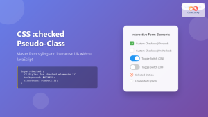
CSS :checked Pseudo-Class: Master Form Input Styling and Interactive UIs
What is the CSS :checked Pseudo-Class? The CSS :checked pseudo-class is a powerful selector that targets form elements in their...
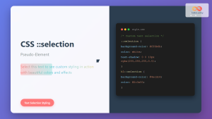
CSS ::selection Pseudo-Element: Complete Guide to Styling Selected Text
The CSS ::selection pseudo-element allows you to style the portion of text that users select with their cursor. This powerful...
CSS :empty Pseudo-Class: Complete Guide to Targeting Empty Elements
The CSS :empty pseudo-class is a powerful selector that targets elements containing no children or text content. This pseudo-class opens...
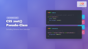
CSS :not() Pseudo-Class: Complete Guide to Excluding Elements from Selection
The CSS :not() pseudo-class is a powerful selector that allows you to target elements that do not match a specific...

CSS Attribute Selectors: Master Targeting Elements by Attribute Values
What Are CSS Attribute Selectors? CSS attribute selectors allow you to target HTML elements based on their attributes and attribute...

CSS ::before Pseudo-Element: Master Adding Content Before Elements
The CSS ::before pseudo-element is one of the most powerful tools in a developer's arsenal for adding decorative content, icons,...

HTML Text required Property: Text Input Required
HTML Text required Property: Ensuring Mandatory Input The required attribute in HTML is a boolean attribute that, when present, specifies...
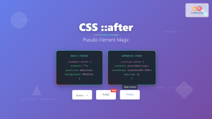
CSS ::after Pseudo-Element: Complete Guide to Adding Dynamic Content After Elements
The CSS ::after pseudo-element is one of the most powerful tools in modern web development, allowing you to insert content...
HTML TextArea required Property: Enforce Text Input in Textareas
HTML textarea required Property: Enforce Text Input The required attribute in HTML's <textarea> element is a boolean attribute that, when...


