
The CSS ::selection pseudo-element allows you to style the portion of text that users select with their cursor. This powerful feature enhances user experience by providing custom styling for selected text, moving beyond the default browser selection appearance.
In this comprehensive guide, you’ll learn everything about the ::selection pseudo-element, from basic syntax to advanced implementation techniques.
What is the CSS ::selection Pseudo-Element?
The ::selection pseudo-element targets the portion of an element that has been selected by the user. When users highlight text by clicking and dragging, the ::selection pseudo-element determines how that selected text appears.
Unlike other pseudo-elements, ::selection only accepts a limited set of CSS properties, making it focused specifically on visual presentation of selected content.
Basic Syntax and Usage
The basic syntax for the ::selection pseudo-element is straightforward:
::selection {
    /* CSS properties */
}

/* For specific elements */
element::selection {
    /* CSS properties */
}
Simple Example
Select this text to see the custom red background and white text color in action. The selection styling makes the text stand out beautifully.
Try it: Click and drag to select the text above.
.custom-selection::selection {
    background-color: #ff6b6b;
    color: white;
}
Supported CSS Properties
The ::selection pseudo-element supports only a limited set of CSS properties:
- color – Sets the text color of selected content
- background-color – Sets the background color of the selection
- text-shadow – Adds shadow effects to selected text
- text-decoration – Applies decorations like underlines to selected text
- text-decoration-color – Sets the color of text decorations
- text-decoration-style – Sets the style of text decorations
- text-decoration-line – Sets which text decoration lines to use
Property Examples
This text demonstrates multiple properties: custom background color, text color, and text shadow when selected.
.enhanced-selection::selection {
    background-color: #4ecdc4;
    color: white;
    text-shadow: 1px 1px 2px rgba(0,0,0,0.3);
}
Browser Support and Vendor Prefixes
Modern browser support for ::selection is excellent, but older versions may require vendor prefixes:
/* Standard syntax */
::selection {
    background-color: #highlightcolor;
    color: #textcolor;
}

/* Webkit-based browsers (older versions) */
::-webkit-selection {
    background-color: #highlightcolor;
    color: #textcolor;
}

/* Mozilla Firefox (older versions) */
::-moz-selection {
    background-color: #highlightcolor;
    color: #textcolor;
}
For maximum compatibility, include all prefixes in your CSS:
This text uses all vendor prefixes to ensure maximum browser compatibility across different versions.
Advanced Styling Techniques
Element-Specific Selection Styles
You can apply different selection styles to different elements:
Heading with red selection
Paragraph text with blue selection styling.
Code elements with dark selection theme
h1::selection, h2::selection, h3::selection {
    background-color: #e74c3c;
    color: white;
}

p::selection {
    background-color: #3498db;
    color: white;
}

code::selection {
    background-color: #2c3e50;
    color: #ecf0f1;
}
Gradient Selection Backgrounds
While direct gradient support is limited, you can create gradient effects using creative approaches:
This text has a gradient effect with custom selection styling that maintains readability.
Interactive Selection Styling
Create engaging user experiences with dynamic selection effects:
Select this text to see an animated glow effect that creates an engaging visual experience.
@keyframes selectionGlow {
    0% { text-shadow: 0 0 5px rgba(255,255,255,0.5); }
    50% { text-shadow: 0 0 20px rgba(255,255,255,0.8); }
    100% { text-shadow: 0 0 5px rgba(255,255,255,0.5); }
}

.interactive-selection::selection {
    background-color: #ff6b6b;
    color: white;
    text-shadow: 0 0 10px rgba(255,255,255,0.6);
    animation: selectionGlow 2s ease-in-out infinite;
}
Best Practices and Accessibility
Accessibility Considerations
When styling text selections, consider accessibility guidelines:
- Sufficient Contrast: Ensure adequate contrast between text and background colors
- Readability: Selected text should remain easily readable
- Color Blindness: Test your selection styles with color blindness simulators
- User Preferences: Respect user’s system preferences for high contrast modes
This text uses high contrast colors that meet WCAG accessibility guidelines for better readability.
Performance Considerations
Keep these performance tips in mind:
- Avoid complex animations in selection styles
- Use simple color values rather than complex gradients
- Test selection performance on low-end devices
- Consider the impact on battery life for mobile devices
Common Use Cases and Examples
Brand-Consistent Selection
Align selection colors with your brand identity:
This selection style matches a brand’s primary color scheme, creating consistency across the user interface.
Dark Theme Selection
Optimize selections for dark themes:
This dark theme text has selection styling optimized for dark backgrounds, ensuring good contrast and readability.
Troubleshooting Common Issues
Selection Not Showing
If your selection styles aren’t appearing:
- Check for CSS specificity conflicts
- Ensure you’re using supported properties only
- Verify browser compatibility
- Test with different content types
Inheritance Issues
Selection styles don’t inherit from parent elements. Each element needs its own selection styling:
/* This won't work for child elements */
.parent::selection {
    background-color: #ff6b6b;
}

/* Instead, use this approach */
.parent *::selection {
    background-color: #ff6b6b;
}
Future of Selection Styling
The CSS Working Group continues to explore enhanced selection capabilities:
- Improved gradient support
- More granular control over selection appearance
- Better integration with CSS custom properties
- Enhanced accessibility features
Conclusion
The CSS ::selection pseudo-element provides a simple yet powerful way to enhance user experience through custom text selection styling. By understanding its syntax, supported properties, and best practices, you can create engaging and accessible selection effects that align with your brand and improve user interaction.
Remember to test your selection styles across different browsers and devices, prioritize accessibility, and use the pseudo-element thoughtfully to create meaningful user experiences. With these techniques, you can transform the simple act of text selection into an opportunity for enhanced user engagement.
Final Demo: Select any text in this box to see a polished selection style that demonstrates the concepts covered in this guide. The green background with white text and subtle shadow creates an appealing visual effect.
Related Posts

CSS ::before Pseudo-Element: Master Adding Content Before Elements
The CSS ::before pseudo-element is one of the most powerful tools in a developer's arsenal for adding decorative content, icons,...

CSS Pseudo-Classes: Master :hover, :focus, :active for Interactive Web Elements
What Are CSS Pseudo-Classes? CSS pseudo-classes are selectors that target elements based on their current state or position, rather than...
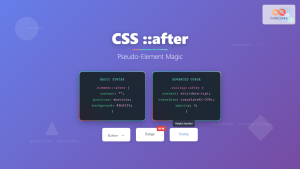
CSS ::after Pseudo-Element: Complete Guide to Adding Dynamic Content After Elements
The CSS ::after pseudo-element is one of the most powerful tools in modern web development, allowing you to insert content...
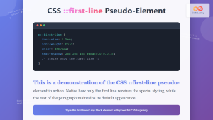
CSS ::first-line Pseudo-Element: Complete Guide to Styling First Line of Text
The CSS ::first-line pseudo-element is a powerful tool that allows developers to apply unique styling to the first line of...
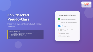
CSS :checked Pseudo-Class: Master Form Input Styling and Interactive UIs
What is the CSS :checked Pseudo-Class? The CSS :checked pseudo-class is a powerful selector that targets form elements in their...
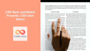
CSS Style userSelect Property: CSS User Select
CSS user-select Property: Controlling Text Selection The CSS user-select property controls whether the user can select text with the mouse...
CSS :required and :optional Pseudo-Classes: Master Form Field Validation Styling
Form validation is a crucial aspect of web development, and CSS pseudo-classes provide powerful tools to enhance user experience through...

CSS :root Pseudo-Class: Complete Guide to Targeting Document Root Element
The CSS :root pseudo-class is a fundamental selector that targets the root element of a document. In HTML documents, this...

CSS Universal Selector: Complete Guide to Selecting All Elements with Asterisk (*)
The CSS universal selector, represented by an asterisk (*), is one of the most powerful yet often misunderstood selectors in...

CSS :disabled and :enabled Pseudo-Classes: Complete Guide to Form Element States
Form elements are the backbone of user interaction on the web, and managing their visual states is crucial for creating...

CSS Attribute Selectors: Master Targeting Elements by Attribute Values
What Are CSS Attribute Selectors? CSS attribute selectors allow you to target HTML elements based on their attributes and attribute...
CSS :empty Pseudo-Class: Complete Guide to Targeting Empty Elements
The CSS :empty pseudo-class is a powerful selector that targets elements containing no children or text content. This pseudo-class opens...


