
The CSS ::before pseudo-element is one of the most powerful tools in a developer’s arsenal for adding decorative content, icons, and visual enhancements to web pages without cluttering HTML markup. This generated content appears as the first child of the selected element, allowing you to create stunning visual effects while maintaining clean, semantic HTML.
What is the CSS ::before Pseudo-Element?
The ::before pseudo-element creates a virtual element that appears before the content of the selected element. It’s not part of the DOM but is rendered by the browser as if it were the first child of the target element. This pseudo-element must include the content property to be visible, even if it’s an empty string.
::before pseudo-element is inline by default but can be styled as any other element using CSS properties.
Basic Syntax and Usage
The fundamental syntax for the ::before pseudo-element follows this pattern:
selector::before {
    content: "text or value";
    /* Additional styling properties */
}
Simple Text Addition Example
Let’s start with a basic example that adds text before paragraph elements:
This paragraph has a star before it.
This paragraph also has a star before it.
.example p::before {
    content: "★ ";
    color: #ff6b35;
    font-weight: bold;
}
The Content Property: Your Creative Canvas
The content property is mandatory for ::before pseudo-elements and accepts various types of values:
String Content
You can insert any text string using quotes:
.notification::before {
    content: "Important: ";
    background-color: #ffeaa7;
    color: #2d3436;
    padding: 2px 6px;
    border-radius: 3px;
    font-size: 0.8em;
    margin-right: 8px;
}
Unicode Characters and Symbols
Unicode characters provide extensive symbol options:
- Task completed successfully
- Another completed item
- All tasks are done
.checklist li::before {
    content: "\2713";  /* Checkmark symbol */
    color: #00b894;
    font-weight: bold;
    margin-right: 8px;
}
Attribute Values
You can dynamically insert HTML attribute values using attr():
.dynamic::before {
    content: "Data: " attr(data-info);
    display: block;
    font-style: italic;
    color: #636e72;
    margin-bottom: 5px;
}
Advanced Styling Techniques
Creating Decorative Elements
Transform ::before pseudo-elements into decorative shapes and designs:
.speech-bubble {
    position: relative;
    background-color: #74b9ff;
    color: white;
    padding: 20px;
    border-radius: 8px;
}

.speech-bubble::before {
    content: "";
    position: absolute;
    top: -10px;
    left: 20px;
    width: 0;
    height: 0;
    border-left: 10px solid transparent;
    border-right: 10px solid transparent;
    border-bottom: 10px solid #74b9ff;
}
Icon Integration
Use ::before to add icons without additional HTML elements:
.contact-list li {
    position: relative;
    padding-left: 30px;
}

.email::before {
    content: "📧";
    position: absolute;
    left: 0;
    top: 0;
}

.phone::before {
    content: "📱";
    position: absolute;
    left: 0;
    top: 0;
}
Interactive Examples and Hover Effects
Combine ::before with CSS transitions and hover states for dynamic effects:
.animated-button {
    position: relative;
    overflow: hidden;
    transition: color 0.3s ease;
}

.animated-button::before {
    content: "";
    position: absolute;
    top: 0;
    left: -100%;
    width: 100%;
    height: 100%;
    background-color: #a29bfe;
    transition: left 0.3s ease;
    z-index: -1;
}

.animated-button:hover::before {
    left: 0;
}
Practical Use Cases
Quote Styling
Create elegant quotation marks for blockquotes:
The best way to predict the future is to create it. Success comes from taking initiative and making things happen.
.styled-quote {
    position: relative;
    padding: 20px 40px;
    background-color: #f8f9fa;
    border-left: 4px solid #6c5ce7;
}

.styled-quote::before {
    content: """;
    position: absolute;
    top: 0;
    left: 10px;
    font-size: 4em;
    color: #6c5ce7;
    line-height: 1;
}
Counter Implementation
Use ::before with CSS counters for automatic numbering:
- Plan your project structure and requirements
- Set up your development environment
- Create the basic HTML structure
- Apply CSS styling and pseudo-elements
- Test across different browsers and devices
.step-list {
    counter-reset: step-counter;
    list-style: none;
}

.step-list li {
    counter-increment: step-counter;
    position: relative;
    padding-left: 50px;
}

.step-list li::before {
    content: counter(step-counter);
    position: absolute;
    left: 0;
    top: 0;
    background-color: #00b894;
    color: white;
    width: 30px;
    height: 30px;
    border-radius: 50%;
    display: flex;
    align-items: center;
    justify-content: center;
}
Browser Support and Compatibility
The ::before pseudo-element enjoys excellent browser support across all modern browsers. Here’s what you need to know about compatibility:
- Modern Browsers: Full support in Chrome, Firefox, Safari, Edge, and Opera
- Internet Explorer: Supported from IE8+ (with single colon syntax
:before) - Mobile Browsers: Well-supported across iOS Safari, Chrome Mobile, and other mobile browsers
::before for modern browsers, but :before still works for backward compatibility.
Best Practices and Performance Tips
Content Property Requirements
Always remember that the content property is mandatory:
/* ❌ Won't work - missing content property */
.element::before {
    background-color: red;
    width: 10px;
    height: 10px;
}

/* ✅ Correct - includes content property */
.element::before {
    content: "";
    background-color: red;
    width: 10px;
    height: 10px;
    display: block;
}
Performance Considerations
- Minimize Complex Selectors: Use simple, specific selectors to avoid performance issues
- Avoid Excessive Pseudo-elements: Too many pseudo-elements can impact rendering performance
- Use Transform Instead of Position: For animations, CSS transforms are more performant than changing position properties
Accessibility Guidelines
Ensure your ::before content doesn’t interfere with accessibility:
- Decorative Content Only: Use
::beforefor visual enhancements, not essential content - Screen Reader Consideration: Pseudo-element content may or may not be read by screen readers
- Alternative Text: Provide alternative ways to convey important information
Common Pitfalls and Solutions
Z-Index Issues
When pseudo-elements appear behind other content:
/* Solution: Adjust z-index and positioning */
.element {
    position: relative;
    z-index: 1;
}

.element::before {
    content: "";
    position: absolute;
    z-index: -1; /* Behind the element */
    /* or z-index: 2; for in front */
}
Inheritance Issues
Pseudo-elements inherit properties from their parent element. Override when necessary:
.parent {
    color: blue;
    font-size: 16px;
}

.parent::before {
    content: "★";
    color: red; /* Override inherited color */
    font-size: 20px; /* Override inherited font-size */
}
Advanced Techniques and Creative Applications
CSS Art with Pseudo-elements
Create complex shapes and designs using only CSS:
Heart shape created with CSS pseudo-elements
Loading Animations
Create engaging loading indicators:
Animated loading indicator using ::before pseudo-element
Conclusion
The CSS ::before pseudo-element is an incredibly versatile tool that enables developers to create rich, interactive, and visually appealing web interfaces without cluttering HTML markup. From simple text additions to complex animations and decorative elements, mastering ::before opens up endless possibilities for creative web design.
Remember to always include the content property, consider accessibility implications, and use pseudo-elements for decorative purposes rather than essential content. With practice and creativity, you’ll discover that ::before is one of the most powerful features in your CSS toolkit.
Start experimenting with these techniques in your projects, and you’ll quickly see how ::before pseudo-elements can transform your designs while keeping your HTML clean and semantic.
Related Posts
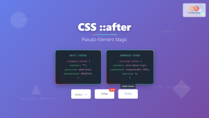
CSS ::after Pseudo-Element: Complete Guide to Adding Dynamic Content After Elements
The CSS ::after pseudo-element is one of the most powerful tools in modern web development, allowing you to insert content...
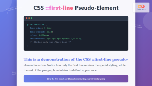
CSS ::first-line Pseudo-Element: Complete Guide to Styling First Line of Text
The CSS ::first-line pseudo-element is a powerful tool that allows developers to apply unique styling to the first line of...
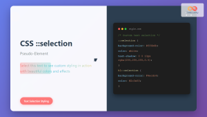
CSS ::selection Pseudo-Element: Complete Guide to Styling Selected Text
The CSS ::selection pseudo-element allows you to style the portion of text that users select with their cursor. This powerful...
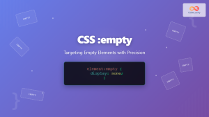
CSS :empty Pseudo-Class: Complete Guide to Targeting Empty Elements
The CSS :empty pseudo-class is a powerful selector that targets elements containing no children or text content. This pseudo-class opens...

CSS :root Pseudo-Class: Complete Guide to Targeting Document Root Element
The CSS :root pseudo-class is a fundamental selector that targets the root element of a document. In HTML documents, this...

CSS Pseudo-Classes: Master :hover, :focus, :active for Interactive Web Elements
What Are CSS Pseudo-Classes? CSS pseudo-classes are selectors that target elements based on their current state or position, rather than...
CSS :not() Pseudo-Class: Complete Guide to Excluding Elements from Selection
The CSS :not() pseudo-class is a powerful selector that allows you to target elements that do not match a specific...

CSS ::first-letter Pseudo-Element: Complete Guide to Drop Caps and First Letter Styling
The CSS ::first-letter pseudo-element is a powerful tool for creating elegant typography effects, particularly the classic drop cap style where...
CSS :first-child and :last-child Pseudo-Classes: Complete Guide with Examples
CSS pseudo-classes are powerful tools that allow developers to select and style elements based on their position, state, or relationship...

CSS :disabled and :enabled Pseudo-Classes: Complete Guide to Form Element States
Form elements are the backbone of user interaction on the web, and managing their visual states is crucial for creating...

CSS General Sibling Selectors: Master Advanced Element Targeting Techniques
CSS general sibling selectors provide a powerful way to target elements that share the same parent and appear after a...

CSS Relative Positioning: Master Element Offset and Layout Control
Understanding CSS Relative Positioning CSS relative positioning is a fundamental layout technique that allows you to move elements from their...


