
The CSS ::after pseudo-element is one of the most powerful tools in modern web development, allowing you to insert content into a page without modifying your HTML markup. This virtual element appears as the last child of the selected element, enabling you to create decorative effects, add icons, implement tooltips, and build complex layouts with minimal code.
What is the CSS ::after Pseudo-Element?
The ::after pseudo-element creates a virtual element that is inserted after the content of the selected element. It’s not part of the HTML DOM but is rendered by the browser as if it were the last child of the target element. This pseudo-element must include the content property to be visible, even if it’s just an empty string.
Key Point: The ::after pseudo-element is inline by default but can be styled as any display type using the display property.
Basic Syntax and Usage
The fundamental syntax for the ::after pseudo-element follows this pattern:
selector::after {
  content: ""; /* Required property */
  /* Additional styling properties */
}
Let’s start with a simple example that adds text after a paragraph:
<p class="greeting">Hello World</p>.greeting::after {
content: " 👋";
color: #f59e0b;
}Hello World 👋
Essential Properties for ::after
The content Property
The content property is mandatory for ::after to render. It accepts various values:
- String values:
content: "text"; - Empty string:
content: "";(for decorative elements) - Attribute values:
content: attr(data-label); - Counters:
content: counter(section); - URLs:
content: url(image.png);
<div class="text-after">Text content</div>
<div class="attr-after" data-info="(Required)">Form field</div>
<div class="empty-after">Decorative element</div>

<style>
.text-after::after {
  content: " - Added text";
  color: #10b981;
}

.attr-after::after {
  content: attr(data-info);
  color: #ef4444;
  font-weight: bold;
}

.empty-after::after {
  content: "";
  display: inline-block;
  width: 20px;
  height: 20px;
  background: #3b82f6;
  border-radius: 50%;
  margin-left: 10px;
}
</style>Practical Examples and Use Cases
Creating Decorative Icons and Symbols
One of the most common uses of ::after is adding decorative icons without cluttering your HTML:
<a href="#" class="external-link">Visit External Site</a>
<button class="download-btn">Download File</button>
<span class="email">[email protected]</span>

<style>
.external-link::after {
  content: " ↗";
  font-size: 0.8em;
  color: #6b7280;
}

.download-btn::after {
  content: " ⬇";
  margin-left: 5px;
}

.email::after {
  content: " ✉";
  color: #3b82f6;
}
</style>Building Custom Tooltips
The ::after pseudo-element is perfect for creating lightweight tooltips that appear on hover:
<span class="tooltip" data-tooltip="This is a helpful tooltip!">Hover over me</span>

<style>
.tooltip {
  position: relative;
  cursor: help;
  border-bottom: 1px dotted #3b82f6;
  color: #3b82f6;
}

.tooltip::after {
  content: attr(data-tooltip);
  position: absolute;
  bottom: 100%;
  left: 50%;
  transform: translateX(-50%);
  background: #1f2937;
  color: white;
  padding: 8px 12px;
  border-radius: 4px;
  font-size: 14px;
  white-space: nowrap;
  opacity: 0;
  visibility: hidden;
  transition: opacity 0.3s, visibility 0.3s;
  z-index: 1000;
}

.tooltip:hover::after {
  opacity: 1;
  visibility: visible;
}
</style>Hover over me
Creating Custom Buttons and UI Elements
Use ::after to add sophisticated styling to buttons and interactive elements:
<button class="fancy-btn">Click Me</button>

<style>
.fancy-btn {
  position: relative;
  padding: 12px 24px;
  background: linear-gradient(45deg, #3b82f6, #1d4ed8);
  color: white;
  border: none;
  border-radius: 8px;
  cursor: pointer;
  overflow: hidden;
  transition: transform 0.2s;
}

.fancy-btn::after {
  content: "";
  position: absolute;
  top: 0;
  left: -100%;
  width: 100%;
  height: 100%;
  background: linear-gradient(90deg, transparent, rgba(255,255,255,0.3), transparent);
  transition: left 0.5s;
}

.fancy-btn:hover {
  transform: translateY(-2px);
}

.fancy-btn:hover::after {
  left: 100%;
}
</style>Advanced Techniques and Patterns
Creating Shapes and Geometric Elements
The ::after pseudo-element can create complex shapes when combined with CSS transforms and borders:
<div class="arrow-right">Arrow pointer</div>
<div class="speech-bubble">Speech bubble effect</div>

<style>
.arrow-right {
  position: relative;
  background: #10b981;
  color: white;
  padding: 10px 20px;
  border-radius: 4px;
  display: inline-block;
  margin: 10px;
}

.arrow-right::after {
  content: "";
  position: absolute;
  top: 50%;
  right: -10px;
  transform: translateY(-50%);
  width: 0;
  height: 0;
  border-left: 10px solid #10b981;
  border-top: 10px solid transparent;
  border-bottom: 10px solid transparent;
}

.speech-bubble {
  position: relative;
  background: #f3f4f6;
  padding: 15px 20px;
  border-radius: 8px;
  display: inline-block;
  margin: 20px 10px;
  border: 2px solid #d1d5db;
}

.speech-bubble::after {
  content: "";
  position: absolute;
  bottom: -12px;
  left: 30px;
  width: 0;
  height: 0;
  border-left: 12px solid transparent;
  border-right: 12px solid transparent;
  border-top: 12px solid #f3f4f6;
}
</style>Implementing Counters and Numbering
Combine ::after with CSS counters to create automatic numbering systems:
<div class="numbered-list">
  <div class="step">First step in the process</div>
  <div class="step">Second step in the process</div>
  <div class="step">Third step in the process</div>
  <div class="step">Fourth step in the process</div>
</div>

<style>
.numbered-list {
  counter-reset: step-counter;
}

.step {
  position: relative;
  padding: 15px 15px 15px 60px;
  margin: 10px 0;
  background: #f8fafc;
  border-radius: 8px;
  border-left: 4px solid #3b82f6;
  counter-increment: step-counter;
}

.step::after {
  content: counter(step-counter);
  position: absolute;
  left: 15px;
  top: 50%;
  transform: translateY(-50%);
  background: #3b82f6;
  color: white;
  width: 30px;
  height: 30px;
  border-radius: 50%;
  display: flex;
  align-items: center;
  justify-content: center;
  font-weight: bold;
  font-size: 14px;
}
</style>1
2
3
4
Best Practices and Performance Tips
Accessibility Considerations
When using ::after pseudo-elements, keep accessibility in mind:
- Avoid essential content: Don’t put crucial information in pseudo-elements as screen readers may not announce it
- Use appropriate ARIA labels: Add
aria-labeloraria-describedbywhen pseudo-elements convey meaning - Maintain color contrast: Ensure sufficient contrast ratios for any text or icons in pseudo-elements
- Test with screen readers: Verify that your pseudo-element content doesn’t interfere with accessibility tools
Performance Optimization
To maintain optimal performance when using ::after pseudo-elements:
- Use efficient selectors: Avoid overly complex selectors that target pseudo-elements
- Minimize repaints: Use
transformandopacityfor animations instead of changing size or position - Batch DOM updates: Group related pseudo-element changes together
- Leverage CSS containment: Use
containproperty for complex pseudo-element layouts
Browser Support and Compatibility
The ::after pseudo-element enjoys excellent browser support across all modern browsers. However, keep these compatibility notes in mind:
Legacy Browser Note: Internet Explorer 8 and earlier require the single-colon syntax (:after) instead of double-colon (::after). Modern browsers support both syntaxes, but double-colon is preferred for new projects.
/* Preferred modern syntax */
.element::after {
  content: "";
}

/* Legacy compatibility (still works) */
.element:after {
  content: "";
}
Common Pitfalls and Troubleshooting
The Missing content Property
The most common mistake is forgetting the content property. Without it, the ::after pseudo-element won’t render:
.element::after {
  background: red;
  width: 20px;
  height: 20px;
  /* Missing content property - won't render! */
}.element::after {
content: ""; /* Required for rendering */
background: red;
width: 20px;
height: 20px;
display: block; /* Often needed for sizing */
}Positioning Issues
Remember that ::after pseudo-elements are inline by default. For absolute positioning or specific dimensions, you’ll need to change the display property:
.parent {
  position: relative; /* Needed for absolute positioning of ::after */
}

.parent::after {
  content: "";
  position: absolute; /* Changes display context */
  top: 0;
  right: 0;
  width: 50px;
  height: 50px;
  background: #3b82f6;
}
Real-World Applications
Creating a Loading Spinner
Build an elegant loading spinner using only CSS and the ::after pseudo-element:
<div class="loading">Loading...</div>

<style>
.loading {
  position: relative;
  padding-left: 40px;
  color: #6b7280;
}

.loading::after {
  content: "";
  position: absolute;
  left: 0;
  top: 50%;
  transform: translateY(-50%);
  width: 20px;
  height: 20px;
  border: 2px solid #e5e7eb;
  border-top: 2px solid #3b82f6;
  border-radius: 50%;
  animation: spin 1s linear infinite;
}

@keyframes spin {
  0% { transform: translateY(-50%) rotate(0deg); }
  100% { transform: translateY(-50%) rotate(360deg); }
}
</style><span style=”content: ”; position:
Related Posts

CSS ::before Pseudo-Element: Master Adding Content Before Elements
The CSS ::before pseudo-element is one of the most powerful tools in a developer's arsenal for adding decorative content, icons,...
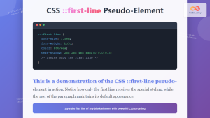
CSS ::first-line Pseudo-Element: Complete Guide to Styling First Line of Text
The CSS ::first-line pseudo-element is a powerful tool that allows developers to apply unique styling to the first line of...
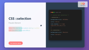
CSS ::selection Pseudo-Element: Complete Guide to Styling Selected Text
The CSS ::selection pseudo-element allows you to style the portion of text that users select with their cursor. This powerful...
CSS :empty Pseudo-Class: Complete Guide to Targeting Empty Elements
The CSS :empty pseudo-class is a powerful selector that targets elements containing no children or text content. This pseudo-class opens...

CSS Pseudo-Classes: Master :hover, :focus, :active for Interactive Web Elements
What Are CSS Pseudo-Classes? CSS pseudo-classes are selectors that target elements based on their current state or position, rather than...

CSS ::first-letter Pseudo-Element: Complete Guide to Drop Caps and First Letter Styling
The CSS ::first-letter pseudo-element is a powerful tool for creating elegant typography effects, particularly the classic drop cap style where...

CSS Adjacent Sibling Selectors: Complete Guide to Next Element Targeting
CSS adjacent sibling selectors are powerful tools that allow you to target elements based on their relationship to other elements...

CSS :root Pseudo-Class: Complete Guide to Targeting Document Root Element
The CSS :root pseudo-class is a fundamental selector that targets the root element of a document. In HTML documents, this...

CSS :not() Pseudo-Class: Complete Guide to Excluding Elements from Selection
The CSS :not() pseudo-class is a powerful selector that allows you to target elements that do not match a specific...

HTML style Property: Element Style
HTML style Property: Element Style The HTML style property allows you to apply inline CSS styles directly to individual HTML...

CSS :disabled and :enabled Pseudo-Classes: Complete Guide to Form Element States
Form elements are the backbone of user interaction on the web, and managing their visual states is crucial for creating...

CSS Text-Indent: Complete Guide to First Line Paragraph Indentation
The CSS text-indent property is a fundamental typography tool that controls the indentation of the first line in a block...


