
What is the CSS :checked Pseudo-Class?
The CSS :checked pseudo-class is a powerful selector that targets form elements in their checked state. This includes checkboxes, radio buttons, and select options that are currently selected. It’s an essential tool for creating interactive user interfaces without JavaScript, enabling developers to build dynamic form styling and custom UI components.
The :checked pseudo-class applies to <input type="checkbox">, <input type="radio">, and <option> elements when they are in their selected state. This selector opens up endless possibilities for creating engaging user experiences through pure CSS.
Basic Syntax and Usage
The syntax for the :checked pseudo-class is straightforward:
input:checked {
  /* Styles for checked elements */
}

/* Target specific input types */
input[type="checkbox"]:checked {
  /* Styles for checked checkboxes */
}

input[type="radio"]:checked {
  /* Styles for checked radio buttons */
}
Styling Checkboxes with :checked
Let’s start with basic checkbox styling. Here’s how you can create custom checkboxes that respond to the checked state:
Example 1: Custom Checkbox Design
Advanced Radio Button Styling
Radio buttons offer unique styling opportunities with the :checked pseudo-class. Here’s how to create elegant radio button designs:
Example 2: Modern Radio Button Group
Creating Interactive Toggle Switches
One of the most popular uses of the :checked pseudo-class is creating toggle switches. These provide an intuitive on/off interface:
Example 3: Animated Toggle Switches
Email Notifications
Dark Mode
Premium Features
Content Revealing with :checked
The :checked pseudo-class can control the visibility of other elements using the adjacent sibling selector (+) or general sibling selector (~). This technique is perfect for creating accordions, tabs, and content toggles:
Example 4: CSS-Only Accordion
The :checked pseudo-class is a CSS selector that targets form elements in their checked or selected state. It works with checkboxes, radio buttons, and select options.
The :checked pseudo-class has excellent browser support and works in all modern browsers including Chrome, Firefox, Safari, and Edge.
Using CSS :checked pseudo-class eliminates the need for JavaScript in many interactive scenarios, resulting in better performance and faster loading times.
Advanced Techniques and Combinations
The :checked pseudo-class becomes even more powerful when combined with other CSS features. Here are some advanced techniques:
Using :checked with CSS Grid and Flexbox
You can create dynamic layouts that respond to checkbox states:
Example 5: Dynamic Layout Control
Form Validation Styling
The :checked pseudo-class is invaluable for providing visual feedback in forms. Combined with the :valid and :invalid pseudo-classes, you can create comprehensive form validation styling:
Example 6: Form Validation with Visual Feedback
Browser Support and Compatibility
The :checked pseudo-class enjoys excellent browser support across all modern browsers:
- Chrome: Supported since version 1.0
- Firefox: Supported since version 1.0
- Safari: Supported since version 3.1
- Edge: Supported since version 12
- Internet Explorer: Supported since version 9
This widespread support makes the :checked pseudo-class a reliable choice for production websites and applications.
Performance Considerations
Using the :checked pseudo-class offers several performance benefits:
- No JavaScript Required: Reduces script loading time and execution overhead
- Native Browser Optimization: Browsers optimize CSS pseudo-class selectors internally
- Reduced DOM Manipulation: No need for event listeners or DOM updates
- Better Accessibility: Works seamlessly with keyboard navigation and screen readers
Accessibility Best Practices
When using the :checked pseudo-class, consider these accessibility guidelines:
- Maintain Focus Indicators: Ensure custom styled elements show focus states
- Preserve Semantic Meaning: Use proper form elements and labels
- Provide Clear Visual Feedback: Make checked/unchecked states obvious
- Support Keyboard Navigation: Test with tab navigation and space/enter keys
Common Pitfalls and Solutions
Here are some common issues developers encounter when working with the :checked pseudo-class:
1. Hidden Input Elements
Problem: Custom styling requires hiding the original input, which can break accessibility.
Solution: Use opacity: 0 and position: absolute instead of display: none to maintain keyboard accessibility.
2. Sibling Selector Limitations
Problem: CSS sibling selectors only work with elements that follow the checkbox in the DOM.
Solution: Structure your HTML carefully or use CSS Grid/Flexbox with order property to rearrange visual layout.
3. Specificity Issues
Problem: Styles not applying due to CSS specificity conflicts.
Solution: Use more specific selectors or the :is() pseudo-class for complex selections.
Future-Proofing Your Code
As CSS continues to evolve, consider these modern approaches:
- CSS Container Queries: Combine with :checked for responsive component-based styling
- CSS Custom Properties: Use CSS variables for dynamic theming based on checked states
- CSS Logical Properties: Ensure international compatibility with logical properties
Conclusion
The CSS :checked pseudo-class is a versatile and powerful tool for creating interactive user interfaces without JavaScript. From simple form styling to complex interactive components, it offers developers a way to enhance user experience while maintaining excellent performance and accessibility.
By mastering the techniques covered in this guide, you can create engaging, responsive, and accessible web interfaces that delight users and perform well across all devices and browsers. The key to success with the :checked pseudo-class lies in understanding its capabilities, combining it thoughtfully with other CSS features, and always keeping accessibility in mind.
Remember to test your implementations across different browsers and devices, and always provide fallbacks for critical functionality. With these best practices in place, the :checked pseudo-class will become an invaluable part of your CSS toolkit.
Related Posts

HTML Checkbox checked Property: Checkbox Checked
HTML Checkbox checked Property: A Comprehensive Guide The checked property in HTML represents the state of a checkbox. It indicates...

HTML Radio checked Property: Radio Checked
HTML Radio checked Property: Control Radio Button State The HTML checked property of a radio button is a boolean attribute...

CSS :disabled and :enabled Pseudo-Classes: Complete Guide to Form Element States
Form elements are the backbone of user interaction on the web, and managing their visual states is crucial for creating...

CSS Pseudo-Classes: Master :hover, :focus, :active for Interactive Web Elements
What Are CSS Pseudo-Classes? CSS pseudo-classes are selectors that target elements based on their current state or position, rather than...
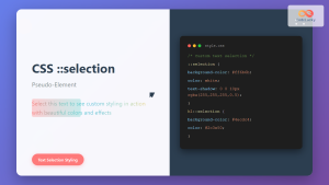
CSS ::selection Pseudo-Element: Complete Guide to Styling Selected Text
The CSS ::selection pseudo-element allows you to style the portion of text that users select with their cursor. This powerful...
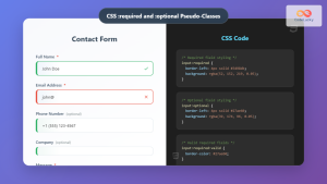
CSS :required and :optional Pseudo-Classes: Master Form Field Validation Styling
Form validation is a crucial aspect of web development, and CSS pseudo-classes provide powerful tools to enhance user experience through...
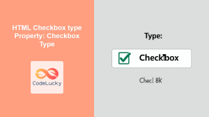
HTML Checkbox type Property: Checkbox Type
HTML Checkbox type Property: A Comprehensive Guide The type attribute of the HTML <input> element is fundamental in defining the...

HTML Radio defaultChecked Property: Radio Default Checked
Understanding the defaultChecked Property in HTML Radio Buttons The defaultChecked property in HTML radio buttons is a boolean attribute that...

CSS :valid and :invalid Pseudo-Classes: Complete Guide to Form Validation Styling
Form validation is a crucial aspect of web development that ensures data quality and improves user experience. While JavaScript provides...
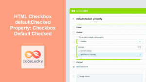
HTML Checkbox defaultChecked Property: Checkbox Default Checked
HTML Checkbox defaultChecked Property: Setting the Initial State The defaultChecked property in HTML represents the initial state of a checkbox...

HTML Checkbox form Property: Checkbox Form
HTML Checkbox form Property: A Comprehensive Guide The HTML form property for checkboxes allows you to explicitly associate a checkbox...

CSS Attribute Selectors: Master Targeting Elements by Attribute Values
What Are CSS Attribute Selectors? CSS attribute selectors allow you to target HTML elements based on their attributes and attribute...


