
Form validation is a crucial aspect of web development that ensures data quality and improves user experience. While JavaScript provides powerful validation capabilities, CSS offers elegant styling solutions through the :valid and :invalid pseudo-classes. These pseudo-classes allow developers to create visually appealing and intuitive form feedback without writing complex JavaScript code.
In this comprehensive guide, we’ll explore how to leverage CSS :valid and :invalid pseudo-classes to create professional form validation experiences that enhance usability and provide immediate visual feedback to users.
Understanding CSS :valid and :invalid Pseudo-Classes
The :valid and :invalid pseudo-classes are CSS selectors that target form elements based on their validation state. These pseudo-classes automatically apply styles when HTML5 form validation rules are met or violated.
What Makes a Field Valid or Invalid?
Form fields are considered valid or invalid based on HTML5 validation attributes and constraints:
- Valid fields: Meet all specified validation requirements
- Invalid fields: Violate one or more validation constraints
- Validation triggers: Include required attributes, pattern matching, input types, and length constraints
Basic Syntax and Usage
The syntax for these pseudo-classes is straightforward:
/* Style valid form elements */
input:valid {
    border-color: green;
    background-color: #f0fff0;
}

/* Style invalid form elements */
input:invalid {
    border-color: red;
    background-color: #fff0f0;
}
Practical Examples with Visual Output
Example 1: Basic Email Validation
Let’s create a simple email input with validation styling:
Example 2: Advanced Form with Multiple Validation Types
Advanced Techniques and Best Practices
Combining with Other Pseudo-Classes
You can combine :valid and :invalid with other pseudo-classes for more sophisticated styling:
/* Style only when focused and invalid */
input:focus:invalid {
border-color: #ff6b6b;
box-shadow: 0 0 10px rgba(255, 107, 107, 0.3);
}
/* Style valid inputs that are not placeholder-shown */
input:valid:not(:placeholder-shown) {
border-color: #51cf66;
}
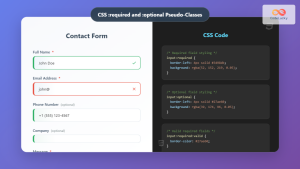
/* Different styling for required vs optional fields */
input:required:invalid {
border-left: 4px solid #ff6b6b;
}
input:optional:valid {
border-left: 4px solid #51cf66;
}Custom Validation Messages with CSS
Form Validation Patterns and Use Cases
Password Strength Indicator
- At least 8 characters
- One uppercase letter
- One lowercase letter
- One number
- One special character
Accessibility Considerations
When implementing form validation styling, it’s crucial to maintain accessibility:
- Color contrast: Ensure sufficient contrast ratios for validation colors
- Multiple indicators: Don’t rely solely on color; use icons, borders, or text
- Screen readers: Provide appropriate ARIA labels and descriptions
- Focus management: Ensure keyboard navigation works seamlessly
/* Accessible validation styling */
.form-field {
    position: relative;
}

.form-field input:invalid {
    border-color: #d32f2f;
    border-width: 2px;
    background-image: url('data:image/svg+xml,');
    background-repeat: no-repeat;
    background-position: right 10px center;
    background-size: 20px;
}

.form-field input:valid {
    border-color: #388e3c;
    border-width: 2px;
}
Browser Support and Fallbacks
The :valid and :invalid pseudo-classes have excellent browser support across modern browsers. However, it’s important to provide fallbacks for older browsers:
/* Fallback for older browsers */
.form-input {
    border: 2px solid #ccc;
}

/* Modern browser support */
@supports selector(:invalid) {
    .form-input:invalid {
        border-color: #e74c3c;
    }

    .form-input:valid {
        border-color: #27ae60;
    }
}
Performance Considerations
CSS validation styling is highly performant because it leverages the browser’s built-in validation engine. However, consider these optimization tips:
- Minimize reflows: Use transforms and opacity for animations
- Efficient selectors: Avoid overly complex pseudo-class combinations
- CSS containment: Use the contain property for form sections
Real-World Implementation Tips
Progressive Enhancement
Start with basic HTML5 validation and enhance with CSS styling:
/* Base styles - works without CSS */
<input type="email" required>

/* Enhanced with CSS pseudo-classes */
input[type="email"]:invalid {
    outline: 2px solid #ff6b6b;
    outline-offset: 2px;
}
Form State Management
Combine CSS pseudo-classes with JavaScript for complex validation scenarios:
/* CSS handles visual feedback */
.form-group--error input {
    border-color: #e74c3c;
}

.form-group--success input {
    border-color: #27ae60;
}

/* JavaScript manages form state */
// Add/remove classes based on validation results
Testing and Debugging
Effective testing strategies for CSS form validation:
- Cross-browser testing: Verify styling across different browsers
- Accessibility testing: Use screen readers and keyboard navigation
- Edge cases: Test with various input combinations and edge cases
- Performance testing: Monitor rendering performance with complex forms
Conclusion
CSS :valid and :invalid pseudo-classes provide a powerful, efficient way to create professional form validation experiences. By leveraging these pseudo-classes effectively, you can build forms that provide immediate visual feedback, improve user experience, and maintain excellent performance without relying heavily on JavaScript.
Remember to always prioritize accessibility, provide clear visual indicators, and test thoroughly across different browsers and devices. With these techniques in your toolkit, you’ll be equipped to create forms that not only look great but also provide exceptional usability for all users.
The examples and techniques covered in this guide should give you a solid foundation for implementing CSS-based form validation in your projects. Experiment with different combinations and adapt the styles to match your design system for the best results.
Related Posts
CSS :required and :optional Pseudo-Classes: Master Form Field Validation Styling
Form validation is a crucial aspect of web development, and CSS pseudo-classes provide powerful tools to enhance user experience through...

CSS Validation: Complete Guide to W3C CSS Validator for Error-Free Stylesheets
What is CSS Validation? CSS validation is the process of checking your Cascading Style Sheets (CSS) code against the official...

CSS :disabled and :enabled Pseudo-Classes: Complete Guide to Form Element States
Form elements are the backbone of user interaction on the web, and managing their visual states is crucial for creating...

CSS Pseudo-Classes: Master :hover, :focus, :active for Interactive Web Elements
What Are CSS Pseudo-Classes? CSS pseudo-classes are selectors that target elements based on their current state or position, rather than...

CSS Syntax: Complete Guide to Rules, Selectors, Properties and Values
CSS (Cascading Style Sheets) is the cornerstone of web design, transforming plain HTML into visually stunning websites. Understanding CSS syntax...

CSS :checked Pseudo-Class: Master Form Input Styling and Interactive UIs
What is the CSS :checked Pseudo-Class? The CSS :checked pseudo-class is a powerful selector that targets form elements in their...

CSS :not() Pseudo-Class: Complete Guide to Excluding Elements from Selection
The CSS :not() pseudo-class is a powerful selector that allows you to target elements that do not match a specific...

CSS Attribute Selectors: Master Targeting Elements by Attribute Values
What Are CSS Attribute Selectors? CSS attribute selectors allow you to target HTML elements based on their attributes and attribute...

HTML style Property: Element Style
HTML style Property: Element Style The HTML style property allows you to apply inline CSS styles directly to individual HTML...

CSS Class Selectors: Master Targeting Elements with Class Attributes
What Are CSS Class Selectors? CSS class selectors are fundamental tools that allow you to target and style HTML elements...

CSS :root Pseudo-Class: Complete Guide to Targeting Document Root Element
The CSS :root pseudo-class is a fundamental selector that targets the root element of a document. In HTML documents, this...

HTML Form novalidate Property: Form No Validate
HTML Form novalidate Property: Bypassing Form Validation The HTML novalidate property is a boolean attribute that, when present on a...


