
The CSS ::first-line pseudo-element is a powerful tool that allows developers to apply unique styling to the first line of text within an element. This pseudo-element enables you to create sophisticated typography effects, enhance readability, and add visual interest to your content without the need for additional HTML markup.
Understanding the ::first-line Pseudo-Element
The ::first-line pseudo-element targets the first formatted line of text in a block-level element. It’s particularly useful for creating drop caps, highlighting introductory text, or applying special formatting to the opening line of paragraphs, similar to traditional print typography.
Key Characteristics:
- Only applies to block-level elements
- Dynamically adjusts based on viewport width and text wrapping
- Limited to specific CSS properties
- Cannot be used with inline elements
Basic Syntax and Usage
The syntax for the ::first-line pseudo-element follows the standard CSS pseudo-element format:
selector::first-line {
    /* CSS properties */
}
Simple Example
This is the first line of the paragraph that will be styled differently from the rest of the text. The remaining content will maintain its default appearance, creating a clear visual distinction between the opening line and the body text.
.example p::first-line {
    font-weight: bold;
    color: #2563eb;
    font-size: 1.2em;
}
Allowed CSS Properties
The ::first-line pseudo-element has restrictions on which CSS properties can be applied. Only certain properties that affect text formatting are permitted:
Font Properties
font-familyfont-sizefont-stylefont-variantfont-weightline-height
Color and Background
colorbackgroundproperties
Text Properties
text-decorationtext-transformletter-spacingword-spacing
Other Properties
vertical-aligntext-shadow
Practical Examples
Magazine-Style Opening
In the world of modern web development, attention to typography can make the difference between a good website and a great one. The careful application of CSS pseudo-elements allows designers to create sophisticated text treatments that enhance readability and visual appeal.
.magazine p::first-line {
    font-variant: small-caps;
    font-weight: 600;
    letter-spacing: 1px;
    color: #dc2626;
}
Elegant Background Highlight
Creating visually appealing content doesn’t always require complex JavaScript or heavy frameworks. Sometimes, the most elegant solutions come from mastering the fundamentals of CSS and understanding how to leverage pseudo-elements effectively.
.highlight p::first-line {
    background: linear-gradient(120deg, #fbbf24 0%, #f59e0b 100%);
    color: white;
    padding: 2px 4px;
    border-radius: 3px;
    font-weight: 500;
}
Decorative Text Effect
The power of CSS pseudo-elements extends far beyond simple text styling. They provide a semantic way to enhance content presentation without cluttering your HTML with unnecessary markup elements.
.decorative p::first-line {
    text-decoration: underline;
    text-decoration-color: #8b5cf6;
    text-decoration-thickness: 2px;
    text-underline-offset: 4px;
    font-size: 1.1em;
    color: #374151;
}
Interactive Demo
This interactive demonstration shows how the ::first-line pseudo-element dynamically adapts to different styling approaches. Try clicking the buttons above to see various effects applied to the first line of this paragraph. Notice how the styling automatically adjusts as you resize your browser window, always targeting just the first formatted line of text.
Advanced Techniques
Combining with Other Pseudo-Elements
You can combine ::first-line with other pseudo-elements for more complex effects:
Classical typography techniques can be beautifully implemented using CSS pseudo-elements. The combination of drop caps and first-line styling creates an elegant, magazine-like appearance that draws readers into your content naturally.
p::first-letter {
    float: left;
    font-size: 3em;
    line-height: 1;
    margin: 0 8px 0 0;
    color: #dc2626;
    font-weight: bold;
}

p::first-line {
    font-variant: small-caps;
    font-weight: 600;
    color: #374151;
}
Responsive First-Line Styling
Create responsive designs that adapt the first-line styling based on screen size:
Responsive typography ensures that your first-line styling looks great on all devices. This paragraph demonstrates how media queries can be used to adjust the appearance of the first line based on screen size, providing optimal readability across different viewports.
p::first-line {
    font-size: 1.1em;
    color: #2563eb;
    font-weight: 500;
}

@media (max-width: 768px) {
    p::first-line {
        font-size: 1em;
        color: #dc2626;
        font-weight: 600;
    }
}
Browser Support and Compatibility
The ::first-line pseudo-element enjoys excellent browser support across all modern browsers:
- Chrome: Full support since version 1
- Firefox: Full support since version 1
- Safari: Full support since version 1
- Edge: Full support since version 12
- Internet Explorer: Supported since IE 9 (with single colon syntax)
Legacy Syntax Considerations
For maximum compatibility with older browsers, you might need to include both single and double colon syntax:
/* Legacy syntax for IE 8 and below */
p:first-line {
    font-weight: bold;
}

/* Modern syntax */
p::first-line {
    font-weight: bold;
}
Common Pitfalls and Best Practices
Avoid These Mistakes
- Using with inline elements:
::first-lineonly works with block-level elements - Applying unsupported properties: Stick to the allowed property list
- Over-styling: Keep first-line effects subtle and readable
- Ignoring responsive design: Test how your styling adapts to different screen sizes
Best Practices
- Maintain readability: Ensure contrast ratios meet accessibility standards
- Test across devices: Verify that line breaks work as expected
- Use semantic HTML: Apply styling to appropriate content elements
- Consider performance: Avoid complex animations or effects that impact rendering
Real-World Applications
Blog and Article Styling
Use ::first-line to create engaging introductions for blog posts and articles, helping readers identify the start of new content sections.
Marketing Copy
Highlight key messaging in marketing materials by styling the first line of important paragraphs, drawing attention to crucial information.
Digital Publications
Recreate traditional print typography effects in digital publications, maintaining familiar reading patterns for users.
Conclusion
The CSS ::first-line pseudo-element is a versatile tool for enhancing typography and creating visually appealing text layouts. By understanding its capabilities, limitations, and best practices, you can effectively use this pseudo-element to improve the visual hierarchy and readability of your web content.
Remember to always test your implementations across different browsers and devices, ensuring that your first-line styling enhances rather than hinders the user experience. With thoughtful application, the ::first-line pseudo-element can elevate your web typography from functional to exceptional.
Related Posts
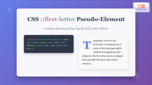
CSS ::first-letter Pseudo-Element: Complete Guide to Drop Caps and First Letter Styling
The CSS ::first-letter pseudo-element is a powerful tool for creating elegant typography effects, particularly the classic drop cap style where...

CSS ::before Pseudo-Element: Master Adding Content Before Elements
The CSS ::before pseudo-element is one of the most powerful tools in a developer's arsenal for adding decorative content, icons,...
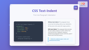
CSS Text-Indent: Complete Guide to First Line Paragraph Indentation
The CSS text-indent property is a fundamental typography tool that controls the indentation of the first line in a block...
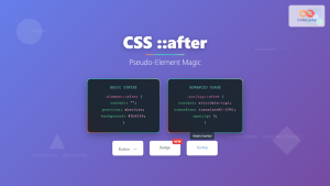
CSS ::after Pseudo-Element: Complete Guide to Adding Dynamic Content After Elements
The CSS ::after pseudo-element is one of the most powerful tools in modern web development, allowing you to insert content...
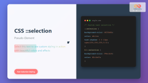
CSS ::selection Pseudo-Element: Complete Guide to Styling Selected Text
The CSS ::selection pseudo-element allows you to style the portion of text that users select with their cursor. This powerful...
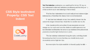
CSS Style textIndent Property: CSS Text Indent
CSS text-indent Property: Controlling Text Indentation The CSS text-indent property specifies the indentation of the first line of text in...
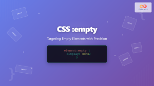
CSS :empty Pseudo-Class: Complete Guide to Targeting Empty Elements
The CSS :empty pseudo-class is a powerful selector that targets elements containing no children or text content. This pseudo-class opens...
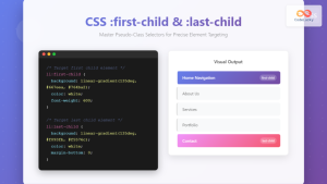
CSS :first-child and :last-child Pseudo-Classes: Complete Guide with Examples
CSS pseudo-classes are powerful tools that allow developers to select and style elements based on their position, state, or relationship...

CSS :root Pseudo-Class: Complete Guide to Targeting Document Root Element
The CSS :root pseudo-class is a fundamental selector that targets the root element of a document. In HTML documents, this...
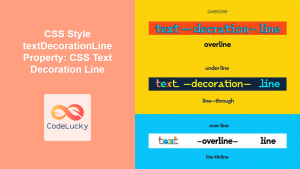
CSS Style textDecorationLine Property: CSS Text Decoration Line
CSS text-decoration-line Property: Styling Text Decorations The text-decoration-line property in CSS is used to specify the kind of text decoration...

CSS Pseudo-Classes: Master :hover, :focus, :active for Interactive Web Elements
What Are CSS Pseudo-Classes? CSS pseudo-classes are selectors that target elements based on their current state or position, rather than...

CSS General Sibling Selectors: Master Advanced Element Targeting Techniques
CSS general sibling selectors provide a powerful way to target elements that share the same parent and appear after a...


