
The CSS ::first-letter pseudo-element is a powerful tool for creating elegant typography effects, particularly the classic drop cap style where the first letter of a paragraph appears larger and more prominent than the rest of the text. This comprehensive guide explores everything you need to know about implementing and customizing first letter styling.
What is the ::first-letter Pseudo-Element?
The ::first-letter pseudo-element targets the first letter of the first line in a block-level element. It allows you to apply unique styling to just that first character, creating visually appealing typography effects commonly seen in magazines, newspapers, and elegant web designs.
Basic Syntax
selector::first-letter {
    /* CSS properties */
}
Creating Your First Drop Cap
Let’s start with a simple example to understand how ::first-letter works:
HTML:
<p class="drop-cap">Lorem ipsum dolor sit amet, consectetur adipiscing elit. Sed do eiusmod tempor incididunt ut labore et dolore magna aliqua.</p>CSS:
.drop-cap::first-letter {
    font-size: 3em;
    font-weight: bold;
    float: left;
    line-height: 1;
    margin-right: 8px;
    margin-top: 4px;
}
Result:
Lorem ipsum dolor sit amet, consectetur adipiscing elit. Sed do eiusmod tempor incididunt ut labore et dolore magna aliqua. Ut enim ad minim veniam, quis nostrud exercitation ullamco laboris.
Advanced Drop Cap Styling
Creating more sophisticated drop caps involves additional CSS properties for enhanced visual appeal:
Enhanced Drop Cap CSS:
.fancy-drop-cap::first-letter {
    font-size: 4em;
    font-weight: bold;
    font-family: 'Georgia', serif;
    color: #2c3e50;
    float: left;
    line-height: 0.8;
    margin: 0.1em 0.1em 0 0;
    padding: 0.1em;
    background: linear-gradient(135deg, #667eea 0%, #764ba2 100%);
    background-clip: text;
    -webkit-background-clip: text;
    -webkit-text-fill-color: transparent;
    text-shadow: 2px 2px 4px rgba(0,0,0,0.1);
}
Result:
This is an example of an advanced drop cap with gradient colors and sophisticated typography. The first letter stands out dramatically while maintaining readability and visual harmony with the rest of the text content.
Interactive Drop Cap Example
Here’s an interactive example that demonstrates different drop cap styles you can experiment with:
Try Different Drop Cap Styles:
Typography is the art and technique of arranging type to make written language legible, readable and appealing when displayed. The arrangement of type involves selecting typefaces, point sizes, line lengths, line-spacing, and letter-spacing, and adjusting the space between pairs of letters.
Browser Support and Compatibility
The ::first-letter pseudo-element enjoys excellent browser support across all modern browsers:
✅ Supported Browsers:
- Chrome: All versions
- Firefox: All versions
- Safari: All versions
- Edge: All versions
- Internet Explorer: 9+
Applicable CSS Properties
Not all CSS properties work with ::first-letter. Here’s what you can and cannot use:
✅ Supported Properties:
- Font properties (font-family, font-size, font-weight, etc.)
- Color and background properties
- Margin and padding
- Border properties
- Float and clear
- Line-height
- Text decorations
- Text transform
- Vertical alignment
❌ Not Supported:
- Position properties
- Display properties (except float)
- Width and height (auto-sized)
- Most layout properties
- Animation properties
- Transform properties
Common Use Cases and Examples
1. Magazine-Style Drop Caps
.magazine-style::first-letter {
    font-size: 5em;
    font-weight: bold;
    font-family: 'Times New Roman', serif;
    color: #2c3e50;
    float: left;
    line-height: 0.7;
    margin: 0.1em 0.1em 0.1em 0;
    padding: 0.1em;
}In the world of digital publishing, creating visually appealing content is essential for engaging readers. The first letter of an article often sets the tone and draws the reader’s attention immediately to the content that follows.
2. Bordered Drop Caps
.bordered-drop::first-letter {
    font-size: 3.5em;
    font-weight: bold;
    color: #007bff;
    float: left;
    line-height: 1;
    margin: 0.1em 0.1em 0 0;
    padding: 0.1em;
    border: 3px solid #007bff;
    border-radius: 8px;
}Web developers often seek creative ways to make their content stand out. Using bordered drop caps can add a professional touch to articles while maintaining readability and visual appeal.
Best Practices and Tips
💡 Pro Tips:
1. Proper Spacing
Always use appropriate margins to ensure the drop cap doesn’t overlap with surrounding text. The margin-right property is crucial for horizontal spacing.
2. Line Height Considerations
Set line-height to a value less than 1 (typically 0.7-0.9) to properly align the drop cap with the baseline of the text.
3. Font Pairing
Choose complementary fonts for your drop cap. Serif fonts often work well for drop caps even when the body text uses sans-serif.
4. Responsive Design
Consider how your drop caps will look on different screen sizes. You may need to adjust font sizes using media queries.
Responsive Drop Caps
Creating responsive drop caps ensures they look great on all devices:
/* Base styles */
.responsive-drop::first-letter {
    font-size: 4em;
    font-weight: bold;
    float: left;
    line-height: 0.8;
    margin: 0.1em 0.1em 0 0;
    color: #2c3e50;
}

/* Tablet styles */
@media (max-width: 768px) {
    .responsive-drop::first-letter {
        font-size: 3em;
        line-height: 0.9;
    }
}

/* Mobile styles */
@media (max-width: 480px) {
    .responsive-drop::first-letter {
        font-size: 2.5em;
        line-height: 1;
        margin: 0.05em 0.05em 0 0;
    }
}
Troubleshooting Common Issues
Issue 1: Drop Cap Not Appearing
Solution: Ensure the element is a block-level element. ::first-letter doesn’t work on inline elements.
Issue 2: Misaligned Drop Cap
Solution: Adjust the line-height and margin-top properties. Sometimes a small negative margin-top can help with alignment.
Issue 3: Drop Cap Overlapping Text
Solution: Increase the margin-right value to create more space between the drop cap and the following text.
Accessibility Considerations
When implementing drop caps, keep accessibility in mind:
- Ensure sufficient color contrast between the drop cap and background
- Don’t rely solely on color to convey information
- Test with screen readers to ensure content remains accessible
- Consider users with dyslexia who might find elaborate drop caps distracting
Advanced Techniques
CSS Grid Integration
For more complex layouts, you can combine drop caps with CSS Grid:
.grid-article {
    display: grid;
    grid-template-columns: auto 1fr;
    gap: 10px;
    align-items: start;
}

.grid-article::first-letter {
    font-size: 4em;
    font-weight: bold;
    color: #2c3e50;
    grid-column: 1;
    grid-row: 1 / 3;
    align-self: start;
}
Performance Considerations
Drop caps are lightweight and don’t significantly impact performance. However, consider these points:
- Avoid complex gradients or shadows on mobile devices
- Use web-safe fonts when possible to avoid additional font loading
- Consider using
font-display: swapfor custom fonts
Conclusion
The CSS ::first-letter pseudo-element is a powerful tool for creating elegant typography effects. From simple drop caps to elaborate decorative letters, this feature allows you to add visual interest to your content while maintaining accessibility and performance. By following the best practices and examples outlined in this guide, you can create stunning first letter effects that enhance your web design and improve user engagement.
Remember to test your implementations across different browsers and devices, and always prioritize readability and accessibility in your designs. With proper implementation, drop caps can significantly enhance the visual appeal of your web content while maintaining excellent user experience.
Related Posts
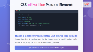
CSS ::first-line Pseudo-Element: Complete Guide to Styling First Line of Text
The CSS ::first-line pseudo-element is a powerful tool that allows developers to apply unique styling to the first line of...
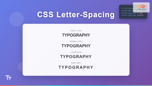
CSS Letter-Spacing: Complete Guide to Character Spacing Control
The letter-spacing property in CSS is a powerful typography tool that controls the horizontal space between characters in text. Whether...
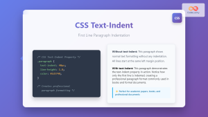
CSS Text-Indent: Complete Guide to First Line Paragraph Indentation
The CSS text-indent property is a fundamental typography tool that controls the indentation of the first line in a block...

CSS Font-Variant: Small-Caps and Typography Variations Guide
The font-variant property in CSS is a powerful typography tool that allows developers to control various aspects of font rendering,...
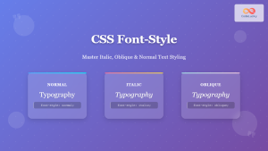
CSS Font-Style: Complete Guide to Italic, Oblique and Normal Text Styling
The CSS font-style property is a fundamental typography tool that controls how text appears on your web pages. Whether you...

CSS ::before Pseudo-Element: Master Adding Content Before Elements
The CSS ::before pseudo-element is one of the most powerful tools in a developer's arsenal for adding decorative content, icons,...
CSS ::after Pseudo-Element: Complete Guide to Adding Dynamic Content After Elements
The CSS ::after pseudo-element is one of the most powerful tools in modern web development, allowing you to insert content...
CSS Style letterSpacing Property: CSS Letter Spacing
CSS letter-spacing Property: A Comprehensive Guide The letter-spacing CSS property controls the horizontal spacing between text characters. It allows you...
CSS :first-child and :last-child Pseudo-Classes: Complete Guide with Examples
CSS pseudo-classes are powerful tools that allow developers to select and style elements based on their position, state, or relationship...
CSS Text-Transform: Complete Guide to Uppercase, Lowercase and Capitalize Text Styling
The CSS text-transform property is a powerful tool that allows developers to control the capitalization of text elements without modifying...
CSS ::selection Pseudo-Element: Complete Guide to Styling Selected Text
The CSS ::selection pseudo-element allows you to style the portion of text that users select with their cursor. This powerful...
CSS :empty Pseudo-Class: Complete Guide to Targeting Empty Elements
The CSS :empty pseudo-class is a powerful selector that targets elements containing no children or text content. This pseudo-class opens...


