While burndown charts have dominated Agile project tracking for years, burnup charts offer a superior alternative for visualizing project progress and scope changes. This comprehensive guide explores how burnup charts provide clearer insights into project health, making them an essential tool for modern Agile teams.
What is a Burnup Chart?
A burnup chart is a visual representation that tracks the cumulative amount of work completed over time, displayed alongside the total project scope. Unlike burndown charts that show remaining work decreasing, burnup charts illustrate completed work increasing toward a target scope line.
The chart features two primary lines: the work completed line that rises as tasks are finished, and the total scope line that may fluctuate as requirements change. This dual-line approach provides immediate visibility into both progress and scope evolution throughout the project lifecycle.
Burnup vs Burndown Charts: Key Differences
Understanding the distinction between these visualization methods is crucial for selecting the right approach for your team. Burndown charts display remaining work declining over time, while burnup charts show completed work accumulating upward.
The fundamental advantage of burnup charts lies in their ability to separate scope changes from progress tracking. When project requirements expand or contract, burndown charts can create misleading impressions of team velocity, whereas burnup charts maintain clear visibility of both actual progress and scope modifications.
Additionally, burnup charts provide more intuitive interpretation for stakeholders. The upward trajectory of completed work creates a positive psychological impact, while the gap between completed work and total scope immediately communicates remaining effort.
Components of a Burnup Chart
Work Completed Line
The work completed line represents the cumulative sum of finished tasks, story points, or hours over time. This line should consistently trend upward, with steeper slopes indicating higher team velocity. Flat segments suggest periods of reduced productivity or potential impediments requiring investigation.
Total Scope Line
The total scope line shows the complete project size at any given time. Unlike the static scope assumption in burndown charts, this line can move up or down as requirements evolve. Upward movements indicate scope creep, while downward adjustments reflect requirement reductions or deferrals.
Target Completion Date
The intersection point where work completed meets total scope represents the projected completion date. This dynamic target updates automatically as both progress and scope change, providing real-time delivery estimates.
Creating Effective Burnup Charts
Data Collection Requirements
Successful burnup chart implementation requires consistent data collection practices. Teams must track work completion daily, using consistent units of measurement such as story points, hours, or task counts. The chosen metric should align with your team’s estimation practices and provide meaningful progress indicators.
Scope tracking demands equal attention, documenting all requirement changes with timestamps. This includes new features, removed functionality, and modified acceptance criteria. Maintaining accurate scope records ensures your burnup chart reflects true project evolution.
Chart Setup and Configuration
Begin by establishing your time axis, typically using sprint boundaries or calendar dates depending on your team’s cadence. The vertical axis should accommodate both current scope and potential growth, allowing room for requirement changes without cramping the visualization.
Configure update frequencies to match your team’s rhythm. Daily updates provide the most accurate trending, while weekly updates may suffice for longer projects with stable requirements. Consistency in update timing ensures reliable velocity calculations and trend analysis.
Interpreting Burnup Chart Patterns
Healthy Progress Indicators
Ideal burnup charts display steady upward progress in the work completed line, with the slope indicating sustainable team velocity. The total scope line should remain relatively stable, with minor fluctuations representing normal requirement refinement.
A converging gap between completed work and total scope suggests on-track delivery. When the work completed line maintains a consistent angle toward the scope line, teams can confidently predict completion dates and communicate realistic expectations to stakeholders.
Warning Signs and Red Flags
Several patterns indicate potential project risks requiring immediate attention. A flattening work completed line suggests velocity issues, potentially caused by technical debt, team capacity changes, or external dependencies blocking progress.
Rapidly rising scope lines indicate uncontrolled requirement growth. While some scope evolution is normal, dramatic increases suggest insufficient requirement management or stakeholder alignment issues requiring intervention.
Diverging lines, where the gap between completed work and total scope increases over time, signal delivery date risks. This pattern demands immediate analysis to identify root causes and implement corrective actions.
Advanced Burnup Chart Techniques
Multi-Track Visualization
Complex projects benefit from multi-track burnup charts that separate different work streams or priority levels. This approach provides granular visibility into component progress while maintaining overall project perspective.
Consider tracking critical path items separately from general backlog work, or distinguishing between development tasks and testing activities. Multi-track charts help identify bottlenecks and resource allocation opportunities across different project dimensions.
Predictive Modeling
Advanced burnup charts incorporate trend lines and predictive modeling to forecast completion dates. By analyzing historical velocity patterns, teams can project future progress and identify potential delivery risks early.
Monte Carlo simulations can enhance prediction accuracy by accounting for velocity variability. These statistical approaches provide confidence intervals around delivery estimates, supporting more informed decision-making and stakeholder communication.
Tools and Implementation
Popular Burnup Chart Tools
Modern project management platforms offer built-in burnup chart capabilities. Jira provides comprehensive burnup reporting through its advanced roadmaps feature, while Azure DevOps includes burnup widgets for dashboard customization.
Specialized tools like Burndown for Trello add burnup functionality to simpler platforms, while TargetProcess offers sophisticated multi-level burnup visualizations for enterprise environments.
For teams preferring custom solutions, spreadsheet templates provide flexible burnup chart creation with full control over data presentation and analysis features.
Integration with Existing Workflows
Successful burnup chart adoption requires seamless integration with existing Agile ceremonies and processes. Incorporate chart reviews into daily standups, focusing on trend analysis rather than detailed data examination.
Sprint retrospectives should include burnup chart pattern analysis, identifying velocity factors and scope management opportunities. This practice transforms charts from simple reporting tools into improvement catalysts for team performance.
Best Practices for Burnup Chart Success
Team Training and Adoption
Effective burnup chart implementation begins with comprehensive team training. Ensure all team members understand chart interpretation, focusing on pattern recognition rather than mathematical analysis. Provide clear guidelines for data collection and update responsibilities.
Address resistance to change by demonstrating burnup chart advantages through pilot projects or parallel tracking with existing methods. Allow teams to experience the benefits firsthand rather than mandating immediate adoption.
Stakeholder Communication
Burnup charts excel as stakeholder communication tools when properly contextualized. Prepare standard explanations for chart components and common patterns, enabling confident presentation to non-technical audiences.
Focus stakeholder discussions on trends and implications rather than raw data points. Use the visual separation of progress and scope to facilitate productive conversations about requirement priorities and delivery trade-offs.
Common Pitfalls and Solutions
Data Quality Issues
Inconsistent data collection undermines burnup chart effectiveness. Establish clear definitions for “completed work” and ensure consistent application across team members. Regular data audits help identify and correct collection inconsistencies before they impact trend analysis.
Implement automated data collection where possible, reducing manual entry errors and ensuring timely updates. Integration with development tools and task management systems provides more reliable data sources than manual tracking.
Over-Analysis and Micromanagement
While burnup charts provide detailed progress visibility, avoid the temptation to micromanage based on daily fluctuations. Focus on weekly or sprint-level trends rather than individual data points, recognizing that normal project execution includes natural variation.
Train managers and stakeholders to interpret patterns rather than isolated measurements, emphasizing long-term trends over short-term volatility. This approach maintains team autonomy while providing necessary project visibility.
Measuring Burnup Chart Effectiveness
Evaluate your burnup chart implementation through multiple success metrics. Prediction accuracy measures how closely actual completion dates match chart projections, indicating the reliability of your tracking approach.
Monitor stakeholder satisfaction with project visibility and communication quality. Improved stakeholder confidence and reduced status meeting frequency often indicate successful burnup chart adoption.
Track scope management improvements by measuring the frequency and magnitude of requirement changes. Effective burnup charts often correlate with better scope discipline and more thoughtful requirement evolution.
Integration with Agile Frameworks
Scrum Implementation
Burnup charts integrate naturally with Scrum practices, providing sprint-level progress tracking and release planning support. Use charts to visualize sprint goal achievement and identify impediments affecting team velocity.
During sprint planning, reference historical burnup data to inform capacity planning and commitment decisions. The visual representation of past performance provides concrete evidence for realistic sprint goal setting.
Kanban and Continuous Flow
In Kanban environments, burnup charts track cumulative flow efficiency and highlight process bottlenecks. The continuous nature of Kanban work aligns well with the progressive visualization that burnup charts provide.
Monitor work-in-progress limits effectiveness through burnup chart slope analysis. Consistent progress slopes indicate well-balanced WIP limits, while irregular patterns suggest optimization opportunities.
Future Trends and Evolution
Burnup chart evolution continues with enhanced automation and artificial intelligence integration. Machine learning algorithms increasingly support predictive accuracy, analyzing historical patterns to improve completion date forecasting.
Real-time integration with development tools provides more granular progress tracking, while advanced visualization techniques offer multi-dimensional project insights. These innovations maintain burnup charts’ relevance in evolving Agile environments.
The growing emphasis on value delivery over task completion drives burnup chart adaptation toward outcome-based metrics. Future implementations will likely incorporate customer value measures alongside traditional progress indicators.
Conclusion
Burnup charts represent a powerful evolution in Agile progress visualization, offering superior scope management and stakeholder communication compared to traditional burndown approaches. Their ability to separate progress tracking from requirement evolution provides crucial project insights for modern development teams.
Successful implementation requires thoughtful tool selection, consistent data collection, and team training focused on pattern interpretation rather than mathematical analysis. When properly deployed, burnup charts transform project tracking from reactive reporting to proactive management, enabling better decisions and improved delivery outcomes.
As Agile practices continue evolving toward value-driven delivery, burnup charts provide the foundation for enhanced project visibility and stakeholder alignment. Teams investing in burnup chart mastery position themselves for sustained project success in increasingly complex development environments.
Related Posts
Burndown Chart: Master Sprint Progress Tracking in Agile Development
Burndown charts are one of the most powerful visual tools in Agile project management, providing teams with real-time insights into...
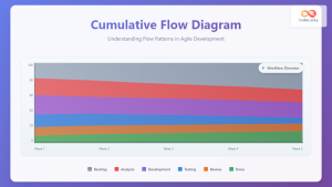
Cumulative Flow Diagram: Master Visual Flow Analysis for Agile Teams
A Cumulative Flow Diagram (CFD) serves as one of the most powerful visual tools in Agile project management, providing teams...
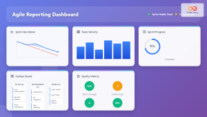
Agile Reporting: Complete Guide to Real-Time Dashboards and Performance Insights
Agile reporting transforms raw project data into actionable insights that drive successful software delivery. Unlike traditional waterfall reporting that focuses...
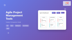
Agile Project Management Tools: Complete Feature Comparison Guide 2025
Selecting the right Agile project management tool can make or break your team's productivity and project success. With dozens of...
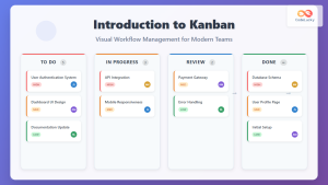
Introduction to Kanban: Visual Workflow Management for Modern Teams
In today's fast-paced business environment, teams need efficient methods to manage work, visualize progress, and optimize productivity. Kanban, a visual...
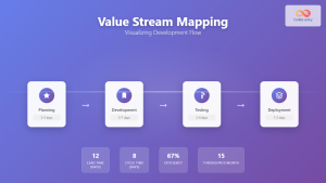
Value Stream Mapping: Complete Guide to Visualizing Development Flow for Agile Teams
What is Value Stream Mapping in Software Development? Value Stream Mapping (VSM) is a lean management technique that visualizes the...
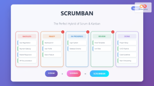
Scrumban: The Ultimate Hybrid Methodology for Agile Teams
What is Scrumban? Scrumban is a hybrid agile methodology that combines the structured framework of Scrum with the visual workflow...
Miro for Agile: Complete Guide to Visual Collaboration and Team Productivity
Visual collaboration has become the cornerstone of successful Agile teams, especially in today's distributed work environment. Miro stands out as...
Agile Metrics: Complete Guide to Measuring Team Performance and Productivity
Measuring team performance in agile environments requires a strategic approach that goes beyond traditional project management metrics. Agile metrics provide...
Kanban Board: Complete Setup and Management Guide for Agile Teams
Kanban boards have revolutionized how teams visualize work, manage workflows, and deliver value consistently. Originally developed by Toyota for manufacturing,...
Sprint Retrospective: Master Continuous Improvement with Proven Agile Techniques
Sprint retrospectives are the cornerstone of continuous improvement in Agile development, yet many teams struggle to extract meaningful insights from...
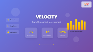
Velocity: Team Throughput Measurement in Agile Development
Velocity stands as one of the most critical metrics in Agile development, serving as the heartbeat of team performance measurement....