Font sizing is one of the most fundamental aspects of web typography that directly impacts user experience and accessibility. Understanding how to properly implement CSS font-size property using different unit types is crucial for creating responsive, accessible, and visually appealing websites.
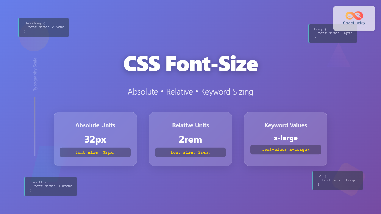
In this comprehensive guide, we’ll explore all three categories of CSS font sizing: absolute units, relative units, and keyword values. You’ll learn when to use each approach, their advantages and limitations, and see practical examples that demonstrate their real-world applications.
Understanding CSS Font-Size Property
The CSS font-size property controls the size of text within an element. It accepts various unit types and keywords, each serving different purposes in responsive web design. The property can be applied to any HTML element that contains text content.
Syntax:
font-size: <absolute-size> | <relative-size> | <length> | <percentage> | inherit | initial | unset;
Absolute Font Size Units
Absolute units provide fixed sizing that remains consistent regardless of parent element sizes or user preferences. These units are ideal when you need precise control over text dimensions.
Pixels (px) – The Most Common Absolute Unit
Pixels are the most widely used absolute unit for font sizing. One pixel represents one dot on the screen, providing precise control over text size across different devices.
Example: Pixel-based Font Sizing
.small-text { font-size: 12px; }
.body-text { font-size: 16px; }
.heading-text { font-size: 24px; }
.large-heading { font-size: 32px; }
Points (pt) and Print Media
Points are traditionally used in print media, where 1pt equals 1/72 of an inch. While less common in web design, points are useful when creating print stylesheets.
Best Practice: Use pixels for screen media and points for print stylesheets to ensure optimal rendering across different output devices.
Other Absolute Units
- Inches (in): Physical measurement, rarely used in web design
- Centimeters (cm): Metric measurement, primarily for print
- Millimeters (mm): Smaller metric unit for precise print control
- Picas (pc): Typography unit equal to 12 points
Relative Font Size Units
Relative units scale based on other elements or properties, making them essential for responsive design and accessibility. They adapt to user preferences and different screen sizes automatically.
Em Units – Relative to Parent Element
The em unit is relative to the font size of the parent element. If the parent has a font size of 16px, then 1em equals 16px, 2em equals 32px, and so on.
Interactive Em Example
Parent element (20px)
.parent {
  font-size: 20px;
}

.child-small { font-size: 0.8em; }  /* 16px */
.child-normal { font-size: 1em; }   /* 20px */
.child-large { font-size: 1.5em; }  /* 30px */
Rem Units – Relative to Root Element
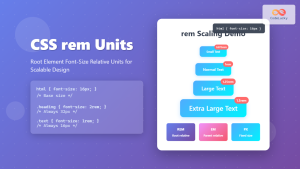
The rem (root em) unit is relative to the root element’s font size, typically the <html> element. This provides more predictable sizing compared to em units.
Rem vs Em Comparison
Parent element (18px)
Using Em (relative to parent):
Using Rem (relative to root):
Percentage (%) – Proportional Sizing
Percentage values are relative to the parent element’s font size, similar to em units. 100% equals the parent’s font size, 150% equals 1.5 times the parent’s size.
Percentage Sizing Example
Base font size: 16px
Viewport Units – Responsive to Screen Size
Viewport units scale with the browser window size, making them perfect for responsive typography that adapts to different screen dimensions.
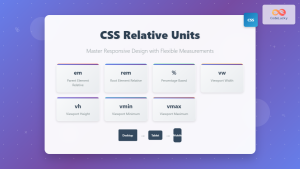
- vw (viewport width): 1vw = 1% of viewport width
- vh (viewport height): 1vh = 1% of viewport height
- vmin: 1vmin = 1% of viewport’s smaller dimension
- vmax: 1vmax = 1% of viewport’s larger dimension
Viewport Units in Action
Try resizing your browser window to see the effect!
Keyword Font Size Values
CSS provides predefined keyword values for font sizing, offering semantic meaning and consistent scaling across different browsers and devices.
Absolute Size Keywords
These keywords provide fixed sizes that correspond to specific pixel values, though the exact size may vary between browsers.
Absolute Size Keywords
Relative Size Keywords
These keywords adjust the font size relative to the parent element’s font size, providing semantic scaling options.
Relative Size Keywords
Parent font size: 18px
Best Practices for Font Sizing
Accessibility Considerations
When choosing font sizes, accessibility should be a primary concern. Users with visual impairments may need to zoom in or adjust font sizes, and your design should accommodate these needs.
Accessibility Guidelines:
- Minimum body text size should be 16px
- Use relative units (rem, em) for better scalability
- Ensure sufficient contrast between text and background
- Test with browser zoom up to 200%
- Avoid very small fonts for important information
Responsive Typography Strategy
Modern web design requires fonts that adapt to different screen sizes and devices. Here’s a comprehensive approach to responsive font sizing:
Responsive Font Size Example
/* Base font size */
html {
  font-size: 16px;
}

/* Responsive body text */
body {
  font-size: 1rem;
  line-height: 1.6;
}

/* Responsive headings */
h1 {
  font-size: clamp(1.8rem, 4vw, 3rem);
}

h2 {
  font-size: clamp(1.5rem, 3vw, 2.5rem);
}

/* Media queries for fine-tuning */
@media (max-width: 768px) {
  html { font-size: 14px; }
}

@media (min-width: 1200px) {
  html { font-size: 18px; }
}
Performance Considerations
Font sizing choices can impact page performance and user experience. Here are key considerations:
- Browser rendering: Relative units may require additional calculations
- Layout shifts: Inconsistent font sizing can cause layout instability
- Caching: Absolute units provide more predictable caching behavior
Advanced Font Sizing Techniques
CSS Clamp() Function
The clamp() function allows you to set a font size that scales between minimum and maximum values, providing ultimate control over responsive typography.
Clamp Function Example
This text scales between 1rem and 2rem based on 3% of viewport width
CSS Custom Properties for Font Scaling
Using CSS custom properties (variables) creates maintainable and consistent font sizing systems across your entire website.
:root {
  --font-scale: 1.25;
  --font-size-sm: calc(1rem / var(--font-scale));
  --font-size-base: 1rem;
  --font-size-lg: calc(1rem * var(--font-scale));
  --font-size-xl: calc(1rem * var(--font-scale) * var(--font-scale));
}

.text-sm { font-size: var(--font-size-sm); }
.text-base { font-size: var(--font-size-base); }
.text-lg { font-size: var(--font-size-lg); }
.text-xl { font-size: var(--font-size-xl); }
Common Font Sizing Mistakes to Avoid
Mistakes to Avoid:
- Using only pixels: Makes text unresponsive to user preferences
- Inconsistent unit mixing: Creates unpredictable scaling behavior
- Too small body text: Hurts readability and accessibility
- Ignoring line height: Font size and line height work together
- Over-relying on viewport units: Can create extremely small or large text
Conclusion
Mastering CSS font sizing requires understanding when to use absolute, relative, and keyword values. Absolute units like pixels provide precise control, relative units like rem and em enable responsive scaling, and keywords offer semantic meaning. The key to effective typography lies in combining these approaches strategically.
For modern web development, start with rem units for most text, use pixels for fine details like borders, and leverage viewport units for dramatic responsive effects. Always prioritize accessibility by maintaining readable font sizes and testing across different devices and zoom levels.
Remember that font sizing is just one aspect of typography. Consider line height, letter spacing, and font weight as complementary properties that work together to create exceptional user experiences. With these techniques and best practices, you’ll be able to create beautiful, accessible, and responsive typography that enhances your web projects.

