
Understanding how to control element dimensions is fundamental to creating well-structured web layouts. CSS width and height properties give you precise control over how much space your elements occupy, directly impacting your design’s visual hierarchy and user experience.
In this comprehensive guide, we’ll explore every aspect of CSS width and height properties, from basic syntax to advanced responsive techniques that will elevate your web development skills.
Understanding CSS Width and Height Properties
The CSS width and height properties define the content area dimensions of an element. These properties accept various unit types and values, giving you flexibility in creating responsive and fixed layouts.
Basic Syntax
element {
  width: value;
  height: value;
}
Both properties can accept absolute units (pixels, points), relative units (percentages, em, rem), or keyword values like auto, max-content, and min-content.
CSS Unit Types for Width and Height
Choosing the right unit type is crucial for creating flexible, maintainable layouts. Let’s examine the most commonly used units:
Absolute Units
- Pixels (px): Fixed size units perfect for precise control
- Points (pt): Primarily used for print stylesheets
- Inches (in), Centimeters (cm): Physical measurement units
Relative Units
- Percentages (%): Relative to parent element’s dimensions
- em: Relative to element’s font size
- rem: Relative to root element’s font size
- vw/vh: Viewport width/height units
- vmin/vmax: Smaller/larger of viewport dimensions
Interactive Unit Comparison
Working with Keyword Values
CSS provides several keyword values that offer intelligent sizing behavior:
Auto Value
The auto keyword allows the browser to calculate dimensions automatically based on content and available space.
.auto-width {
  width: auto; /* Default for block elements */
  height: auto; /* Default for all elements */
}
Content-Based Keywords
- max-content: Intrinsic maximum width
- min-content: Intrinsic minimum width
- fit-content: Uses available space, but never exceeds max-content
Content-Based Sizing Demo
Box Model and Dimensions
Understanding the CSS box model is essential when working with width and height properties. By default, these properties only affect the content area, not including padding, borders, or margins.
Default Box Sizing
.default-box {
  width: 200px;
  height: 100px;
  padding: 20px;
  border: 5px solid #333;
  /* Total width: 200px + 40px + 10px = 250px */
  /* Total height: 100px + 40px + 10px = 150px */
}
Border-Box Sizing
The box-sizing: border-box property includes padding and borders within the specified width and height:
.border-box {
  box-sizing: border-box;
  width: 200px;
  height: 100px;
  padding: 20px;
  border: 5px solid #333;
  /* Total width: 200px (includes padding and border) */
  /* Total height: 100px (includes padding and border) */
}
Box Model Comparison
Default (content-box)
Border-box
Min-Width, Max-Width, Min-Height, and Max-Height
These properties provide flexible constraints for responsive design, allowing elements to adapt while maintaining design integrity.
Practical Applications
.flexible-container {
  width: 100%;
  min-width: 300px;
  max-width: 800px;
  height: auto;
  min-height: 200px;
  max-height: 600px;
}
Responsive Container Demo
Try resizing me!
This container respects min/max constraints while allowing flexibility.
Viewport Units for Responsive Design
Viewport units create truly responsive designs that adapt to screen size changes:
- vw: 1% of viewport width
- vh: 1% of viewport height
- vmin: 1% of smaller viewport dimension
- vmax: 1% of larger viewport dimension
.hero-section {
  width: 100vw;
  height: 100vh;
  /* Full viewport coverage */
}

.responsive-square {
  width: 50vmin;
  height: 50vmin;
  /* Always maintains square aspect ratio */
}
Viewport Units Visualization
Aspect Ratio Control
Modern CSS provides the aspect-ratio property for maintaining proportional dimensions:
.video-container {
  width: 100%;
  aspect-ratio: 16/9;
  /* Maintains 16:9 ratio regardless of width */
}

.profile-image {
  width: 200px;
  aspect-ratio: 1;
  /* Creates a perfect square */
}
Aspect Ratio Examples
Interactive Dimension Controller
Dynamic Sizing Demo
250px
100px
Common Pitfalls and Best Practices
Avoiding Layout Issues
Here are essential practices for reliable dimension control:
- Use border-box sizing for predictable layouts
- Avoid fixed heights when content length varies
- Test responsive behavior across different screen sizes
- Consider accessibility when setting minimum dimensions
Performance Considerations
/* Efficient CSS Reset */
*, *::before, *::after {
  box-sizing: border-box;
}

/* Responsive container queries */
.container {
  width: min(90%, 1200px);
  margin: 0 auto;
}
Advanced Techniques
Intrinsic Web Design
Combine different sizing methods for truly flexible layouts:
.flexible-grid {
  display: grid;
  grid-template-columns: repeat(auto-fit, minmax(250px, 1fr));
  gap: 1rem;
  width: 100%;
  max-width: 1200px;
}
Container Queries (Modern Approach)
.card {
  container-type: inline-size;
  width: 100%;
  max-width: 400px;
}

@container (min-width: 300px) {
  .card-content {
    padding: 2rem;
  }
}
💡 Pro Tip
Always test your width and height implementations across different devices and screen orientations. Use browser developer tools to simulate various viewport sizes and ensure your designs remain functional and visually appealing.
Conclusion
Mastering CSS width and height properties is fundamental to creating professional, responsive web layouts. By understanding the various unit types, box model behavior, and modern sizing techniques, you can build flexible designs that work seamlessly across all devices and screen sizes.
Remember to combine these techniques thoughtfully, always considering user experience and accessibility. The key to success lies in choosing the right approach for each specific use case and testing thoroughly across different contexts.
Practice these concepts in your projects, experiment with different combinations, and gradually incorporate more advanced techniques as you build confidence with the fundamentals.
Related Posts

CSS Width Property: Mastering Element Width in CSS
CSS Width Property: Mastering Element Width The width property in CSS defines the width of an element's content area. It's...
CSS Style height Property: CSS Height
Understanding the CSS height Property: A Comprehensive Guide The height property in CSS specifies the height of an element's content...

CSS Max-Height and Min-Height: Complete Guide to Constraining Element Height
Understanding how to control element height is crucial for creating responsive and visually appealing web layouts. CSS provides powerful properties...

CSS Style maxWidth Property: CSS Max Width
Understanding the CSS maxWidth Property The CSS maxWidth property is a fundamental tool in web development for controlling the maximum...

CSS Percentage Units: Complete Guide to Parent-Relative Sizing
CSS percentage units are fundamental building blocks for creating responsive, flexible layouts that adapt to different screen sizes and container...
CSS Max-Width and Min-Width: Complete Guide to Responsive Width Constraints
When building responsive websites, controlling element widths is crucial for creating layouts that work across all devices. CSS provides two...
CSS Style maxHeight Property: CSS Max Height
Understanding the CSS max-height Property The CSS max-height property is a fundamental tool for controlling the maximum height of an...

HTML Element clientWidth Property: Element Width
HTML Element clientWidth Property: Understanding Element Width The clientWidth property is a read-only property of an HTML element that returns...

CSS Units: Complete Guide to Relative Units – em, rem, %, vw, vh, vmin, vmax
CSS relative units are the foundation of responsive web design, enabling websites to adapt seamlessly across different devices and screen...
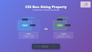
CSS Box-Sizing Property: Master Content-Box vs Border-Box for Perfect Layouts
The CSS box-sizing property is one of the most crucial yet often misunderstood concepts in web development. It determines how...
CSS Resize Property: Controlling Element Resizability
Understanding the CSS Resize Property: Controlling Element Resizability The resize property in CSS allows you to control whether (and how)...

CSS Style fontSize Property: CSS Font Size
CSS fontSize Property: Controlling Text Size The fontSize property in CSS specifies the size of the font. This property is...


