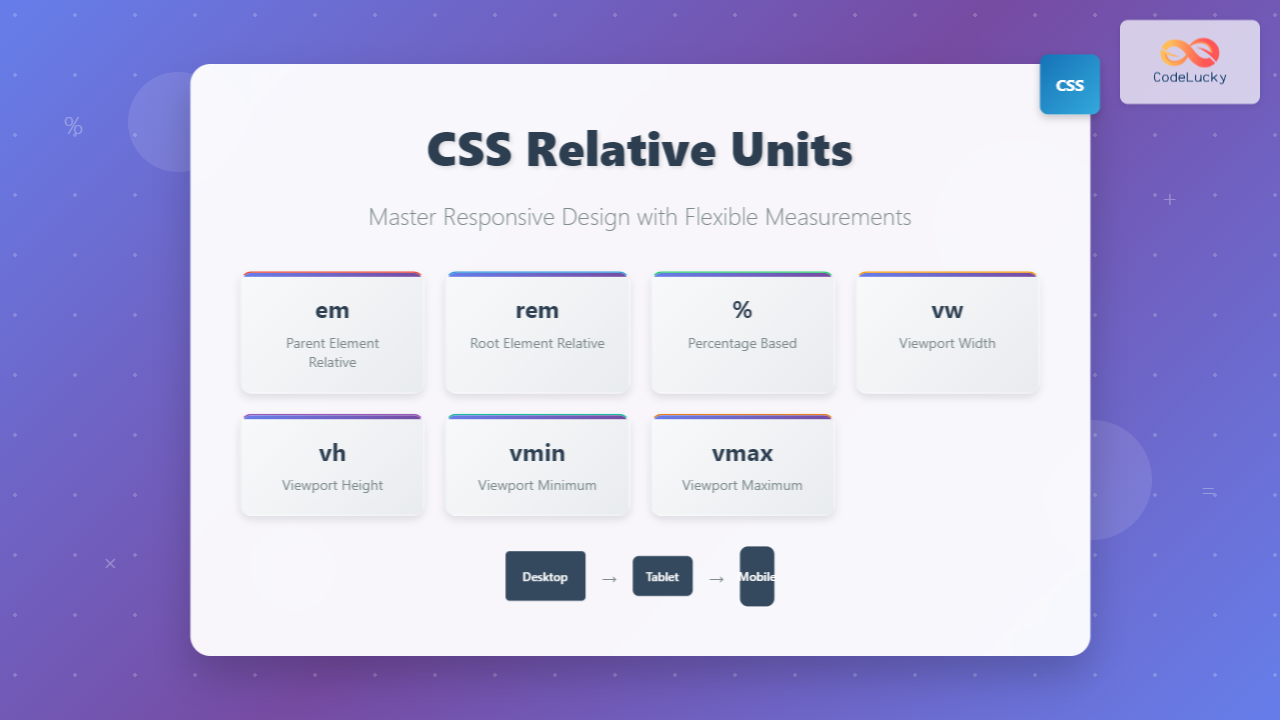
CSS relative units are the foundation of responsive web design, enabling websites to adapt seamlessly across different devices and screen sizes. Unlike absolute units that remain fixed regardless of context, relative units scale proportionally based on their parent elements or viewport dimensions.
Understanding when and how to use each relative unit is crucial for creating flexible, maintainable, and accessible web interfaces. This comprehensive guide explores all major relative units with practical examples and interactive demonstrations.
Understanding Relative vs Absolute Units
Before diving into specific relative units, it’s important to understand the fundamental difference between relative and absolute units:
- Absolute units (px, pt, cm, mm, in) maintain fixed sizes regardless of context
- Relative units scale proportionally based on parent elements, root element, or viewport dimensions
Visual Comparison Demo
Absolute Units (px)
Relative Units (em)
The em Unit: Element-Based Scaling
The em unit is relative to the font-size of its parent element. One em equals the computed font-size of the parent element, making it ideal for creating scalable typography and spacing.
How em Works
When you set an element’s font-size to 1.5em, it becomes 1.5 times the parent’s font-size. This creates a cascading effect where nested elements can compound their sizing.
Interactive em Demo
Parent (16px base)
Child (1.5em = 24px)
Grandchild (1.2em = 28.8px)
0.8em text (23.04px)
Best Practices for em Units
- Typography scaling: Use em for font-sizes when you want text to scale with parent elements
- Component spacing: Apply em for padding and margins within components
- Button sizing: Create buttons that scale with their text content
- Avoid deep nesting: Be cautious with nested em units as they compound
Practical Example: Scalable Button
Both buttons use identical em values, but scale with their parent’s font-size
The rem Unit: Root-Based Consistency
The rem (root em) unit is relative to the root element’s font-size (typically the <html> element). This provides consistent scaling throughout your document without the compounding effects of nested em units.
rem vs em Comparison
Side-by-Side Comparison
em Units (Cascading)
Parent: 18px
1.5em = 27px
1.5em = 40.5px
rem Units (Consistent)
Parent: 18px
1.5rem = 24px
1.5rem = 24px
When to Use rem Units
- Global typography: Consistent heading sizes across your site
- Layout spacing: Margins and padding that scale with user preferences
- Component dimensions: Consistent sizing regardless of nesting level
- Media queries: Responsive breakpoints that respect user font preferences
Percentage Units: Flexible Proportions
Percentage units are relative to the parent element’s corresponding property. For width and height, percentages refer to the parent’s dimensions, while for font-size, they relate to the parent’s font-size.
Interactive Percentage Demo
Responsive Layout with Percentages
Resize your browser to see how percentage units maintain proportional relationships
Percentage Unit Applications
- Fluid layouts: Create responsive grid systems and flexible containers
- Image scaling: Make images responsive within their containers
- Typography: Scale font-sizes relative to parent elements
- Positioning: Create proportional positioning with top, left, etc.
Viewport Units: Screen-Relative Sizing
Viewport units are relative to the browser’s viewport dimensions, making them perfect for creating full-screen layouts and responsive designs that adapt to different screen sizes.
The Four Viewport Units
vw (Viewport Width)
1vw = 1% of viewport width
vh (Viewport Height)
1vh = 1% of viewport height
vmin (Viewport Minimum)
1vmin = 1% of smaller dimension
vmax (Viewport Maximum)
1vmax = 1% of larger dimension
Practical Viewport Unit Examples
Hero Section with Viewport Units
Responsive Hero Title
Subtitle that scales with viewport
This hero section uses vh for height and vw for font-sizes, creating a fully responsive design
Combining Relative Units: Advanced Techniques
The real power of relative units emerges when you combine them strategically. Modern CSS techniques like clamp(), min(), and max() functions work beautifully with relative units to create sophisticated responsive designs.
Fluid Typography with clamp()
This heading uses clamp(1.5rem, 4vw, 3rem)
This paragraph uses clamp(1rem, 2.5vw, 1.25rem) for responsive text that never gets too small or too large.
clamp(minimum, preferred, maximum)
Responsive Grid with Mixed Units
Card 1
Grid uses rem for gaps, mixed units for responsive columns
Card 2
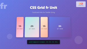
Minimum width in pixels, flexible growth with fr units
Card 3
Perfect balance of flexibility and constraints
Accessibility Considerations
When working with relative units, it’s crucial to consider accessibility implications, particularly for users who adjust their browser’s default font size or use assistive technologies.
Best Practices for Accessibility
- Respect user preferences: Use rem units for font-sizes to honor user’s browser font settings
- Maintain readable text: Set minimum font sizes using clamp() or min() functions
- Preserve spacing ratios: Use relative units for margins and padding to maintain proportions
- Test with zoom: Ensure your design works at 200% browser zoom
Accessibility Demo
This paragraph uses max(1rem, 16px) to ensure text never falls below 16px, maintaining readability while respecting user font preferences.
Performance and Browser Support
All relative units covered in this guide have excellent browser support across modern browsers. Viewport units have complete support in all browsers released after 2013, while em, rem, and percentage units have been supported since the early days of CSS.
Performance Tips
- Avoid excessive calculations: Complex nested em units can impact rendering performance
- Use CSS custom properties: Store commonly used relative values in CSS variables
- Optimize font loading: When using rem units, ensure web fonts load quickly to prevent layout shifts
- Test on real devices: Viewport units can behave differently on mobile devices with dynamic viewports
Common Pitfalls and Solutions
Pitfall: Compounding em Units
Problem: Nested em units multiply, creating unexpectedly large or small elements.
Solution: Use rem units for consistent sizing, or carefully manage em inheritance.
Pitfall: Viewport Units on Mobile
Problem: Mobile browsers with dynamic viewports (address bars) can cause layout jumps.
Solution: Use the new viewport units (svh, lvh, dvh) when supported, or combine vh with min-height.
Pitfall: Percentage Height Issues
Problem: Percentage heights don’t work when parent height isn’t explicitly set.
Solution: Ensure parent elements have defined heights, or use viewport units instead.
Real-World Implementation Examples
Complete Responsive Card Component
Conclusion
Mastering CSS relative units is essential for creating modern, responsive web designs. Each unit serves specific purposes:
- em: Perfect for component-level scaling and contextual sizing
- rem: Ideal for consistent global sizing and accessibility
- %: Essential for fluid layouts and proportional relationships
- vw/vh: Powerful for full-screen designs and responsive typography
- vmin/vmax: Excellent for maintaining aspect ratios and orientation-independent sizing
By combining these units strategically with modern CSS functions like clamp(), min(), and max(), you can create sophisticated, accessible, and performant responsive designs that work beautifully across all devices and user preferences.
Remember to always test your implementations across different devices, screen sizes, and accessibility settings to ensure your relative unit choices create the best possible user experience.

