
The word-spacing property in CSS is a powerful tool for controlling the spacing between words in your text content. This property allows you to increase or decrease the space between words, giving you precise control over typography and text readability.
What is CSS Word-Spacing?
The word-spacing property defines the amount of space between words in a line of text. It works by adding or subtracting space from the default word spacing that browsers apply to text elements.
Basic Syntax
word-spacing: normal | length | initial | inherit;Word-Spacing Values and Examples
1. Normal Value
The normal value is the default browser spacing between words.
.normal-spacing {
    word-spacing: normal;
}
This text uses normal word spacing between all words in the sentence.
2. Length Values (px, em, rem)
You can specify exact spacing using length units like pixels, em, or rem.
.spacing-pixels {
    word-spacing: 10px;
}

.spacing-em {
    word-spacing: 0.5em;
}

.spacing-rem {
    word-spacing: 1rem;
}
10px spacing: This text has 10 pixels of extra space between words.
0.5em spacing: This text has half em unit spacing between words.
1rem spacing: This text has one rem unit spacing between words.
3. Negative Values
Negative values reduce the space between words, making text more compact.
.negative-spacing {
    word-spacing: -2px;
}
This text has reduced word spacing making words appear closer together.
Interactive Word-Spacing Demo
Try Different Word-Spacing Values
Relative Units vs Absolute Units
Using Em Units
Em units are relative to the font size of the element, making them responsive to font size changes.
.small-text {
    font-size: 14px;
    word-spacing: 0.3em;
}

.large-text {
    font-size: 24px;
    word-spacing: 0.3em;
}
Small text with 0.3em word spacing – notice how spacing scales with font size.
Large text with 0.3em word spacing – spacing scales proportionally.
Practical Use Cases
1. Improving Readability in Headlines
Large headlines often benefit from increased word spacing for better visual impact.
.headline {
    font-size: 2.5rem;
    font-weight: bold;
    word-spacing: 0.2em;
    text-align: center;
}
Modern Web Design
2. Justified Text Optimization
Word spacing can help improve the appearance of justified text by controlling spacing distribution.
.justified-text {
    text-align: justify;
    word-spacing: 0.1em;
    line-height: 1.6;
}
Lorem ipsum dolor sit amet, consectetur adipiscing elit. Sed do eiusmod tempor incididunt ut labore et dolore magna aliqua. Ut enim ad minim veniam, quis nostrud exercitation ullamco laboris nisi ut aliquip ex ea commodo consequat. Duis aute irure dolor in reprehenderit in voluptate velit esse cillum dolore eu fugiat nulla pariatur.
3. Branding and Stylistic Effects
Unique word spacing can create distinctive typography for branding purposes.
.brand-text {
    font-family: 'Arial', sans-serif;
    font-weight: 300;
    word-spacing: 0.4em;
    letter-spacing: 0.1em;
    text-transform: uppercase;
}
Premium Brand Identity
Browser Support and Compatibility
The word-spacing property has excellent browser support across all modern browsers:
✅ Supported Browsers:
- Chrome: All versions
- Firefox: All versions
- Safari: All versions
- Edge: All versions
- Internet Explorer: 6+
Best Practices and Tips
1. Use Relative Units for Responsive Design
Prefer em or rem units over pixels for better scalability across different screen sizes and font sizes.
2. Test Across Different Font Families
Different fonts may require different word spacing adjustments for optimal readability.
/* Different fonts may need different spacing */
.serif-text {
    font-family: 'Times New Roman', serif;
    word-spacing: 0.1em;
}

.sans-serif-text {
    font-family: 'Arial', sans-serif;
    word-spacing: 0.15em;
}
3. Don’t Overdo It
Excessive word spacing can harm readability. Keep adjustments subtle and test with real content.
Advanced Techniques
Combining with Other Text Properties
Word spacing works well in combination with other typography properties:
.advanced-typography {
    font-family: 'Georgia', serif;
    font-size: 18px;
    line-height: 1.7;
    word-spacing: 0.2em;
    letter-spacing: 0.02em;
    text-align: justify;
}
This paragraph demonstrates advanced typography combining word spacing with letter spacing, line height, and text alignment for optimal readability and visual appeal in longer text content.
Media Query Adjustments
Adjust word spacing for different screen sizes:
.responsive-text {
    word-spacing: 0.1em;
}

@media (max-width: 768px) {
    .responsive-text {
        word-spacing: 0.05em;
    }
}

@media (max-width: 480px) {
    .responsive-text {
        word-spacing: normal;
    }
}
Common Mistakes to Avoid
❌ Don’t Do This:
- Using extremely large positive values (> 1em)
- Using large negative values that make words overlap
- Applying word spacing to every element unnecessarily
- Forgetting to test with actual content
✅ Do This Instead:
- Use subtle adjustments (0.1em to 0.3em typically)
- Test with real content and different browsers
- Consider the overall design and readability
- Use relative units for better scalability
Conclusion
The CSS word-spacing property is a valuable tool for fine-tuning typography and improving text readability. By understanding its values, use cases, and best practices, you can create more polished and professional-looking web content.
Remember to use word spacing judiciously – subtle adjustments often yield the best results. Test your implementations across different browsers and devices to ensure consistent appearance and optimal readability for your users.
Related Posts
CSS Style wordSpacing Property: CSS Word Spacing
Understanding CSS word-spacing Property The word-spacing property in CSS is used to specify the amount of space between words. This...
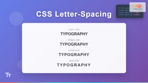
CSS Letter-Spacing: Complete Guide to Character Spacing Control
The letter-spacing property in CSS is a powerful typography tool that controls the horizontal space between characters in text. Whether...
CSS Style letterSpacing Property: CSS Letter Spacing
CSS letter-spacing Property: A Comprehensive Guide The letter-spacing CSS property controls the horizontal spacing between text characters. It allows you...
CSS White-Space: Complete Guide to Controlling Whitespace and Line Breaks
The CSS white-space property is a powerful tool that controls how browsers handle whitespace characters, line breaks, and text wrapping...
CSS Line-Height: Complete Guide to Controlling Text Spacing and Readability
The CSS line-height property is one of the most fundamental yet underutilized tools for creating readable, visually appealing typography on...
CSS Style lineHeight Property: CSS Line Height
Understanding the CSS line-height Property: Your Guide to Perfect Text Spacing The line-height property in CSS is a fundamental tool...
CSS white-space Property: Controlling Text White Space
CSS white-space Property: Controlling Text White Space The white-space property in CSS controls how whitespace characters (spaces, tabs, and line...
CSS marginBottom Property: CSS Margin Bottom
Understanding the CSS margin-bottom Property The margin-bottom property in CSS defines the space below an element. This margin is added...
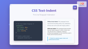
CSS Text-Indent: Complete Guide to First Line Paragraph Indentation
The CSS text-indent property is a fundamental typography tool that controls the indentation of the first line in a block...
CSS Style padding Property: CSS Padding
CSS Padding Property: A Comprehensive Guide The CSS padding property is a fundamental tool in web development, allowing you to...
CSS paddingBottom Property: CSS Padding Bottom
CSS paddingBottom Property: Mastering Bottom Padding The paddingBottom property in CSS is used to set the amount of padding space...
CSS Style paddingLeft Property: CSS Padding Left
CSS padding-left Property: A Comprehensive Guide The padding-left property in CSS is used to set the amount of padding space...


