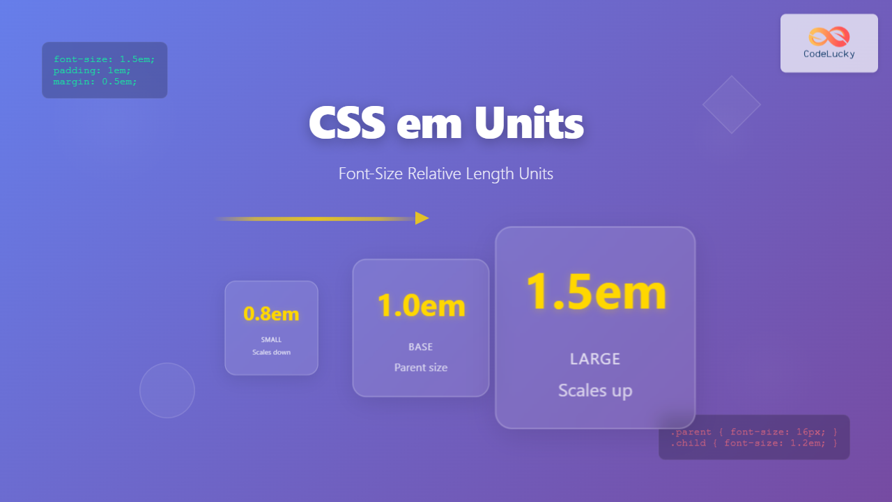
CSS em units are one of the most powerful and flexible relative length units in web development. Unlike absolute units like pixels, em units scale relative to the font-size of their parent element, making them essential for creating responsive and accessible web designs.
What are CSS em Units?
The em unit is a relative length unit that represents the calculated font-size of an element. If used on the font-size property itself, it represents the inherited font-size of the element. The name “em” comes from typography, originally referring to the width of the capital letter “M” in a given typeface.
How em Units Work
Em units calculate their value based on the font-size of the parent element. This creates a cascading effect where child elements inherit and multiply the em values of their parents.
Basic em Unit Calculation
/* Parent element with 16px font-size */
.parent {
  font-size: 16px;
}

/* Child element with 1.5em font-size */
.child {
  font-size: 1.5em; /* 1.5 × 16px = 24px */
}

/* Grandchild element with 0.8em font-size */
.grandchild {
  font-size: 0.8em; /* 0.8 × 24px = 19.2px */
}
Visual Example: em Unit Inheritance
em Units vs Other CSS Units
Understanding the differences between em units and other CSS units is crucial for making informed design decisions.
em vs px (Pixels)
| Aspect | em Units | px Units |
|---|---|---|
| Scaling | Relative to parent font-size | Fixed absolute size |
| Accessibility | Respects user font preferences | Ignores user font preferences |
| Responsive Design | Naturally responsive | Requires media queries |
em vs rem Units
While em units are relative to the parent element’s font-size, rem units are always relative to the root element’s font-size, preventing the cascading multiplication effect.
/* Root element */
html {
  font-size: 16px;
}

/* em units cascade */
.parent-em {
  font-size: 1.5em; /* 24px */
}

.child-em {
  font-size: 1.5em; /* 1.5 × 24px = 36px */
}

/* rem units don't cascade */
.parent-rem {
  font-size: 1.5rem; /* 24px */
}

.child-rem {
  font-size: 1.5rem; /* 1.5 × 16px = 24px */
}
Practical Applications of em Units
1. Typography Scaling
Em units excel at creating proportional typography systems where all text scales together harmoniously.
.article {
  font-size: 18px; /* Base font size */
}

.article h2 {
  font-size: 1.8em; /* 32.4px */
  margin-bottom: 0.5em; /* 9px */
}

.article h3 {
  font-size: 1.4em; /* 25.2px */
  margin-bottom: 0.4em; /* 7.2px */
}

.article p {
  font-size: 1em; /* 18px */
  line-height: 1.6em; /* 28.8px */
  margin-bottom: 1em; /* 18px */
}
Main Heading (1.8em)
Subheading (1.4em)
This paragraph demonstrates how em units create proportional spacing and typography. All elements scale together when the base font-size changes.
2. Component-Based Scaling
Em units are perfect for creating scalable components that maintain their proportions regardless of context.
.button {
  font-size: 1em;
  padding: 0.5em 1em;
  border-radius: 0.25em;
  border: 0.1em solid #007bff;
}

/* Small button variant */
.button--small {
  font-size: 0.8em;
}

/* Large button variant */
.button--large {
  font-size: 1.2em;
}
3. Responsive Spacing
Using em units for margins and padding creates spacing that scales with text size, improving readability across different screen sizes.
.card {
  padding: 1.5em;
  margin-bottom: 1em;
  border-radius: 0.5em;
}

.card h3 {
  margin-bottom: 0.5em;
}

.card p {
  margin-bottom: 1em;
  line-height: 1.5em;
}
Interactive Example: em Unit Calculator
em Unit Calculator
Best Practices for Using em Units
1. Use em for Component-Level Scaling
Apply em units within components where you want all elements to scale proportionally together.
2. Set Base Font Sizes Strategically
Establish clear base font sizes at component or section levels to control em unit calculations.
/* Set base sizes at component level */
.header {
  font-size: 20px; /* Base for header components */
}

.sidebar {
  font-size: 14px; /* Base for sidebar components */
}

.main-content {
  font-size: 16px; /* Base for main content */
}
3. Combine with rem for Better Control
Use rem units for global spacing and em units for component-internal proportions.
/* Global spacing with rem */
.section {
  margin-bottom: 3rem;
  padding: 2rem;
}

/* Component internal scaling with em */
.card {
  font-size: 16px;
  padding: 1.5em; /* Scales with card font-size */
}

.card h3 {
  font-size: 1.25em; /* Proportional to card font-size */
  margin-bottom: 0.5em;
}
Common Pitfalls and Solutions
1. Compound Scaling Issues
Deep nesting of em units can create unexpected results due to compound multiplication.
/* Problematic: Compound scaling */
.level1 { font-size: 1.2em; } /* 19.2px if parent is 16px */
.level2 { font-size: 1.2em; } /* 23.04px (1.2 × 19.2px) */
.level3 { font-size: 1.2em; } /* 27.65px (1.2 × 23.04px) */

/* Solution: Use rem or reset base */
.level1 { font-size: 1.2rem; } /* Always 19.2px */
.level2 { font-size: 1.2rem; } /* Always 19.2px */
.level3 { font-size: 1.2rem; } /* Always 19.2px */
2. Browser Default Variations
Different browsers may have slightly different default font sizes, affecting em calculations.
/* Establish consistent base */
html {
  font-size: 16px; /* Override browser defaults */
}

/* Or use percentage for user preference respect */
html {
  font-size: 100%; /* Respects user's browser settings */
}
Accessibility Considerations
Em units naturally support accessibility by respecting user font-size preferences set in their browser or operating system.
Supporting User Preferences
/* Respects user's default font size */
body {
  font-size: 1em; /* Inherits from browser/OS settings */
}

/* All other sizes scale proportionally */
h1 { font-size: 2.5em; }
h2 { font-size: 2em; }
h3 { font-size: 1.5em; }
small { font-size: 0.8em; }
Minimum Size Considerations
Always ensure text remains readable even when scaled down with em units.
/* Ensure minimum readable size */
.small-text {
  font-size: max(0.8em, 12px); /* Never smaller than 12px */
}
Performance and Browser Support
Em units have excellent browser support and minimal performance impact. They’re supported in all modern browsers and don’t require any polyfills or fallbacks.
Browser Compatibility
- Chrome: Full support since version 1
- Firefox: Full support since version 1
- Safari: Full support since version 1
- Edge: Full support since version 12
- Internet Explorer: Full support since version 3
Real-World Example: Scalable Card Component
Here’s a complete example showing how to build a scalable card component using em units effectively:
.card {
  font-size: 16px; /* Base size for calculations */
  padding: 1.5em;
  margin-bottom: 1em;
  border: 0.1em solid #ddd;
  border-radius: 0.5em;
  box-shadow: 0 0.2em 0.5em rgba(0,0,0,0.1);
}

.card__title {
  font-size: 1.25em;
  font-weight: bold;
  margin-bottom: 0.5em;
  line-height: 1.2em;
}

.card__content {
  font-size: 1em;
  line-height: 1.5em;
  margin-bottom: 1em;
  color: #666;
}

.card__button {
  font-size: 0.9em;
  padding: 0.7em 1.2em;
  border: 0.1em solid #007bff;
  border-radius: 0.3em;
  background: #007bff;
  color: white;
}

/* Size variations */
.card--small { font-size: 14px; }
.card--large { font-size: 18px; }
Small Card
This card uses 14px base font-size. All em values scale proportionally.
Regular Card
This card uses 16px base font-size. Same em values, different rendered sizes.
Large Card
This card uses 18px base font-size. Perfect proportional scaling maintained.
Conclusion
CSS em units provide a powerful foundation for creating scalable, accessible, and maintainable web designs. By understanding how em units calculate relative to parent font-sizes, you can build components and layouts that naturally adapt to different contexts and user preferences.
Key takeaways for using em units effectively:
- Use em units for component-internal scaling and proportional relationships
- Establish clear base font-sizes to control em calculations
- Avoid deep nesting to prevent compound scaling issues
- Combine with rem units for better overall control
- Always consider accessibility and user font preferences
When used thoughtfully, em units become an invaluable tool in your CSS toolkit, enabling you to create designs that are both flexible and user-friendly. Start incorporating em units into your next project and experience the benefits of truly scalable web design.

