Object-Oriented CSS (OOCSS) is a revolutionary methodology that transforms how developers approach CSS architecture. By applying object-oriented programming principles to stylesheet organization, OOCSS enables teams to create scalable, maintainable, and efficient CSS codebases that can grow with complex web applications.
What is Object-Oriented CSS (OOCSS)?
Object-Oriented CSS is a methodology developed by Nicole Sullivan that encourages writing CSS in a modular, reusable way. Instead of creating page-specific styles, OOCSS promotes building small, independent CSS “objects” that can be combined and reused across different parts of a website.
The core philosophy revolves around creating a library of flexible, multipurpose CSS objects that can be mixed and matched to build complex layouts and components without duplicating code.
The Two Fundamental Principles of OOCSS
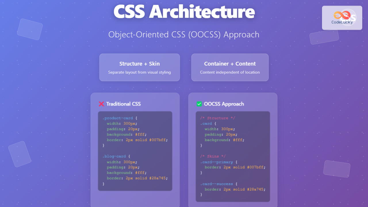
1. Separation of Structure and Skin
This principle advocates separating the structural properties (layout, positioning) from the visual properties (colors, fonts, shadows). This separation allows you to apply different visual styles to the same structural foundation.
❌ Bad Example (Coupled Structure and Skin):
.product-card {
  width: 300px;
  height: 400px;
  padding: 20px;
  margin: 10px;
  background: #ffffff;
  border: 2px solid #007bff;
  border-radius: 8px;
  box-shadow: 0 4px 6px rgba(0, 0, 0, 0.1);
}

.blog-card {
  width: 300px;
  height: 400px;
  padding: 20px;
  margin: 10px;
  background: #ffffff;
  border: 2px solid #28a745;
  border-radius: 8px;
  box-shadow: 0 4px 6px rgba(0, 0, 0, 0.1);
}
✅ Good Example (Separated Structure and Skin):
/* Structure */
.card {
  width: 300px;
  height: 400px;
  padding: 20px;
  margin: 10px;
  border-radius: 8px;
  box-shadow: 0 4px 6px rgba(0, 0, 0, 0.1);
}

/* Skins */
.card--primary {
  background: #ffffff;
  border: 2px solid #007bff;
}

.card--success {
  background: #ffffff;
  border: 2px solid #28a745;
}
2. Separation of Container and Content
This principle ensures that content styling is independent of its container. An object should look the same regardless of where it’s placed on the page.
❌ Bad Example (Content Depends on Container):
.sidebar h3 {
  font-size: 18px;
  color: #333;
  margin-bottom: 10px;
}

.main-content h3 {
  font-size: 18px;
  color: #333;
  margin-bottom: 10px;
}
✅ Good Example (Content Independent of Container):
.heading-secondary {
  font-size: 18px;
  color: #333;
  margin-bottom: 10px;
}
Benefits of Using OOCSS
- Reduced CSS File Size: Eliminates duplicate code by promoting reusability
- Improved Maintainability: Changes to visual styles only require updating skin classes
- Enhanced Scalability: New components can be built by combining existing objects
- Faster Development: Developers can quickly assemble layouts using predefined objects
- Consistent Design: Promotes design system consistency across the application
- Better Performance: Smaller CSS files load faster and improve page performance
OOCSS Implementation Strategy
1. Identify Common Patterns
Start by analyzing your design to identify recurring patterns, layouts, and visual elements. These become candidates for OOCSS objects.
2. Create Base Objects
Develop foundational objects that handle structure and common functionality:
/* Base Media Object */
.media {
  display: flex;
  align-items: flex-start;
}

.media__figure {
  margin-right: 1rem;
  flex-shrink: 0;
}

.media__body {
  flex: 1;
}

/* Base Button Object */
.btn {
  display: inline-block;
  padding: 0.75rem 1.5rem;
  border: none;
  border-radius: 4px;
  text-decoration: none;
  text-align: center;
  cursor: pointer;
  font-weight: 500;
  transition: all 0.2s ease;
}

/* Base Grid Object */
.grid {
  display: grid;
  gap: 1rem;
}

.grid--2-col {
  grid-template-columns: repeat(2, 1fr);
}

.grid--3-col {
  grid-template-columns: repeat(3, 1fr);
}
3. Add Skin Variations
Create skin classes for different visual appearances:
/* Button Skins */
.btn--primary {
  background-color: #007bff;
  color: white;
}

.btn--primary:hover {
  background-color: #0056b3;
}

.btn--secondary {
  background-color: #6c757d;
  color: white;
}

.btn--success {
  background-color: #28a745;
  color: white;
}

/* Size Modifiers */
.btn--small {
  padding: 0.5rem 1rem;
  font-size: 0.875rem;
}

.btn--large {
  padding: 1rem 2rem;
  font-size: 1.125rem;
}
Real-World OOCSS Example: Building a Card System
Let’s create a comprehensive card component system using OOCSS principles:
CSS Structure:
/* Base Card Object */
.card {
  display: flex;
  flex-direction: column;
  border-radius: 8px;
  overflow: hidden;
  box-shadow: 0 2px 4px rgba(0, 0, 0, 0.1);
  transition: box-shadow 0.2s ease;
}

.card:hover {
  box-shadow: 0 4px 8px rgba(0, 0, 0, 0.15);
}

.card__header {
  padding: 1.5rem;
  border-bottom: 1px solid #e9ecef;
}

.card__body {
  padding: 1.5rem;
  flex: 1;
}

.card__footer {
  padding: 1rem 1.5rem;
  background-color: #f8f9fa;
  border-top: 1px solid #e9ecef;
}

/* Card Skins */
.card--white {
  background-color: white;
  border: 1px solid #e9ecef;
}

.card--dark {
  background-color: #343a40;
  color: white;
  border: 1px solid #495057;
}

.card--primary {
  background-color: #007bff;
  color: white;
  border: 1px solid #0056b3;
}

/* Card Size Modifiers */
.card--small {
  max-width: 300px;
}

.card--medium {
  max-width: 400px;
}

.card--large {
  max-width: 500px;
}

/* Card Layout Modifiers */
.card--horizontal {
  flex-direction: row;
}

.card--horizontal .card__header {
  border-bottom: none;
  border-right: 1px solid #e9ecef;
  flex-shrink: 0;
  width: 200px;
}
HTML Implementation:
<!-- Basic White Card -->
<div class="card card--white card--medium">
  <div class="card__header">
    <h3>Product Title</h3>
  </div>
  <div class="card__body">
    <p>Product description goes here...</p>
  </div>
  <div class="card__footer">
    <button class="btn btn--primary">Add to Cart</button>
  </div>
</div>

<!-- Dark Horizontal Card -->
<div class="card card--dark card--horizontal card--large">
  <div class="card__header">
    <img src="image.jpg" alt="Product" style="width: 100%; height: auto;">
  </div>
  <div class="card__body">
    <h3>Featured Article</h3>
    <p>Article excerpt...</p>
  </div>
</div>
Interactive OOCSS Example
Here’s a live demonstration of OOCSS principles in action:
OOCSS Naming Conventions
Establishing consistent naming conventions is crucial for OOCSS success:
Recommended Naming Pattern:
/* Base Object */
.object-name { }

/* Object Elements */
.object-name__element { }

/* Object Modifiers */
.object-name--modifier { }

/* Examples */
.card { }                    /* Base object */
.card__header { }           /* Element */
.card__body { }             /* Element */
.card--large { }            /* Size modifier */
.card--primary { }          /* Skin modifier */
.card--horizontal { }       /* Layout modifier */
Common OOCSS Patterns and Objects
1. The Media Object
Perfect for comments, testimonials, and any content with an image and text:
.media {
  display: flex;
  align-items: flex-start;
}

.media__figure {
  margin-right: 1rem;
  flex-shrink: 0;
}

.media__body {
  flex: 1;
}

.media--reverse .media__figure {
  order: 2;
  margin-right: 0;
  margin-left: 1rem;
}

.media--center {
  align-items: center;
}
2. The Flag Object
Ideal for navigation items and inline content:
.flag {
  display: flex;
  align-items: center;
}

.flag__image {
  margin-right: 1rem;
  flex-shrink: 0;
}

.flag__body {
  flex: 1;
}
3. The List Object
For creating various list layouts:
.list {
  list-style: none;
  padding: 0;
  margin: 0;
}

.list__item {
  padding: 0.5rem 0;
}

.list--inline .list__item {
  display: inline-block;
  margin-right: 1rem;
}

.list--horizontal {
  display: flex;
}

.list--horizontal .list__item {
  margin-right: 1rem;
}
OOCSS Best Practices
- Start Small: Begin with common elements like buttons, cards, and forms
- Be Descriptive: Use clear, semantic class names that describe function, not appearance
- Avoid Location-Dependent Styling: Objects should work anywhere on the page
- Prefer Composition: Combine multiple classes rather than creating monolithic components
- Document Your Objects: Maintain a style guide showing all available objects and modifiers
- Test Across Contexts: Ensure objects work in different containers and layouts
- Keep Specificity Low: Use single classes to maintain flexibility
OOCSS vs Other CSS Methodologies
| Methodology | Focus | Best For |
|---|---|---|
| OOCSS | Reusable objects and patterns | Large-scale applications, design systems |
| BEM | Block-Element-Modifier structure | Component-based architectures |
| SMACSS | Categorizing CSS rules | Organizing existing codebases |
| Atomic CSS | Single-purpose utility classes | Rapid prototyping, utility-first frameworks |
Implementing OOCSS in Your Project
Step 1: Audit Your Current CSS
Identify repeated patterns, duplicate styles, and tightly coupled code. Look for opportunities to extract reusable objects.
Step 2: Create a Base Object Library
Start building foundational objects for common UI patterns in your application.
Step 3: Establish Naming Conventions
Define consistent naming rules and document them for your team.
Step 4: Refactor Gradually
Begin refactoring existing components to use OOCSS principles, starting with the most frequently used elements.
Step 5: Build a Style Guide
Create documentation showing all available objects, their variations, and usage examples.
Common OOCSS Pitfalls to Avoid
- Over-abstraction: Don’t create objects for elements that appear only once
- Poor Naming: Avoid names based on visual appearance rather than function
- Tight Coupling: Ensure objects don’t depend on specific parent containers
- Ignoring Specificity: Keep CSS specificity low to maintain flexibility
- Lack of Documentation: Always document your objects and their intended usage
Tools and Resources for OOCSS
Several tools can help you implement and maintain OOCSS effectively:
- Sass/SCSS: Enables better organization through partials and mixins
- PostCSS: Provides plugins for automated OOCSS optimization
- Stylelint: Enforces consistent CSS coding standards
- Pattern Lab: Creates living style guides for your OOCSS objects
- Fractal: Component library tool for documenting CSS objects
Conclusion
Object-Oriented CSS represents a paradigm shift in how we approach CSS architecture. By separating structure from skin and container from content, OOCSS enables developers to create maintainable, scalable stylesheets that can evolve with growing applications.
The methodology’s emphasis on reusability and modularity not only reduces code duplication but also promotes consistency across design systems. While OOCSS requires initial investment in planning and structure, the long-term benefits in maintainability, performance, and development speed make it an invaluable approach for modern web development.
Start implementing OOCSS gradually in your projects, beginning with common UI patterns like buttons, cards, and navigation elements. As you become more comfortable with the methodology, you’ll find yourself naturally thinking in terms of reusable objects, leading to cleaner, more efficient CSS codebases.

