What is BEM Methodology?
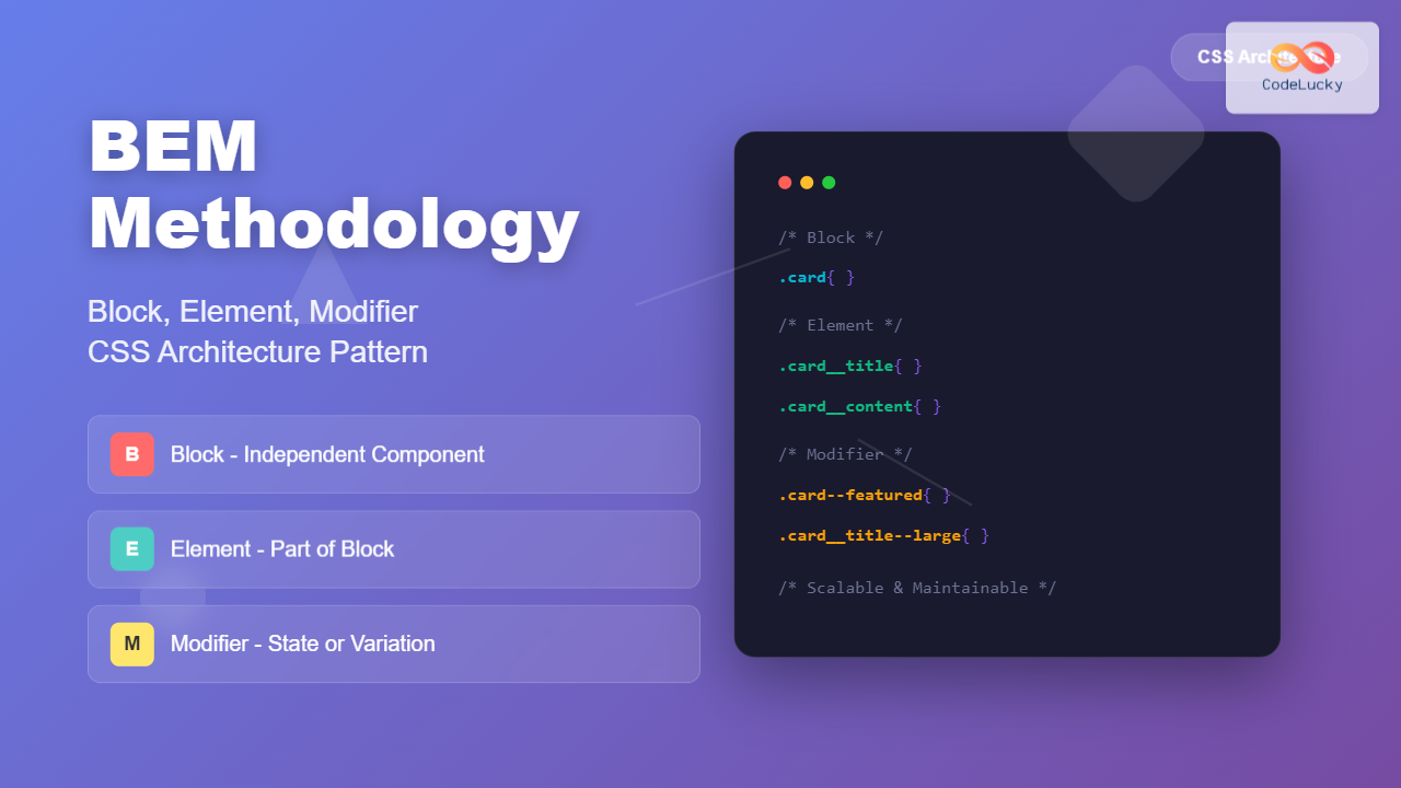
BEM (Block, Element, Modifier) is a popular CSS naming methodology that helps developers write more maintainable and scalable stylesheets. Developed by Yandex, BEM provides a systematic approach to naming CSS classes that makes your code more predictable, readable, and easier to maintain across large projects.
The methodology breaks down user interfaces into independent blocks, making it easier to develop, debug, and maintain complex web applications. BEM’s structured approach eliminates naming conflicts and creates a clear hierarchy in your CSS architecture.
Understanding BEM Components
BEM consists of three main components that work together to create a comprehensive naming system:
Block
A block represents a standalone component that is meaningful on its own. It’s the top-level abstraction of a new component. Examples include header, menu, search-form, or button.
- Use lowercase letters
- Separate words with hyphens
- Be descriptive and meaningful
Element
An element is a part of a block that has no standalone meaning. Elements are semantically tied to their block and cannot exist outside of it. Examples include menu items, list items, or form inputs.
- Block name + double underscore + element name
- Format:
block__element - Example:
menu__item,card__title
Modifier
A modifier is a flag on a block or element that changes appearance, behavior, or state. Modifiers represent different states like disabled, highlighted, or different sizes and themes.
- Block/Element name + double dash + modifier name
- Format:
block--modifierorblock__element--modifier - Example:
button--large,menu__item--active
BEM Naming Convention Syntax
The BEM naming convention follows a specific pattern that ensures consistency across your entire codebase:
.block { }
.block__element { }
.block–modifier { }
.block__element–modifier { }
.search-form { }
.search-form__input { }
.search-form__button { }
.search-form__button–disabled { }
.search-form–compact { }
Practical BEM Implementation Examples
Example 1: Navigation Menu
Let’s implement a navigation menu using BEM methodology:
<nav class=”nav”>
<ul class=”nav__list”>
<li class=”nav__item”>
<a href=”#” class=”nav__link nav__link–active”>Home</a>
</li>
<li class=”nav__item”>
<a href=”#” class=”nav__link”>About</a>
</li>
<li class=”nav__item”>
<a href=”#” class=”nav__link”>Services</a>
</li>
<li class=”nav__item”>
<a href=”#” class=”nav__link”>Contact</a>
</li>
</ul>
</nav>
.nav {
background-color: #333;
padding: 1rem;
}
.nav__list {
display: flex;
list-style: none;
margin: 0;
padding: 0;
gap: 2rem;
}
.nav__item {
position: relative;
}
.nav__link {
color: white;
text-decoration: none;
padding: 0.5rem 1rem;
border-radius: 4px;
transition: background-color 0.3s ease;
}
.nav__link:hover {
background-color: rgba(255, 255, 255, 0.1);
}
.nav__link–active {
background-color: #007bff;
font-weight: bold;
}
Visual Output:
Example 2: Card Component
Here’s a more complex example showing a card component with multiple elements and modifiers:
<div class=”card card–featured”>
<img src=”image.jpg” alt=”Card image” class=”card__image”>
<div class=”card__content”>
<h3 class=”card__title”>Featured Article</h3>
<p class=”card__description”>This is a featured article with special styling.</p>
<div class=”card__actions”>
<button class=”card__button card__button–primary”>Read More</button>
<button class=”card__button”>Share</button>
</div>
</div>
</div>
.card {
border: 1px solid #e2e8f0;
border-radius: 8px;
overflow: hidden;
max-width: 300px;
background: white;
box-shadow: 0 2px 4px rgba(0, 0, 0, 0.1);
}
.card–featured {
border-color: #007bff;
box-shadow: 0 4px 12px rgba(0, 123, 255, 0.15);
}
.card__image {
width: 100%;
height: 200px;
object-fit: cover;
display: block;
}
.card__content {
padding: 1.5rem;
}
.card__title {
margin: 0 0 1rem 0;
font-size: 1.25rem;
font-weight: 600;
color: #2d3748;
}
.card__description {
margin: 0 0 1.5rem 0;
color: #4a5568;
line-height: 1.6;
}
.card__actions {
display: flex;
gap: 0.75rem;
}
.card__button {
padding: 0.5rem 1rem;
border: 1px solid #e2e8f0;
border-radius: 4px;
background: white;
color: #4a5568;
cursor: pointer;
font-size: 0.875rem;
transition: all 0.2s ease;
}
.card__button:hover {
background: #f7fafc;
}
.card__button–primary {
background: #007bff;
color: white;
border-color: #007bff;
}
.card__button–primary:hover {
background: #0056b3;
}
Visual Output:
Interactive BEM Example
Let’s create an interactive form component that demonstrates BEM methodology in action:
Try the form above – enter an invalid email or short password to see BEM modifiers in action!
BEM Best Practices
1. Keep Blocks Independent
Blocks should be independent and reusable. Avoid styling blocks based on their position in the DOM or their relationship to other blocks.
.sidebar .button { }
.nav–header { }
.button { }
.button–sidebar { }
2. Avoid Deep Nesting
Don’t create elements of elements. BEM doesn’t support deep nesting – if you need it, consider creating a new block.
.card__text { }
3. Use Semantic Names
Choose names that describe what the element is, not how it looks. This makes your code more maintainable when designs change.
.text–small { }
.text–caption { }
4. Organize Your CSS Files
Structure your CSS files to match your BEM blocks. This makes maintenance easier:
├── blocks/
│ ├── header.css
│ ├── nav.css
│ ├── card.css
│ └── button.css
└── main.css
Common BEM Mistakes to Avoid
1. Using Tag Selectors with BEM
Avoid mixing tag selectors with BEM classes as it reduces specificity control and reusability.
2. Creating Overly Specific Selectors
Don’t combine multiple BEM classes in selectors. Each BEM class should be complete and independent.
3. Ignoring the Single Responsibility Principle
Each block should have a single responsibility. If a block is doing too many things, consider breaking it into smaller blocks.
BEM vs Other Methodologies
While BEM is popular, it’s worth understanding how it compares to other CSS methodologies:
BEM vs OOCSS
OOCSS focuses on separating structure from skin, while BEM focuses on component independence and naming consistency.
BEM vs SMACSS
SMACSS categorizes CSS rules into base, layout, module, state, and theme, while BEM focuses specifically on naming conventions for components.
BEM vs Atomic CSS
Atomic CSS uses single-purpose utility classes, while BEM creates component-based classes with semantic meaning.
Implementing BEM in Large Projects
For large-scale applications, consider these strategies when implementing BEM:
CSS Preprocessors Integration
Use Sass or Less to organize BEM code more efficiently:
.card {
border: 1px solid #e2e8f0;
border-radius: 8px;
&__image {
width: 100%;
height: 200px;
}
&__title {
font-size: 1.25rem;
font-weight: 600;
}
&–featured {
border-color: #007bff;
box-shadow: 0 4px 12px rgba(0, 123, 255, 0.15);
}
}
Documentation and Style Guides
Create comprehensive documentation that includes:
- Naming conventions and examples
- Component library with BEM classes
- Code review guidelines
- Migration strategies for existing code
Tools and Resources for BEM
Several tools can help you implement and maintain BEM methodology:
Development Tools
- PostCSS BEM Linter: Validates BEM naming conventions in your CSS
- Stylelint: CSS linter with BEM-specific rules
- BEM Helper: Sass mixins for generating BEM classes
Browser Extensions
- BEM Validator: Chrome extension for validating BEM markup
- CSS Dig: Analyzes CSS architecture and naming patterns
Performance Considerations
BEM methodology can impact performance in several ways:
Positive Impacts
- Reduced CSS specificity wars: Lower specificity means faster rendering
- Better caching: Organized CSS files cache more effectively
- Smaller bundle sizes: Eliminates duplicate styles
Potential Concerns
- Longer class names: Can increase HTML file size
- More CSS classes: May increase CSS file size initially
The benefits typically outweigh the concerns, especially as projects grow in complexity.
Migration Strategy
If you’re migrating an existing project to BEM, follow this approach:
Phase 1: Assessment
- Audit existing CSS architecture
- Identify components that can be converted to BEM blocks
- Document current naming patterns
Phase 2: Gradual Implementation
- Start with new components using BEM
- Refactor high-priority components first
- Maintain backward compatibility during transition
Phase 3: Full Adoption
- Convert remaining components
- Remove legacy CSS
- Update documentation and style guides
Conclusion
BEM methodology provides a robust foundation for scalable CSS architecture. By following its principles of Blocks, Elements, and Modifiers, you can create maintainable, reusable, and predictable stylesheets that grow with your project.
The key to successful BEM implementation is consistency and team adoption. Start small, document your conventions, and gradually expand your usage as your team becomes comfortable with the methodology.
Remember that BEM is a tool to solve specific problems – use it when it adds value to your project, and don’t be afraid to adapt it to your team’s needs. The goal is always to write better, more maintainable CSS that serves your users and your development team.

