
What is SMACSS?
SMACSS (Scalable and Modular Architecture for CSS) is a comprehensive methodology developed by Jonathan Snook that provides a structured approach to organizing CSS code. This architecture system categorizes CSS rules into five distinct types, making stylesheets more maintainable, scalable, and easier to understand for development teams.
Unlike other CSS methodologies that focus primarily on naming conventions, SMACSS emphasizes the categorization and organization of styles based on their purpose and function within the application. This approach helps developers create more predictable and maintainable code bases that can scale effectively as projects grow.
The Five Categories of SMACSS
Default styles for HTML elements without classes or IDs. These are the foundation styles that apply globally.
Styles that define the major structural components and page sections like headers, footers, and grids.
Reusable, modular components that can be used throughout the application like buttons, cards, and navigation.
Styles that describe how modules or layouts look in different states like active, hidden, or expanded.
Visual appearance styles that can be swapped to change the overall look and feel of the application.
1. Base Rules
Base rules establish the default styling for HTML elements. These styles should be minimal and focus on setting consistent foundations across browsers. Base rules typically include CSS resets, normalization, and default typography settings.
* {
box-sizing: border-box;
}
html {
font-size: 16px;
line-height: 1.6;
}
body {
margin: 0;
font-family: -apple-system, BlinkMacSystemFont, ‘Segoe UI’, sans-serif;
color: #333;
background-color: #fff;
}
h1, h2, h3, h4, h5, h6 {
margin-top: 0;
margin-bottom: 0.5em;
font-weight: 600;
}
p {
margin-top: 0;
margin-bottom: 1em;
}
a {
color: #2563eb;
text-decoration: none;
}
a:hover {
text-decoration: underline;
}
Base Rules Demo
This text demonstrates the base typography styles. Notice how the font family, line height, and spacing are consistently applied.
Links are styled with a blue color by default, and hover effects are applied consistently.
2. Layout Rules
Layout rules define the major structural components of your page. These rules use ID selectors or class names prefixed with “l-” or “layout-” to distinguish them from other categories. Layout rules should focus on positioning and spacing of major page sections.
.l-header {
background: #2563eb;
color: white;
padding: 1rem;
position: sticky;
top: 0;
z-index: 100;
}
.l-main {
display: flex;
min-height: calc(100vh – 60px);
}
.l-sidebar {
width: 250px;
background: #f3f4f6;
padding: 1rem;
border-right: 1px solid #e5e7eb;
}
.l-content {
flex: 1;
padding: 2rem;
max-width: 1200px;
}
.l-footer {
background: #1f2937;
color: white;
text-align: center;
padding: 2rem;
}
/* Grid Layout System */
.l-grid {
display: grid;
grid-template-columns: repeat(12, 1fr);
gap: 1rem;
}
.l-grid-item {
grid-column: span 12;
}
@media (min-width: 768px) {
.l-grid-item–half {
grid-column: span 6;
}
.l-grid-item–third {
grid-column: span 4;
}
}
Layout Rules Demo
3. Module Rules
Module rules are the heart of SMACSS. These are reusable, modular components that can be placed anywhere in your layout. Modules should be designed to be independent and portable, with their own self-contained styling that doesn’t depend on their location within the page.
.btn {
display: inline-block;
padding: 10px 20px;
border: none;
border-radius: 4px;
cursor: pointer;
text-decoration: none;
font-weight: 500;
font-size: 14px;
transition: all 0.3s ease;
text-align: center;
}
.btn-primary {
background: #2563eb;
color: white;
}
.btn-primary:hover {
background: #1d4ed8;
transform: translateY(-1px);
}
.btn-secondary {
background: #6b7280;
color: white;
}
.btn-secondary:hover {
background: #4b5563;
}
.btn-outline {
background: transparent;
border: 2px solid #2563eb;
color: #2563eb;
}
.btn-outline:hover {
background: #2563eb;
color: white;
}
/* Card Module */
.card {
background: white;
border: 1px solid #e5e7eb;
border-radius: 8px;
padding: 20px;
box-shadow: 0 1px 3px rgba(0, 0, 0, 0.1);
transition: box-shadow 0.3s ease;
}
.card:hover {
box-shadow: 0 4px 12px rgba(0, 0, 0, 0.15);
}
.card-header {
font-size: 1.25em;
font-weight: bold;
margin-bottom: 10px;
color: #1f2937;
}
.card-body {
color: #6b7280;
line-height: 1.6;
}
.card-footer {
margin-top: 15px;
padding-top: 15px;
border-top: 1px solid #e5e7eb;
}
/* Navigation Module */
.nav {
list-style: none;
padding: 0;
margin: 0;
display: flex;
}
.nav-item {
margin-right: 1rem;
}
.nav-link {
padding: 0.5rem 1rem;
color: #6b7280;
text-decoration: none;
border-radius: 4px;
transition: all 0.3s ease;
}
.nav-link:hover {
background: #f3f4f6;
color: #1f2937;
}
Module Rules Demo
Button Modules
4. State Rules
State rules describe how modules or layouts appear when in different states. States are generally applied with JavaScript and indicate changes like active, inactive, expanded, collapsed, or hidden. State classes are typically prefixed with “is-” to clearly indicate their purpose.
.is-hidden {
display: none !important;
}
.is-visible {
display: block !important;
}
.is-active {
background: #fef3c7 !important;
border-color: #f59e0b !important;
color: #92400e !important;
}
.is-disabled {
opacity: 0.6 !important;
pointer-events: none !important;
cursor: not-allowed !important;
}
.is-loading {
position: relative;
pointer-events: none;
}
.is-loading::after {
content: ”;
position: absolute;
top: 50%;
left: 50%;
width: 20px;
height: 20px;
margin: -10px 0 0 -10px;
border: 2px solid #f3f3f3;
border-top: 2px solid #2563eb;
border-radius: 50%;
animation: spin 1s linear infinite;
}
@keyframes spin {
0% { transform: rotate(0deg); }
100% { transform: rotate(360deg); }
}
.is-expanded {
max-height: 1000px !important;
overflow: visible !important;
}
.is-collapsed {
max-height: 0 !important;
overflow: hidden !important;
transition: max-height 0.3s ease;
}
/* Tab-specific states */
.tab.is-active {
background: white;
border-bottom-color: white;
z-index: 1;
}
.tab-content.is-active {
display: block;
}
.tab-content {
display: none;
}
State Rules Interactive Demo
5. Theme Rules
Theme rules define the visual appearance and can be swapped to change colors, fonts, and other visual aspects of your site. Themes allow you to create different visual variations without changing the underlying structure or functionality.
/* Default Theme */
.theme-default {
–primary-color: #2563eb;
–secondary-color: #6b7280;
–background-color: #ffffff;
–text-color: #1f2937;
–border-color: #e5e7eb;
}
/* Dark Theme */
.theme-dark {
–primary-color: #3b82f6;
–secondary-color: #9ca3af;
–background-color: #1f2937;
–text-color: #f9fafb;
–border-color: #4b5563;
}
/* Applying theme variables */
.themed-container {
background-color: var(–background-color);
color: var(–text-color);
border: 1px solid var(–border-color);
padding: 20px;
border-radius: 8px;
transition: all 0.3s ease;
}
.themed-button {
background-color: var(–primary-color);
color: white;
border: none;
padding: 10px 20px;
border-radius: 4px;
cursor: pointer;
}
.themed-card {
background-color: var(–background-color);
border: 1px solid var(–border-color);
border-radius: 8px;
padding: 20px;
color: var(–text-color);
}
/* Alternative approach without CSS custom properties */
.btn-theme-corporate {
background: #1e40af;
color: white;
}
.btn-theme-nature {
background: #059669;
color: white;
}
.btn-theme-sunset {
background: #dc2626;
color: white;
}
.card-theme-corporate {
border-left: 4px solid #1e40af;
}
.card-theme-nature {
border-left: 4px solid #059669;
}
.card-theme-sunset {
border-left: 4px solid #dc2626;
}
Theme Rules Interactive Demo
Themed Container
This container uses CSS custom properties to apply theme colors. Switch between themes to see the visual differences.
Cards also adapt to the selected theme automatically.
File Organization in SMACSS
SMACSS encourages organizing CSS files according to the five categories. This approach makes it easier to locate and maintain styles as your project grows. Here’s a recommended file structure:
├── base/
│ ├── _reset.scss
│ ├── _typography.scss
│ └── _base.scss
├── layout/
│ ├── _header.scss
│ ├── _footer.scss
│ ├── _sidebar.scss
│ └── _grid.scss
├── modules/
│ ├── _buttons.scss
│ ├── _cards.scss
│ ├── _navigation.scss
│ ├── _forms.scss
│ └── _modal.scss
├── state/
│ ├── _states.scss
│ └── _animations.scss
├── theme/
│ ├── _default.scss
│ ├── _dark.scss
│ └── _corporate.scss
└── main.scss
/* Base styles first */
@import ‘base/reset’;
@import ‘base/typography’;
@import ‘base/base’;
/* Layout styles */
@import ‘layout/grid’;
@import ‘layout/header’;
@import ‘layout/footer’;
@import ‘layout/sidebar’;
/* Module styles */
@import ‘modules/buttons’;
@import ‘modules/cards’;
@import ‘modules/navigation’;
@import ‘modules/forms’;
@import ‘modules/modal’;
/* State styles */
@import ‘state/states’;
@import ‘state/animations’;
/* Theme styles last */
@import ‘theme/default’;
@import ‘theme/dark’;
@import ‘theme/corporate’;
SMACSS Naming Conventions
While SMACSS is more about categorization than naming, it does provide some naming guidelines to help identify the category and purpose of CSS rules:
body, h1, p.l-header, .l-sidebar.btn, .btn-primary.is-active, .is-hidden.theme-dark, .theme-corporateBest Practices for SMACSS Implementation
1. Keep Modules Independent
Ensure that modules can function independently regardless of their context. Avoid styling modules based on their parent containers.
.card {
background: white;
border: 1px solid #e5e7eb;
border-radius: 8px;
padding: 20px;
}
/* Bad – Module depends on parent */
.sidebar .card {
width: 100%;
margin-bottom: 15px;
}
/* Better approach – Use modifier classes */
.card-sidebar {
width: 100%;
margin-bottom: 15px;
}
2. Use Depth of Applicability
Minimize the depth of your CSS selectors. Deep nesting makes styles harder to override and maintain.
.nav-item {
padding: 0.5rem;
}
.nav-link {
color: #6b7280;
text-decoration: none;
}
/* Bad – Deep nesting */
.nav .nav-list .nav-item .nav-link {
color: #6b7280;
text-decoration: none;
}
3. Minimize the Use of !important
Use !important sparingly and mainly for state rules where you need to override other styles.
.is-hidden {
display: none !important;
}
.is-disabled {
pointer-events: none !important;
opacity: 0.6 !important;
}
/* Avoid in regular module styles */
.btn {
background: #2563eb; /* Don’t use !important here */
}
SMACSS vs Other CSS Methodologies
Comparison with Other Methodologies
| Methodology | Focus | Strengths | Best For |
|---|---|---|---|
| SMACSS | Categorization | Clear organization, scalability | Large applications |
| BEM | Naming conventions | Clear relationships, specificity control | Component-based projects |
| OOCSS | Object orientation | Reusability, performance | Design systems |
Related Posts
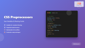
CSS Preprocessors: Sass Variables and Nesting – Complete Guide for Modern Web Development
CSS preprocessors have revolutionized how developers write and maintain stylesheets. Among the most popular preprocessors, Sass (Syntactically Awesome StyleSheets) stands...

CSS File Organization: Master Folder Structure and Import Strategies for Scalable Projects
Managing CSS files in large projects can quickly become overwhelming without proper organization. Professional developers rely on structured approaches to...
CSS Introduction: Complete Guide to Styling HTML with Cascading Style Sheets
CSS (Cascading Style Sheets) is the cornerstone technology that transforms plain HTML documents into visually stunning, professional websites. While HTML...
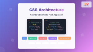
CSS Architecture: Atomic CSS Utility-First Approach – Complete Guide to Modern CSS Design
CSS architecture has evolved significantly over the years, and one of the most revolutionary approaches is Atomic CSS with a...
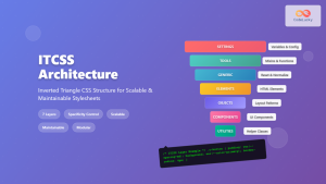
ITCSS Inverted Triangle CSS: Complete Guide to Scalable CSS Architecture
CSS architecture becomes increasingly complex as projects grow. Without proper organization, stylesheets quickly become unmaintainable nightmares filled with specificity wars...
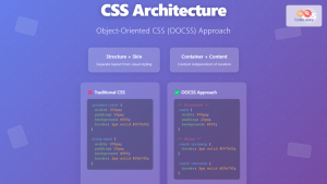
CSS Architecture: OOCSS Object-Oriented CSS – Complete Guide with Examples
Object-Oriented CSS (OOCSS) is a revolutionary methodology that transforms how developers approach CSS architecture. By applying object-oriented programming principles to...
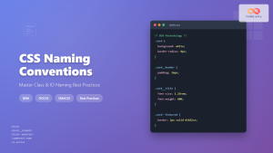
CSS Naming Conventions: Complete Guide to Class and ID Naming Best Practices
Proper CSS naming conventions are the foundation of maintainable, scalable, and collaborative web development. Whether you're working on a small...

CSS Syntax: Complete Guide to Rules, Selectors, Properties and Values
CSS (Cascading Style Sheets) is the cornerstone of web design, transforming plain HTML into visually stunning websites. Understanding CSS syntax...
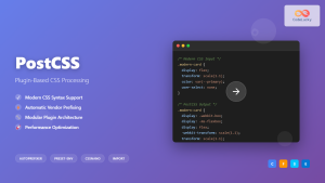
CSS PostCSS: Complete Guide to Modern Plugin-Based CSS Processing
PostCSS has revolutionized how developers write and process CSS by providing a powerful, plugin-based ecosystem that transforms your stylesheets with...

CSS Refactoring: Complete Guide to Modernizing Legacy Stylesheets
Legacy CSS codebases can become a significant burden on development teams, slowing down feature delivery and creating maintenance nightmares. CSS...
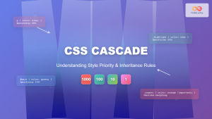
CSS Cascade: Understanding Style Priority and Inheritance Rules
The CSS cascade is the fundamental mechanism that determines which styles are applied to HTML elements when multiple CSS rules...
CSS Linting: Stylelint Configuration and Rules – Complete Developer Guide
What is CSS Linting and Why It Matters CSS linting is the process of analyzing your CSS code to identify...


