CSS (Cascading Style Sheets) is the cornerstone technology that transforms plain HTML documents into visually stunning, professional websites. While HTML provides the structure and content, CSS brings life to web pages through colors, layouts, animations, and responsive design. This comprehensive guide will take you through everything you need to know about CSS and how it seamlessly integrates with HTML.
What is CSS?
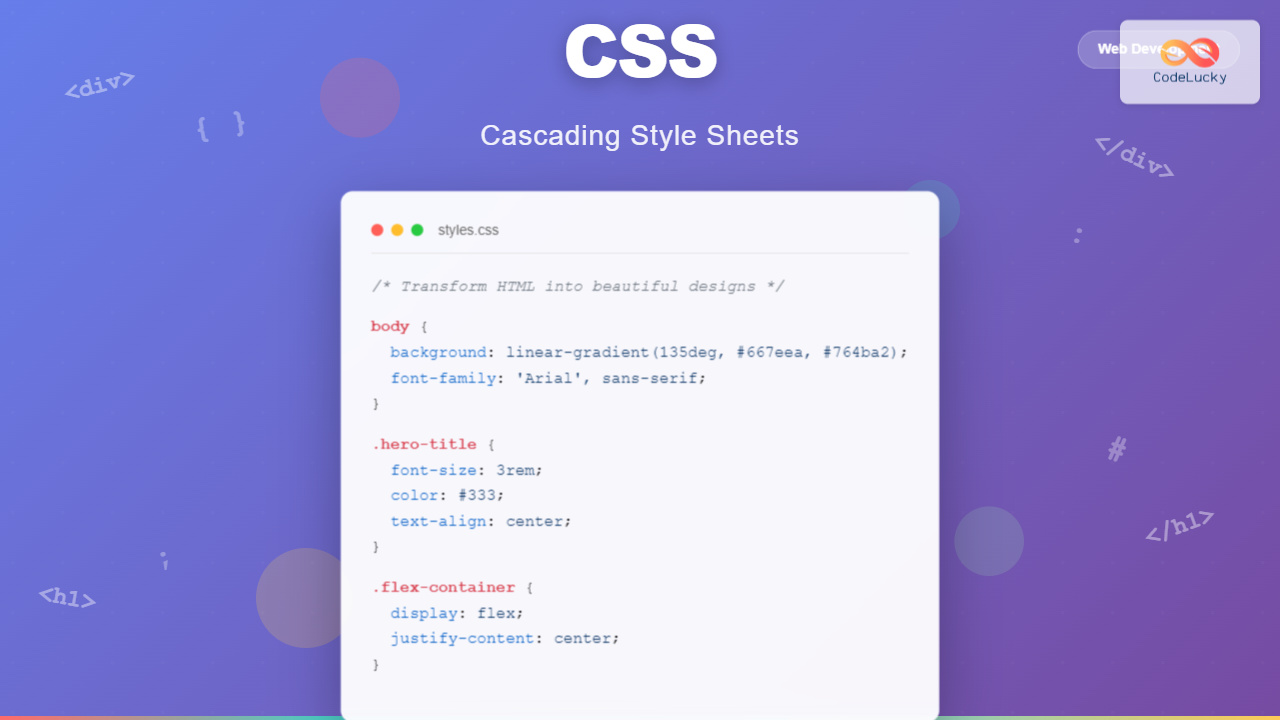
CSS stands for Cascading Style Sheets and is a stylesheet language used to describe the presentation of HTML documents. Think of HTML as the skeleton of a house and CSS as the paint, furniture, and decorative elements that make it beautiful and functional.
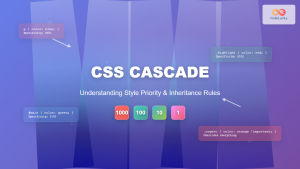
The term “cascading” refers to the way CSS rules are applied – styles cascade down from parent elements to child elements, and multiple stylesheets can be combined with specific rules determining which styles take precedence.
Key Benefits of CSS:
- Separation of Concerns: Keeps content (HTML) separate from presentation (CSS)
- Consistency: Apply uniform styling across multiple pages
- Maintainability: Easy to update designs without changing HTML
- Performance: Reduces code duplication and file sizes
- Responsive Design: Adapts layouts for different screen sizes
How CSS Works with HTML
CSS and HTML work together through a simple but powerful relationship. HTML elements are styled using CSS selectors that target specific elements, classes, or IDs. Here’s how they connect:
HTML Structure:
<div class="container">
  <h1 id="main-title">Welcome to My Website</h1>
  <p class="intro-text">This is a paragraph with styling.</p>
</div>
CSS Styling:
.container {
  max-width: 800px;
  margin: 0 auto;
  padding: 20px;
}

#main-title {
  color: #333;
  font-size: 2.5em;
  text-align: center;
}

.intro-text {
  font-size: 1.2em;
  line-height: 1.6;
  color: #666;
}
Three Ways to Add CSS to HTML
1. Inline CSS
CSS applied directly to HTML elements using the style attribute. While convenient for quick fixes, it’s not recommended for larger projects due to maintainability issues.
<p style="color: blue; font-size: 18px; font-weight: bold;">This text is styled inline</p>This text is styled inline
2. Internal CSS
CSS rules placed within <style> tags in the HTML document’s <head> section. Perfect for single-page styling or page-specific styles.
<head>
  <style>
    .highlight {
      background-color: yellow;
      padding: 10px;
      border-radius: 5px;
    }
  </style>
</head>
3. External CSS (Recommended)
CSS rules stored in separate .css files and linked to HTML documents. This is the most efficient and maintainable approach for most projects.
<head>
  <link rel="stylesheet" href="styles.css">
</head>
CSS Selectors: Targeting HTML Elements
CSS selectors are patterns that determine which HTML elements to style. Understanding selectors is crucial for effective CSS development.
Basic Selectors
Element Selector
p {
  color: #333;
}
Targets all <p> elements
Class Selector
.my-class {
  font-weight: bold;
}
Targets elements with class=”my-class”
ID Selector
#header {
  background: #007bff;
}
Targets element with id=”header”
Universal Selector
* {
  margin: 0;
  padding: 0;
}
Targets all elements
Interactive Selector Demo
Live CSS Selector Demo
This is a regular paragraph.
This paragraph has the “special” class.
This paragraph has the “unique” ID.
This paragraph has the “highlight” class.
This paragraph has both “special” and “highlight” classes.
Essential CSS Properties
Typography and Text Styling
h1 {
  font-family: 'Arial', sans-serif;
  font-size: 2.5rem;
  font-weight: 700;
  color: #2c3e50;
  text-align: center;
  line-height: 1.4;
  letter-spacing: 1px;
  text-transform: uppercase;
}
Styled Heading
Colors and Backgrounds
CSS offers multiple ways to define colors and create engaging backgrounds:
#ff6b6brgb(52, 152, 219)linear-gradient(45deg, #ff9a9e, #fecfef)hsla(271, 76%, 62%, 0.8)Box Model and Layout
The CSS box model is fundamental to understanding how elements are sized and spaced. Every element consists of content, padding, border, and margin:
.box {
  width: 200px;
  height: 100px;
  padding: 20px;
  border: 5px solid #ccc;
  margin: 15px;
  background-color: #f0f0f0;
}
Responsive Design with CSS
Modern websites must work seamlessly across all devices. CSS media queries enable responsive design by applying different styles based on screen size, orientation, and other device characteristics.
Responsive Breakpoints Example
/* Mobile First Approach */
.container {
  width: 100%;
  padding: 10px;
}

/* Tablet */
@media (min-width: 768px) {
  .container {
    width: 750px;
    padding: 20px;
  }
}

/* Desktop */
@media (min-width: 1024px) {
  .container {
    width: 1000px;
    padding: 30px;
  }
}

/* Large Desktop */
@media (min-width: 1200px) {
  .container {
    width: 1170px;
  }
}
CSS Flexbox: Modern Layout Solution
Flexbox revolutionized CSS layouts by providing an efficient way to arrange, distribute, and align elements within containers, even when their size is unknown or dynamic.
Flexbox Demo: Perfect Centering
.flex-container {
  display: flex;
  justify-content: center;
  align-items: center;
  height: 150px;
  background: linear-gradient(45deg, #ff9a9e, #fecfef);
}

.flex-item {
  background: white;
  padding: 20px;
  border-radius: 8px;
  box-shadow: 0 4px 15px rgba(0,0,0,0.1);
}
CSS Grid: Advanced Layout System
CSS Grid provides a two-dimensional layout system that’s perfect for creating complex, responsive layouts with precise control over both rows and columns.
CSS Grid Layout Demo
.grid-container {
  display: grid;
  grid-template-columns: repeat(3, 1fr);
  grid-gap: 15px;
}

.main-content {
  grid-column: span 2;
}
CSS Animations and Transitions
CSS animations and transitions add life to web pages, creating engaging user experiences without JavaScript. Here’s how to implement smooth, performant animations:
Interactive Animation Demo
/* Smooth Transitions */
.button {
  transition: all 0.3s ease;
}

.button:hover {
  transform: scale(1.2) rotate(180deg);
  box-shadow: 0 10px 25px rgba(0,0,0,0.2);
}

/* CSS Animations */
@keyframes pulse {
  0% { transform: scale(1); }
  50% { transform: scale(1.1); }
  100% { transform: scale(1); }
}

.pulse {
  animation: pulse 2s infinite;
}
CSS Best Practices
1. Organize Your CSS
Structure your stylesheets logically with clear sections and consistent naming conventions:
/* ==========================================================================
   Base styles
   ========================================================================== */

/* ==========================================================================
   Layout
   ========================================================================== */

/* ==========================================================================
   Components
   ========================================================================== */

/* ==========================================================================
   Utilities
   ========================================================================== */
2. Use Meaningful Class Names
Choose descriptive, purpose-driven class names that communicate intent:
❌ Poor Naming
.red-text { color: red; }
.big-box { font-size: 2em; }
.div1 { margin: 10px; }
✅ Good Naming
.error-message { color: red; }
.hero-title { font-size: 2em; }
.content-wrapper { margin: 10px; }
3. Optimize for Performance
- Minimize CSS: Remove unnecessary whitespace and comments for production
- Combine files: Reduce HTTP requests by combining CSS files
- Use efficient selectors: Avoid overly complex selectors that slow down rendering
- Optimize images: Use appropriate formats and compression for background images
Common CSS Mistakes to Avoid
⚠️ Common Pitfalls
- Overusing !important: This breaks the cascade and makes CSS harder to maintain
- Inline styles everywhere: Defeats the purpose of CSS and hurts maintainability
- Not using a CSS reset: Leads to inconsistent styling across browsers
- Ignoring browser compatibility: Always test across different browsers
- Writing repetitive code: Use classes and inheritance to keep code DRY
Modern CSS Features
CSS continues to evolve with powerful new features that enhance styling capabilities:
CSS Custom Properties (Variables)
:root {
  --primary-color: #007bff;
  --secondary-color: #6c757d;
  --font-size-large: 1.5rem;
  --border-radius: 8px;
}

.button {
  background-color: var(--primary-color);
  font-size: var(--font-size-large);
  border-radius: var(--border-radius);
  border: 2px solid var(--primary-color);
  color: white;
  padding: 12px 24px;
  cursor: pointer;
  transition: all 0.3s ease;
}

.button:hover {
  background-color: var(--secondary-color);
  border-color: var(--secondary-color);
}Tools and Resources for CSS Development
Essential CSS Tools
Preprocessors
- Sass/SCSS
- Less
- Stylus
Frameworks
- Bootstrap
- Tailwind CSS
- Bulma
Build Tools
- PostCSS
- Webpack
- Vite
Browser Tools
- DevTools Inspector
- Lighthouse
- Can I Use
Conclusion
CSS is an incredibly powerful and versatile language that transforms static HTML into engaging, responsive, and beautiful web experiences. From basic styling to complex animations and layouts, CSS provides the tools needed to create modern, professional websites.
The key to mastering CSS lies in understanding its core concepts – the cascade, specificity, the box model, and how different layout systems work together. As you continue your CSS journey, focus on writing clean, maintainable code and staying updated with the latest features and best practices.
Ready to Start Styling?
Begin with simple selectors and properties, then gradually explore advanced features like Flexbox, Grid, and animations. Remember, the best way to learn CSS is by practicing and experimenting with different techniques.
“CSS is not just about making things look pretty – it’s about creating intuitive, accessible, and performant user experiences.”
Whether you’re building your first website or enhancing an existing project, CSS empowers you to bring your creative vision to life while ensuring your content is accessible and engaging across all devices and platforms.

