
CSS architecture becomes increasingly complex as projects grow. Without proper organization, stylesheets quickly become unmaintainable nightmares filled with specificity wars and conflicting rules. ITCSS (Inverted Triangle CSS) solves this problem by providing a structured, scalable approach to organizing CSS that keeps your codebase clean and predictable.
ITCSS, created by Harry Roberts, organizes CSS into seven distinct layers arranged in an inverted triangle. This methodology prioritizes CSS rules from generic to specific, low specificity to high specificity, creating a natural cascade that prevents common CSS pitfalls.
What is ITCSS (Inverted Triangle CSS)?
ITCSS stands for Inverted Triangle CSS, a CSS architecture methodology that organizes stylesheets into seven layers. Each layer has a specific purpose and follows strict rules about specificity and reach. The “inverted triangle” refers to how CSS rules flow from broad, low-specificity rules at the top to narrow, high-specificity rules at the bottom.
- Eliminates CSS specificity conflicts
- Creates predictable, maintainable code
- Scales efficiently for large projects
- Reduces CSS bloat and redundancy
- Improves team collaboration
The Seven Layers of ITCSS
ITCSS organizes CSS into seven distinct layers, each serving a specific purpose in the cascade:
1. Settings Layer
The Settings layer contains global variables, configuration options, and design tokens. This layer produces no CSS output by itself but provides values used throughout the project.
/* Settings Layer - _settings.scss */
:root {
  /* Colors */
  --color-primary: #007bff;
  --color-secondary: #6c757d;
  --color-success: #28a745;
  --color-danger: #dc3545;

  /* Typography */
  --font-family-base: 'Inter', -apple-system, sans-serif;
  --font-size-base: 1rem;
  --line-height-base: 1.5;

  /* Spacing */
  --spacing-xs: 0.25rem;
  --spacing-sm: 0.5rem;
  --spacing-md: 1rem;
  --spacing-lg: 1.5rem;
  --spacing-xl: 3rem;

  /* Breakpoints */
  --breakpoint-sm: 576px;
  --breakpoint-md: 768px;
  --breakpoint-lg: 992px;
  --breakpoint-xl: 1200px;
}
2. Tools Layer
Tools contain globally available mixins, functions, and helper utilities. Like Settings, this layer produces no CSS output but provides reusable functionality.
/* Tools Layer - _tools.scss */
@mixin respond-above($breakpoint) {
  @media (min-width: var(--breakpoint-#{$breakpoint})) {
    @content;
  }
}

@mixin visually-hidden {
  position: absolute !important;
  width: 1px !important;
  height: 1px !important;
  padding: 0 !important;
  margin: -1px !important;
  overflow: hidden !important;
  clip: rect(0, 0, 0, 0) !important;
  white-space: nowrap !important;
  border: 0 !important;
}

@function rem($pixels) {
  @return #{$pixels / 16}rem;
}
3. Generic Layer
Generic styles include CSS resets, normalize rules, and box-sizing declarations. These are the first styles that generate actual CSS output.
/* Generic Layer - _generic.scss */
*,
*::before,
*::after {
  box-sizing: border-box;
}

html {
  font-size: 100%;
  line-height: var(--line-height-base);
  -webkit-text-size-adjust: 100%;
  -ms-text-size-adjust: 100%;
}

body {
  margin: 0;
  font-family: var(--font-family-base);
  font-size: var(--font-size-base);
  color: #212529;
  background-color: #fff;
}

img {
  max-width: 100%;
  height: auto;
  border-style: none;
}

button,
input,
optgroup,
select,
textarea {
  font-family: inherit;
  font-size: 100%;
  line-height: var(--line-height-base);
  margin: 0;
}
4. Elements Layer
Elements layer styles bare HTML elements without classes. These provide default styling for semantic HTML elements.
/* Elements Layer - _elements.scss */
h1, h2, h3, h4, h5, h6 {
  margin-top: 0;
  margin-bottom: var(--spacing-md);
  font-weight: 600;
  line-height: 1.2;
}

h1 { font-size: 2.5rem; }
h2 { font-size: 2rem; }
h3 { font-size: 1.75rem; }
h4 { font-size: 1.5rem; }
h5 { font-size: 1.25rem; }
h6 { font-size: 1rem; }

p {
  margin-top: 0;
  margin-bottom: var(--spacing-md);
}

a {
  color: var(--color-primary);
  text-decoration: underline;
  transition: color 0.15s ease-in-out;
}

a:hover {
  color: #0056b3;
  text-decoration: none;
}

ul, ol {
  margin-top: 0;
  margin-bottom: var(--spacing-md);
  padding-left: var(--spacing-lg);
}

blockquote {
  margin: 0 0 var(--spacing-md);
  padding: var(--spacing-md);
  border-left: 4px solid var(--color-primary);
  background-color: #f8f9fa;
}
5. Objects Layer
Objects are class-based selectors that define undecorated design patterns and layout structures. They’re cosmetically neutral and highly reusable.
/* Objects Layer - _objects.scss */

/* Layout Object */
.o-layout {
  display: flex;
  flex-wrap: wrap;
  margin-left: calc(var(--spacing-md) * -1);
}

.o-layout__item {
  padding-left: var(--spacing-md);
  flex-basis: 100%;
}

.o-layout__item--1\/2 {
  flex-basis: 50%;
}

.o-layout__item--1\/3 {
  flex-basis: 33.333%;
}

.o-layout__item--2\/3 {
  flex-basis: 66.666%;
}

/* Container Object */
.o-container {
  max-width: 1200px;
  margin-left: auto;
  margin-right: auto;
  padding-left: var(--spacing-md);
  padding-right: var(--spacing-md);
}

.o-container--narrow {
  max-width: 800px;
}

/* Media Object */
.o-media {
  display: flex;
  align-items: flex-start;
}

.o-media__figure {
  margin-right: var(--spacing-md);
}

.o-media__body {
  flex: 1;
}

.o-media__body > :last-child {
  margin-bottom: 0;
}
6. Components Layer
Components are specific UI pieces with complete styling. This is where most of your project’s CSS lives, containing buttons, cards, navigation, and other interface elements.
/* Components Layer - _components.scss */

/* Button Component */
.c-button {
  display: inline-block;
  padding: var(--spacing-sm) var(--spacing-md);
  font-size: var(--font-size-base);
  font-weight: 600;
  text-align: center;
  text-decoration: none;
  line-height: 1.5;
  border: 2px solid transparent;
  border-radius: 0.375rem;
  cursor: pointer;
  transition: all 0.15s ease-in-out;
  background-color: var(--color-primary);
  color: white;
}

.c-button:hover {
  background-color: #0056b3;
  color: white;
  text-decoration: none;
}

.c-button--secondary {
  background-color: var(--color-secondary);
}

.c-button--secondary:hover {
  background-color: #545b62;
}

.c-button--outline {
  background-color: transparent;
  border-color: var(--color-primary);
  color: var(--color-primary);
}

.c-button--outline:hover {
  background-color: var(--color-primary);
  color: white;
}

/* Card Component */
.c-card {
  background-color: white;
  border: 1px solid #dee2e6;
  border-radius: 0.5rem;
  box-shadow: 0 0.125rem 0.25rem rgba(0, 0, 0, 0.075);
  overflow: hidden;
}

.c-card__header {
  padding: var(--spacing-md);
  background-color: #f8f9fa;
  border-bottom: 1px solid #dee2e6;
}

.c-card__body {
  padding: var(--spacing-md);
}

.c-card__footer {
  padding: var(--spacing-md);
  background-color: #f8f9fa;
  border-top: 1px solid #dee2e6;
}

/* Navigation Component */
.c-nav {
  display: flex;
  flex-wrap: wrap;
  list-style: none;
  margin: 0;
  padding: 0;
}

.c-nav__item {
  margin-right: var(--spacing-md);
}

.c-nav__link {
  display: block;
  padding: var(--spacing-sm) var(--spacing-md);
  color: #6c757d;
  text-decoration: none;
  transition: color 0.15s ease-in-out;
}

.c-nav__link:hover,
.c-nav__link--active {
  color: var(--color-primary);
}
7. Utilities Layer
Utilities are high-specificity helper classes that override other styles. They provide single-purpose functionality and should be used sparingly.
/* Utilities Layer - _utilities.scss */

/* Spacing Utilities */
.u-margin-none { margin: 0 !important; }
.u-margin-xs { margin: var(--spacing-xs) !important; }
.u-margin-sm { margin: var(--spacing-sm) !important; }
.u-margin-md { margin: var(--spacing-md) !important; }
.u-margin-lg { margin: var(--spacing-lg) !important; }

.u-margin-top-none { margin-top: 0 !important; }
.u-margin-bottom-none { margin-bottom: 0 !important; }

/* Text Utilities */
.u-text-center { text-align: center !important; }
.u-text-left { text-align: left !important; }
.u-text-right { text-align: right !important; }

.u-text-bold { font-weight: bold !important; }
.u-text-normal { font-weight: normal !important; }

.u-text-uppercase { text-transform: uppercase !important; }
.u-text-lowercase { text-transform: lowercase !important; }

/* Color Utilities */
.u-color-primary { color: var(--color-primary) !important; }
.u-color-secondary { color: var(--color-secondary) !important; }
.u-color-success { color: var(--color-success) !important; }
.u-color-danger { color: var(--color-danger) !important; }

/* Display Utilities */
.u-hidden { display: none !important; }
.u-block { display: block !important; }
.u-inline { display: inline !important; }
.u-inline-block { display: inline-block !important; }

/* Visibility Utilities */
.u-visually-hidden {
  position: absolute !important;
  width: 1px !important;
  height: 1px !important;
  padding: 0 !important;
  margin: -1px !important;
  overflow: hidden !important;
  clip: rect(0, 0, 0, 0) !important;
  white-space: nowrap !important;
  border: 0 !important;
}
ITCSS in Practice: Complete Example
Here’s how all ITCSS layers work together in a real-world example:
Implementing ITCSS in Your Project
To implement ITCSS effectively, follow these practical steps:
File Structure Organization
Organize your SCSS files to reflect the ITCSS architecture:
scss/
├── main.scss
├── settings/
│   ├── _colors.scss
│   ├── _typography.scss
│   └── _spacing.scss
├── tools/
│   ├── _mixins.scss
│   └── _functions.scss
├── generic/
│   ├── _reset.scss
│   └── _box-sizing.scss
├── elements/
│   ├── _headings.scss
│   ├── _links.scss
│   └── _forms.scss
├── objects/
│   ├── _layout.scss
│   ├── _media.scss
│   └── _container.scss
├── components/
│   ├── _buttons.scss
│   ├── _cards.scss
│   ├── _navigation.scss
│   └── _forms.scss
└── utilities/
    ├── _spacing.scss
    ├── _text.scss
    └── _display.scss
Main SCSS Import File
Your main SCSS file should import layers in the correct order:
/* main.scss - Import layers in ITCSS order */

/* Settings */
@import 'settings/colors';
@import 'settings/typography';
@import 'settings/spacing';

/* Tools */
@import 'tools/mixins';
@import 'tools/functions';

/* Generic */
@import 'generic/reset';
@import 'generic/box-sizing';

/* Elements */
@import 'elements/headings';
@import 'elements/links';
@import 'elements/forms';

/* Objects */
@import 'objects/layout';
@import 'objects/media';
@import 'objects/container';

/* Components */
@import 'components/buttons';
@import 'components/cards';
@import 'components/navigation';
@import 'components/forms';

/* Utilities */
@import 'utilities/spacing';
@import 'utilities/text';
@import 'utilities/display';
ITCSS Best Practices and Guidelines
Naming Conventions
Use consistent prefixes to identify each layer:
o-for Objects (e.g.,.o-layout,.o-media)c-for Components (e.g.,.c-button,.c-card)u-for Utilities (e.g.,.u-text-center,.u-hidden)is-orhas-for States (e.g.,.is-active,.has-error)
Specificity Management
ITCSS naturally manages CSS specificity by organizing rules from low to high specificity:
- Settings & Tools: No CSS output (variables and mixins only)
- Generic: Element selectors only (specificity: 0,0,0,1)
- Elements: Element selectors only (specificity: 0,0,0,1)
- Objects: Single class selectors (specificity: 0,0,1,0)
- Components: One or more class selectors (specificity: 0,0,1,0+)
- Utilities: Single class + !important (specificity: 1,0,1,0)
Component Design Principles
When creating components in the Components layer, follow these principles:
- Single Responsibility: Each component should have one clear purpose
- Self-Contained: Components shouldn’t depend on their context
- Modular: Components should work independently and be reusable
- Configurable: Use modifier classes for variations
Common ITCSS Pitfalls and Solutions
Pitfall 1: Mixing Layers
Problem: Adding component-specific styles to the Elements layer or using utilities within components.
Solution: Maintain strict layer separation. Elements should only style bare HTML elements, while component-specific styling belongs in the Components layer.
Pitfall 2: Overusing Utilities
Problem: Creating too many utility classes or using them instead of proper components.
Solution: Use utilities sparingly for true edge cases. If you find yourself combining multiple utilities frequently, create a component instead.
Pitfall 3: Incorrect Import Order
Problem: Importing ITCSS layers in the wrong order, breaking the specificity cascade.
Solution: Always maintain the correct import order: Settings → Tools → Generic → Elements → Objects → Components → Utilities.
ITCSS vs Other CSS Methodologies
Understanding how ITCSS compares to other popular CSS methodologies helps you choose the right approach:
| Methodology | Focus | Best For | Learning Curve |
|---|---|---|---|
| ITCSS | Architecture & Specificity | Large, complex projects | Medium |
| BEM | Naming Convention | Component-based UIs | Low |
| SMACSS | Categorization | Medium projects | Medium |
| Atomic CSS | Utility-First | Rapid prototyping | Low |
ITCSS works exceptionally well when combined with other methodologies. You can use BEM naming within ITCSS components or incorporate atomic/utility approaches in the Utilities layer.
Advanced ITCSS Techniques
Responsive ITCSS
Implement responsive design within the ITCSS structure:
/* Responsive Objects */
.o-layout--responsive {
  display: block;
}

@media (min-width: 768px) {
  .o-layout--responsive {
    display: flex;
  }
}

/* Responsive Components */
.c-navigation {
  display: block;
}

.c-navigation__item {
  display: block;
  border-bottom: 1px solid #eee;
}

@media (min-width: 768px) {
  .c-navigation {
    display: flex;
  }

  .c-navigation__item {
    border-bottom: none;
    margin-right: var(--spacing-md);
  }
}

/* Responsive Utilities */
@media (min-width: 768px) {
  .u-hidden\@md-up {
    display: none !important;
  }
}
Theme Implementation
Use ITCSS Settings layer for theme management:
/* Default Theme Settings */
:root {
  --theme-color-primary: #007bff;
  --theme-color-background: #ffffff;
  --theme-color-text: #212529;
}

/* Dark Theme Override */
[data-theme="dark"] {
  --theme-color-primary: #66b3ff;
  --theme-color-background: #1a1a1a;
  --theme-color-text: #ffffff;
}

/* Components use theme variables */
.c-card {
  background-color: var(--theme-color-background);
  color: var(--theme-color-text);
}
Performance Considerations
ITCSS provides several performance benefits:
- Reduced Specificity Wars: Prevents unnecessary
!importantdeclarations - Better Gzip Compression: Organized code compresses more efficiently
- Easier Dead Code Elimination: Clear layer separation makes unused CSS easier to identify
- Optimized Cascade: Natural CSS cascade reduces browser computation
Build Process Integration
Optimize your ITCSS build process:
// gulpfile.js or webpack.config.js
const criticalCSS = [
  'dist/css/settings.css',
  'dist/css/generic.css',
  'dist/css/elements.css'
];

const nonCriticalCSS = [
  'dist/css/objects.css',
  'dist/css/components.css',
  'dist/css/utilities.css'
];
Migration Strategy to ITCSS
Migrating existing projects to ITCSS requires a systematic approach:
Phase 1: Assessment
- Audit existing CSS for specificity issues
- Identify reusable patterns and components
- Document current architecture problems
Phase 2: Foundation
- Set up ITCSS
Related Posts

CSS Architecture: SMACSS – Complete Guide to Scalable and Modular CSS
What is SMACSS? SMACSS (Scalable and Modular Architecture for CSS) is a comprehensive methodology developed by Jonathan Snook that provides...
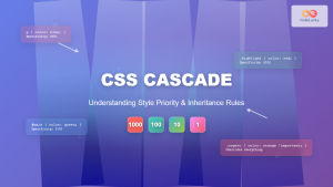
CSS Cascade: Understanding Style Priority and Inheritance Rules
The CSS cascade is the fundamental mechanism that determines which styles are applied to HTML elements when multiple CSS rules...
CSS Introduction: Complete Guide to Styling HTML with Cascading Style Sheets
CSS (Cascading Style Sheets) is the cornerstone technology that transforms plain HTML documents into visually stunning, professional websites. While HTML...
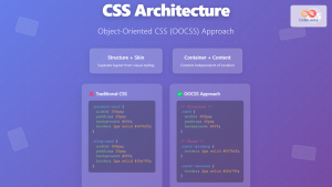
CSS Architecture: OOCSS Object-Oriented CSS – Complete Guide with Examples
Object-Oriented CSS (OOCSS) is a revolutionary methodology that transforms how developers approach CSS architecture. By applying object-oriented programming principles to...
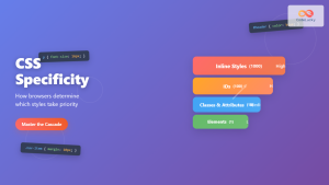
CSS Specificity: Complete Guide to Style Priority and Cascade Resolution
CSS specificity is one of the most crucial concepts every web developer must master. It determines which styles the browser...

CSS Syntax: Complete Guide to Rules, Selectors, Properties and Values
CSS (Cascading Style Sheets) is the cornerstone of web design, transforming plain HTML into visually stunning websites. Understanding CSS syntax...

CSS File Organization: Master Folder Structure and Import Strategies for Scalable Projects
Managing CSS files in large projects can quickly become overwhelming without proper organization. Professional developers rely on structured approaches to...
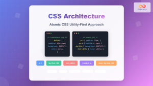
CSS Architecture: Atomic CSS Utility-First Approach – Complete Guide to Modern CSS Design
CSS architecture has evolved significantly over the years, and one of the most revolutionary approaches is Atomic CSS with a...
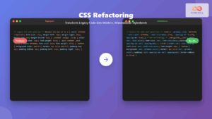
CSS Refactoring: Complete Guide to Modernizing Legacy Stylesheets
Legacy CSS codebases can become a significant burden on development teams, slowing down feature delivery and creating maintenance nightmares. CSS...
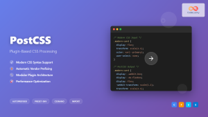
CSS PostCSS: Complete Guide to Modern Plugin-Based CSS Processing
PostCSS has revolutionized how developers write and process CSS by providing a powerful, plugin-based ecosystem that transforms your stylesheets with...
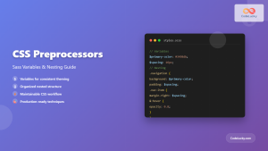
CSS Preprocessors: Sass Variables and Nesting – Complete Guide for Modern Web Development
CSS preprocessors have revolutionized how developers write and maintain stylesheets. Among the most popular preprocessors, Sass (Syntactically Awesome StyleSheets) stands...

HTML Styles: Mastering Inline, Internal, and External CSS
Introduction Have you ever looked at a website and wondered how all the elements are so beautifully arranged and styled?...


