
CSS isolation Property: Isolating Styles for Reusable Components
The CSS isolation property controls whether an element must create a new stacking context. This is particularly useful for encapsulating styles within components, ensuring they don’t interfere with styles outside the component or vice versa. This guide explores the isolation property, its values, and practical examples to enhance your understanding.
What is CSS Isolation?
CSS isolation is a mechanism that helps in creating independent and encapsulated components within a web application. By creating a new stacking context, the isolation property can prevent styles from bleeding in or out of a component, making it more reusable and predictable.
Purpose of CSS isolation
The primary purpose of the CSS isolation property is to:
- Encapsulate styles within a component.
- Prevent style conflicts between different parts of a web application.
- Enhance the reusability of components by making them independent of external styles.
- Improve predictability of styles by limiting their scope.
Syntax and Values
The isolation property accepts the following values:
isolation: auto | isolate;
| Value | Description |
|---|---|
| `auto` | The element does not create a new stacking context unless one is required by other properties. This is the default value. |
| `isolate` | The element creates a new stacking context. |
Practical Examples
Let’s explore the isolation property with practical examples. Each example includes the necessary HTML and CSS code to demonstrate its usage.
Basic Usage of isolation: isolate
In this example, we’ll create a simple component with isolation: isolate to ensure its styles are encapsulated.
<div class="container-isolation-1">
  <div class="isolated-component-1">
    <h2>Isolated Component</h2>
    <p>This is an isolated component with specific styles.</p>
  </div>
</div>
.container-isolation-1 {
  background-color: #f0f0f0;
  padding: 20px;
}

.isolated-component-1 {
  isolation: isolate;
  background-color: lightblue;
  padding: 10px;
  border: 1px solid blue;
}

.isolated-component-1 h2 {
  color: blue;
}
Isolated Component
This is an isolated component with specific styles.
In this example, the .isolated-component-1 creates a new stacking context, ensuring its background color and text color are isolated from any potential parent styles.
Preventing Style Bleed with isolation
Here, we’ll demonstrate how isolation prevents styles from “bleeding” into a component from its parent.
<div class="parent-isolation-2">
  <h2>Parent Element</h2>
  <p>Styles from the parent should not affect the isolated component.</p>
  <div class="isolated-component-2">
    <h2>Isolated Component</h2>
    <p>This component's styles are isolated.</p>
  </div>
</div>
.parent-isolation-2 {
  background-color: lightcoral;
  color: white;
  padding: 20px;
}

.isolated-component-2 {
  isolation: isolate;
  background-color: lightblue;
  color: black;
  padding: 10px;
  border: 1px solid blue;
}
Parent Element
Styles from the parent should not affect the isolated component.
Isolated Component
This component’s styles are isolated.
The .isolated-component-2 is unaffected by the parent’s color: white style, thanks to isolation: isolate.
Creating Reusable Components
Using isolation, you can create reusable components that maintain their appearance regardless of where they are used in your application.
<div class="container-isolation-3">
  <div class="reusable-component-3">
    <h2>Reusable Component</h2>
    <p>This component can be used anywhere without style conflicts.</p>
    <button>Click Me</button>
  </div>
</div>
.reusable-component-3 {
  isolation: isolate;
  background-color: lightgreen;
  padding: 15px;
  border: 1px solid green;
  border-radius: 5px;
}

.reusable-component-3 h2 {
  color: darkgreen;
}

.reusable-component-3 button {
  background-color: white;
  color: darkgreen;
  border: 1px solid green;
  padding: 8px 12px;
  cursor: pointer;
}
Reusable Component
This component can be used anywhere without style conflicts.
The .reusable-component-3 will always render with its defined styles, regardless of any surrounding styles.
Combination with Other Properties
The isolation property can be combined with other CSS properties to create more complex and encapsulated components.
<div class="container-isolation-4">
  <div class="complex-component-4">
    <h2>Complex Component</h2>
    <p>Combination with other properties.</p>
  </div>
</div>
.container-isolation-4 {
  background-color: #f9f9f9;
  padding: 20px;
}

.complex-component-4 {
  isolation: isolate;
  background-color: #fff;
  border: 1px solid #ccc;
  box-shadow: 0 2px 4px rgba(0, 0, 0, 0.1);
  padding: 15px;
  border-radius: 5px;
}

.complex-component-4 h2 {
  color: #333;
}
Complex Component
Combination with other properties.
Here, isolation ensures the component’s background, border, shadow, and text color are encapsulated, providing a consistent look.
Use Case Example: Creating a Themeable Button Component
Let’s create a practical example that demonstrates how to use the CSS isolation property to build a themeable button component. This example shows how to combine various CSS features to create a reusable and encapsulated UI element.
<div class="theme-container-5">
  <button class="themeable-button-5">Click Me</button>
</div>
/* Themeable button component */
.themeable-button-5 {
  isolation: isolate;
  padding: 10px 20px;
  border: none;
  border-radius: 5px;
  font-size: 16px;
  cursor: pointer;
}

/* Default theme */
.themeable-button-5 {
  background-color: #4CAF50;
  color: white;
}

/* Dark theme */
.theme-container-5.dark-theme .themeable-button-5 {
  background-color: #333;
  color: #fff;
}
// JavaScript to toggle the theme
document.addEventListener('DOMContentLoaded', function() {
  const themeContainer5 = document.querySelector('.theme-container-5');

  themeContainer5.addEventListener('click', function() {
    themeContainer5.classList.toggle('dark-theme');
  });
});
This example demonstrates several important concepts:
- Component Encapsulation: The button’s styles are isolated, preventing interference from other styles on the page.
- Theming: The button can be easily themed by applying different styles based on the parent container’s class.
- Reusability: The button can be used anywhere in the application and will maintain its appearance and functionality.
Browser Support
The isolation property is supported by all modern browsers:
- Chrome
- Firefox
- Safari
- Edge
- Opera
Conclusion
The CSS isolation property is a powerful tool for creating encapsulated and reusable components in web development. By understanding its syntax, values, and practical applications, you can enhance the modularity and maintainability of your projects. Whether you are building complex web applications or simple websites, the isolation property can help you manage styles more effectively and create more predictable and reusable components.
Related Posts
HTML style Property: Element Style
HTML style Property: Element Style The HTML style property allows you to apply inline CSS styles directly to individual HTML...

CSS Containment: Mastering the contain Property for Optimal Web Performance
CSS containment is a powerful performance optimization technique that allows developers to isolate parts of the DOM tree, preventing unnecessary...
CSS display Property: CSS Display
Understanding the CSS display Property: A Comprehensive Guide The display property in CSS is a cornerstone for controlling the layout...
CSS Style visibility Property: CSS Visibility
Understanding the CSS visibility Property The visibility property in CSS controls the visibility of an element without affecting the layout...
CSS Style color Property: CSS Color
Understanding the CSS color Property: A Comprehensive Guide The CSS color property is fundamental for styling web pages. It specifies...
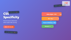
CSS Specificity: Complete Guide to Style Priority and Cascade Resolution
CSS specificity is one of the most crucial concepts every web developer must master. It determines which styles the browser...
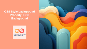
CSS Style background Property: CSS Background
CSS background Property: A Comprehensive Guide to Styling Web Page Backgrounds The CSS background property is a versatile shorthand property...
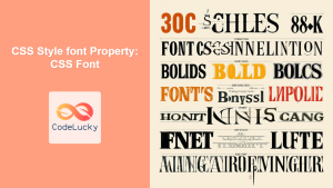
CSS Style font Property: CSS Font
CSS font Property: A Comprehensive Guide The CSS font property is a shorthand property used to set several font-related styles...

HTML DOM Style Object: Accessing Style Elements
HTML DOM Style Object: Accessing and Modifying Styles The HTML DOM style object provides a powerful interface to dynamically access...
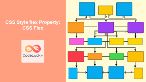
CSS Style flex Property: CSS Flex
Understanding the CSS flex Property: A Comprehensive Guide The CSS flex property is a shorthand property used to set the...
CSS Class Selectors: Master Targeting Elements with Class Attributes
What Are CSS Class Selectors? CSS class selectors are fundamental tools that allow you to target and style HTML elements...
HTML id Property: Element ID
HTML id Property: Element ID The id property in HTML is a global attribute used to specify a unique identifier...


