Burndown charts are one of the most powerful visual tools in Agile project management, providing teams with real-time insights into sprint progress and work completion rates. Whether you’re a Scrum Master, Product Owner, or development team member, understanding how to create, read, and optimize burndown charts can significantly improve your team’s performance and project delivery success.
What is a Burndown Chart?
A burndown chart is a graphical representation that displays the amount of work remaining in a sprint or project over time. The chart features a downward-trending line that ideally reaches zero by the end of the sprint, indicating all planned work has been completed.
The chart consists of two main components:
- X-axis (Horizontal): Represents time, typically showing sprint days or weeks
- Y-axis (Vertical): Represents the amount of work remaining, measured in story points, hours, or tasks
The burndown chart includes two critical lines:
- Ideal Burndown Line: A straight diagonal line showing the expected progress if work is completed at a consistent rate
- Actual Burndown Line: The real progress line that fluctuates based on actual work completion
Types of Burndown Charts
Sprint Burndown Chart
The most common type, sprint burndown charts track progress within a single sprint iteration. These charts help teams monitor daily progress and make necessary adjustments to meet sprint goals. They typically span 1-4 weeks depending on your sprint duration.
Release Burndown Chart
Release burndown charts provide a broader view, tracking progress across multiple sprints toward a specific release or milestone. These charts help stakeholders understand overall project trajectory and make strategic decisions about scope and timeline adjustments.
Epic Burndown Chart
Epic burndown charts focus on larger user stories or features that span multiple sprints. They’re particularly useful for tracking complex features that require sustained effort across several iterations.
How to Create an Effective Burndown Chart
Step 1: Define Your Metrics
Choose the appropriate unit of measurement for your team’s work. Common options include:
- Story Points: Relative estimation units that account for complexity, effort, and uncertainty
- Task Hours: Direct time estimates for individual tasks
- Number of Tasks: Simple count of remaining work items
Story points are generally preferred as they provide more stable measurements that aren’t affected by individual productivity variations.
Step 2: Calculate the Ideal Burndown Line
The ideal burndown line represents perfect progress where work is completed at a consistent rate throughout the sprint. Calculate this by dividing your total sprint commitment by the number of working days in your sprint.
For example, if you have 100 story points to complete in a 10-day sprint, the ideal burndown would be 10 points per day.
Step 3: Track Daily Progress
Update your burndown chart daily, preferably during your daily standup meetings. Record the remaining work based on what your team has actually completed, not what they’ve worked on.
Key tracking principles:
- Only count work as “done” when it meets your Definition of Done
- Update charts based on completed work, not work in progress
- Be consistent with your measurement timing (e.g., always update at end of day)
Step 4: Analyze and Adjust
Use the chart data to identify trends and make informed decisions about sprint adjustments, scope changes, or process improvements.
Reading and Interpreting Burndown Charts
Healthy Burndown Patterns
Steady Decline: The actual line follows closely to the ideal line, indicating consistent progress and good sprint planning.
Early Completion: The actual line drops below the ideal line and reaches zero before sprint end, suggesting the team may have undercommitted or worked exceptionally efficiently.
Warning Signs and Red Flags
Flat Line: No progress for extended periods indicates blockers, scope creep, or other impediments that need immediate attention.
Scope Creep: The line moves upward, showing work has been added mid-sprint. This requires careful evaluation of priorities and potentially removing other work items.
Late Start: Minimal progress in early sprint days followed by steep decline indicates poor work distribution or initial blockers.
Stair-Step Pattern: Dramatic drops followed by flat periods suggest work is being completed in large batches rather than continuously, which can hide problems until late in the sprint.
Best Practices for Burndown Chart Success
Team Involvement
Make burndown charts a team responsibility, not just a Scrum Master task. Encourage all team members to understand and contribute to chart accuracy. During daily standups, briefly review the chart and discuss any concerning trends.
Focus on Trends, Not Daily Fluctuations
Don’t overreact to single-day variations. Instead, look for multi-day trends that indicate systematic issues or improvements. A single flat day might be normal, but three consecutive flat days warrant investigation.
Combine with Other Metrics
Use burndown charts alongside other Agile metrics like velocity, cycle time, and cumulative flow diagrams for a comprehensive view of team performance. No single metric tells the complete story.
Regular Retrospective Analysis
During sprint retrospectives, review burndown chart patterns to identify process improvements. Ask questions like:
- What caused the flat periods in our burndown?
- Why did we see scope creep this sprint?
- How can we achieve more consistent daily progress?
Common Burndown Chart Mistakes to Avoid
Measuring Work Started vs. Work Completed
Only update your burndown when work is truly completed according to your Definition of Done. Measuring work in progress creates false confidence and hides real bottlenecks.
Adding Work Mid-Sprint Without Transparency
When scope changes occur, make them visible on the chart and discuss the impact with stakeholders. Hidden scope creep undermines sprint predictability and team morale.
Ignoring External Dependencies
Account for external dependencies in your burndown planning. If your team frequently waits for external approvals or resources, factor this into your ideal burndown calculations.
Using Burndown Charts as Performance Evaluation Tools
Burndown charts should inform process improvements, not individual performance reviews. Using them punitively will encourage gaming the metrics rather than honest reporting.
Tools and Technologies for Burndown Charts
Popular Agile Management Tools
Most modern Agile project management tools automatically generate burndown charts:
- Jira: Offers robust sprint and release burndown reporting with customizable views
- Azure DevOps: Provides comprehensive burndown analytics and trend analysis
- Trello: Basic burndown functionality through power-ups and third-party integrations
- Monday.com: Visual project tracking with burndown chart capabilities
Manual Creation Options
For teams preferring manual tracking, Excel or Google Sheets can create effective burndown charts. This approach offers more customization but requires consistent manual updates.
Advanced Burndown Chart Techniques
Burnup Charts as Complementary Tools
Consider using burnup charts alongside burndown charts. While burndown shows remaining work, burnup charts display completed work over time, making scope changes more visible and providing additional insights into team productivity patterns.
Forecasting and Predictive Analysis
Use historical burndown data to improve future sprint planning. Analyze patterns across multiple sprints to identify your team’s natural rhythm and adjust commitments accordingly.
Multi-Team Coordination
For large projects involving multiple teams, create program-level burndown charts that aggregate data from individual team charts. This provides stakeholders with enterprise visibility while maintaining team autonomy.
Troubleshooting Common Burndown Chart Issues
Addressing Scope Creep
When your burndown line moves upward due to added work, immediately assess the impact on sprint goals. Options include:
- Removing equivalent work to maintain sprint commitment
- Accepting reduced sprint completion with stakeholder approval
- Moving the new work to the product backlog for future sprints
Handling Blocked Work
When work becomes blocked, your burndown will flatten. Address this by:
- Clearly marking blocked items in your tracking system
- Escalating blockers immediately to appropriate stakeholders
- Identifying alternative work that can progress while resolving blockers
Managing Late Sprint Discoveries
When teams discover additional complexity late in the sprint, causing dramatic burndown changes:
- Re-estimate remaining work honestly
- Discuss scope adjustments with the Product Owner
- Document lessons learned for future sprint planning
Measuring Success with Burndown Charts
Key Performance Indicators
Track these metrics over multiple sprints to measure burndown chart effectiveness:
- Sprint Completion Rate: Percentage of committed work completed each sprint
- Prediction Accuracy: How closely actual burndown matches ideal burndown
- Scope Stability: Frequency and magnitude of mid-sprint scope changes
- Impediment Resolution Time: How quickly flat-line periods are resolved
Continuous Improvement
Use burndown chart data to drive continuous improvement initiatives:
- Identify recurring patterns that indicate process weaknesses
- Experiment with different estimation techniques to improve accuracy
- Adjust sprint lengths based on completion patterns
- Refine Definition of Done based on completion inconsistencies
Conclusion
Burndown charts are essential tools for successful Agile project management, providing visual transparency into sprint progress and enabling data-driven decision making. When implemented correctly, they help teams maintain focus, identify issues early, and continuously improve their delivery processes.
Remember that burndown charts are most effective when used as collaborative tools that promote team transparency and continuous improvement rather than individual performance measurement. By following the best practices outlined in this guide and avoiding common pitfalls, your team can leverage burndown charts to achieve more predictable and successful sprint outcomes.
Start implementing these techniques in your next sprint and observe how clear visual progress tracking transforms your team’s ability to deliver consistent, high-quality results. The key to burndown chart success lies not just in creating the charts, but in actively using them to facilitate better communication, planning, and delivery within your Agile development process.
Related Posts
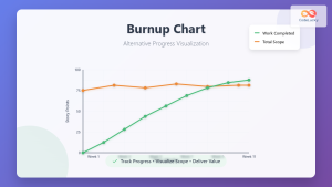
Burnup Chart: Complete Guide to Alternative Progress Visualization in Agile Projects
While burndown charts have dominated Agile project tracking for years, burnup charts offer a superior alternative for visualizing project progress...
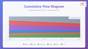
Cumulative Flow Diagram: Master Visual Flow Analysis for Agile Teams
A Cumulative Flow Diagram (CFD) serves as one of the most powerful visual tools in Agile project management, providing teams...
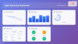
Agile Reporting: Complete Guide to Real-Time Dashboards and Performance Insights
Agile reporting transforms raw project data into actionable insights that drive successful software delivery. Unlike traditional waterfall reporting that focuses...
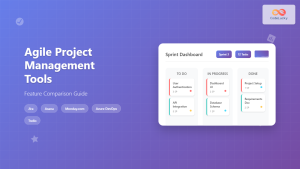
Agile Project Management Tools: Complete Feature Comparison Guide 2025
Selecting the right Agile project management tool can make or break your team's productivity and project success. With dozens of...
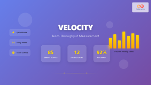
Velocity: Team Throughput Measurement in Agile Development
Velocity stands as one of the most critical metrics in Agile development, serving as the heartbeat of team performance measurement....
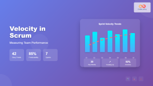
Velocity in Scrum: The Complete Guide to Measuring and Improving Team Performance
Velocity is one of the most crucial metrics in Scrum that helps teams measure their performance and plan future sprints...
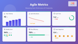
Agile Metrics: Complete Guide to Measuring Team Performance and Productivity
Measuring team performance in agile environments requires a strategic approach that goes beyond traditional project management metrics. Agile metrics provide...
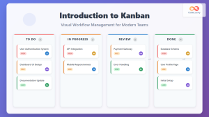
Introduction to Kanban: Visual Workflow Management for Modern Teams
In today's fast-paced business environment, teams need efficient methods to manage work, visualize progress, and optimize productivity. Kanban, a visual...
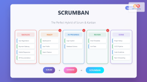
Scrumban: The Ultimate Hybrid Methodology for Agile Teams
What is Scrumban? Scrumban is a hybrid agile methodology that combines the structured framework of Scrum with the visual workflow...
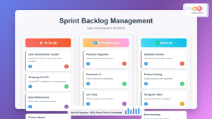
Sprint Backlog: Complete Guide to Creation and Management in Agile Development
The sprint backlog serves as the heart of Agile development, acting as a dynamic roadmap that guides development teams through...

JavaScript Plotly: Creating Interactive Charts and Plots
In the world of data visualization, JavaScript Plotly stands out as a powerful and versatile library for creating stunning, interactive...

Sprint Planning: Complete Guide and Best Practices for Agile Teams
Sprint planning forms the cornerstone of successful agile development, serving as the critical bridge between product vision and executable work....