The transform-origin property is a powerful CSS feature that determines the reference point for element transformations. Whether you’re rotating, scaling, or skewing elements, understanding how to control the transformation origin is crucial for creating precise and visually appealing effects.
What is CSS Transform-Origin?
The transform-origin property sets the point around which CSS transformations are applied. By default, transformations occur from the center of an element (50% 50%), but you can change this to any point within or outside the element’s boundaries.
Basic Syntax
transform-origin: x-axis y-axis z-axis;

/* Common values */
transform-origin: center;           /* 50% 50% */
transform-origin: top left;         /* 0% 0% */
transform-origin: 25% 75%;          /* percentage values */
transform-origin: 10px 20px;        /* pixel values */
Transform-Origin Values and Positioning
The transform-origin property accepts various value types to define the transformation reference point:
Keyword Values
- Horizontal:
left,center,right - Vertical:
top,center,bottom - Z-axis: Used for 3D transformations
Percentage Values
Percentages are relative to the element’s dimensions:
0% 0%= top-left corner50% 50%= center (default)100% 100%= bottom-right corner
Length Values
Absolute units like px, em, or rem position the origin from the top-left corner.
transform-origin: left 25% or transform-origin: 10px center.
Practical Examples with Visual Demonstrations
Example 1: Rotation with Different Origins
Let’s see how transform-origin affects rotation transformations:
Default Origin (center)
transform-origin: center;
Top-Left Origin
transform-origin: top left;
Bottom-Right Origin
transform-origin: bottom right;
.rotate-center {
  transform-origin: center;
  transform: rotate(45deg);
}

.rotate-top-left {
  transform-origin: top left;
  transform: rotate(45deg);
}

.rotate-bottom-right {
  transform-origin: bottom right;
  transform: rotate(45deg);
}
Example 2: Scaling with Custom Origins
Transform-origin significantly impacts scaling transformations:
Scale from Center
Hover to scale
Scale from Top-Left
Hover to scale
Scale from Custom Point
Hover to scale
Advanced Transform-Origin Techniques
Combining Multiple Transformations
When applying multiple transformations, the transform-origin affects all of them:
.complex-transform {
  transform-origin: top right;
  transform: rotate(30deg) scale(1.2) translateX(20px);
  transition: transform 0.5s ease;
}

.complex-transform:hover {
  transform: rotate(60deg) scale(1.5) translateX(40px);
}
Interactive Demo: Complex Transformation
Transform origin: top right
3D Transformations and Z-Axis Origin
For 3D transformations, you can specify a third value for the Z-axis:
.card-3d {
  transform-origin: center center -50px;
  transform-style: preserve-3d;
  transition: transform 0.6s ease;
}

.card-3d:hover {
  transform: rotateY(180deg);
}
Common Use Cases and Best Practices
1. Card Flip Animations
Perfect for creating card flip effects where you want the rotation to occur along a specific edge:
Hover to flip the card
2. Menu Toggle Animations
Transform-origin is essential for hamburger menu animations:
Click to toggle hamburger menu
3. Image Zoom Effects
Control where image scaling originates for better user experience:
.image-zoom-top-left {
  transform-origin: top left;
  transition: transform 0.3s ease;
}

.image-zoom-top-left:hover {
  transform: scale(1.1);
}
Browser Support and Performance
The transform-origin property enjoys excellent browser support across all modern browsers. It’s supported in:
- Chrome 4+
- Firefox 3.5+
- Safari 3.1+
- Internet Explorer 9+
- Opera 10.5+
transform-origin are hardware-accelerated in most browsers, making them ideal for smooth animations.
Common Pitfalls and Troubleshooting
1. Forgetting the Transform Property
Remember that transform-origin only affects elements that have a transform property applied.
2. Z-index Issues with 3D Transforms
When using 3D transformations, be mindful of z-index stacking contexts.
3. Percentage vs. Pixel Values
Understand the difference: percentages are relative to the element’s size, while pixels are absolute positions.
transform-origin without any transform property will have no visible effect.
Interactive Transform-Origin Playground
Experiment with Transform-Origin
transform: rotate(45deg);
Conclusion
Mastering transform-origin opens up countless possibilities for creating sophisticated animations and transformations. By understanding how to control the reference point for transformations, you can create more intuitive and visually appealing effects that enhance user experience.
Key takeaways:
- Transform-origin determines where transformations originate from
- You can use keywords, percentages, or length values
- It affects all transformation functions (rotate, scale, skew, etc.)
- Essential for creating professional animations and interactive elements
- Works seamlessly with CSS transitions and animations
Start experimenting with different transform-origin values in your projects to see how they can improve your CSS animations and create more engaging user interfaces.
Related Posts
CSS Style transformOrigin Property: CSS Transform Origin
CSS transformOrigin Property: Mastering Element Transformation Origins The transformOrigin property in CSS is a fundamental tool for controlling how transformations...
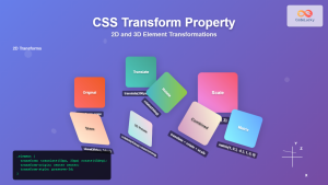
CSS Transform Property: Complete Guide to 2D and 3D Element Transformations
The CSS transform property is one of the most powerful tools in modern web development, allowing developers to manipulate HTML...
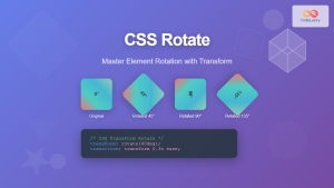
CSS Rotate: Complete Guide to Rotating Elements with Transform
CSS rotation is one of the most powerful and visually striking transformation effects available to web developers. The transform: rotate()...
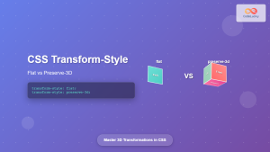
CSS Transform-Style: Complete Guide to Flat vs Preserve-3d for 3D Transformations
The CSS transform-style property is a powerful tool that controls how child elements are rendered in 3D space when their...
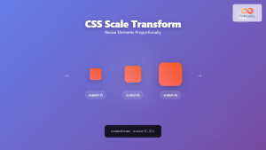
CSS Scale: Master Element Resizing with Transform Property
The CSS scale() function is a powerful transformation tool that allows you to resize elements proportionally without affecting the document...
CSS Style transform Property: CSS Transform
CSS transform Property: A Comprehensive Guide The CSS transform property is a powerful tool that allows you to modify the...

CSS Skew: Distorting Elements Along Axes for Dynamic Visual Effects
CSS skew transforms allow you to distort elements by slanting them along the X and Y axes, creating dynamic visual...
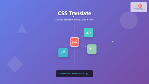
CSS Translate: Complete Guide to Moving Elements Along X and Y Axes
The CSS translate() function is one of the most powerful and versatile tools for moving elements on a webpage. Unlike...
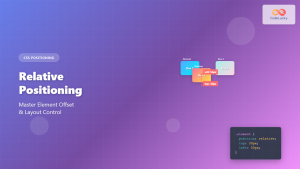
CSS Relative Positioning: Master Element Offset and Layout Control
Understanding CSS Relative Positioning CSS relative positioning is a fundamental layout technique that allows you to move elements from their...
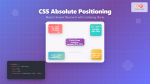
CSS Absolute Positioning: Master Element Placement with Containing Blocks
CSS absolute positioning is one of the most powerful tools for creating precise layouts and complex designs. Understanding how absolutely...
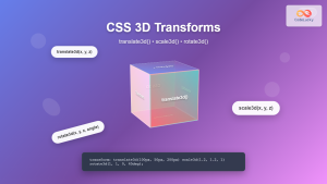
CSS 3D Transforms: Complete Guide to Translate3d, Scale3d, and Rotate3d Functions
CSS 3D transforms revolutionize how we create interactive and visually stunning web interfaces. By utilizing the power of translate3d(), scale3d(),...

CSS Style backgroundOrigin Property: CSS Background Origin
Understanding the background-origin Property in CSS The background-origin property in CSS specifies where the background image should be positioned within...


