
CSS rotation is one of the most powerful and visually striking transformation effects available to web developers. The transform: rotate() property allows you to rotate HTML elements around their center point or a custom pivot, creating dynamic and engaging user interfaces.
In this comprehensive guide, you’ll learn everything about CSS rotation, from basic syntax to advanced 3D transformations, with interactive examples and real-world applications.
Understanding CSS Transform Rotate
The CSS rotate() function is part of the transform property family. It rotates an element clockwise or counterclockwise around a fixed point, typically the element’s center. The rotation is measured in degrees (deg), radians (rad), gradians (grad), or turns.
Basic Syntax
/* Basic rotation syntax */
transform: rotate(angle);

/* Examples */
transform: rotate(45deg);     /* 45 degrees clockwise */
transform: rotate(-90deg);    /* 90 degrees counterclockwise */
transform: rotate(0.5turn);   /* Half turn (180 degrees) */
transform: rotate(1.57rad);   /* ~90 degrees in radians */
Basic CSS Rotate Examples
Let’s start with simple rotation examples to understand how the property works:
Example 1: Simple 45-Degree Rotation
Original Element
Rotated 45°
.rotate-45 {
  transform: rotate(45deg);
  transition: transform 0.3s ease;
}
Example 2: Multiple Rotation Values
0°
45°
90°
180°
270°
360°
.rotate-0   { transform: rotate(0deg); }
.rotate-45  { transform: rotate(45deg); }
.rotate-90  { transform: rotate(90deg); }
.rotate-180 { transform: rotate(180deg); }
.rotate-270 { transform: rotate(270deg); }
.rotate-360 { transform: rotate(360deg); }
Interactive Rotation Demo
Try It Yourself: Interactive Rotation Control
/* Interactive rotation with JavaScript */
.rotatable {
  transition: transform 0.3s ease;
  cursor: pointer;
}

.rotatable:hover {
  transform: rotate(10deg);
}
Transform Origin: Changing the Rotation Point
By default, elements rotate around their center point. However, you can change this behavior using the transform-origin property to rotate around different pivot points.
Transform Origin Examples
Center (default)
transform-origin: center;
Top Left
transform-origin: top left;
Bottom Right
transform-origin: bottom right;
/* Different transform origins */
.rotate-center      { transform-origin: center; }
.rotate-top-left    { transform-origin: top left; }
.rotate-top-right   { transform-origin: top right; }
.rotate-bottom-left { transform-origin: bottom left; }
.rotate-bottom-right{ transform-origin: bottom right; }

/* Custom coordinates */
.rotate-custom { transform-origin: 75% 25%; }
3D Rotations with rotateX, rotateY, and rotateZ
CSS also supports 3D rotations along different axes, creating more dynamic and dimensional effects:
3D Rotation Examples
rotateX(45deg)
rotateY(45deg)
rotateZ(45deg)
Combined
/* 3D rotation functions */
.rotate-x { transform: rotateX(45deg); }
.rotate-y { transform: rotateY(45deg); }
.rotate-z { transform: rotateZ(45deg); }

/* Combined 3D rotations */
.rotate-3d {
  transform: rotateX(20deg) rotateY(30deg) rotateZ(15deg);
  perspective: 1000px;
}
CSS Rotation Animations
Combining CSS rotate with animations creates smooth, continuous rotation effects perfect for loading spinners, decorative elements, or interactive components.
Rotation Animation Examples
Continuous Spin
Loading Spinner
Wobble Effect
Pulse Rotate
/* Continuous rotation animation */
@keyframes spin {
  0% { transform: rotate(0deg); }
  100% { transform: rotate(360deg); }
}

.loading-spinner {
  animation: spin 2s linear infinite;
}

/* Wobble animation */
@keyframes wobble {
  0%, 100% { transform: rotate(0deg); }
  25% { transform: rotate(15deg); }
  75% { transform: rotate(-15deg); }
}

.wobble-element {
  animation: wobble 2s ease-in-out infinite;
}
Practical Applications and Use Cases
CSS rotation has numerous practical applications in modern web development:
Real-World Examples
Navigation Menu Icon
Click to see hamburger animation
Card Flip Effect
Click to flip the card
Arrow Indicators
Click arrows to rotate them
Performance Considerations and Best Practices
While CSS rotations are generally performant, following best practices ensures smooth animations and optimal user experience:
✅ Best Practices
- Use transform instead of changing element properties: Transforms are hardware-accelerated and don’t trigger layout recalculations.
- Add transition property: Smooth transitions improve user experience and perceived performance.
- Optimize animation duration: Keep animations between 200ms-500ms for UI interactions.
- Use transform-origin strategically: Set appropriate pivot points for natural-looking rotations.
- Consider will-change property: For complex animations, hint the browser to optimize rendering.
⚠️ Performance Tips
/* Optimized rotation with hardware acceleration */
.optimized-rotation {
  transform: rotate(45deg);
  transition: transform 0.3s ease-out;
  will-change: transform; /* Use sparingly */
}

/* Avoid animating multiple properties simultaneously */
.avoid-this {
  transition: transform 0.3s, width 0.3s, height 0.3s; /* Heavy */
}

.prefer-this {
  transition: transform 0.3s; /* Lightweight */
}
Browser Compatibility and Fallbacks
CSS transform rotate has excellent browser support across all modern browsers. However, for legacy browser support, consider providing fallbacks:
Browser Support and Fallbacks
/* Modern browsers */
.rotate-element {
  transform: rotate(45deg);
}

/* Legacy Internet Explorer support */
.rotate-element {
  -ms-transform: rotate(45deg);     /* IE 9 */
  -webkit-transform: rotate(45deg); /* Safari/Chrome */
  -moz-transform: rotate(45deg);    /* Firefox */
  -o-transform: rotate(45deg);      /* Opera */
  transform: rotate(45deg);         /* Standard */
}

/* Feature detection with CSS */
@supports (transform: rotate(45deg)) {
  .rotate-element {
    transform: rotate(45deg);
  }
}

@supports not (transform: rotate(45deg)) {
  .rotate-element {
    /* Fallback styles for unsupported browsers */
    position: relative;
    /* Alternative styling */
  }
}
Advanced Techniques and Creative Applications
Beyond basic rotations, you can combine rotate with other CSS properties for creative effects:
Creative Rotation Effects
Rotating Border
Morphing Shape
Orbital Motion
Related Posts
CSS Style transformOrigin Property: CSS Transform Origin
CSS transformOrigin Property: Mastering Element Transformation Origins The transformOrigin property in CSS is a fundamental tool for controlling how transformations...
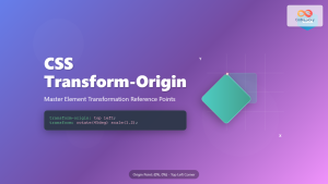
CSS Transform-Origin: Master Element Transformation Reference Points
The transform-origin property is a powerful CSS feature that determines the reference point for element transformations. Whether you're rotating, scaling,...
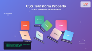
CSS Transform Property: Complete Guide to 2D and 3D Element Transformations
The CSS transform property is one of the most powerful tools in modern web development, allowing developers to manipulate HTML...
CSS Style transform Property: CSS Transform
CSS transform Property: A Comprehensive Guide The CSS transform property is a powerful tool that allows you to modify the...

CSS Skew: Distorting Elements Along Axes for Dynamic Visual Effects
CSS skew transforms allow you to distort elements by slanting them along the X and Y axes, creating dynamic visual...

HTML Canvas rotate() Method: Rotating the Canvas
HTML Canvas rotate() Method: Rotating the Canvas The rotate() method of the HTML Canvas API is a powerful tool for...

CSS Hue-Rotate Filter: Complete Guide to Dynamic Color Shifting
The CSS hue-rotate filter is a powerful tool that allows web developers to dynamically shift the hue values of any...
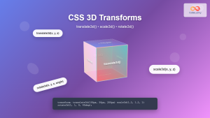
CSS 3D Transforms: Complete Guide to Translate3d, Scale3d, and Rotate3d Functions
CSS 3D transforms revolutionize how we create interactive and visually stunning web interfaces. By utilizing the power of translate3d(), scale3d(),...
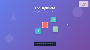
CSS Translate: Complete Guide to Moving Elements Along X and Y Axes
The CSS translate() function is one of the most powerful and versatile tools for moving elements on a webpage. Unlike...
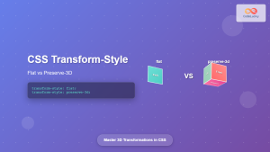
CSS Transform-Style: Complete Guide to Flat vs Preserve-3d for 3D Transformations
The CSS transform-style property is a powerful tool that controls how child elements are rendered in 3D space when their...
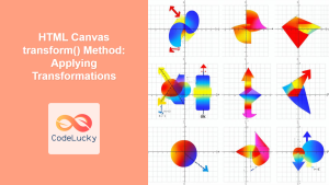
HTML Canvas transform() Method: Applying Transformations
HTML Canvas transform() Method: Applying Transformations The transform() method in the HTML Canvas API is a powerful tool that allows...
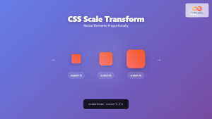
CSS Scale: Master Element Resizing with Transform Property
The CSS scale() function is a powerful transformation tool that allows you to resize elements proportionally without affecting the document...


