
CSS absolute positioning is one of the most powerful tools for creating precise layouts and complex designs. Understanding how absolutely positioned elements interact with their containing blocks is crucial for modern web development. This comprehensive guide will teach you everything you need to know about CSS absolute positioning and containing blocks.
What is CSS Absolute Positioning?
CSS absolute positioning removes an element from the normal document flow and positions it relative to its nearest positioned ancestor (containing block). When you apply position: absolute to an element, it becomes positioned absolutely within its containing block, allowing you to place it exactly where you want using the top, right, bottom, and left properties.
Key Characteristics of Absolute Positioning:
- Removed from document flow: Other elements behave as if the absolutely positioned element doesn’t exist
- Positioned relative to containing block: Uses the nearest positioned ancestor as reference
- Z-index aware: Can be layered above or below other elements
- Size flexibility: Can shrink to content or stretch to fill space
Understanding the Containing Block
The containing block is the rectangular area that serves as the reference point for an absolutely positioned element. Understanding which element becomes the containing block is essential for precise positioning.
How the Containing Block is Determined
For absolutely positioned elements, the containing block is determined by the position property of ancestor elements:
- Nearest positioned ancestor: The closest ancestor with
position: relative,absolute,fixed, orsticky - Initial containing block: If no positioned ancestor exists, the initial containing block (usually the viewport) is used
💡 Pro Tip: Use position: relative on parent elements to create a positioning context without affecting their layout position.
Basic Absolute Positioning Example
Let’s start with a simple example to understand the fundamentals:
top: 20px; left: 20px;
bottom: 20px; right: 20px;
Perfect center positioning
.container {
  position: relative;
  height: 300px;
  background: #f8f9fa;
  border: 2px solid #6c757d;
}

.element-1 {
  position: absolute;
  top: 20px;
  left: 20px;
  background: #007bff;
  color: white;
  padding: 15px;
}

.element-2 {
  position: absolute;
  bottom: 20px;
  right: 20px;
  background: #28a745;
  color: white;
  padding: 15px;
}

.centered-element {
  position: absolute;
  top: 50%;
  left: 50%;
  transform: translate(-50%, -50%);
  background: #dc3545;
  color: white;
  padding: 15px;
}
Positioning Properties in Detail
Absolute positioning uses four main properties to determine element placement:
Top, Right, Bottom, Left Properties
top
Distance from the top edge of the containing block
top: 10px; /* 10px from top */
right
Distance from the right edge of the containing block
right: 20px; /* 20px from right */
bottom
Distance from the bottom edge of the containing block
bottom: 15px; /* 15px from bottom */
left
Distance from the left edge of the containing block
left: 25px; /* 25px from left */
Interactive Positioning Demo
Experiment with different positioning values using this interactive demo:
20px
20px
Common Positioning Patterns
1. Corner Positioning
Positioning elements in specific corners of their containing block:
/* Corner positioning examples */
.top-left { top: 10px; left: 10px; }
.top-right { top: 10px; right: 10px; }
.bottom-left { bottom: 10px; left: 10px; }
.bottom-right { bottom: 10px; right: 10px; }
2. Perfect Centering
Multiple techniques for centering absolutely positioned elements:
Transform Method
.center-transform {
  top: 50%;
  left: 50%;
  transform: translate(-50%, -50%);
}
Margin Auto Method
.center-margin {
  top: 0; left: 0;
  right: 0; bottom: 0;
  width: 120px; height: 40px;
  margin: auto;
}
3. Stretching Elements
Making elements stretch to fill available space:
.stretch-fill {
  position: absolute;
  top: 20px;
  left: 20px;
  right: 20px;
  bottom: 20px;
  /* Element will stretch to fill the space with 20px margin on all sides */
}
Z-Index and Stacking Context
Absolutely positioned elements participate in stacking contexts, allowing you to control their layering with the z-index property:
.element-1 { z-index: 1; } /* Bottom layer */
.element-2 { z-index: 3; } /* Top layer */
.element-3 { z-index: 2; } /* Middle layer */
Practical Use Cases
1. Modal Overlays
2. Tooltip Positioning
3. Navigation Dropdowns
Common Pitfalls and Solutions
⚠️ Common Mistakes
- Forgetting to set positioned parent: Without a positioned ancestor, elements position relative to the viewport
- Overlapping content: Absolutely positioned elements don’t affect layout flow
- Accessibility issues: Screen readers may have trouble with positioned content
- Responsive design challenges: Fixed pixel values don’t scale well
✅ Best Practices
- Use relative positioning for containers: Create predictable positioning contexts
- Consider content flow: Reserve space or use overlays appropriately
- Test across devices: Ensure responsive behavior with percentage values
- Maintain accessibility: Ensure keyboard navigation and screen reader support
Responsive Absolute Positioning
Make absolutely positioned elements responsive using percentage values and media queries:
/* Responsive positioning with percentages */
.responsive-element {
  position: absolute;
  top: 10%;
  left: 10%;
  width: 35%;
  height: 35%;
}

/* Media query adjustments */
@media (max-width: 768px) {
  .responsive-element {
    top: 5%;
    left: 5%;
    width: 90%;
    height: 40%;
  }
}
Performance Considerations
Absolutely positioned elements can affect performance, especially when animated. Here are optimization tips:
⚡ Performance Tips
- Use
transformfor animations instead of changingtop/left - Apply
will-changeproperty for frequently animated elements - Use
containproperty to limit layout recalculation
🎯 Animation Best Practices
- Animate
transformandopacityonly - Use CSS transitions over JavaScript animations
- Leverage GPU acceleration with
transform3d()
Browser Support and Compatibility
CSS absolute positioning has excellent browser support across all modern browsers. Here’s what you need to know:
Chrome
Full support since v1
Firefox
Full support since v1
Safari
Full support since v1
Edge
Full support since v12
Conclusion
CSS absolute positioning with containing blocks is a fundamental technique for creating sophisticated layouts and interactive elements. By understanding how containing blocks work and mastering the positioning properties, you can create pixel-perfect designs that work across all devices and browsers.
Remember these key points:
- Always establish a positioning context with
position: relativeon parent elements - Use percentage values for responsive designs
- Consider the document flow and accessibility implications
- Optimize performance with
transformfor animations - Test across different screen sizes and devices
With practice and understanding of these concepts, you’ll be able to create complex layouts, interactive components, and engaging user interfaces that enhance the user experience on your websites.
Related Posts
CSS Relative Positioning: Master Element Offset and Layout Control
Understanding CSS Relative Positioning CSS relative positioning is a fundamental layout technique that allows you to move elements from their...
CSS Top, Right, Bottom, Left: Complete Guide to Positioning Offset Properties
CSS positioning offset properties—top, right, bottom, and left—are fundamental tools for precisely controlling element placement on web pages. These properties...
CSS Static Positioning: Understanding Default Document Flow and Layout Fundamentals
CSS positioning is one of the fundamental concepts every web developer must master. Among the various positioning methods available, static...
CSS Position Property: Complete Guide to Static, Relative, Absolute, Fixed & Sticky Positioning
The CSS position property is one of the most powerful tools for controlling element layout and creating sophisticated web designs....
CSS Text-Align: Complete Guide to Left, Right, Center and Justify Text Alignment
Text alignment is a fundamental aspect of web design that significantly impacts readability and visual hierarchy. The CSS text-align property...
CSS Style left Property: CSS Left
CSS left Property: A Comprehensive Guide The CSS left property is a fundamental tool for web developers, enabling precise horizontal...

CSS Style right Property: CSS Right
Understanding the CSS right Property The CSS right property plays a crucial role in positioning elements within a web page....
CSS bottom Property: CSS Bottom
Understanding the CSS bottom Property The CSS bottom property is a fundamental tool for controlling the vertical positioning of elements...
CSS marginBottom Property: CSS Margin Bottom
Understanding the CSS margin-bottom Property The margin-bottom property in CSS defines the space below an element. This margin is added...
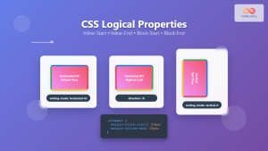
CSS Logical Properties: Master Inline-Start, Inline-End, Block-Start, Block-End for Modern Web Design
CSS logical properties revolutionize how we approach layout and spacing in modern web development. Unlike traditional physical properties that rely...

CSS position Property: Mastering Layouts in CSS
Understanding the CSS position Property: A Comprehensive Guide The position property in CSS is a fundamental tool for controlling the...
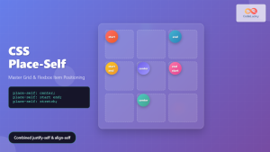
CSS Place-Self: Master Grid and Flexbox Item Positioning with One Property
The CSS place-self property is a powerful shorthand that combines justify-self and align-self into a single declaration, making it easier...


