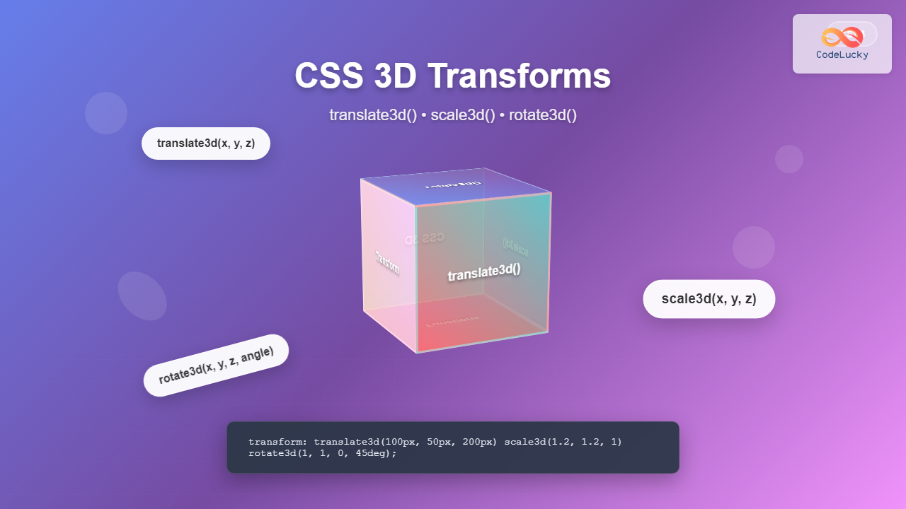
CSS 3D transforms revolutionize how we create interactive and visually stunning web interfaces. By utilizing the power of translate3d(), scale3d(), and rotate3d() functions, developers can craft immersive three-dimensional experiences directly in the browser without requiring external libraries or plugins.
Understanding CSS 3D Transform Fundamentals
CSS 3D transforms extend the capabilities of 2D transforms by adding depth perception through the Z-axis. Unlike traditional 2D transforms that operate on X and Y coordinates, 3D transforms introduce a third dimension, enabling elements to move, rotate, and scale in three-dimensional space.
The key to 3D transforms lies in establishing a 3D rendering context using the transform-style: preserve-3d property and defining perspective with the perspective property. These foundational properties create the illusion of depth and enable true 3D transformations.
Pro Tip: Always set perspective on the parent container and transform-style: preserve-3d to maintain 3D context across nested elements.
The translate3d() Function: Moving in 3D Space
The translate3d() function moves elements along the X, Y, and Z axes simultaneously. Its syntax follows the pattern translate3d(x, y, z), where each parameter represents the distance to move along its respective axis.
Syntax and Parameters
transform: translate3d(x, y, z);

/* Examples */
transform: translate3d(50px, 100px, 200px);
transform: translate3d(-20px, 0, 150px);
transform: translate3d(10%, 50px, -100px);
Interactive translate3d() Example
Click the cube to see translate3d() in action
Practical translate3d() Applications
The translate3d() function excels in creating layered interfaces, parallax effects, and smooth animations. By manipulating the Z-axis, you can bring elements closer to or further from the viewer, creating depth hierarchy in your designs.
.card-stack {
    perspective: 1000px;
}

.card {
    transition: transform 0.3s ease;
}

.card:nth-child(1) { transform: translate3d(0, 0, 0); }
.card:nth-child(2) { transform: translate3d(10px, 10px, -50px); }
.card:nth-child(3) { transform: translate3d(20px, 20px, -100px); }

.card:hover {
    transform: translate3d(0, -20px, 100px);
}
The scale3d() Function: Scaling in Three Dimensions
The scale3d() function resizes elements along all three axes, providing precise control over how objects appear to grow or shrink in 3D space. This function accepts three parameters: scale3d(scaleX, scaleY, scaleZ).
Understanding scale3d() Parameters
- scaleX: Horizontal scaling factor (1 = original size, 2 = double width, 0.5 = half width)
- scaleY: Vertical scaling factor
- scaleZ: Depth scaling factor (affects thickness in 3D space)
/* Basic scale3d() examples */
transform: scale3d(1.5, 1.5, 1.5);  /* Uniform scaling */
transform: scale3d(2, 1, 0.5);      /* Non-uniform scaling */
transform: scale3d(0.8, 1.2, 2);    /* Complex scaling */
Interactive scale3d() Demonstration
Hover to see scale3d() transformation
Advanced scale3d() Techniques
Combining scale3d() with other transform functions creates compelling visual effects. The Z-axis scaling particularly shines when working with layered elements or creating depth illusions.
.button-3d {
    transform: scale3d(1, 1, 1);
    transition: transform 0.2s ease;
}

.button-3d:hover {
    transform: scale3d(1.05, 1.05, 1.5) translate3d(0, -5px, 20px);
}

.button-3d:active {
    transform: scale3d(0.98, 0.98, 0.8) translate3d(0, 2px, -10px);
}
The rotate3d() Function: Three-Dimensional Rotation
The rotate3d() function rotates elements around a custom 3D axis defined by a vector. Its syntax is rotate3d(x, y, z, angle), where x, y, and z define the rotation axis, and angle specifies the rotation amount.
rotate3d() Syntax Breakdown
transform: rotate3d(x, y, z, angle);

/* Rotate around X-axis */
transform: rotate3d(1, 0, 0, 45deg);

/* Rotate around Y-axis */
transform: rotate3d(0, 1, 0, 90deg);

/* Rotate around Z-axis */
transform: rotate3d(0, 0, 1, 180deg);

/* Custom diagonal axis */
transform: rotate3d(1, 1, 0, 45deg);
Interactive rotate3d() Showcase
Click each cube to see different rotate3d() axes
Combining 3D Transform Functions
The true power of CSS 3D transforms emerges when combining multiple functions. You can chain translate3d(), scale3d(), and rotate3d() functions to create complex, multi-dimensional animations.
.complex-transform {
    transform:
        translate3d(100px, 50px, 200px)
        rotate3d(1, 1, 0, 45deg)
        scale3d(1.2, 1.2, 0.8);
}

/* Animation combining all functions */
@keyframes complex3d {
    0% {
        transform: translate3d(0, 0, 0) rotate3d(0, 0, 0, 0) scale3d(1, 1, 1);
    }
    50% {
        transform: translate3d(100px, -50px, 150px) rotate3d(1, 1, 0, 180deg) scale3d(1.5, 1.5, 2);
    }
    100% {
        transform: translate3d(0, 0, 0) rotate3d(1, 1, 0, 360deg) scale3d(1, 1, 1);
    }
}
Advanced 3D Transform Example
Click for combined transform animation
Performance Optimization for 3D Transforms
CSS 3D transforms can be performance-intensive, especially on mobile devices. Implementing proper optimization techniques ensures smooth animations and maintains good user experience across all devices.
Hardware Acceleration
Modern browsers automatically enable hardware acceleration for 3D transforms, but you can explicitly trigger it using the transform3d() hack or will-change property.
/* Force hardware acceleration */
.accelerated {
    transform: translate3d(0, 0, 0); /* GPU trigger */
    will-change: transform; /* Modern approach */
}

/* Remove will-change after animation */
.accelerated.animation-complete {
    will-change: auto;
}
Best Practices for Performance
- Use transform3d() instead of separate functions:
translate3d()is more efficient thantranslateX() translateY() translateZ() - Avoid animating layout properties: Stick to transform and opacity for smooth animations
- Set reasonable perspective values: Very large or small values can impact performance
- Use transform-style: preserve-3d judiciously: Only apply where necessary as it affects rendering performance
Browser Support and Fallbacks
CSS 3D transforms enjoy excellent browser support in modern browsers, but implementing graceful fallbacks ensures compatibility across older browsers.
/* Feature detection with @supports */
@supports (transform: translate3d(0, 0, 0)) {
    .modern-3d {
        transform: translate3d(100px, 50px, 200px) rotate3d(1, 0, 0, 45deg);
    }
}

/* Fallback for older browsers */
@supports not (transform: translate3d(0, 0, 0)) {
    .modern-3d {
        transform: translateX(100px) translateY(50px) rotate(45deg);
    }
}
Real-World Applications and Use Cases
CSS 3D transforms find applications in various modern web design patterns, from subtle interface enhancements to complex interactive experiences.
Card Flip Animations
.flip-card {
    perspective: 1000px;
    width: 200px;
    height: 200px;
}

.flip-card-inner {
    position: relative;
    width: 100%;
    height: 100%;
    transform-style: preserve-3d;
    transition: transform 0.6s;
}

.flip-card:hover .flip-card-inner {
    transform: rotateY(180deg);
}

.flip-card-front, .flip-card-back {
    position: absolute;
    width: 100%;
    height: 100%;
    backface-visibility: hidden;
}

.flip-card-back {
    transform: rotateY(180deg);
}
3D Button Effects
.btn-3d {
    position: relative;
    transform: translate3d(0, 0, 0);
    transition: all 0.2s ease;
}

.btn-3d:before {
    content: '';
    position: absolute;
    top: 5px;
    left: 5px;
    right: 5px;
    bottom: 5px;
    background: rgba(0,0,0,0.2);
    transform: translate3d(0, 0, -1px);
    border-radius: inherit;
}

.btn-3d:hover {
    transform: translate3d(0, -3px, 5px);
}

.btn-3d:active {
    transform: translate3d(0, 0, 0);
}
Common Pitfalls and Troubleshooting
Understanding common issues with CSS 3D transforms helps avoid frustrating debugging sessions and ensures consistent results across different browsers and devices.
Common Issues:
- Forgetting to set
perspectiveon parent containers - Not using
transform-style: preserve-3dfor nested 3D elements - Applying transforms to inline elements (use
display: inline-blockorblock) - Z-fighting when multiple elements occupy the same 3D space
Future of CSS 3D Transforms
CSS 3D transforms continue evolving with new specifications and browser implementations. Understanding current capabilities while staying aware of emerging features helps developers create future-ready applications.
The integration with CSS animations, Web Animations API, and emerging technologies like WebXR showcases the expanding possibilities for 3D web experiences. As browser support improves and performance optimizations advance, CSS 3D transforms become increasingly powerful tools for creating immersive web interfaces.
Conclusion
Mastering CSS 3D transforms through translate3d(), scale3d(), and rotate3d() functions opens up endless possibilities for creating engaging, interactive web experiences. These powerful functions, when combined with proper performance optimization and thoughtful design, enable developers to craft stunning 3D interfaces that enhance user engagement while maintaining excellent performance across devices.
Remember to always consider user experience, accessibility, and performance when implementing 3D transforms. Start with subtle effects and gradually build complexity as you become more comfortable with the three-dimensional coordinate system and transform combinations.

