
CSS positioning is one of the fundamental concepts every web developer must master. Among the various positioning methods available, static positioning serves as the foundation upon which all other positioning techniques are built. Understanding static positioning is crucial because it represents the default behavior of HTML elements in the document flow.
What is CSS Static Positioning?
Static positioning is the default positioning method for all HTML elements. When you don’t explicitly set a position property on an element, it automatically uses static positioning. Elements with static positioning follow the normal document flow, appearing in the order they’re written in the HTML markup.
Key Point: Static positioning is so fundamental that you rarely need to explicitly declare position: static in your CSS, as it’s the browser’s default behavior.
Understanding Document Flow
Before diving deeper into static positioning, it’s essential to understand what “document flow” means. The document flow refers to the natural order in which HTML elements are rendered on a webpage:
- Block-level elements stack vertically, taking up the full width available
- Inline elements flow horizontally, wrapping to the next line when necessary
- Inline-block elements combine characteristics of both, flowing horizontally but allowing width and height properties
Visual Example of Document Flow
Inline 2
Inline 3
– These flow horizontally
CSS Static Positioning Syntax
The syntax for static positioning is straightforward, though as mentioned, it’s rarely needed since it’s the default:
.element {
  position: static;
}
Characteristics of Static Positioning
Elements with static positioning have several distinct characteristics that set them apart from other positioning methods:
1. Ignores Offset Properties
Static elements completely ignore the top, right, bottom, and left properties. These offset properties have no effect whatsoever on statically positioned elements.
Interactive Example: Offset Properties
Try it: Click the button to see how the same element behaves with relative positioning where offset properties take effect.
2. No Stacking Context Creation
Static elements don’t create new stacking contexts and the z-index property has no effect on them. They appear in the natural document order without any special layering behavior.
3. Respects Box Model
Static elements fully respect the CSS box model, including margins, borders, and padding. They also respond to properties like display, float, and clear.
Practical Examples of Static Positioning
Example 1: Basic Document Structure
Here’s how static positioning works in a typical webpage structure:
Website Header
This header uses static positioning (default)
Main Content Area
This main content section follows the natural document flow. It appears after the navigation because that’s the order in the HTML.
Example 2: Mixed Element Types
This example demonstrates how different element types behave with static positioning:
Block Elements (Full Width)
Inline Elements (Horizontal Flow)
When to Use Static Positioning
While static positioning is the default, there are specific scenarios where you might explicitly use it:
1. Resetting Position Property
Sometimes you need to reset an element’s position back to static, especially when working with responsive designs or JavaScript manipulations:
/* Mobile-first approach */
.sidebar {
  position: static; /* Default flow on mobile */
}

/* Desktop layout */
@media (min-width: 768px) {
  .sidebar {
    position: fixed; /* Fixed sidebar on desktop */
    top: 0;
    right: 0;
  }
}

/* Reset back to static if needed */
@media (min-width: 1200px) {
  .sidebar {
    position: static; /* Back to document flow on large screens */
  }
}
2. Debugging Positioning Issues
When debugging complex layouts, temporarily setting elements to position: static can help you understand the natural document flow and identify positioning problems.
Static vs. Other Positioning Methods
To better understand static positioning, let’s compare it with other positioning methods:
| Positioning | Document Flow | Offset Properties | Z-index |
|---|---|---|---|
| Static | Follows normal flow | Ignored | No effect |
| Relative | Maintains space in flow | Works | Works |
| Absolute | Removed from flow | Works | Works |
| Fixed | Removed from flow | Works | Works |
Common Use Cases and Best Practices
1. Content-First Layouts
Static positioning is perfect for content-heavy websites where you want text and images to flow naturally:
Blog Post Title
This is a paragraph of content that flows naturally in the document. The text wraps and continues to the next line as needed, creating a readable format.

More content continues after the image, following the natural document flow. This creates an intuitive reading experience for users.
2. Responsive Design Foundation
Static positioning provides an excellent foundation for responsive designs because elements naturally reflow as screen sizes change:
Card 1
Content flows naturally and wraps on smaller screens
Card 2
Static positioning works perfectly with flexbox
Performance Considerations
Static positioning offers several performance benefits:
- No Layout Recalculation: Since static elements don’t create stacking contexts or require offset calculations, they’re computationally efficient
- Predictable Rendering: Browsers can optimize rendering of static elements because their position is predictable
- Memory Efficiency: No additional memory is needed to track positioning contexts or z-index layers
Troubleshooting Common Issues
Issue 1: Unexpected Element Behavior
If an element isn’t responding to offset properties, check if it’s using static positioning:
Problem:
/* This won't work */
.element {
  position: static;
  top: 20px; /* Ignored! */
  left: 30px; /* Ignored! */
}
Solution:
/* Use relative, absolute, or fixed instead */
.element {
  position: relative;
  top: 20px; /* Now it works! */
  left: 30px; /* Now it works! */
}
Issue 2: Z-index Not Working
Static elements don’t participate in z-index stacking. If you need layering, use a different positioning method.
Browser Support and Compatibility
Static positioning has universal browser support since it represents the fundamental behavior of HTML rendering. It works consistently across:
- All modern browsers (Chrome, Firefox, Safari, Edge)
- Legacy browsers including Internet Explorer
- Mobile browsers and webviews
- Screen readers and assistive technologies
Conclusion
CSS static positioning is the cornerstone of web layout, providing the natural document flow that makes content accessible and readable. While you may not often write position: static explicitly, understanding how it works is crucial for mastering more advanced positioning techniques.
Remember these key points about static positioning:
- It’s the default positioning method for all HTML elements
- Elements follow the natural document flow
- Offset properties (top, right, bottom, left) are ignored
- Z-index has no effect on static elements
- It provides the foundation for responsive, accessible web design
Master static positioning, and you’ll have a solid foundation for understanding and implementing more complex CSS layouts. It’s not just about knowing when to use it, but understanding how it works as the baseline behavior that all other positioning methods build upon.
Related Posts
CSS Relative Positioning: Master Element Offset and Layout Control
Understanding CSS Relative Positioning CSS relative positioning is a fundamental layout technique that allows you to move elements from their...
CSS Position Property: Complete Guide to Static, Relative, Absolute, Fixed & Sticky Positioning
The CSS position property is one of the most powerful tools for controlling element layout and creating sophisticated web designs....
CSS Absolute Positioning: Master Element Placement with Containing Blocks
CSS absolute positioning is one of the most powerful tools for creating precise layouts and complex designs. Understanding how absolutely...

CSS position Property: Mastering Layouts in CSS
Understanding the CSS position Property: A Comprehensive Guide The position property in CSS is a fundamental tool for controlling the...
CSS Fixed Positioning: Complete Guide to Viewport-Relative Elements
CSS fixed positioning is one of the most powerful tools in a web developer's arsenal for creating engaging, interactive user...

CSS Style right Property: CSS Right
Understanding the CSS right Property The CSS right property plays a crucial role in positioning elements within a web page....
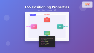
CSS Top, Right, Bottom, Left: Complete Guide to Positioning Offset Properties
CSS positioning offset properties—top, right, bottom, and left—are fundamental tools for precisely controlling element placement on web pages. These properties...
CSS Style top Property: CSS Top
Understanding the CSS top Property: A Comprehensive Guide The top property in CSS is used to specify the vertical position...
CSS Sticky Positioning: Master Scroll-Based Position Switching with Practical Examples
CSS sticky positioning is a powerful layout technique that combines the best of both relative and fixed positioning. It allows...
CSS Display Property: Complete Guide to Block, Inline, and Inline-Block Elements
The CSS display property is one of the most fundamental concepts in web development, controlling how elements are rendered and...
CSS Style left Property: CSS Left
CSS left Property: A Comprehensive Guide The CSS left property is a fundamental tool for web developers, enabling precise horizontal...
CSS Text-Align: Complete Guide to Left, Right, Center and Justify Text Alignment
Text alignment is a fundamental aspect of web design that significantly impacts readability and visual hierarchy. The CSS text-align property...


