The CSS display property is one of the most fundamental concepts in web development, controlling how elements are rendered and positioned on a webpage. Understanding the differences between block, inline, and inline-block elements is crucial for creating effective layouts and achieving pixel-perfect designs.
In this comprehensive guide, we’ll explore each display type in detail, examine their unique characteristics, and provide practical examples with visual demonstrations to help you master CSS layout fundamentals.
What is the CSS Display Property?
The display property defines how an HTML element should be displayed in the document flow. It determines whether an element behaves as a block-level element, an inline element, or something in between. This property is essential for controlling layout, spacing, and the overall structure of your web pages.
Basic Syntax
selector {
  display: value;
}

/* Common values */
display: block;
display: inline;
display: inline-block;
display: none;
display: flex;
display: grid;
Block Elements: Taking Full Width Control
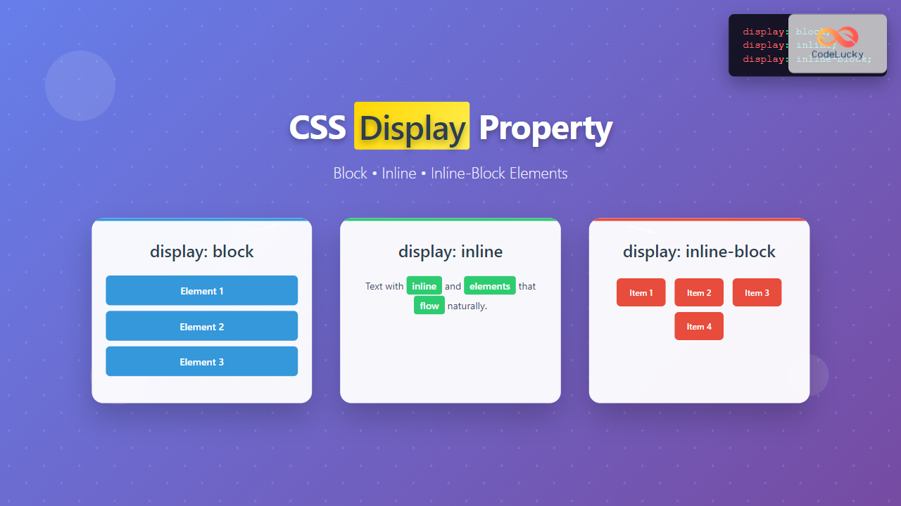
Block elements are the building blocks of web page structure. They naturally occupy the full width of their parent container and always start on a new line, creating a “block” of content that stacks vertically.
Key Characteristics of Block Elements
- Full Width: Extends to occupy 100% of the parent container’s width by default
- New Line: Always starts on a new line, forcing subsequent elements below
- Height Control: Height is determined by content or can be explicitly set
- Margin & Padding: Accepts all margin and padding values (top, right, bottom, left)
- Width & Height: Can have explicit width and height properties applied
Default Block Elements
Many HTML elements are block-level by default, including:
<div><p><h1>-<h6><header><footer><section><article><nav><main><aside><ul>, <ol><li><blockquote><form><table><pre>
Block Elements Example
HTML:
<div class="block-example">
  <div class="block-item">First Block Element</div>
  <div class="block-item">Second Block Element</div>
  <div class="block-item">Third Block Element</div>
</div>
CSS:
.block-item {
  display: block;
  background-color: #007bff;
  color: white;
  padding: 15px;
  margin: 10px 0;
  border-radius: 4px;
  text-align: center;
}
Visual Output:
Inline Elements: Flowing with the Text
Inline elements flow naturally within the text, appearing side by side and wrapping to the next line when necessary. They only take up as much width as their content requires and don’t force line breaks.
Key Characteristics of Inline Elements
- Content Width: Width is determined by the content inside
- Same Line: Appears on the same line as adjacent inline elements
- No Width/Height: Cannot have explicit width or height properties
- Limited Margins: Only horizontal margins (left and right) are respected
- Vertical Padding Issues: Vertical padding may overlap with other elements
- Text Flow: Follows the natural flow of text and line spacing
Default Inline Elements
Common HTML elements that are inline by default include:
<span><a><strong><em><b><i><u><small><sub><sup><code><img><input><label><select><textarea>
Inline Elements Example
HTML:
<div class="inline-example">
  This is a paragraph with <span class="inline-item">inline element</span>
  and another <span class="inline-item">inline element</span>
  that flow naturally with the text.
</div>
CSS:
.inline-item {
  display: inline;
  background-color: #28a745;
  color: white;
  padding: 5px 10px;
  border-radius: 4px;
}
Visual Output:
Inline-Block Elements: Best of Both Worlds
Inline-block elements combine the characteristics of both inline and block elements. They flow inline with text but can have explicit dimensions and respect all margin and padding values, making them incredibly versatile for layout purposes.
Key Characteristics of Inline-Block Elements
- Inline Flow: Sits inline with other elements on the same line
- Block Properties: Can have width, height, and all margin/padding values
- Content-Based Width: Width defaults to content size but can be overridden
- Vertical Alignment: Can be vertically aligned using vertical-align property
- Spacing Control: Full control over spacing and dimensions
- Layout Flexibility: Perfect for creating horizontal layouts and button groups
Inline-Block Elements Example
HTML:
<div class="inline-block-example">
  <div class="inline-block-item">Item 1</div>
  <div class="inline-block-item">Item 2</div>
  <div class="inline-block-item">Item 3</div>
</div>
CSS:
.inline-block-item {
  display: inline-block;
  background-color: #dc3545;
  color: white;
  padding: 15px 20px;
  margin: 5px;
  border-radius: 4px;
  width: 120px;
  text-align: center;
}
Visual Output:
Interactive Comparison Demo
The following interactive demonstration allows you to see the differences between all three display types in real-time:
.demo-item { display: block; }
Practical Use Cases and Best Practices
When to Use Block Elements
Perfect for:
- Main content containers and sections
- Headers, paragraphs, and standalone content blocks
- Layout structures that need full-width control
- Elements that should appear on separate lines
- Creating vertical spacing and organization
When to Use Inline Elements
Perfect for:
- Text formatting within paragraphs (bold, italic, links)
- Small UI elements that should flow with text
- Icons and badges within content
- Form labels that sit next to inputs
- Navigation items in horizontal menus
When to Use Inline-Block Elements
Perfect for:
- Button groups and toolbars
- Image galleries and card layouts
- Navigation menus with specific sizing
- Form elements that need precise dimensions
- Creating horizontal layouts without flexbox
Common Issues and Solutions
Inline-Block Spacing Problem
One common issue with inline-block elements is unwanted spacing between elements caused by whitespace in HTML. Here are several solutions:
Problem:
<!-- Unwanted spaces appear between elements -->
<div class="inline-block-item">Item 1</div>
<div class="inline-block-item">Item 2</div>
Solution 1: Remove HTML whitespace
<div class="inline-block-item">Item 1</div><div class="inline-block-item">Item 2</div>Solution 2: Use font-size: 0 on parent
.parent {
  font-size: 0;
}
.inline-block-item {
  font-size: 16px; /* Reset font size */
}
Vertical Alignment with Inline-Block
Control vertical alignment of inline-block elements using the vertical-align property:
.inline-block-item {
  display: inline-block;
  vertical-align: top;    /* or middle, bottom, baseline */
}Performance and Accessibility Considerations
Performance Tips
- Avoid Excessive DOM Manipulation: Changing display properties frequently can trigger layout recalculations
- Use CSS Classes: Pre-define display classes rather than inline styles for better caching
- Consider Modern Alternatives: Flexbox and Grid often provide better performance for complex layouts
Accessibility Best Practices
- Maintain Logical Structure: Don’t use display properties to change semantic meaning
- Preserve Tab Order: Visual layout changes shouldn’t break keyboard navigation
- Screen Reader Considerations: Ensure content remains logically ordered for assistive technologies
Browser Support and Compatibility
The CSS display property has excellent browser support across all modern browsers:
✓ Full Support
All versions
✓ Full Support
All versions
✓ Full Support
All versions
✓ Full Support
All versions
Summary and Key Takeaways
Understanding the CSS display property is fundamental to creating effective web layouts. Here’s a quick reference guide:
Mastering these three display types will give you the foundation needed to create sophisticated layouts and understand more advanced CSS concepts like Flexbox and Grid. Practice with different combinations and use cases to build your intuition for when each display type is most appropriate.
Remember that while these display properties are powerful, modern CSS offers even more flexible layout options through Flexbox and CSS Grid, which often provide cleaner solutions for complex layouts. However, understanding block, inline, and inline-block remains essential for web development fundamentals.

