
The CSS position property is one of the most powerful tools for controlling element layout and creating sophisticated web designs. Understanding how positioning works is essential for building modern, responsive websites that deliver exceptional user experiences.
In this comprehensive guide, we’ll explore all five CSS position values: static, relative, absolute, fixed, and sticky. You’ll learn when to use each positioning method, see practical examples, and discover best practices for real-world implementation.
What is CSS Position Property?
The CSS position property determines how an element is positioned within its containing element or the viewport. It works in conjunction with the offset properties (top, right, bottom, left) to precisely control element placement.
CSS Position Values Overview
CSS offers five distinct position values, each serving specific layout needs:
- Static: Default positioning following normal document flow
- Relative: Positioned relative to its normal position
- Absolute: Positioned relative to nearest positioned ancestor
- Fixed: Positioned relative to the viewport
- Sticky: Switches between relative and fixed based on scroll position
1. Static Position (Default)
The static position is the default value for all HTML elements. Elements with static positioning follow the normal document flow, appearing in the order they’re written in the HTML markup.
Static Position Characteristics:
- Elements appear in normal document flow
- Offset properties (top, right, bottom, left) have no effect
- No special positioning context is created
- Most predictable and stable positioning method
Static Position Example:
.static-box {
    position: static; /* Default value */
    background: #ffeb3b;
    padding: 1rem;
    margin: 0.5rem;
}
2. Relative Position
The relative position allows you to move an element from its normal position while maintaining its original space in the document flow. This creates a positioning context for absolutely positioned child elements.
Relative Position Features:
- Element maintains its space in document flow
- Can be offset using top, right, bottom, left properties
- Creates a new positioning context for child elements
- Other elements aren’t affected by the positioning offset
Relative Position Example:
.relative-box {
    position: relative;
    top: 10px;
    left: 20px;
    background: #4caf50;
    padding: 1rem;
}
3. Absolute Position
The absolute position removes an element from the normal document flow and positions it relative to its nearest positioned ancestor (an ancestor with position other than static). If no positioned ancestor exists, it positions relative to the initial containing block.
Absolute Position Characteristics:
- Element is removed from normal document flow
- Positioned relative to nearest positioned ancestor
- Takes only the space it needs (shrink-to-fit)
- Can overlap other elements
- Useful for tooltips, dropdown menus, and overlays
Absolute Position Example:
.container {
    position: relative; /* Creates positioning context */
    height: 200px;
}

.absolute-box {
    position: absolute;
    top: 50px;
    right: 20px;
    background: #4caf50;
    padding: 1rem;
}
4. Fixed Position
The fixed position removes an element from the document flow and positions it relative to the viewport. Fixed elements remain in the same position even when the page is scrolled, making them perfect for navigation bars, floating action buttons, and persistent UI elements.
Fixed Position Benefits:
- Always positioned relative to the viewport
- Remains visible during scrolling
- Commonly used for headers, sidebars, and modal overlays
- Creates a new stacking context
Fixed Position Simulation:
.fixed-header {
    position: fixed;
    top: 0;
    left: 0;
    width: 100%;
    background: #2196f3;
    color: white;
    padding: 1rem;
    z-index: 1000;
}
5. Sticky Position
The sticky position is a hybrid between relative and fixed positioning. An element with sticky positioning behaves like a relatively positioned element until it reaches a specified threshold, then it becomes fixed within its containing block.
Sticky Position Use Cases:
- Table headers that stick while scrolling
- Navigation menus that become fixed after scrolling
- Section headers in long articles
- Shopping cart summaries in e-commerce sites
Sticky Position Example:
.sticky-element {
    position: sticky;
    top: 0; /* Sticks when 0px from top */
    background: #ff9800;
    padding: 1rem;
    z-index: 10;
}
Z-Index and Stacking Context
When working with positioned elements, understanding the z-index property is crucial for controlling which elements appear on top. The z-index only works on positioned elements (position value other than static).
Z-Index Example:
.layer-1 { position: absolute; z-index: 1; }
.layer-2 { position: absolute; z-index: 2; }
.layer-3 { position: absolute; z-index: 3; } /* Appears on top */
Interactive Position Comparison Tool
Try Different Position Values:
Best Practices for CSS Positioning
1. Choose the Right Position Value
- Use static for normal document flow elements
- Use relative for minor adjustments and creating positioning contexts
- Use absolute for overlays, tooltips, and elements that need precise placement
- Use fixed for persistent UI elements like headers and navigation
- Use sticky for elements that should stick after scrolling to a certain point
2. Performance Considerations
- Fixed and absolute positioned elements can trigger repaints
- Use
transforminstead of changingtop/leftfor animations - Be mindful of z-index values to avoid unnecessary stacking contexts
- Test sticky positioning across different browsers
3. Accessibility Guidelines
- Ensure positioned elements don’t interfere with keyboard navigation
- Maintain proper focus order for absolutely positioned elements
- Use appropriate ARIA labels for positioned UI components
- Test with screen readers to ensure content remains accessible
Common CSS Positioning Patterns
Centered Modal Dialog
.modal {
    position: fixed;
    top: 50%;
    left: 50%;
    transform: translate(-50%, -50%);
    background: white;
    padding: 2rem;
    box-shadow: 0 10px 30px rgba(0,0,0,0.3);
    z-index: 1000;
}
Sticky Navigation
.navigation {
    position: sticky;
    top: 0;
    background: white;
    border-bottom: 1px solid #ddd;
    z-index: 100;
}
Absolute Positioning with Fallback
.tooltip {
    position: absolute;
    top: 100%;
    left: 50%;
    transform: translateX(-50%);
    /* Fallback for older browsers */
    margin-left: -50px;
    width: 100px;
}
Browser Support and Compatibility
CSS positioning enjoys excellent browser support across modern browsers:
- Static, Relative, Absolute, Fixed: Supported in all modern browsers
- Sticky: Supported in Chrome 56+, Firefox 32+, Safari 13+, Edge 16+
- CSS Grid and Flexbox: Often better alternatives for complex layouts
Troubleshooting Common Position Issues
Absolute Positioning Not Working
Solution: Ensure the parent element has a position value other than static (usually position: relative).
Z-Index Not Working
Solution: Check that the element has a position value other than static, and verify stacking context hierarchy.
Sticky Element Not Sticking
Solution: Ensure the parent container has sufficient height and check for overflow hidden on ancestors.
Fixed Element Covering Content
Solution: Add appropriate margin or padding to the body/content to account for fixed element height.
Conclusion
Mastering CSS positioning is essential for creating sophisticated, interactive web layouts. Each position value serves specific purposes:
staticfor normal document flowrelativefor minor adjustments and positioning contextsabsolutefor precise element placementfixedfor viewport-relative positioningstickyfor scroll-dependent positioning
By understanding when and how to use each positioning method, you’ll be able to create more engaging user interfaces, implement complex layouts, and solve challenging design problems. Remember to consider performance, accessibility, and browser compatibility when implementing positioned elements in your projects.
Practice with the interactive examples provided, experiment with different combinations, and gradually incorporate these techniques into your web development workflow. With time and experience, CSS positioning will become an invaluable tool in your frontend development arsenal.
Related Posts
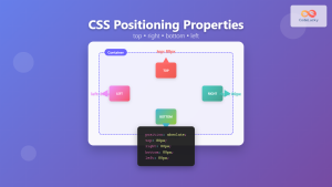
CSS Top, Right, Bottom, Left: Complete Guide to Positioning Offset Properties
CSS positioning offset properties—top, right, bottom, and left—are fundamental tools for precisely controlling element placement on web pages. These properties...
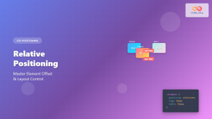
CSS Relative Positioning: Master Element Offset and Layout Control
Understanding CSS Relative Positioning CSS relative positioning is a fundamental layout technique that allows you to move elements from their...

CSS position Property: Mastering Layouts in CSS
Understanding the CSS position Property: A Comprehensive Guide The position property in CSS is a fundamental tool for controlling the...

CSS Style right Property: CSS Right
Understanding the CSS right Property The CSS right property plays a crucial role in positioning elements within a web page....
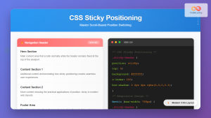
CSS Sticky Positioning: Master Scroll-Based Position Switching with Practical Examples
CSS sticky positioning is a powerful layout technique that combines the best of both relative and fixed positioning. It allows...
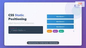
CSS Static Positioning: Understanding Default Document Flow and Layout Fundamentals
CSS positioning is one of the fundamental concepts every web developer must master. Among the various positioning methods available, static...
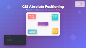
CSS Absolute Positioning: Master Element Placement with Containing Blocks
CSS absolute positioning is one of the most powerful tools for creating precise layouts and complex designs. Understanding how absolutely...
CSS Style left Property: CSS Left
CSS left Property: A Comprehensive Guide The CSS left property is a fundamental tool for web developers, enabling precise horizontal...
CSS Style top Property: CSS Top
Understanding the CSS top Property: A Comprehensive Guide The top property in CSS is used to specify the vertical position...
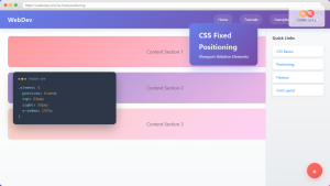
CSS Fixed Positioning: Complete Guide to Viewport-Relative Elements
CSS fixed positioning is one of the most powerful tools in a web developer's arsenal for creating engaging, interactive user...
CSS bottom Property: CSS Bottom
Understanding the CSS bottom Property The CSS bottom property is a fundamental tool for controlling the vertical positioning of elements...
CSS Display Property: Complete Guide to Block, Inline, and Inline-Block Elements
The CSS display property is one of the most fundamental concepts in web development, controlling how elements are rendered and...


