
CSS rem units are a powerful tool for creating scalable, maintainable, and accessible web designs. Unlike pixels or em units, rem (root em) units are relative to the root element’s font size, making them ideal for responsive typography and consistent spacing throughout your website.
What are CSS rem Units?
The rem unit stands for “root em” and represents a relative length unit in CSS. It’s calculated based on the font-size of the root element (html element) of the document. By default, most browsers set the root font-size to 16px, which means 1rem equals 16px.
How rem Units Work
The calculation for rem units is straightforward:
- 1rem = root element font-size
- If root font-size is 16px: 1rem = 16px, 2rem = 32px, 0.5rem = 8px
- If root font-size is 20px: 1rem = 20px, 2rem = 40px, 0.5rem = 10px
Basic rem Unit Example
This is a 2rem heading
This paragraph uses 1rem font-size with 1.5rem line-height and 0.5rem padding.
rem vs em vs px: Understanding the Differences
Understanding when to use rem, em, or px units is crucial for effective CSS development:
Comparison Table
| Unit | Reference Point | Best For | Inheritance |
|---|---|---|---|
| rem | Root element font-size | Global scaling, consistent spacing | No cascading issues |
| em | Parent element font-size | Component-relative sizing | Can cascade and multiply |
| px | Absolute pixel value | Precise control, borders, shadows | Fixed size |
Interactive Comparison Example
Practical rem Unit Applications
1. Responsive Typography System
Create a scalable typography system using rem units:
2. Consistent Spacing System
Use rem units for consistent spacing across your design:
Card Component
This card uses rem-based padding (1.5rem) and margin-bottom (2rem) for consistent spacing.
3. Accessible Design with rem Units
rem units respect user font-size preferences, making your site more accessible:
Accessible Form Example
Common rem Unit Patterns and Best Practices
1. Setting Up a rem-Based Design System
2. rem Units for Layout Components
Site Header
Card One
Example card with rem-based spacing
Card Two
Consistent spacing across all cards
rem Units and Browser Support
rem units have excellent browser support and are widely adopted:
- Modern browsers: Full support in all current browsers
- Internet Explorer: Supported from IE9+
- Mobile browsers: Full support across iOS Safari and Android Chrome
Fallback Strategy for Legacy Browsers
Common Pitfalls and How to Avoid Them
1. Overriding Root Font-Size Inconsistently
2. Mixing Units Inconsistently
Performance and Accessibility Benefits
Accessibility Advantages
- User preference respect: rem units scale with user’s browser font-size settings
- Consistent scaling: All elements scale proportionally when users adjust font size
- Better readability: Maintains relative proportions across different devices
Performance Benefits
- Simplified calculations: Browser handles scaling calculations efficiently
- Reduced CSS complexity: Less need for multiple breakpoint adjustments
- Maintainable code: Changes to root font-size affect entire design system
Advanced rem Techniques
Dynamic rem Scaling with CSS Custom Properties
rem-Based Grid System
Conclusion
CSS rem units provide a powerful foundation for creating scalable, accessible, and maintainable web designs. By using rem units consistently throughout your stylesheets, you can build responsive layouts that adapt beautifully to different screen sizes and user preferences.
Key takeaways for using rem units effectively:
- Use rem for font-sizes, padding, margins, and other scalable dimensions
- Establish a clear root font-size strategy with media queries
- Combine rem units with CSS custom properties for advanced scaling systems
- Reserve px units for borders, shadows, and elements that shouldn’t scale
- Test your designs with different browser font-size settings for accessibility
Start incorporating rem units into your next project and experience the benefits of a truly scalable design system that respects user preferences and maintains consistency across all devices.
Related Posts
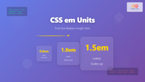
CSS em Units: Complete Guide to Font-Size Relative Length Units
CSS em units are one of the most powerful and flexible relative length units in web development. Unlike absolute units...
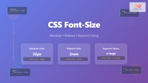
CSS Font-Size: Complete Guide to Absolute, Relative and Keyword Sizing
Font sizing is one of the most fundamental aspects of web typography that directly impacts user experience and accessibility. Understanding...

CSS Units: Complete Guide to Relative Units – em, rem, %, vw, vh, vmin, vmax
CSS relative units are the foundation of responsive web design, enabling websites to adapt seamlessly across different devices and screen...

CSS Style fontSize Property: CSS Font Size
CSS fontSize Property: Controlling Text Size The fontSize property in CSS specifies the size of the font. This property is...

CSS Percentage Units: Complete Guide to Parent-Relative Sizing
CSS percentage units are fundamental building blocks for creating responsive, flexible layouts that adapt to different screen sizes and container...
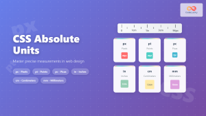
CSS Units: Absolute Units – Complete Guide to px, pt, pc, in, cm, mm
CSS absolute units are fixed measurement values that remain constant regardless of the parent element's size or the user's device...

CSS Viewport Units: Complete Guide to vw, vh, vmin, vmax for Modern Responsive Design
CSS viewport units revolutionize how we approach responsive web design by providing a direct relationship between element sizes and the...

CSS Grid fr Unit: Master Fractional Units for Responsive Web Layouts
The CSS Grid fr unit (fractional unit) is a powerful tool that revolutionizes how we create flexible and responsive web...

CSS Width and Height: Complete Guide to Element Dimensions
Understanding how to control element dimensions is fundamental to creating well-structured web layouts. CSS width and height properties give you...

CSS Width Property: Mastering Element Width in CSS
CSS Width Property: Mastering Element Width The width property in CSS defines the width of an element's content area. It's...

CSS Aspect-Ratio Property: Complete Guide to Maintaining Perfect Width/Height Ratios
The CSS aspect-ratio property revolutionizes how we maintain consistent width-to-height ratios in responsive web design. Instead of relying on complex...
CSS Style font Property: CSS Font
CSS font Property: A Comprehensive Guide The CSS font property is a shorthand property used to set several font-related styles...


