
CSS percentage units are fundamental building blocks for creating responsive, flexible layouts that adapt to different screen sizes and container dimensions. Unlike fixed units like pixels, percentage values are relative to their parent element, making them essential for modern web design.
In this comprehensive guide, we’ll explore how CSS percentage units work, their behavior in different contexts, and practical implementation strategies for building responsive layouts.
Understanding CSS Percentage Units
CSS percentage units represent a proportion of the parent element’s corresponding dimension. When you set width: 50%, the element takes up half the width of its parent container. This relative sizing creates flexible layouts that automatically adjust as parent containers change size.
Basic Percentage Behavior
Let’s start with a simple example to demonstrate how percentage units work:
Example: Basic Percentage Width
.parent {
  width: 100%;
  background-color: #e74c3c;
}

.child-75 {
  width: 75%; /* 75% of parent width */
  background-color: #2ecc71;
}

.child-50 {
  width: 50%; /* 50% of parent width */
  background-color: #f39c12;
}

.child-25 {
  width: 25%; /* 25% of parent width */
  background-color: #9b59b6;
}
Percentage Units for Different Properties
Width and Height Percentages
Width percentages are straightforward—they reference the parent’s width. Height percentages, however, have special behavior that often confuses developers.
Example: Width vs Height Percentages
.container {
  width: 300px;
  height: 200px;
  position: relative;
}

.box-1 {
  width: 50%;  /* 150px (50% of 300px) */
  height: 50%; /* 100px (50% of 200px) */
}

.box-2 {
  width: 30%;  /* 90px (30% of 300px) */
  height: 80%; /* 160px (80% of 200px) */
}
Important Height Percentage Gotcha
Height percentages only work when the parent element has an explicit height. If the parent’s height is determined by its content (auto), percentage heights won’t work as expected.
Example: Height Percentage Problem
Parent with auto height:
Parent with explicit height (150px):
/* This won't work */
.parent-auto {
  height: auto; /* or no height specified */
}
.child {
  height: 50%; /* No effect */
}

/* This works */
.parent-explicit {
  height: 150px;
}
.child {
  height: 50%; /* 75px */
}
Margin and Padding Percentages
Here’s where things get interesting: margin and padding percentages are always calculated relative to the parent’s width, even for top and bottom margins/padding.
Example: Margin and Padding Percentages
.container {
  width: 400px;
}

.box-1 {
  margin: 5% 10%; /* 20px 40px (5% and 10% of 400px) */
}

.box-2 {
  padding: 5% 2.5%; /* 20px 10px (5% and 2.5% of 400px) */
}
Interactive Example: Responsive Layout
Let’s create an interactive example that demonstrates how percentage units create responsive layouts:
Interactive Responsive Layout
600px
.responsive-container {
  width: 600px; /* This changes dynamically */
  height: 300px;
  position: relative;
}

.box-1 { width: 40%; height: 40%; }
.box-2 { width: 25%; height: 60%; }
.box-3 { width: 60%; height: 25%; }
.box-4 { width: 20%; height: 25%; }
Percentage Units in Flexbox
Flexbox changes how percentage units behave. In flex containers, percentage widths are calculated based on the flex container’s width, but flex items can grow and shrink based on the flex properties.
Example: Percentages in Flexbox
With flex-grow:
.flex-container {
  display: flex;
  gap: 10px;
}

.flex-item-1 {
  width: 30%;
  flex-grow: 1;
}

.flex-item-2 {
  width: 50%;
  flex-grow: 2; /* Grows twice as much */
}

.flex-item-3 {
  width: 20%;
  /* No flex-grow */
}
Percentage Units in CSS Grid
CSS Grid provides more predictable behavior with percentage units. Grid tracks sized with percentages will always respect those percentages relative to the grid container.
Example: Percentages in CSS Grid
.grid-container-1 {
  display: grid;
  grid-template-columns: 25% 50% 25%;
  gap: 10px;
}

.grid-container-2 {
  display: grid;
  grid-template-columns: 30% 1fr 20%;
  gap: 10px;
}
Common Pitfalls and Solutions
1. The 100% + Padding Problem
Setting width: 100% and adding padding can cause overflow issues because padding is added to the width.
Problem: Width + Padding = Overflow
Solution: box-sizing: border-box
/* Problem */
.box {
  width: 100%;
  padding: 20px; /* Adds to the width */
}

/* Solution */
.box {
  width: 100%;
  padding: 20px;
  box-sizing: border-box; /* Includes padding in width */
}
2. Nested Percentage Calculations
Percentage values are always relative to the immediate parent, which can create unexpected results in nested layouts.
Example: Nested Percentage Calculations
.grandparent {
  width: 400px;
}

.parent {
  width: 75%; /* 300px (75% of 400px) */
}

.child {
  width: 50%; /* 150px (50% of 300px, not 400px) */
}
Best Practices for Percentage Units
1. Use Percentages for Responsive Layouts
Percentages are ideal for creating layouts that adapt to different screen sizes and container dimensions.
Best Practice: Responsive Card Layout
.card-container {
  display: flex;
  flex-wrap: wrap;
  gap: 2%;
}

.card {
  width: 23.5%; /* 4 cards with 2% gaps */
  min-width: 200px; /* Prevents cards from becoming too small */
  margin-bottom: 2%;
}
2. Combine with CSS Custom Properties
Use CSS custom properties (variables) to make percentage-based layouts more maintainable.
:root {
  --container-padding: 5%;
  --column-width: 48%;
  --column-gap: 4%;
}

.container {
  padding: 0 var(--container-padding);
}

.two-column {
  width: var(--column-width);
  margin-right: var(--column-gap);
}
3. Consider Modern Alternatives
While percentages are still valuable, modern CSS provides better alternatives for many use cases:
- CSS Grid: Use
frunits for more flexible layouts - Flexbox: Use
flex-growandflex-shrinkfor dynamic sizing - Container Queries: Use
cqwandcqhfor container-relative sizing - Viewport Units: Use
vwandvhfor viewport-relative sizing
Browser Support and Compatibility
CSS percentage units have excellent browser support and have been part of CSS since the early days. All modern browsers support percentage units consistently, making them a safe choice for production websites.
The key considerations for browser compatibility are:
- Height percentages: Work consistently when parent has explicit height
- Flexbox percentages: Supported in all modern browsers
- Grid percentages: Supported in all browsers that support CSS Grid
- Box-sizing: Supported in all modern browsers (IE8+)
Conclusion
CSS percentage units are powerful tools for creating flexible, responsive layouts. Understanding how they work relative to parent elements is crucial for effective web design. Remember these key points:
- Percentages are always relative to the parent element’s corresponding dimension
- Margin and padding percentages are based on the parent’s width
- Height percentages require explicit parent heights to work properly
- Combine percentages with modern CSS features like Flexbox and Grid for optimal results
- Use
box-sizing: border-boxto avoid overflow issues with padding
By mastering percentage units, you’ll create more flexible and responsive web layouts that adapt beautifully to different screen sizes and container dimensions.
Related Posts

CSS Units: Complete Guide to Relative Units – em, rem, %, vw, vh, vmin, vmax
CSS relative units are the foundation of responsive web design, enabling websites to adapt seamlessly across different devices and screen...

CSS Aspect-Ratio Property: Complete Guide to Maintaining Perfect Width/Height Ratios
The CSS aspect-ratio property revolutionizes how we maintain consistent width-to-height ratios in responsive web design. Instead of relying on complex...

CSS Width and Height: Complete Guide to Element Dimensions
Understanding how to control element dimensions is fundamental to creating well-structured web layouts. CSS width and height properties give you...

CSS Grid fr Unit: Master Fractional Units for Responsive Web Layouts
The CSS Grid fr unit (fractional unit) is a powerful tool that revolutionizes how we create flexible and responsive web...

CSS Viewport Units: Complete Guide to vw, vh, vmin, vmax for Modern Responsive Design
CSS viewport units revolutionize how we approach responsive web design by providing a direct relationship between element sizes and the...

CSS Max-Width and Min-Width: Complete Guide to Responsive Width Constraints
When building responsive websites, controlling element widths is crucial for creating layouts that work across all devices. CSS provides two...
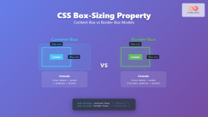
CSS Box-Sizing Property: Master Content-Box vs Border-Box for Perfect Layouts
The CSS box-sizing property is one of the most crucial yet often misunderstood concepts in web development. It determines how...

CSS Style maxWidth Property: CSS Max Width
Understanding the CSS maxWidth Property The CSS maxWidth property is a fundamental tool in web development for controlling the maximum...

CSS Width Property: Mastering Element Width in CSS
CSS Width Property: Mastering Element Width The width property in CSS defines the width of an element's content area. It's...
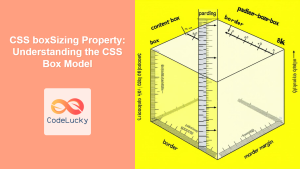
CSS boxSizing Property: Understanding the CSS Box Model
Understanding the CSS boxSizing Property The boxSizing property in CSS is a fundamental tool for controlling how the total width...

CSS Units: Absolute Units – Complete Guide to px, pt, pc, in, cm, mm
CSS absolute units are fixed measurement values that remain constant regardless of the parent element's size or the user's device...

CSS Box Model: Master Content, Padding, Border and Margin for Perfect Layouts
The CSS Box Model is the fundamental concept that governs how elements are sized and spaced in web layouts. Understanding...


