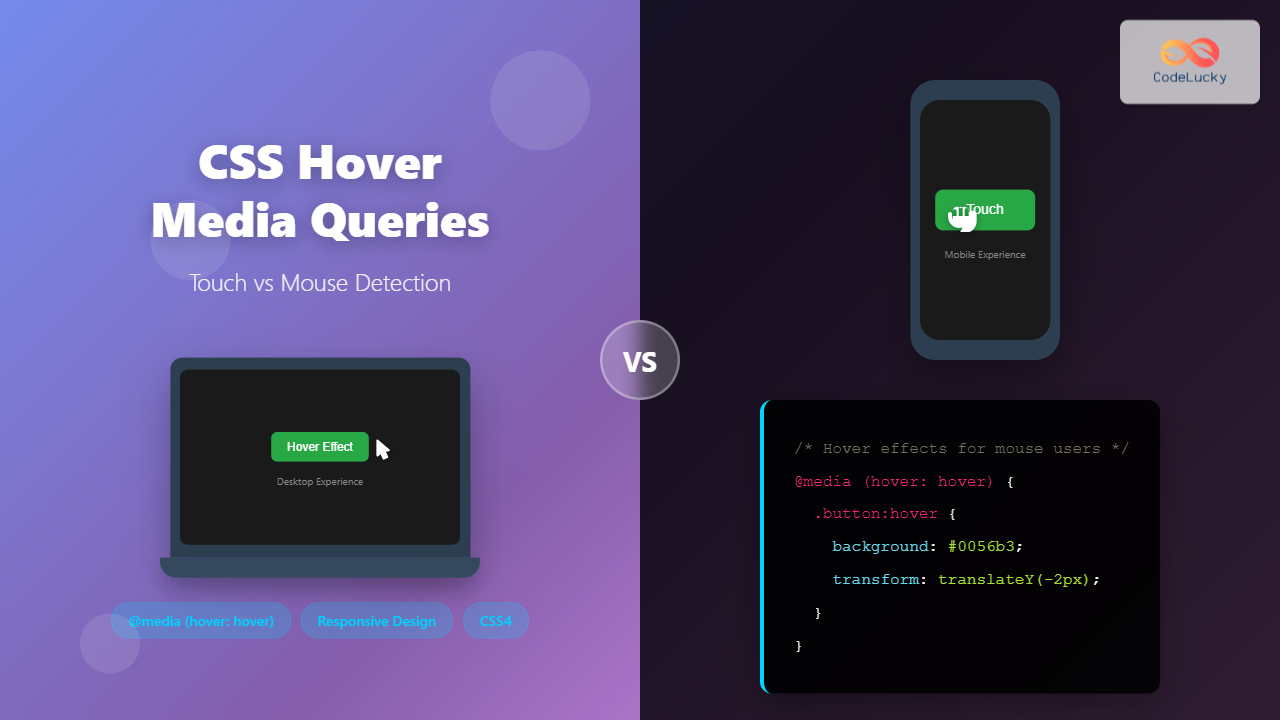
Modern web development requires creating interfaces that work seamlessly across devices with different input methods. While desktop users navigate with precise mouse cursors, mobile users rely on touch interactions. CSS hover media queries provide a powerful solution to detect these different input types and create adaptive user experiences.
Understanding how to properly implement hover detection can dramatically improve your website’s usability and prevent common issues like sticky hover states on touch devices.
Understanding Hover Media Queries
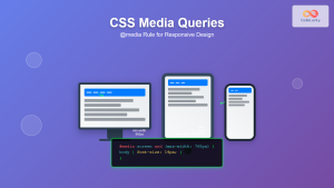
CSS hover media queries are part of the Media Queries Level 4 specification that allow developers to detect the primary input mechanism’s hover capability. These queries help distinguish between devices that can hover (like desktop computers with mice) and those that cannot (like smartphones and tablets).
The hover media feature has three possible values:
- hover: The primary input mechanism can hover over elements
- none: The primary input mechanism cannot hover, or there is no pointing device
- on-demand: The primary input mechanism can hover but requires significant effort (rare)
Basic Hover Media Query Syntax
The fundamental syntax for hover media queries follows this pattern:
@media (hover: hover) {
  /* Styles for devices that can hover */
}

@media (hover: none) {
  /* Styles for devices that cannot hover */
}
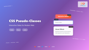
This approach ensures that hover effects only apply to devices where they make sense, preventing frustrating user experiences on touch devices.
Practical Implementation Examples
Button Hover Effects
Let’s create a button that behaves differently based on the input method:
Interactive Button Demo
Desktop: Hover to see elevation effect
Mobile: Button remains consistent without hover states
.hover-button {
  background: #007bff;
  color: white;
  border: none;
  padding: 12px 24px;
  border-radius: 6px;
  transition: all 0.3s ease;
}

/* Hover effects only for devices that can hover */
@media (hover: hover) {
  .hover-button:hover {
    background: #0056b3;
    transform: translateY(-2px);
    box-shadow: 0 4px 8px rgba(0,0,0,0.2);
  }
}
Navigation Menu Enhancement
Navigation menus benefit greatly from hover detection to provide smooth interactions on desktop while maintaining touch-friendly behavior on mobile:
Responsive Navigation Menu
Desktop: Hover for sliding animation
Mobile: Clean, touch-friendly interaction
.nav-link {
  display: block;
  color: white;
  text-decoration: none;
  padding: 15px 20px;
  transition: background-color 0.3s ease;
}

@media (hover: hover) {
  .nav-link:hover {
    background: #555;
    padding-left: 30px;
  }
}
Advanced Hover Detection Techniques
Card Interactions
Cards are perfect candidates for sophisticated hover effects that enhance user experience without interfering with touch interactions:
Interactive Cards
Feature Card
This card demonstrates how hover effects can enhance desktop experience while maintaining clean touch interactions on mobile devices.
Desktop: Hover for elevation effect
Mobile: Consistent appearance without hover states
.card {
  background: white;
  border-radius: 8px;
  padding: 20px;
  box-shadow: 0 2px 4px rgba(0,0,0,0.1);
  transition: all 0.3s ease;
}

@media (hover: hover) {
  .card:hover {
    transform: translateY(-5px);
    box-shadow: 0 8px 25px rgba(0,0,0,0.15);
  }
}
Tooltip Implementation
Tooltips present a unique challenge since they rely heavily on hover states. Here’s how to handle them across different input methods:
Adaptive Tooltips
Desktop: Hover to reveal tooltip
Touch: Focus (tap) to reveal tooltip
.tooltip-content {
  opacity: 0;
  visibility: hidden;
  transition: all 0.3s ease;
}

/* Show tooltip on hover for hover-capable devices */
@media (hover: hover) {
  .tooltip-container:hover .tooltip-content {
    opacity: 1;
    visibility: visible;
  }
}

/* Alternative for touch devices - show on focus */
.tooltip-container:focus-within .tooltip-content {
  opacity: 1;
  visibility: visible;
}
Complex Hover Interactions
For more sophisticated interfaces, you can combine multiple hover techniques to create rich, adaptive experiences:
Advanced Feature Cards
Performance
Optimized for lightning-fast loading and smooth interactions across all devices.
Responsive
Adapts beautifully to any screen size and input method for consistent UX.
Accessible
Built with accessibility in mind, ensuring everyone can use your interface.
Desktop: Hover for scale, rotation, and shimmer effects
Mobile: Clean, static presentation
Browser Support and Fallbacks
Hover media queries enjoy excellent browser support across modern browsers:
- Chrome: Supported since version 41
- Firefox: Supported since version 64
- Safari: Supported since version 9
- Edge: Supported since version 12
For older browsers, you can implement feature detection using JavaScript:
// Feature detection fallback
if (window.matchMedia && window.matchMedia('(hover: hover)').matches) {
  document.body.classList.add('has-hover');
} else {
  document.body.classList.add('no-hover');
}
Best Practices and Performance Tips
1. Touch-First Approach
Always design for touch interactions first, then enhance with hover effects:
/* Base styles for all devices */
.button {
  background: #007bff;
  padding: 12px 24px;
  border: none;
  border-radius: 4px;
  color: white;
}

/* Enhancement for hover-capable devices */
@media (hover: hover) {
  .button:hover {
    background: #0056b3;
  }
}
2. Avoid Conflicting States
Ensure your hover states don’t conflict with focus or active states:
@media (hover: hover) {
  .button:hover:not(:focus):not(:active) {
    transform: translateY(-2px);
  }
}
3. Performance Optimization
Use CSS transforms instead of changing layout properties for better performance:
/* Good - uses transform */
@media (hover: hover) {
  .card:hover {
    transform: scale(1.05);
  }
}

/* Avoid - causes layout recalculation */
@media (hover: hover) {
  .card:hover {
    width: 105%;
    height: 105%;
  }
}
Accessibility Considerations
When implementing hover media queries, always consider accessibility:
- Focus States: Ensure all hover effects have corresponding focus states
- Reduced Motion: Respect user preferences for reduced motion
- Color Contrast: Maintain sufficient contrast in all states
- Keyboard Navigation: Test with keyboard-only navigation
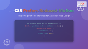
/* Respect user motion preferences */
@media (hover: hover) and (prefers-reduced-motion: no-preference) {
  .button:hover {
    transform: translateY(-2px);
    transition: transform 0.3s ease;
  }
}

/* Simple color change for reduced motion */
@media (hover: hover) and (prefers-reduced-motion: reduce) {
  .button:hover {
    background-color: #0056b3;
  }
}
Testing Hover Media Queries
Testing hover interactions across different devices is crucial:
Browser DevTools
Most modern browsers allow you to simulate different input types in their developer tools. In Chrome DevTools, you can toggle touch simulation to test how your hover states behave.
Real Device Testing
Always test on actual devices to ensure your hover media queries work as expected. Pay special attention to:
- Hybrid devices (laptops with touchscreens)
- Devices that switch between input methods
- Different operating systems and browsers
Common Pitfalls and Solutions
Sticky Hover States
One of the most common issues is sticky hover states on touch devices. This happens when hover styles are applied without proper media query protection:
/* Problem: Hover state persists on touch */
.button:hover {
  background: red;
}

/* Solution: Protect with hover media query */
@media (hover: hover) {
  .button:hover {
    background: red;
  }
}
Hybrid Device Handling
Some devices support both touch and mouse input. The browser will report the primary input method, but users might switch between them:
/* Handle both input methods gracefully */
.interactive-element {
  /* Base styles */
  transition: all 0.3s ease;
}

@media (hover: hover) {
  .interactive-element:hover {
    /* Hover enhancements */
  }
}

.interactive-element:focus {
  /* Focus styles for keyboard/touch */
}
Future of Hover Detection
The CSS Media Queries Level 5 specification introduces additional interaction media features:
- any-hover: Detects if any input mechanism can hover
- pointer: Indicates the accuracy of the primary pointing device
- any-pointer: Indicates the accuracy of any available pointing device
/* Future-proof hover detection */
@media (any-hover: hover) {
  /* Styles for when any input method can hover */
}

@media (pointer: fine) {
  /* Styles for precise pointing devices like mice */
}

@media (pointer: coarse) {
  /* Styles for less precise pointing like fingers */
}
Conclusion
CSS hover media queries are essential for creating modern, responsive web interfaces that work seamlessly across all device types. By detecting whether users can hover, you can provide enhanced experiences for desktop users while maintaining clean, touch-friendly interactions on mobile devices.
Remember to always start with a touch-first approach, enhance with hover effects where appropriate, and thoroughly test across different devices and input methods. This strategy ensures your interfaces are accessible, performant, and provide optimal user experiences regardless of how users interact with your content.
Implementing proper hover detection is not just about preventing sticky hover states – it’s about creating interfaces that feel natural and intuitive for every user, regardless of their device or input method.

