CSS screen media queries are the cornerstone of responsive web design, enabling developers to create websites that adapt seamlessly across different devices and screen sizes. These powerful CSS features allow you to apply specific styles based on the characteristics of the user’s display, ensuring optimal user experience regardless of whether visitors are using smartphones, tablets, desktops, or large monitors.
In this comprehensive guide, we’ll explore everything you need to know about CSS screen media queries, from basic syntax to advanced targeting techniques that will transform your approach to responsive design.
What Are CSS Screen Media Queries?
Media queries are CSS techniques that apply different styles based on the characteristics of the device or viewport displaying the content. The screen media type specifically targets devices with screens, excluding print media and other output types.
A media query consists of a media type (like screen) and one or more media features (like max-width or orientation) that define when the enclosed CSS rules should be applied.
@media screen and (condition) {
  /* CSS rules here */
}
Essential Screen Media Query Breakpoints
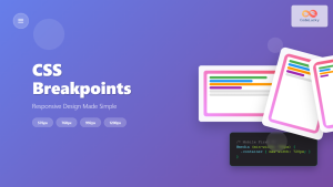
Understanding common breakpoints is crucial for effective responsive design. Here are the most widely used breakpoints that target different device categories:
/* Extra small devices (phones, less than 576px) */
@media screen and (max-width: 575.98px) {
  .container {
    padding: 10px;
    font-size: 14px;
  }
}

/* Small devices (landscape phones, 576px and up) */
@media screen and (min-width: 576px) {
  .container {
    max-width: 540px;
    margin: 0 auto;
  }
}

/* Medium devices (tablets, 768px and up) */
@media screen and (min-width: 768px) {
  .container {
    max-width: 720px;
  }
  .grid {
    display: grid;
    grid-template-columns: repeat(2, 1fr);
    gap: 20px;
  }
}

/* Large devices (desktops, 992px and up) */
@media screen and (min-width: 992px) {
  .container {
    max-width: 960px;
  }
  .grid {
    grid-template-columns: repeat(3, 1fr);
  }
}

/* Extra large devices (large desktops, 1200px and up) */
@media screen and (min-width: 1200px) {
  .container {
    max-width: 1140px;
  }
  .grid {
    grid-template-columns: repeat(4, 1fr);
  }
}
Interactive Demo: Responsive Grid Layout
Responsive Grid Demo
Resize your browser to see the layout adapt
Item 1
Mobile: 1 column
Item 2
Tablet: 2-3 columns
Item 3
Desktop: 4 columns
Item 4
Fully responsive
Advanced Media Query Features
Orientation-Based Targeting
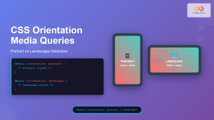
Screen orientation is particularly important for mobile and tablet experiences. You can target landscape and portrait orientations to optimize layouts accordingly:
/* Portrait orientation */
@media screen and (orientation: portrait) {
  .mobile-menu {
    position: fixed;
    bottom: 0;
    width: 100%;
    height: 60px;
  }

  .content {
    padding-bottom: 80px;
  }
}

/* Landscape orientation */
@media screen and (orientation: landscape) {
  .mobile-menu {
    position: fixed;
    left: 0;
    top: 0;
    width: 200px;
    height: 100vh;
  }

  .content {
    margin-left: 220px;
  }
}
High-Resolution Display Targeting
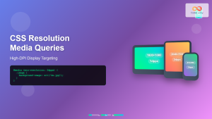
Modern devices often have high-density displays (Retina, 4K, etc.). You can target these displays to serve higher quality images or adjust interface elements:
/* Standard resolution */
@media screen and (-webkit-max-device-pixel-ratio: 1) {
  .logo {
    background-image: url('logo-standard.png');
  }
}

/* High resolution (Retina) displays */
@media screen and (-webkit-min-device-pixel-ratio: 2),
       screen and (min-resolution: 192dpi) {
  .logo {
    background-image: url('logo-retina.png');
    background-size: 100px 50px;
  }
}

/* Ultra-high resolution (4K) displays */
@media screen and (-webkit-min-device-pixel-ratio: 3),
       screen and (min-resolution: 288dpi) {
  .logo {
    background-image: url('logo-4k.png');
    background-size: 100px 50px;
  }
}
Combining Multiple Conditions
Media queries become truly powerful when you combine multiple conditions using logical operators. This allows for precise targeting of specific device characteristics:
/* Tablets in landscape mode */
@media screen and (min-width: 768px) and (max-width: 1024px) and (orientation: landscape) {
  .tablet-landscape-layout {
    display: grid;
    grid-template-columns: 1fr 2fr;
    gap: 30px;
  }
}

/* Large screens with high resolution */
@media screen and (min-width: 1200px) and (-webkit-min-device-pixel-ratio: 2) {
  .hero-image {
    background-image: url('hero-4k.jpg');
    background-size: cover;
  }
}

/* Mobile devices in portrait with small height */
@media screen and (max-width: 480px) and (orientation: portrait) and (max-height: 600px) {
  .compact-header {
    height: 40px;
    font-size: 14px;
  }
}
Modern CSS Container Queries
While traditional media queries respond to viewport size, container queries (supported in modern browsers) allow elements to respond to their container’s size:
/* Container query setup */
.card-container {
  container-type: inline-size;
  container-name: card;
}

/* Container query usage */
@container card (min-width: 300px) {
  .card {
    display: flex;
    align-items: center;
  }

  .card-image {
    width: 40%;
    margin-right: 20px;
  }

  .card-content {
    width: 60%;
  }
}

@container card (max-width: 299px) {
  .card {
    display: block;
    text-align: center;
  }

  .card-image {
    width: 100%;
    margin-bottom: 15px;
  }
}
Performance Optimization Techniques
Mobile-First Approach
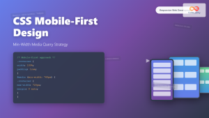
Always start with mobile styles as your base, then use min-width media queries to enhance for larger screens. This approach ensures better performance on mobile devices:
/* Base mobile styles (no media query needed) */
.navigation {
  display: block;
  width: 100%;
  background: #333;
}

.nav-item {
  display: block;
  padding: 15px;
  border-bottom: 1px solid #555;
}

/* Tablet and up */
@media screen and (min-width: 768px) {
  .navigation {
    display: flex;
    justify-content: space-between;
    align-items: center;
  }

  .nav-item {
    display: inline-block;
    border-bottom: none;
    padding: 10px 20px;
  }
}

/* Desktop and up */
@media screen and (min-width: 1024px) {
  .navigation {
    padding: 0 40px;
  }

  .nav-item:hover {
    background: #555;
    transition: background 0.3s ease;
  }
}
Critical CSS and Media Query Organization
Organize your media queries strategically to improve loading performance:
- Group related media queries together
- Use consistent breakpoint values throughout your project
- Consider loading critical mobile CSS inline
- Use CSS custom properties for breakpoint values
Real-World Implementation Example
Here’s a complete example of a responsive card component that demonstrates professional media query usage:
Adaptive Card Component
This card demonstrates responsive design principles using CSS media queries. It adapts from a stacked mobile layout to a side-by-side tablet layout, and finally to an enhanced desktop version.
Common Pitfalls and Solutions
Viewport Meta Tag
Always include the viewport meta tag in your HTML head to ensure media queries work correctly on mobile devices:
<meta name="viewport" content="width=device-width, initial-scale=1.0">Overlapping Breakpoints
Avoid overlapping breakpoints that can cause unexpected behavior. Use precise ranges:
@media screen and (max-width: 768px) { /* styles */ }
@media screen and (min-width: 768px) { /* styles */ }
✅ Better:
@media screen and (max-width: 767.98px) { /* styles */ }
@media screen and (min-width: 768px) { /* styles */ }
Testing and Debugging Media Queries
Effective testing is crucial for responsive design success. Use these browser developer tools features:
- Device Mode: Test different screen sizes and orientations
- Responsive Design Mode: Drag to resize and see breakpoints in action
- Media Query Inspector: See which queries are active
- Network Throttling: Test performance on slower connections
Future of CSS Media Queries
CSS media queries continue to evolve with new features on the horizon:
- prefers-color-scheme: Detect dark/light mode preferences
- prefers-reduced-motion: Respect user accessibility preferences
- hover and pointer: Detect touch vs. mouse interaction
- Container queries: Element-based responsive design
/* Modern accessibility-aware queries */
@media screen and (prefers-color-scheme: dark) {
  :root {
    --bg-color: #1a202c;
    --text-color: #e2e8f0;
  }
}

@media screen and (prefers-reduced-motion: reduce) {
  * {
    animation-duration: 0.01ms !important;
    animation-iteration-count: 1 !important;
    transition-duration: 0.01ms !important;
  }
}

@media screen and (hover: none) and (pointer: coarse) {
  /* Touch device styles */
  .button {
    min-height: 44px;
    min-width: 44px;
  }
}
Conclusion
CSS screen media queries are essential tools for creating responsive, user-friendly websites that work seamlessly across all devices. By mastering the techniques covered in this guide—from basic breakpoints to advanced targeting and performance optimization—you’ll be equipped to build modern, adaptive web experiences.
Remember to always start with a mobile-first approach, test thoroughly across different devices, and stay updated with emerging CSS features. As web technologies continue to evolve, media queries remain a fundamental skill for any frontend developer serious about creating exceptional user experiences.
Start implementing these techniques in your next project, and you’ll see immediate improvements in how your website adapts to different screens and user preferences. The key is practice and consistent application of these responsive design principles.

