
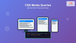
CSS media queries are the cornerstone of responsive web design, allowing developers to apply different styles based on device characteristics like screen size, resolution, and orientation. Understanding media query syntax is essential for creating websites that look perfect on every device, from smartphones to ultra-wide monitors.
What Are CSS Media Queries?
Media queries are CSS features that enable conditional styling based on media types and device features. They use the @media rule to apply styles only when certain conditions are met, making your website responsive and adaptive to different viewing environments.
Key Benefits:
- Create responsive layouts that adapt to any screen size
- Optimize user experience across all devices
- Improve website performance by loading appropriate styles
- Enhance accessibility for different viewing conditions
Basic Media Query Syntax
The fundamental structure of a CSS media query follows this pattern:
@media [media-type] [logical-operator] ([media-feature]: [value]) {
  /* CSS rules */
}
Let’s break down each component:
- @media: The at-rule that initiates a media query
- media-type: Specifies the type of media (screen, print, etc.)
- logical-operator: Combines multiple conditions (and, or, not)
- media-feature: The characteristic being tested
- value: The condition that must be met
Media Types
Media types define the broad category of device or medium where the CSS will be applied. Here are the most commonly used media types:
Screen
The screen media type targets computer screens, tablets, smartphones, and other screen-based devices. This is the most frequently used media type in modern web development.
@media screen and (max-width: 768px) {
  body {
    font-size: 14px;
    padding: 10px;
  }
}The print media type applies styles when a page is being printed or in print preview mode. This is crucial for creating printer-friendly versions of web pages.
@media print {
  body {
    background: white;
    color: black;
    font-size: 12pt;
  }

  .no-print {
    display: none;
  }
}
All
The all media type is the default and applies to all media types. When no media type is specified, all is assumed.
@media all and (orientation: landscape) {
  .landscape-only {
    display: block;
  }
}
Essential Media Features
Media features are the specific characteristics you can test in your media queries. Here are the most important ones for responsive design:
Width and Height Features
width, max-width, min-width
These features test the viewport width, making them perfect for creating responsive breakpoints.
/* Mobile-first approach */
.container {
  width: 100%;
  padding: 15px;
}

/* Tablet and up */
@media (min-width: 768px) {
  .container {
    max-width: 750px;
    margin: 0 auto;
  }
}

/* Desktop and up */
@media (min-width: 1024px) {
  .container {
    max-width: 1200px;
    padding: 30px;
  }
}
height, max-height, min-height
Height-based media queries are useful for adjusting layouts based on viewport height, especially for navigation and full-screen elements.
/* Adjust navigation for short screens */
@media (max-height: 600px) {
  .navigation {
    height: 40px;
    font-size: 14px;
  }
}

/* Full-height hero section for tall screens */
@media (min-height: 800px) {
  .hero {
    min-height: 100vh;
  }
}
Orientation Feature
The orientation feature detects whether the device is in portrait or landscape mode.
/* Portrait orientation */
@media (orientation: portrait) {
  .image-gallery {
    grid-template-columns: 1fr 1fr;
  }
}

/* Landscape orientation */
@media (orientation: landscape) {
  .image-gallery {
    grid-template-columns: repeat(4, 1fr);
  }
}
Resolution Features
Resolution media queries help optimize content for high-DPI displays like Retina screens.
/* Standard resolution */
.logo {
  background-image: url('logo.png');
}

/* High resolution displays */
@media (min-resolution: 2dppx) {
  .logo {
    background-image: url('[email protected]');
    background-size: 200px 100px;
  }
}
Aspect Ratio Features
Aspect ratio queries are perfect for optimizing content based on screen proportions.
/* Ultra-wide screens */
@media (min-aspect-ratio: 21/9) {
  .content {
    display: grid;
    grid-template-columns: 1fr 2fr 1fr;
  }
}

/* Square or nearly square screens */
@media (aspect-ratio: 1/1) {
  .square-optimized {
    display: flex;
    flex-direction: column;
    justify-content: center;
  }
}
Logical Operators
Logical operators allow you to combine multiple conditions in your media queries, creating more precise targeting.
AND Operator
The and operator requires all conditions to be true.
/* Tablet in landscape mode */
@media screen and (min-width: 768px) and (max-width: 1023px) and (orientation: landscape) {
  .tablet-landscape {
    display: flex;
    flex-direction: row;
  }
}
OR Operator (Comma)
The comma acts as an OR operator, applying styles when any condition is met.
/* Mobile OR very narrow desktop windows */
@media (max-width: 480px), (max-width: 768px) and (max-height: 600px) {
  .compact-layout {
    padding: 10px;
    font-size: 14px;
  }
}
NOT Operator
The not operator negates the entire media query.
/* Everything except print */
@media not print {
  .interactive-element {
    cursor: pointer;
    transition: all 0.3s ease;
  }
}
Interactive Examples
Let’s create some interactive examples to see media queries in action. Try resizing your browser window to see how these examples respond:
Responsive Grid Example
Resize your browser to see the grid adapt: 1 column on mobile, 2 on tablet, 3 on desktop, and 4 on large screens.
Orientation-Based Layout
This layout changes based on your device orientation. On mobile devices, rotate your screen to see the difference.
Common Media Query Patterns
Here are some proven patterns and breakpoints used by popular frameworks and experienced developers:
Mobile-First Approach
The mobile-first approach starts with mobile styles and progressively enhances for larger screens:
/* Base styles (mobile) */
.container {
  width: 100%;
  padding: 15px;
}

.navigation {
  flex-direction: column;
}

/* Small tablets and up */
@media (min-width: 576px) {
  .container {
    max-width: 540px;
  }
}

/* Large tablets and up */
@media (min-width: 768px) {
  .container {
    max-width: 720px;
  }

  .navigation {
    flex-direction: row;
  }
}

/* Desktops and up */
@media (min-width: 992px) {
  .container {
    max-width: 960px;
  }
}

/* Large desktops and up */
@media (min-width: 1200px) {
  .container {
    max-width: 1140px;
  }
}
Desktop-First Approach
The desktop-first approach starts with desktop styles and scales down:
/* Base styles (desktop) */
.sidebar {
  width: 300px;
  position: fixed;
  left: 0;
}

.main-content {
  margin-left: 320px;
}

/* Tablets and down */
@media (max-width: 991px) {
  .sidebar {
    width: 250px;
  }

  .main-content {
    margin-left: 270px;
  }
}

/* Mobile and down */
@media (max-width: 767px) {
  .sidebar {
    width: 100%;
    position: static;
  }

  .main-content {
    margin-left: 0;
  }
}
Advanced Media Query Features
Modern CSS provides additional media features for more sophisticated responsive designs:
Prefers-Color-Scheme
Detect user’s preferred color scheme (light or dark mode):
/* Light mode (default) */
body {
  background-color: white;
  color: black;
}

/* Dark mode */
@media (prefers-color-scheme: dark) {
  body {
    background-color: #1a1a1a;
    color: #ffffff;
  }

  .card {
    background-color: #2d2d2d;
    border-color: #404040;
  }
}
Prefers-Reduced-Motion
Respect user’s preference for reduced motion:
/* Default animations */
.button {
  transition: all 0.3s ease;
}

.modal {
  animation: slideIn 0.5s ease-out;
}

/* Reduced motion preference */
@media (prefers-reduced-motion: reduce) {
  .button {
    transition: none;
  }

  .modal {
    animation: none;
  }
}
Hover and Pointer Features
Optimize interactions based on input capabilities:
/* Touch devices */
@media (hover: none) and (pointer: coarse) {
  .button {
    min-height: 44px; /* Larger touch targets */
    padding: 12px 20px;
  }
}

/* Mouse/trackpad devices */
@media (hover: hover) and (pointer: fine) {
  .button:hover {
    background-color: #0056b3;
    transform: translateY(-2px);
  }
}
Best Practices and Tips
Follow these guidelines to write efficient and maintainable media queries:
✅ Do’s
- Use mobile-first approach for better performance
- Choose meaningful breakpoints based on content, not devices
- Group related media queries together
- Use relative units (em, rem) for more flexible breakpoints
- Test on real devices, not just browser dev tools
- Keep media queries as simple as possible
❌ Don’ts
- Don’t create too many breakpoints
- Don’t use device-specific breakpoints
- Don’t nest media queries unnecessarily
- Don’t forget to test print styles
- Don’t use !important to override media query styles
Organizing Media Queries
Structure your CSS for better maintainability:
/* Component styles first */
.header {
  background: #fff;
  padding: 1rem;
}

.navigation {
  display: flex;
  flex-direction: column;
}

/* Then media queries for the same component */
@media (min-width: 768px) {
  .header {
    padding: 2rem;
  }

  .navigation {
    flex-direction: row;
    justify-content: space-between;
  }
}
Debugging Media Queries
Use these techniques to troubleshoot media query issues:
Browser Developer Tools
Modern browsers provide excellent tools for testing responsive designs:
- Use device simulation mode to test different screen sizes
- Check the computed styles panel to see which media queries are active
- Use the responsive design mode to test custom dimensions
CSS Debugging Tricks
Add temporary styles to visualize when media queries are active:
/* Debugging aid - remove in production */
body::before {
  content: "Mobile";
  position: fixed;
  top: 0;
  left: 0;
  background: red;
  color: white;
  padding: 5px;
  z-index: 9999;
}

@media (min-width: 768px) {
  body::before {
    content: "Tablet";
    background: orange;
  }
}

@media (min-width: 1024px) {
  body::before {
    content: "Desktop";
    background: green;
  }
}
Performance Considerations
Media queries can impact performance if not used wisely:
Minimize Repaints and Reflows
Avoid changing properties that trigger expensive recalculations:
/* Good - uses transform instead of changing position */
@media (max-width: 767px) {
  .sidebar {
    transform: translateX(-100%);
  }
}

/* Avoid - causes layout recalculation */
@media (max-width: 767px) {
  .sidebar {
    left: -300px;
  }
}
Load Critical CSS First
Ensure above-the-fold content styles load quickly:
/* Critical styles for initial viewport */
.hero {
  background: #007bff;
  color: white;
  min-height: 50vh;
}

/* Non-critical styles can be in separate media queries */
@media (min-width: 1024px) {
  .hero {
    min-height: 80vh;
    background-attachment: fixed;
  }
}
Conclusion
CSS media queries are powerful tools that enable truly responsive web design. By understanding media types, features, and logical operators, you can create websites that provide optimal user experiences across all devices and viewing conditions.
Remember to start with a mobile-first approach, use meaningful breakpoints based on your content, and always test your designs on real devices. With these fundamentals and best practices, you’ll be able to craft responsive layouts that adapt beautifully to any screen size or device capability.
The key to mastering media queries is practice and experimentation. Start with simple responsive layouts and gradually incorporate more advanced features like dark mode support and motion preferences. Your users will appreciate the thoughtful, adaptive experiences you create.
Related Posts
CSS Media Queries: Complete Guide to @media Rule for Responsive Web Design
What Are CSS Media Queries? CSS Media Queries are a fundamental feature of modern web development that allow you to...
CSS Screen Media Queries: Complete Guide to Responsive Monitor and Device Targeting
CSS screen media queries are the cornerstone of responsive web design, enabling developers to create websites that adapt seamlessly across...
CSS Media Query Operators: Complete Guide to and, or, not, only Keywords
CSS media query operators are essential tools for creating responsive web designs that adapt to different devices and screen conditions....
CSS Resolution Media Queries: Complete Guide to High-DPI Display Targeting
Understanding CSS Resolution Media Queries CSS resolution media queries allow developers to target specific display densities and create optimized experiences...
CSS Mobile-First Design: Complete Min-Width Media Query Guide for Responsive Web Development
What is Mobile-First Design? Mobile-first design is a progressive enhancement approach where you start designing and coding for the smallest...
HTML Responsive Web Design: Crafting Websites for Every Device
Introduction In today's digital landscape, users access the internet through a plethora of devices, from large desktop monitors to small...
CSS Orientation Media Queries: Complete Guide to Portrait vs Landscape Detection
CSS orientation media queries are essential tools for creating responsive web designs that adapt seamlessly to different device orientations. Whether...
HTML Source media Property: Source Media Query
HTML Source media Property: Source Media Query The HTML <source> element is used within <picture> and <video> elements to provide...
CSS Future: Complete Guide to Upcoming CSS Features and Specifications 2025
The future of CSS is incredibly exciting, with numerous groundbreaking features and specifications currently in development that promise to revolutionize...
CSS Container Queries: Complete Guide to @container Rule and Containment Context
CSS Container Queries represent a revolutionary approach to responsive web design, allowing elements to respond to their container's size rather...
JavaScript MediaQueryList API: Responsive Design
JavaScript MediaQueryList API: Crafting Dynamic Responsive Designs The JavaScript MediaQueryList API provides a powerful mechanism for web developers to dynamically...
JavaScript Window matchMedia() Method: Matching Media Queries
JavaScript Window matchMedia() Method: Matching Media Queries The window.matchMedia() method in JavaScript is a powerful tool that enables developers to...


