
CSS fixed positioning is one of the most powerful tools in a web developer’s arsenal for creating engaging, interactive user experiences. When an element is positioned with position: fixed, it’s removed from the normal document flow and positioned relative to the viewport, remaining in the same location even when users scroll through the page.
Understanding CSS Fixed Positioning
Fixed positioning creates elements that stay in a specific location on the screen, regardless of scrolling. This behavior makes it perfect for navigation bars, floating action buttons, modal overlays, and other UI elements that need to remain accessible at all times.
Key Characteristics of Fixed Positioning
- Viewport Relative: Elements are positioned relative to the browser’s viewport, not the document
- Scroll Independent: Fixed elements don’t move when the page is scrolled
- Removed from Flow: Other elements behave as if fixed elements don’t exist
- Z-Index Aware: Fixed elements participate in stacking context
Basic Fixed Positioning Syntax
The fundamental syntax for fixed positioning involves setting the position property to fixed and using offset properties to define the element’s location:
.fixed-element {
  position: fixed;
  top: 20px;
  right: 20px;
  width: 200px;
  height: 100px;
}
Offset Properties for Fixed Elements
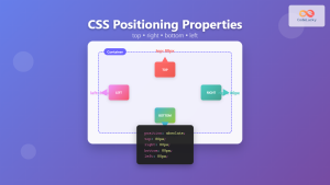
Fixed positioned elements use four offset properties to determine their exact location:
- top: Distance from the top edge of the viewport
- right: Distance from the right edge of the viewport
- bottom: Distance from the bottom edge of the viewport
- left: Distance from the left edge of the viewport
Interactive Demo: Basic Fixed Positioning
Try It Yourself: Fixed Position Demo
Scrollable Content Area
This content area is scrollable. Notice how the blue “Fixed Element” stays in place even when you scroll through this content.
Lorem ipsum dolor sit amet, consectetur adipiscing elit. Sed do eiusmod tempor incididunt ut labore et dolore magna aliqua.
Ut enim ad minim veniam, quis nostrud exercitation ullamco laboris nisi ut aliquip ex ea commodo consequat.
Duis aute irure dolor in reprehenderit in voluptate velit esse cillum dolore eu fugiat nulla pariatur.
Excepteur sint occaecat cupidatat non proident, sunt in culpa qui officia deserunt mollit anim id est laborum.
Common Use Cases for Fixed Positioning
1. Sticky Navigation Headers
One of the most popular applications of fixed positioning is creating navigation bars that remain visible while users scroll through content:
.navbar {
  position: fixed;
  top: 0;
  left: 0;
  width: 100%;
  background-color: #333;
  color: white;
  z-index: 1000;
  padding: 15px 20px;
  box-shadow: 0 2px 10px rgba(0,0,0,0.1);
}

.content {
  margin-top: 70px; /* Account for fixed navbar height */
}
2. Floating Action Buttons
Fixed positioning is perfect for creating floating action buttons (FABs) that provide quick access to primary actions:
.fab {
  position: fixed;
  bottom: 30px;
  right: 30px;
  width: 60px;
  height: 60px;
  border-radius: 50%;
  background-color: #ff4081;
  color: white;
  border: none;
  box-shadow: 0 4px 12px rgba(255,64,129,0.4);
  cursor: pointer;
  transition: transform 0.2s ease;
}

.fab:hover {
  transform: scale(1.1);
}
3. Modal Overlays and Pop-ups
Fixed positioning enables full-screen overlays that cover the entire viewport:
.modal-overlay {
  position: fixed;
  top: 0;
  left: 0;
  width: 100%;
  height: 100%;
  background-color: rgba(0, 0, 0, 0.5);
  z-index: 9999;
  display: flex;
  align-items: center;
  justify-content: center;
}

.modal-content {
  background-color: white;
  padding: 30px;
  border-radius: 12px;
  max-width: 500px;
  width: 90%;
  box-shadow: 0 10px 30px rgba(0,0,0,0.3);
}
Advanced Fixed Positioning Techniques
Responsive Fixed Elements
Creating fixed elements that adapt to different screen sizes requires careful consideration of viewport dimensions and media queries:
.responsive-fixed {
  position: fixed;
  top: 20px;
  right: 20px;
  width: 250px;
  padding: 20px;
  background-color: #007bff;
  color: white;
  border-radius: 8px;
}

@media (max-width: 768px) {
  .responsive-fixed {
    width: calc(100% - 40px);
    left: 20px;
    right: 20px;
  }
}

@media (max-width: 480px) {
  .responsive-fixed {
    top: 10px;
    left: 10px;
    right: 10px;
    width: auto;
  }
}
Fixed Positioning with CSS Grid and Flexbox
Modern CSS layout methods work seamlessly with fixed positioning. Here’s how to center a fixed element using Flexbox:
.centered-fixed {
  position: fixed;
  top: 0;
  left: 0;
  width: 100%;
  height: 100%;
  display: flex;
  align-items: center;
  justify-content: center;
  background-color: rgba(0, 0, 0, 0.8);
  z-index: 1000;
}

.centered-content {
  background-color: white;
  padding: 40px;
  border-radius: 12px;
  text-align: center;
  max-width: 400px;
  width: 90%;
}
Real-World Example: Complete Fixed Layout
Complete Example: Modern Web Layout
Performance Considerations
While fixed positioning is powerful, it’s important to consider its impact on performance and user experience:
Browser Rendering and Repaints
Fixed elements can trigger repaints and reflows, especially when they change frequently. To optimize performance:
- Use
transformandopacityfor animations instead of changing position values - Minimize the number of fixed elements on a single page
- Use
will-changeproperty for elements that will be animated - Consider using
position: stickyas an alternative when appropriate
.performance-optimized {
  position: fixed;
  top: 20px;
  right: 20px;
  will-change: transform, opacity;
  transform: translateZ(0); /* Force hardware acceleration */
  backface-visibility: hidden;
}
Accessibility Best Practices
Fixed positioned elements can impact accessibility if not implemented thoughtfully:
Screen Reader Considerations
- Ensure fixed elements don’t obstruct important content
- Use appropriate ARIA labels and roles
- Provide keyboard navigation support
- Consider reduced motion preferences
⚠️ Accessibility Tip
Always test your fixed positioned elements with keyboard navigation and screen readers to ensure they don’t create barriers for users with disabilities.
Troubleshooting Common Issues
Z-Index Stacking Problems
Fixed elements often encounter z-index issues. Here’s how to manage stacking contexts effectively:
/* Establish a clear z-index hierarchy */
.navbar { z-index: 1000; }
.modal-overlay { z-index: 9999; }
.tooltip { z-index: 10000; }
.dropdown { z-index: 1001; }

/* Create new stacking context when needed */
.stacking-context {
  position: relative;
  z-index: 0;
}
Mobile Device Considerations
Fixed positioning behaves differently on mobile devices, especially with virtual keyboards and orientation changes:
/* Mobile-friendly fixed positioning */
@media (max-width: 768px) {
  .mobile-fixed {
    position: fixed;
    bottom: env(safe-area-inset-bottom, 20px);
    left: env(safe-area-inset-left, 20px);
    right: env(safe-area-inset-right, 20px);
  }
}

/* Handle virtual keyboard on mobile */
@media (max-height: 500px) {
  .keyboard-aware {
    display: none;
  }
}
Browser Support and Compatibility
CSS fixed positioning enjoys excellent browser support across all modern browsers. However, there are some historical considerations:
- Internet Explorer 6: Required DOCTYPE declaration for proper support
- Mobile Safari: Had issues with fixed positioning during scrolling (resolved in modern versions)
- Android Browser: Early versions had performance issues (resolved in Android 3+)
Conclusion
CSS fixed positioning is a fundamental technique for creating modern, interactive web interfaces. From sticky navigation bars to floating action buttons and modal overlays, fixed positioning enables developers to create engaging user experiences that keep important elements accessible regardless of scroll position.
Remember to consider performance implications, accessibility requirements, and mobile device behaviors when implementing fixed positioned elements. With proper planning and implementation, fixed positioning can significantly enhance your website’s usability and visual appeal.
As you continue developing with CSS, experiment with different fixed positioning techniques and combine them with modern layout methods like Flexbox and Grid for even more powerful and flexible designs.
Related Posts
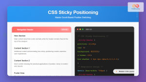
CSS Sticky Positioning: Master Scroll-Based Position Switching with Practical Examples
CSS sticky positioning is a powerful layout technique that combines the best of both relative and fixed positioning. It allows...
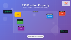
CSS Position Property: Complete Guide to Static, Relative, Absolute, Fixed & Sticky Positioning
The CSS position property is one of the most powerful tools for controlling element layout and creating sophisticated web designs....
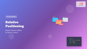
CSS Relative Positioning: Master Element Offset and Layout Control
Understanding CSS Relative Positioning CSS relative positioning is a fundamental layout technique that allows you to move elements from their...
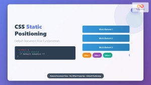
CSS Static Positioning: Understanding Default Document Flow and Layout Fundamentals
CSS positioning is one of the fundamental concepts every web developer must master. Among the various positioning methods available, static...

CSS position Property: Mastering Layouts in CSS
Understanding the CSS position Property: A Comprehensive Guide The position property in CSS is a fundamental tool for controlling the...

CSS Style right Property: CSS Right
Understanding the CSS right Property The CSS right property plays a crucial role in positioning elements within a web page....
CSS Top, Right, Bottom, Left: Complete Guide to Positioning Offset Properties
CSS positioning offset properties—top, right, bottom, and left—are fundamental tools for precisely controlling element placement on web pages. These properties...
CSS overflowX Property: CSS Overflow X Explained with Examples
Understanding the CSS overflowX Property The overflowX property in CSS dictates how the browser handles content that overflows the horizontal...
CSS Background-Attachment: Master Fixed vs Scroll Background Effects
The CSS background-attachment property controls how background images behave when users scroll through your webpage. Understanding the difference between fixed...
CSS Style overflow Property: CSS Overflow
CSS overflow Property: Controlling Content Overflow The CSS overflow property specifies how to handle content that overflows a container element....

HTML Element scrollIntoView() Method: Scrolling Element into View
HTML Element scrollIntoView() Method: Scrolling Element into View The scrollIntoView() method is a powerful tool in the arsenal of web...
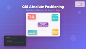
CSS Absolute Positioning: Master Element Placement with Containing Blocks
CSS absolute positioning is one of the most powerful tools for creating precise layouts and complex designs. Understanding how absolutely...


