
The CSS background-attachment property controls how background images behave when users scroll through your webpage. Understanding the difference between fixed and scroll values can dramatically improve your web design capabilities, especially when creating engaging parallax effects and immersive user experiences.
What is CSS Background-Attachment?
The background-attachment property determines whether a background image is fixed relative to the viewport or scrolls with the content. This property accepts three main values:
- scroll – Background scrolls with the content (default behavior)
- fixed – Background remains fixed relative to the viewport
- local – Background scrolls with the element’s content
CSS Background-Attachment Syntax
/* Basic syntax */
background-attachment: scroll | fixed | local | initial | inherit;

/* Multiple backgrounds */
background-attachment: scroll, fixed, local;
Background-Attachment: Scroll (Default Behavior)
When set to scroll, the background image moves along with the page content as users scroll. This is the default behavior that most websites use.
Scroll Background Example
Live Demo: Scroll Background
Scroll within this container to see the background moving with the content.
Notice how the background gradient moves as you scroll.
This is the default scroll behavior.
Keep scrolling to see more content…
The background continues to scroll with the text.
.scroll-background {
    background-image: url('your-image.jpg');
    background-attachment: scroll;
    background-size: cover;
    background-position: center;
    height: 100vh;
}
Background-Attachment: Fixed (Creating Parallax Effects)
The fixed value creates a stationary background that remains in place while content scrolls over it. This technique is commonly used for creating parallax scrolling effects and immersive storytelling experiences.
Fixed Background Example
Live Demo: Fixed Background
This content scrolls over a fixed background.
Notice how the background stays in place while this content moves.
This creates a beautiful parallax effect.
Perfect for storytelling and immersive designs.
.fixed-background {
    background-image: url('your-background.jpg');
    background-attachment: fixed;
    background-size: cover;
    background-position: center;
    min-height: 100vh;
}
Background-Attachment: Local
The local value makes the background scroll with the element’s content, including when the element itself has scrollable content. This is useful for scrollable containers with background images.
Live Demo: Local Background
This container has a striped background with local attachment.
Scroll to see how the background moves with the content inside this scrollable area.
The background pattern scrolls along with this text.
This is different from both scroll and fixed behaviors.
.local-background {
    background-image: url('pattern.png');
    background-attachment: local;
    background-repeat: repeat;
    height: 200px;
    overflow-y: auto;
}
Practical Applications and Use Cases
1. Hero Sections with Fixed Backgrounds
Fixed backgrounds work excellently for creating impactful hero sections that maintain visual interest as users begin scrolling.
.hero-section {
    background-image: url('hero-bg.jpg');
    background-attachment: fixed;
    background-size: cover;
    background-position: center;
    height: 100vh;
    display: flex;
    align-items: center;
    justify-content: center;
    color: white;
    text-align: center;
}
2. Storytelling Sections
Combine fixed and scroll backgrounds to create engaging storytelling experiences where different sections have distinct visual treatments.
.story-section-1 {
    background-image: url('story-bg-1.jpg');
    background-attachment: fixed;
    min-height: 100vh;
    padding: 50px 0;
}

.story-section-2 {
    background-image: url('story-bg-2.jpg');
    background-attachment: scroll;
    min-height: 100vh;
    padding: 50px 0;
}
3. Card Overlays with Local Backgrounds
Use local background attachment for cards or containers with scrollable content that need consistent background patterns.
.scrollable-card {
    background-image: url('subtle-pattern.png');
    background-attachment: local;
    background-repeat: repeat;
    max-height: 300px;
    overflow-y: auto;
    padding: 20px;
    border-radius: 8px;
    box-shadow: 0 4px 6px rgba(0,0,0,0.1);
}
Interactive Comparison Demo
Compare All Three Behaviors
Browser Support and Compatibility
The background-attachment property enjoys excellent browser support across all modern browsers. However, there are some important considerations:
- Desktop browsers: Full support in Chrome, Firefox, Safari, and Edge
- Mobile browsers: Fixed backgrounds may not work on some mobile devices due to performance optimization
- iOS Safari: Fixed backgrounds are disabled by default for performance reasons
- Performance: Fixed backgrounds can impact scrolling performance on lower-end devices
Performance Considerations
While fixed backgrounds create stunning visual effects, they can impact performance, especially on mobile devices and during scrolling. Here are optimization strategies:
1. Use CSS Transforms for Better Performance
/* Instead of background-attachment: fixed */
.parallax-container {
    overflow-x: hidden;
    overflow-y: auto;
    height: 100vh;
}

.parallax-element {
    position: absolute;
    top: 0;
    left: 0;
    right: 0;
    bottom: 0;
    background-image: url('bg.jpg');
    background-size: cover;
    will-change: transform;
    transform: translateZ(0);
}
2. Mobile-First Approach
/* Default scroll behavior for mobile */
.hero-section {
    background-attachment: scroll;
    background-image: url('hero-mobile.jpg');
}

/* Fixed background for larger screens */
@media (min-width: 768px) {
    .hero-section {
        background-attachment: fixed;
        background-image: url('hero-desktop.jpg');
    }
}
Common Pitfalls and Solutions
1. Fixed Backgrounds Not Working on Mobile
Many mobile browsers disable fixed backgrounds for performance. Always provide fallbacks:
.section {
    background-attachment: scroll; /* Fallback */
    background-attachment: fixed;
}

/* Alternative approach */
@supports (background-attachment: fixed) {
    @media (min-width: 768px) {
        .section {
            background-attachment: fixed;
        }
    }
}
2. Background Size and Position Issues
Always combine background-attachment with appropriate sizing and positioning:
.background-section {
    background-image: url('image.jpg');
    background-attachment: fixed;
    background-size: cover;          /* Ensures full coverage */
    background-position: center;     /* Centers the image */
    background-repeat: no-repeat;    /* Prevents repetition */
}
Advanced Techniques
Multiple Backgrounds with Different Attachments
You can combine multiple backgrounds with different attachment values for complex effects:
.multi-bg {
    background-image:
        url('overlay.png'),
        url('texture.jpg'),
        url('main-bg.jpg');
    background-attachment:
        local,
        scroll,
        fixed;
    background-size:
        auto,
        cover,
        cover;
    background-position:
        center,
        center,
        center;
}
CSS Custom Properties for Dynamic Control
:root {
    --bg-attachment: scroll;
}

.dynamic-bg {
    background-attachment: var(--bg-attachment);
    background-image: url('bg.jpg');
    background-size: cover;
}

/* JavaScript can change the custom property */
/* element.style.setProperty('--bg-attachment', 'fixed'); */
Accessibility Considerations
When using background-attachment effects, consider accessibility:
- Respect reduced motion preferences: Users with vestibular disorders may be sensitive to parallax effects
- Ensure text readability: Fixed backgrounds shouldn’t interfere with content legibility
- Provide alternative experiences: Consider disabling effects for users who prefer reduced motion
/* Respect user's motion preferences */
@media (prefers-reduced-motion: reduce) {
    .parallax-section {
        background-attachment: scroll;
    }
}
Testing and Debugging
When working with background-attachment, use these debugging techniques:
- Browser developer tools: Inspect computed styles to verify applied values
- Cross-device testing: Test on actual mobile devices, not just browser emulation
- Performance monitoring: Use tools like Chrome DevTools to monitor scroll performance
- Gradual enhancement: Start with basic scroll behavior and enhance progressively
Conclusion
The CSS background-attachment property is a powerful tool for creating engaging, visually rich web experiences. Understanding when to use scroll, fixed, or local values allows you to craft immersive designs that enhance user engagement while maintaining good performance and accessibility.
Remember to always test across different devices and browsers, provide appropriate fallbacks for mobile users, and consider the performance implications of your design choices. With these principles in mind, you can leverage background-attachment to create stunning web experiences that work beautifully across all platforms.
Start experimenting with these techniques in your next project, and you’ll discover how this seemingly simple CSS property can dramatically transform your web designs.
Related Posts
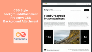
CSS Style backgroundAttachment Property: CSS Background Attachment
Understanding the background-attachment Property in CSS The background-attachment property in CSS determines whether a background image scrolls with the containing...
CSS Style backgroundImage Property: CSS Background Image
CSS backgroundImage Property: A Comprehensive Guide The backgroundImage property in CSS is used to set one or more background images...
CSS Background-Image: Complete Guide to Adding Images to Element Backgrounds
The CSS background-image property is one of the most powerful tools for creating visually appealing web designs. It allows you...
CSS Style background Property: CSS Background
CSS background Property: A Comprehensive Guide to Styling Web Page Backgrounds The CSS background property is a versatile shorthand property...
CSS Backdrop-Filter: Complete Guide to Background Blur and Visual Effects
What is CSS Backdrop-Filter? The backdrop-filter property in CSS allows you to apply graphical effects like blur, brightness, contrast, and...
CSS Style backgroundPosition Property: CSS Background Position
CSS background-position Property: Mastering Background Image Placement The CSS background-position property allows you to precisely control the initial position of...
CSS Style backgroundSize Property: CSS Background Size
CSS background-size Property: Mastering Background Image Scaling The CSS background-size property specifies the size of background images. Controlling the size...
CSS Fixed Positioning: Complete Guide to Viewport-Relative Elements
CSS fixed positioning is one of the most powerful tools in a web developer's arsenal for creating engaging, interactive user...
CSS Background-Size: Master Cover, Contain and Custom Sizing Techniques
The CSS background-size property is a powerful tool that controls how background images are sized within their containers. Whether you're...
CSS scrollBehavior Property: CSS Scroll Behavior
Understanding CSS scroll-behavior: Smooth Scrolling Made Easy The scroll-behavior property in CSS allows you to define the scrolling behavior when...
CSS Background-Position: Complete Guide to Precise Background Image Positioning
The CSS background-position property is a fundamental tool for controlling exactly where background images appear within their containers. Whether you're...
CSS Style backgroundOrigin Property: CSS Background Origin
Understanding the background-origin Property in CSS The background-origin property in CSS specifies where the background image should be positioned within...


