
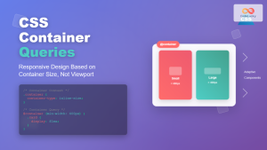
CSS Container Query Length Units represent a revolutionary approach to responsive web design, allowing developers to create components that adapt based on their container’s dimensions rather than the viewport size. The four primary units – cqw, cqh, cqi, and cqb – provide unprecedented control over component-level responsiveness.
Understanding Container Query Length Units
Container query length units are relative units that calculate their values based on the dimensions of a containment context. Unlike traditional viewport units (vw, vh), these units respond to the size of a specific container element, enabling true component-based responsive design.
The Four Container Query Units
- cqw (Container Query Width): 1% of the container’s width
- cqh (Container Query Height): 1% of the container’s height
- cqi (Container Query Inline): 1% of the container’s inline size
- cqb (Container Query Block): 1% of the container’s block size
Setting Up Container Queries
Before using container query units, you must establish a containment context using the container-type property:
.container {
  container-type: inline-size; /* Enables width-based queries */
  /* or */
  container-type: size; /* Enables both width and height queries */
}
CQW (Container Query Width) Unit
The cqw unit represents 1% of the container’s width. This unit is particularly useful for creating components that scale their internal elements proportionally to the container’s width.
Example: Responsive Card Component
.card-container {
  container-type: inline-size;
  width: 300px;
  border: 2px solid #007bff;
  border-radius: 8px;
  padding: 1cqw;
}

.card-title {
  font-size: 5cqw;
  margin-bottom: 2cqw;
}

.card-content {
  font-size: 3cqw;
  line-height: 1.4;
}
Responsive Card
This card’s text scales with the container width using cqw units.
CQH (Container Query Height) Unit
The cqh unit represents 1% of the container’s height. This unit requires container-type: size to function properly and is ideal for vertical scaling scenarios.
Example: Vertical Progress Indicator
.progress-container {
  container-type: size;
  width: 60px;
  height: 200px;
  border: 2px solid #28a745;
  border-radius: 8px;
  position: relative;
}

.progress-bar {
  width: 10cqh;
  height: 60cqh;
  background: #28a745;
  border-radius: 4px;
  margin: 5cqh auto;
}

.progress-label {
  font-size: 8cqh;
  text-align: center;
  margin-top: 2cqh;
}CQI (Container Query Inline) Unit
The cqi unit represents 1% of the container’s inline size. In left-to-right languages, this typically corresponds to width, but it adapts to the writing mode of the document.
Example: Adaptive Button Component
.button-container {
  container-type: inline-size;
  width: 250px;
}

.adaptive-button {
  padding: 2cqi 4cqi;
  font-size: 4cqi;
  border: 1cqi solid #6c757d;
  border-radius: 1cqi;
  background-color: #6c757d;
  color: white;
  cursor: pointer;
}

.adaptive-button:hover {
  background-color: #5a6268;
}CQB (Container Query Block) Unit
The cqb unit represents 1% of the container’s block size. In horizontal writing modes, this corresponds to height, but it adapts based on the writing direction.
Example: Sidebar Navigation
.sidebar {
  container-type: size;
  width: 180px;
  height: 300px;
  background: #343a40;
  border-radius: 8px;
  padding: 3cqb;
}

.nav-item {
  display: block;
  padding: 2cqb 4cqi;
  margin-bottom: 1cqb;
  background: #495057;
  color: white;
  text-decoration: none;
  border-radius: 1cqb;
  font-size: 3cqb;
}Interactive Demo: Container Query Units in Action
Resizable Container Demo
Container Query Demo
Width: 100cqw | Height: 100cqh
Inline: 100cqi | Block: 100cqb
Drag the bottom-right corner to resize the container and see how the elements scale!
Practical Use Cases and Benefits
1. Component-Based Responsive Design
Container query units enable true component-based responsive design, where each component can adapt independently based on its available space rather than the viewport size.
2. Reusable UI Components
Components designed with container query units can be reused across different contexts without modification, as they automatically adapt to their container’s dimensions.
3. Grid and Flexbox Integration
Container query units work seamlessly with CSS Grid and Flexbox, creating more sophisticated and adaptive layouts.
Example: Adaptive Grid Cards
.grid-container {
  display: grid;
  grid-template-columns: repeat(auto-fit, minmax(250px, 1fr));
  gap: 20px;
}

.grid-card {
  container-type: inline-size;
  background: white;
  border-radius: 2cqw;
  padding: 4cqw;
  box-shadow: 0 2px 8px rgba(0,0,0,0.1);
}

.card-image {
  width: 100%;
  height: 40cqw;
  background: #e9ecef;
  border-radius: 1cqw;
  margin-bottom: 3cqw;
}

.card-title {
  font-size: 6cqw;
  margin-bottom: 2cqw;
}

.card-description {
  font-size: 3.5cqw;
  line-height: 1.5;
  color: #666;
}
Browser Support and Fallbacks
Container query units are supported in modern browsers, but it’s important to provide fallbacks for older browsers:
Fallback Strategy
/* Fallback for older browsers */
.responsive-text {
  font-size: 16px; /* Fallback */
  font-size: 4cqw; /* Container query unit */
}

/* Feature detection */
@supports (font-size: 1cqw) {
  .modern-component {
    /* Container query unit styles */
  }
}
Best Practices and Tips
1. Choose the Right Container Type
- Use
container-type: inline-sizefor width-based queries only - Use
container-type: sizewhen you need both width and height queries
2. Combine with Traditional Units
Mix container query units with traditional units for optimal results:
.mixed-units {
  padding: 2cqw 20px; /* Responsive horizontal, fixed vertical */
  font-size: clamp(14px, 4cqw, 24px); /* Responsive with limits */
  margin-bottom: 1rem; /* Fixed spacing */
}
3. Consider Performance
Container queries trigger layout calculations, so use them judiciously in performance-critical applications.
Common Pitfalls to Avoid
1. Forgetting Container Type Declaration
Container query units won’t work without proper container-type declaration on the parent element.
2. Using Height-Based Units Without size Containment
Units like cqh and cqb require container-type: size, not just inline-size.
3. Circular Dependencies
Avoid situations where container queries create circular dependencies that could cause layout thrashing.
Advanced Techniques
Combining Container Queries with CSS Custom Properties
.dynamic-component {
  container-type: inline-size;
  --base-size: 4cqw;
  --spacing: calc(var(--base-size) * 0.5);
}

.dynamic-content {
  font-size: var(--base-size);
  padding: var(--spacing);
  margin-bottom: var(--spacing);
}
Future of Container Query Units
Container query units represent a significant evolution in CSS, enabling more sophisticated and maintainable responsive designs. As browser support continues to improve, these units will become essential tools for modern web development.
Conclusion
CSS Container Query Length Units (cqw, cqh, cqi, cqb) provide powerful tools for creating truly responsive components that adapt to their container’s dimensions. By understanding and implementing these units effectively, developers can create more flexible, reusable, and maintainable user interfaces that respond intelligently to their context.
Start experimenting with container query units in your projects today to unlock new possibilities in responsive web design. Remember to provide appropriate fallbacks for older browsers and consider performance implications when implementing these advanced CSS features.
Related Posts
CSS Container Queries: Complete Guide to @container Rule and Containment Context
CSS Container Queries represent a revolutionary approach to responsive web design, allowing elements to respond to their container's size rather...

CSS Viewport Units: Complete Guide to vw, vh, vmin, vmax for Modern Responsive Design
CSS viewport units revolutionize how we approach responsive web design by providing a direct relationship between element sizes and the...

CSS Future: Complete Guide to Upcoming CSS Features and Specifications 2025
The future of CSS is incredibly exciting, with numerous groundbreaking features and specifications currently in development that promise to revolutionize...

CSS Style maxWidth Property: CSS Max Width
Understanding the CSS maxWidth Property The CSS maxWidth property is a fundamental tool in web development for controlling the maximum...

CSS Width and Height: Complete Guide to Element Dimensions
Understanding how to control element dimensions is fundamental to creating well-structured web layouts. CSS width and height properties give you...

CSS Percentage Units: Complete Guide to Parent-Relative Sizing
CSS percentage units are fundamental building blocks for creating responsive, flexible layouts that adapt to different screen sizes and container...
CSS Units: Complete Guide to Relative Units – em, rem, %, vw, vh, vmin, vmax
CSS relative units are the foundation of responsive web design, enabling websites to adapt seamlessly across different devices and screen...
CSS Screen Media Queries: Complete Guide to Responsive Monitor and Device Targeting
CSS screen media queries are the cornerstone of responsive web design, enabling developers to create websites that adapt seamlessly across...
CSS Media Query Operators: Complete Guide to and, or, not, only Keywords
CSS media query operators are essential tools for creating responsive web designs that adapt to different devices and screen conditions....
CSS boxSizing Property: Understanding the CSS Box Model
Understanding the CSS boxSizing Property The boxSizing property in CSS is a fundamental tool for controlling how the total width...
CSS Media Query Syntax: Complete Guide to Media Types and Features
CSS media queries are the cornerstone of responsive web design, allowing developers to apply different styles based on device characteristics...
CSS minHeight Property: CSS Min Height
Understanding the CSS minHeight Property The CSS minHeight property sets the minimum height of an element. It prevents the element's...


