
CSS absolute units are fixed measurement values that remain constant regardless of the parent element’s size or the user’s device settings. Unlike relative units, absolute units provide precise control over element dimensions and are essential for creating consistent layouts across different viewing environments.
Understanding CSS Absolute Units
Absolute units in CSS represent physical measurements that don’t change based on context. They’re particularly useful when you need exact sizing, such as print stylesheets, precise layouts, or maintaining specific proportions across different devices.
The six primary CSS absolute units are:
- px (pixels) – The most common unit for screen-based designs
- pt (points) – Traditional typography unit, ideal for print
- pc (picas) – Typography unit equal to 12 points
- in (inches) – Physical measurement unit
- cm (centimeters) – Metric measurement unit
- mm (millimeters) – Smaller metric measurement unit
Pixels (px) – The Digital Standard
Pixels are the most widely used absolute unit in web development. A pixel represents a single dot on a screen and provides consistent sizing across different browsers and devices.
Pixel Examples
width: 100px; height: 50px;
width: 200px; height: 30px;
font-size: 16px, 24px, 32px;
Pixels are ideal for:
- Screen-based designs and web interfaces
- Precise control over element dimensions
- Consistent spacing and margins
- Icon sizing and small graphic elements
Points (pt) – Typography’s Traditional Unit
Points are primarily used in typography and print design. One point equals 1/72 of an inch, making it perfect for consistent text sizing across different media.
Point Examples
font-size: 12pt, 14pt, 18pt, 24pt;
(1in × 1in)
width: 72pt; height: 72pt;
Points are best for:
- Print stylesheets and PDF generation
- Typography that needs to match print standards
- Professional document layouts
- Consistent text sizing across different output formats
Picas (pc) – The Typography Professional’s Choice
Picas are commonly used in professional typography and print design. One pica equals 12 points or 1/6 of an inch, making it useful for larger measurements in typographic layouts.
Pica Examples
width: 6pc; height: 2pc;
font-size: 1pc, 1.5pc, 2pc;
Picas are excellent for:
- Professional print layouts
- Typography-heavy designs
- Grid systems in print media
- Consistent spacing in editorial layouts
Inches (in) – Physical World Measurements
Inches provide direct correlation to physical measurements, making them valuable for print designs and applications where physical dimensions matter.
Inch Examples
width: 2in; height: 1in;
Square
width: 1in; height: 1in;
Inches are perfect for:
- Print layouts and documents
- Business cards and brochure designs
- Applications requiring physical dimension accuracy
- Print-to-web consistency projects
Centimeters (cm) – Metric Precision
Centimeters offer metric system measurements, providing intuitive sizing for international projects and precise physical dimensions.
Centimeter Examples
width: 5cm; height: 3cm;
Square
width: 2.5cm; height: 2.5cm;
Centimeters work well for:
- International projects using metric measurements
- Print designs requiring metric precision
- Technical documentation and specifications
- European and Asian market applications
Millimeters (mm) – Fine-Grained Control
Millimeters provide the finest level of absolute measurement control, ideal for precise layouts and detailed design work.
Millimeter Examples
width: 50mm; height: 25mm;
Square
width: 20mm; height: 20mm;
Millimeters excel in:
- Precision print layouts
- Technical drawings and specifications
- Fine detail work and micro-layouts
- Industrial design applications
Unit Conversion Reference
Understanding the relationships between absolute units helps in choosing the right unit for your project:
Conversion Table
| Unit | Equals | Common Use |
|---|---|---|
| 1 inch (in) | 72pt, 6pc, 2.54cm, 25.4mm, 96px* | Print layouts |
| 1 point (pt) | 1/72 inch, 1/6 pc, 1.33px* | Typography |
| 1 pica (pc) | 12pt, 1/6 inch, 16px* | Professional print |
| 1 centimeter (cm) | 10mm, 0.39 inches, 37.8px* | Metric layouts |
| 1 millimeter (mm) | 0.1cm, 0.039 inches, 3.78px* | Precision work |
*Pixel conversions assume 96 DPI (dots per inch)
Interactive Unit Comparison Tool
Compare Different Units
Adjust the slider to see how different absolute units compare visually:
Pixels (px)
Points (pt)
Millimeters (mm)
Best Practices for Absolute Units
When to Use Each Unit
Use pixels (px) when:
- Designing for screen-based interfaces
- Creating consistent spacing and margins
- Working with icon sizes and small graphics
- Building responsive layouts with media queries
Use points (pt) when:
- Creating print stylesheets
- Ensuring typography consistency across media
- Working with PDF generation
- Matching traditional print design standards
Use inches/centimeters/millimeters when:
- Designing for print output
- Creating business cards, brochures, or flyers
- Working with physical dimension requirements
- Building applications for manufacturing or technical use
Common Mistakes to Avoid
⚠️ Avoid These Pitfalls:
- Mixing units inconsistently: Choose one primary unit system and stick with it
- Using physical units for responsive design: Absolute units don’t adapt to different screen sizes
- Ignoring accessibility: Very small absolute units may be hard to read on some devices
- Not considering print output: Screen-optimized pixel sizes may not translate well to print
Advanced Techniques and Tips
Combining Absolute Units with CSS Functions
You can enhance absolute units using CSS functions like calc(), min(), and max():
/* Combining absolute units with calculations */
.container {
    width: calc(100% - 40px); /* Subtract absolute margin */
    max-width: 800px; /* Absolute maximum width */
    padding: 20px; /* Absolute padding */
}

/* Responsive absolute sizing */
.responsive-text {
    font-size: max(16px, 1rem); /* At least 16px, but can be larger */
}

/* Print-optimized layout */
@media print {
    .print-section {
        width: 7.5in; /* Standard letter width minus margins */
        font-size: 12pt; /* Standard print font size */
    }
}
Performance Considerations
Absolute units generally have better performance than relative units because they don’t require recalculation when parent elements change. However, consider these factors:
- Browser rendering: Pixels render fastest on screens
- Print optimization: Physical units (in, cm, mm, pt) are more accurate for print
- Scalability: Absolute units don’t scale with user preferences
- Accessibility: May not respect user’s font size settings
Conclusion
CSS absolute units provide precise, consistent control over element sizing and positioning. While pixels dominate web development, understanding when to use points, picas, inches, centimeters, and millimeters can significantly improve your designs, especially for print media and applications requiring physical accuracy.
The key to mastering absolute units lies in understanding their strengths and appropriate use cases. Use pixels for screen designs, points for typography, and physical units for print layouts. Remember that absolute units don’t adapt to user preferences or device characteristics, so consider combining them with relative units for the best user experience.
As you continue developing your CSS skills, experiment with different absolute units in various contexts. Understanding these fundamental measurement tools will help you create more precise, professional layouts across all media types.
Related Posts

CSS Units: Complete Guide to Relative Units – em, rem, %, vw, vh, vmin, vmax
CSS relative units are the foundation of responsive web design, enabling websites to adapt seamlessly across different devices and screen...
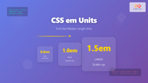
CSS em Units: Complete Guide to Font-Size Relative Length Units
CSS em units are one of the most powerful and flexible relative length units in web development. Unlike absolute units...

CSS Percentage Units: Complete Guide to Parent-Relative Sizing
CSS percentage units are fundamental building blocks for creating responsive, flexible layouts that adapt to different screen sizes and container...
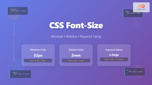
CSS Font-Size: Complete Guide to Absolute, Relative and Keyword Sizing
Font sizing is one of the most fundamental aspects of web typography that directly impacts user experience and accessibility. Understanding...
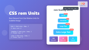
CSS rem Units: Complete Guide to Root Element Font-Size Relative Units
CSS rem units are a powerful tool for creating scalable, maintainable, and accessible web designs. Unlike pixels or em units,...

CSS Viewport Units: Complete Guide to vw, vh, vmin, vmax for Modern Responsive Design
CSS viewport units revolutionize how we approach responsive web design by providing a direct relationship between element sizes and the...

CSS Width and Height: Complete Guide to Element Dimensions
Understanding how to control element dimensions is fundamental to creating well-structured web layouts. CSS width and height properties give you...
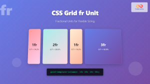
CSS Grid fr Unit: Master Fractional Units for Responsive Web Layouts
The CSS Grid fr unit (fractional unit) is a powerful tool that revolutionizes how we create flexible and responsive web...

CSS Aspect-Ratio Property: Complete Guide to Maintaining Perfect Width/Height Ratios
The CSS aspect-ratio property revolutionizes how we maintain consistent width-to-height ratios in responsive web design. Instead of relying on complex...

CSS Width Property: Mastering Element Width in CSS
CSS Width Property: Mastering Element Width The width property in CSS defines the width of an element's content area. It's...

HTML Element clientWidth Property: Element Width
HTML Element clientWidth Property: Understanding Element Width The clientWidth property is a read-only property of an HTML element that returns...

CSS Container Query Length Units: Complete Guide to cqw, cqh, cqi, cqb for Responsive Design
CSS Container Query Length Units represent a revolutionary approach to responsive web design, allowing developers to create components that adapt...


