The CSS translate() function is one of the most powerful and versatile tools for moving elements on a webpage. Unlike traditional positioning methods, translate() allows you to move elements along the X and Y axes without affecting the document flow, making it perfect for animations, responsive layouts, and interactive effects.
What is CSS Translate?
CSS translate() is a transform function that moves an element from its current position without changing its place in the document flow. It’s part of the CSS Transform Module and works by shifting elements along the horizontal (X-axis) and vertical (Y-axis) coordinates.
Key Benefits of CSS Translate:
- Performance: Hardware-accelerated, smoother animations
- Document Flow: Doesn’t affect other elements’ positions
- Flexibility: Works with percentages, pixels, and other units
- Responsive: Adapts well to different screen sizes
CSS Translate Syntax
The translate() function has several variations, each serving different purposes:
/* Basic syntax */
transform: translate(x, y);

/* Individual axis functions */
transform: translateX(value);
transform: translateY(value);

/* 3D translation */
transform: translate3d(x, y, z);
Understanding the Parameters
- X-value: Horizontal movement (positive = right, negative = left)
- Y-value: Vertical movement (positive = down, negative = up)
- Units: px, em, rem, %, vw, vh, and more
Basic CSS Translate Examples
Let’s explore practical examples of how translate() works in different scenarios:
Example 1: Simple Translation
Hover Me
.translate-example {
  width: 100px;
  height: 100px;
  background: #007bff;
  transition: transform 0.3s ease;
}

.translate-example:hover {
  transform: translate(50px, 30px);
}
Example 2: Individual Axis Translation
X-axis
Y-axis
/* X-axis only */
.translate-x:hover {
  transform: translateX(40px);
}

/* Y-axis only */
.translate-y:hover {
  transform: translateY(-30px);
}
Advanced CSS Translate Techniques
Percentage-Based Translation
Using percentages with translate() is particularly useful for responsive design and centering elements:
Perfectly Centered
.center-element {
  position: absolute;
  top: 50%;
  left: 50%;
  transform: translate(-50%, -50%);
}
Combining Translate with Other Transforms
You can combine translate() with other transform functions for complex effects:
Multi-Transform
.multi-transform:hover {
  transform: translate(30px, 20px) rotate(45deg) scale(1.2);
}
CSS Translate for Animations
The translate() function is perfect for creating smooth animations. Here’s an example of a sliding animation:
@keyframes slideAnimation {
  0% {
    transform: translateX(0);
  }
  100% {
    transform: translateX(200px);
  }
}

.sliding-element {
  animation: slideAnimation 3s infinite alternate ease-in-out;
}
Responsive Design with CSS Translate
CSS translate() works excellently with viewport units for responsive designs:
/* Responsive translation */
.responsive-move {
  transform: translate(5vw, 3vh);
}

/* Media query adjustments */
@media (max-width: 768px) {
  .responsive-move {
    transform: translate(3vw, 2vh);
  }
}
Interactive CSS Translate Demo
Here’s an interactive demo showing different translate effects:
Click to Translate
Performance Considerations
When using CSS translate(), keep these performance tips in mind:
Best Practices:
- Use translate() instead of changing position: More performant for animations
- Enable hardware acceleration: Add
transform: translateZ(0)orwill-change: transform - Combine transforms: Use single transform property for multiple effects
- Use transitions: Smooth animations with
transition: transform 0.3s ease
Common Use Cases
1. Modal Centering
.modal {
  position: fixed;
  top: 50%;
  left: 50%;
  transform: translate(-50%, -50%);
}
2. Hover Effects
.card:hover {
  transform: translateY(-10px);
  box-shadow: 0 10px 25px rgba(0,0,0,0.15);
}
3. Loading Animations
@keyframes loading {
  0%, 100% { transform: translateY(0); }
  50% { transform: translateY(-20px); }
}
Browser Support and Fallbacks
CSS translate() has excellent browser support across all modern browsers. For older browsers, consider these fallbacks:
/* Fallback for older browsers */
.element {
  position: relative;
  left: 50px; /* Fallback */
  top: 30px; /* Fallback */
  transform: translate(50px, 30px); /* Modern browsers */
}
Troubleshooting Common Issues
Issue 1: Transform Not Working
Solution: Ensure the element isn’t inline. Use display: block or display: inline-block.
Issue 2: Blurry Text After Translation
Solution: Use fractional pixel values or add transform-style: preserve-3d.
Issue 3: Z-index Problems
Solution: Transformed elements create new stacking contexts. Adjust z-index accordingly.
Conclusion
CSS translate() is an essential tool for modern web development, offering performance benefits and flexibility for moving elements along X and Y axes. Whether you’re creating smooth animations, responsive layouts, or interactive effects, mastering translate() will significantly improve your CSS skills and create better user experiences.
Remember to combine translate() with transitions for smooth animations, use percentage values for responsive designs, and always consider performance when implementing complex transformations. With practice, you’ll find translate() becomes an indispensable part of your CSS toolkit.
Related Posts
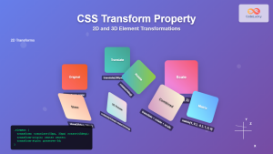
CSS Transform Property: Complete Guide to 2D and 3D Element Transformations
The CSS transform property is one of the most powerful tools in modern web development, allowing developers to manipulate HTML...
CSS Style transform Property: CSS Transform
CSS transform Property: A Comprehensive Guide The CSS transform property is a powerful tool that allows you to modify the...
CSS Style transformOrigin Property: CSS Transform Origin
CSS transformOrigin Property: Mastering Element Transformation Origins The transformOrigin property in CSS is a fundamental tool for controlling how transformations...
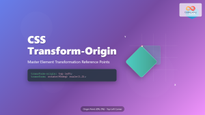
CSS Transform-Origin: Master Element Transformation Reference Points
The transform-origin property is a powerful CSS feature that determines the reference point for element transformations. Whether you're rotating, scaling,...
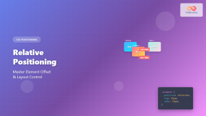
CSS Relative Positioning: Master Element Offset and Layout Control
Understanding CSS Relative Positioning CSS relative positioning is a fundamental layout technique that allows you to move elements from their...
HTML Canvas translate() Method: Translating the Canvas Origin
HTML Canvas translate() Method: Shifting the Drawing Origin The HTML Canvas translate() method is a powerful tool for manipulating the...
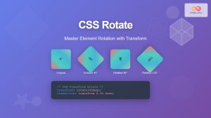
CSS Rotate: Complete Guide to Rotating Elements with Transform
CSS rotation is one of the most powerful and visually striking transformation effects available to web developers. The transform: rotate()...
CSS Transform-Style: Complete Guide to Flat vs Preserve-3d for 3D Transformations
The CSS transform-style property is a powerful tool that controls how child elements are rendered in 3D space when their...
CSS Scale: Master Element Resizing with Transform Property
The CSS scale() function is a powerful transformation tool that allows you to resize elements proportionally without affecting the document...
CSS Fixed Positioning: Complete Guide to Viewport-Relative Elements
CSS fixed positioning is one of the most powerful tools in a web developer's arsenal for creating engaging, interactive user...
CSS Static Positioning: Understanding Default Document Flow and Layout Fundamentals
CSS positioning is one of the fundamental concepts every web developer must master. Among the various positioning methods available, static...
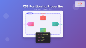
CSS Top, Right, Bottom, Left: Complete Guide to Positioning Offset Properties
CSS positioning offset properties—top, right, bottom, and left—are fundamental tools for precisely controlling element placement on web pages. These properties...


