The CSS transform-style property is a powerful tool that controls how child elements are rendered in 3D space when their parent has 3D transformations applied. Understanding the difference between flat and preserve-3d values is crucial for creating sophisticated 3D effects in web development.
What is CSS Transform-Style?
The transform-style property determines whether child elements are positioned in 3D space or flattened into the plane of their parent element. This property only affects elements that have 3D transformations applied to them.
Syntax
transform-style: flat | preserve-3d | initial | inherit;Understanding the Values
flat (Default Value)
When transform-style: flat is applied, all child elements are flattened into the plane of the parent element. This means that even if child elements have 3D transformations, they won’t maintain their 3D positioning relative to each other.
preserve-3d
With transform-style: preserve-3d, child elements maintain their 3D positioning in the same 3D rendering context as their parent. This allows for true 3D compositions where elements can intersect and overlap in 3D space.
Visual Comparison: Flat vs Preserve-3D
transform-style: flat
Child elements are flattened
transform-style: preserve-3d
3D positioning is preserved
Interactive 3D Cube Example
Let’s create an interactive 3D cube to demonstrate the practical difference between flat and preserve-3d:
Current: preserve-3d
Code Examples and Implementation
Basic 3D Card Flip
.card-container {
  perspective: 1000px;
  width: 200px;
  height: 200px;
}

.card {
  width: 100%;
  height: 100%;
  position: relative;
  transform-style: preserve-3d;
  transition: transform 0.8s;
}

.card:hover {
  transform: rotateY(180deg);
}

.card-front,
.card-back {
  position: absolute;
  width: 100%;
  height: 100%;
  backface-visibility: hidden;
  border-radius: 10px;
  display: flex;
  align-items: center;
  justify-content: center;
}

.card-back {
  transform: rotateY(180deg);
}
Live Demo: 3D Card Flip
Hover to flip the card
Nested 3D Transformations
When working with nested elements that have 3D transformations, preserve-3d becomes essential:
.scene {
  perspective: 1000px;
  height: 300px;
}

.group {
  transform-style: preserve-3d;
  transform: rotateY(45deg);
  position: relative;
}

.item {
  transform-style: preserve-3d;
  transform: translateZ(50px) rotateX(30deg);
}

/* Without preserve-3d, nested transformations are flattened */
.group-flat {
  transform-style: flat; /* Child 3D transformations are ignored */
}
Browser Support and Considerations
Browser Compatibility
- Chrome: Full support since version 36
- Firefox: Full support since version 16
- Safari: Full support since version 9
- Edge: Full support since version 12
Important Considerations
Performance Impact
preserve-3d can impact performance as it requires the browser to maintain 3D rendering contexts. Use it only when necessary for your 3D effects.
Stacking Context
Elements with transform-style: preserve-3d create new stacking contexts, which can affect z-index behavior.
Overflow and Clipping
Parent elements with overflow: hidden may clip 3D-transformed children unexpectedly when using preserve-3d.
Advanced Use Cases
Creating a 3D Image Gallery
Common Pitfalls and Solutions
Problem: 3D Effects Not Working
Issue: Child elements don’t appear to have 3D positioning despite having 3D transforms.
Solution: Ensure the parent element has transform-style: preserve-3d and perspective is set on an ancestor element.
Problem: Unexpected Clipping
Issue: 3D elements are being clipped or hidden unexpectedly.
Solution: Check for overflow: hidden on parent elements and ensure sufficient perspective distance.
Best Practices
Optimization Tips
- Use
preserve-3donly when necessary for true 3D compositions - Combine with
will-change: transformfor better performance - Set appropriate
perspectivevalues (typically 800px-1200px) - Use
backface-visibility: hiddento improve performance when elements rotate - Test on mobile devices as 3D transforms can be resource-intensive
Conclusion
The transform-style property is essential for creating sophisticated 3D web experiences. Understanding when to use flat versus preserve-3d allows you to control exactly how 3D transformations are rendered in nested element hierarchies. While flat is suitable for simple 2D layouts, preserve-3d unlocks the full potential of CSS 3D transforms for creating immersive, interactive web experiences.
Remember to consider performance implications and browser support when implementing complex 3D effects, and always test your implementations across different devices and browsers to ensure optimal user experience.
Related Posts
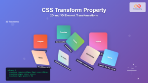
CSS Transform Property: Complete Guide to 2D and 3D Element Transformations
The CSS transform property is one of the most powerful tools in modern web development, allowing developers to manipulate HTML...
CSS Style transform Property: CSS Transform
CSS transform Property: A Comprehensive Guide The CSS transform property is a powerful tool that allows you to modify the...
CSS Transform-Origin: Master Element Transformation Reference Points
The transform-origin property is a powerful CSS feature that determines the reference point for element transformations. Whether you're rotating, scaling,...
CSS Style transformOrigin Property: CSS Transform Origin
CSS transformOrigin Property: Mastering Element Transformation Origins The transformOrigin property in CSS is a fundamental tool for controlling how transformations...
CSS 3D Transforms: Complete Guide to Translate3d, Scale3d, and Rotate3d Functions
CSS 3D transforms revolutionize how we create interactive and visually stunning web interfaces. By utilizing the power of translate3d(), scale3d(),...

CSS perspective Property: CSS Perspective
Understanding the CSS perspective Property The CSS perspective property allows you to give a 3D-positioned element some perspective. It defines...
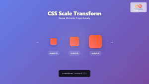
CSS Scale: Master Element Resizing with Transform Property
The CSS scale() function is a powerful transformation tool that allows you to resize elements proportionally without affecting the document...
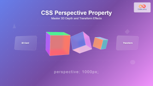
CSS Perspective Property: Master 3D Depth and Transform Effects
What is CSS Perspective Property? The CSS perspective property is a powerful tool that defines the distance between the user...
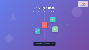
CSS Translate: Complete Guide to Moving Elements Along X and Y Axes
The CSS translate() function is one of the most powerful and versatile tools for moving elements on a webpage. Unlike...

CSS Style perspectiveOrigin Property: CSS Perspective Origin
CSS perspective-origin Property: A Comprehensive Guide The perspective-origin property in CSS is used to set the vanishing point for 3D...
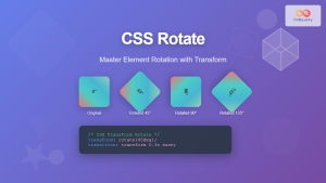
CSS Rotate: Complete Guide to Rotating Elements with Transform
CSS rotation is one of the most powerful and visually striking transformation effects available to web developers. The transform: rotate()...
CSS Relative Positioning: Master Element Offset and Layout Control
Understanding CSS Relative Positioning CSS relative positioning is a fundamental layout technique that allows you to move elements from their...


