
CSS positioning offset properties—top, right, bottom, and left—are fundamental tools for precisely controlling element placement on web pages. These properties work in conjunction with the position property to create sophisticated layouts, overlays, and interactive interfaces.
Understanding CSS Positioning Offset Properties
The four positioning offset properties define how far an element should be moved from its normal position or containing block edges. They only take effect when an element has a position value other than static (the default).
Basic Syntax and Values
selector {
  position: relative | absolute | fixed | sticky;
  top: value;
  right: value;
  bottom: value;
  left: value;
}
Each offset property accepts various value types:
- Length values:
px,em,rem,vh,vw - Percentage values: Relative to containing block dimensions
- auto: Browser calculates the value (default)
- inherit: Inherits from parent element
How Offset Properties Work with Different Position Values
Relative Positioning
With position: relative, offset properties move the element from its normal document flow position while preserving the original space.
Example: Relative Positioning
.moved-element {
  position: relative;
  top: 20px;
  left: 30px;
}
Absolute Positioning
Elements with position: absolute are removed from the normal document flow and positioned relative to their nearest positioned ancestor (or the viewport if none exists).
Example: Absolute Positioning
Container (position: relative)
.container {
  position: relative;
}

.absolute-element {
  position: absolute;
  top: 10px;
  right: 10px;
}
Fixed Positioning
Fixed elements are positioned relative to the viewport and remain in place during scrolling. They’re commonly used for navigation bars, modals, and floating buttons.
Example: Fixed Positioning
Note: Fixed elements would stick to viewport edges. Here’s the CSS:
.fixed-header {
  position: fixed;
  top: 0;
  left: 0;
  width: 100%;
  background: #333;
  color: white;
  padding: 10px;
  z-index: 1000;
}
Sticky Positioning
Sticky positioning combines relative and fixed behavior. Elements stick to a specified position when scrolling reaches a threshold.
Example: Sticky Positioning
.sticky-nav {
  position: sticky;
  top: 0;
  background: #fff;
  border-bottom: 1px solid #ddd;
  padding: 10px;
}
Interactive Examples and Visual Demonstrations
Interactive Positioning Demo
Understanding Offset Property Interactions
Conflicting Properties
When both opposing properties are set (like top and bottom, or left and right), the behavior depends on writing direction and element constraints:
Priority Rules
- Horizontal:
lefttakes precedence overrightin LTR languages - Vertical:
toptakes precedence overbottom - Exception: When width/height is constrained, both properties can affect sizing
.stretched-element {
  position: absolute;
  top: 10px;
  bottom: 10px;  /* Both affect height */
  left: 20px;
  width: 100px;
}
Percentage Values and Containing Blocks
Percentage values in offset properties are calculated relative to the containing block’s dimensions:
Percentage Calculation Examples
.percentage-positioned {
  position: absolute;
  top: 25%;    /* 25% of container height */
  left: 25%;   /* 25% of container width */
}

.corner-element {
  position: absolute;
  bottom: 10%; /* 10% from bottom */
  right: 10%;  /* 10% from right */
}
Common Use Cases and Patterns
Centering Elements
Offset properties combined with transforms create perfect centering solutions:
Perfect Centering
.center-element {
  position: absolute;
  top: 50%;
  left: 50%;
  transform: translate(-50%, -50%);
}
Creating Overlays and Modals
Full-Screen Overlay
.overlay {
  position: fixed;
  top: 0;
  right: 0;
  bottom: 0;
  left: 0;
  background: rgba(0, 0, 0, 0.5);
  z-index: 1000;
}

.modal {
  position: absolute;
  top: 50%;
  left: 50%;
  transform: translate(-50%, -50%);
  background: white;
  padding: 20px;
  border-radius: 8px;
}
Navigation and UI Elements
Floating Action Button
.floating-button {
  position: fixed;
  bottom: 20px;
  right: 20px;
  width: 60px;
  height: 60px;
  border-radius: 50%;
  background: #4caf50;
  color: white;
  border: none;
  font-size: 24px;
  cursor: pointer;
  z-index: 100;
}
Performance Considerations and Best Practices
Browser Optimization Tips
- Use transform instead of offset properties for animations when possible
- Avoid frequent changes to offset properties as they trigger layout recalculation
- Consider will-change property for elements that will be animated
- Use fixed positioning sparingly as it can impact scrolling performance
Performance-Optimized Animation
/* Better for performance */
.animated-element {
  position: absolute;
  will-change: transform;
  transform: translateX(0);
  transition: transform 0.3s ease;
}

.animated-element.moved {
  transform: translateX(100px);
}

/* Avoid for animations */
.slow-animation {
  transition: left 0.3s ease; /* Triggers layout */
}
Responsive Design with Offset Properties
Offset properties work seamlessly with responsive design patterns using media queries and viewport units:
Responsive Positioning
.responsive-element {
  position: fixed;
  top: 2vh;
  right: 2vw;
}

@media (max-width: 768px) {
  .responsive-element {
    position: static;
    /* Return to normal flow on mobile */
  }
}

@media (min-width: 1200px) {
  .responsive-element {
    right: calc(50vw - 600px); /* Center-aligned with max-width container */
  }
}
Troubleshooting Common Issues
Z-Index and Stacking Context
Positioned elements create new stacking contexts, which can affect layering:
Managing Element Stacking
.modal-backdrop {
  position: fixed;
  top: 0;
  left: 0;
  right: 0;
  bottom: 0;
  background: rgba(0, 0, 0, 0.5);
  z-index: 1000;
}

.modal-content {
  position: relative;
  z-index: 1001; /* Higher than backdrop */
}
Container Query Compatibility
When using CSS Container Queries, be aware that positioned elements may break out of container boundaries:
Container-Aware Positioning
@container (min-width: 400px) {
  .card-element {
    position: relative; /* Keep within container bounds */
    top: 0;
    left: 0;
  }
}

@container (max-width: 399px) {
  .card-element {
    position: static; /* Normal flow for small containers */
  }
}
Advanced Techniques and Modern CSS
CSS Grid and Positioning
Combining CSS Grid with positioning creates powerful layout possibilities:
Grid with Positioned Overlays
.grid-container {
  display: grid;
  grid-template-columns: repeat(3, 1fr);
  gap: 20px;
  position: relative;
}

.grid-overlay {
  position: absolute;
  top: 0;
  left: 0;
  right: 0;
  background: rgba(255, 255, 255, 0.9);
  padding: 20px;
  z-index: 10;
}
Logical Properties Alternative
Modern CSS offers logical properties that adapt to writing direction:
Logical Positioning Properties
/* Traditional */
.element {
  position: absolute;
  top: 10px;
  left: 20px;
}

/* Logical (writing-mode aware) */
.element-logical {
  position: absolute;
  inset-block-start: 10px;
  inset-inline-start: 20px;
}

/* Shorthand for all sides */
.element-shorthand {
  position: absolute;
  inset: 10px 20px 15px 25px; /* top right bottom left */
}
Accessibility Considerations
When using positioning offset properties, consider the impact on screen readers and keyboard navigation:
- Maintain logical tab order even when visual position changes
- Use focus management for positioned modals and overlays
- Provide skip links for fixed navigation elements
- Ensure content remains accessible when positioned off-screen
Accessible Positioning Example
.skip-link {
  position: absolute;
  top: -40px;
  left: 6px;
  background: #000;
  color: #fff;
  padding: 8px;
  text-decoration: none;
  z-index: 1000;
}

.skip-link:focus {
  top: 6px; /* Bring into view when focused */
}
CSS positioning offset properties provide powerful control over element placement, enabling everything from simple layout adjustments to complex interactive interfaces. By understanding how these properties interact with different positioning contexts and following best practices for performance and accessibility, you can create robust, maintainable layouts that work across all devices and user scenarios.
Master these fundamental properties, and you’ll have the foundation needed for advanced CSS layout techniques and modern web development patterns.
Related Posts
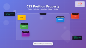
CSS Position Property: Complete Guide to Static, Relative, Absolute, Fixed & Sticky Positioning
The CSS position property is one of the most powerful tools for controlling element layout and creating sophisticated web designs....
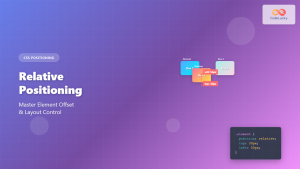
CSS Relative Positioning: Master Element Offset and Layout Control
Understanding CSS Relative Positioning CSS relative positioning is a fundamental layout technique that allows you to move elements from their...
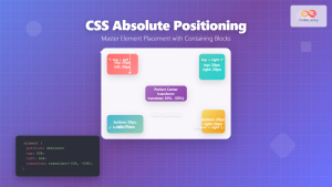
CSS Absolute Positioning: Master Element Placement with Containing Blocks
CSS absolute positioning is one of the most powerful tools for creating precise layouts and complex designs. Understanding how absolutely...

CSS Style right Property: CSS Right
Understanding the CSS right Property The CSS right property plays a crucial role in positioning elements within a web page....
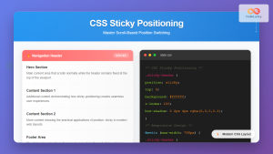
CSS Sticky Positioning: Master Scroll-Based Position Switching with Practical Examples
CSS sticky positioning is a powerful layout technique that combines the best of both relative and fixed positioning. It allows...
CSS Style left Property: CSS Left
CSS left Property: A Comprehensive Guide The CSS left property is a fundamental tool for web developers, enabling precise horizontal...
CSS bottom Property: CSS Bottom
Understanding the CSS bottom Property The CSS bottom property is a fundamental tool for controlling the vertical positioning of elements...
CSS Style top Property: CSS Top
Understanding the CSS top Property: A Comprehensive Guide The top property in CSS is used to specify the vertical position...

CSS position Property: Mastering Layouts in CSS
Understanding the CSS position Property: A Comprehensive Guide The position property in CSS is a fundamental tool for controlling the...

HTML Element offsetTop Property: Element’s Distance to Top
HTML Element offsetTop Property: Understanding the Element's Distance to the Top The offsetTop property in HTML DOM provides the distance...

HTML Element offsetParent Property: Element Offset Parent
HTML Element offsetParent Property: Understanding Element Offset Parent The offsetParent property in HTML DOM is a read-only property that returns...
HTML Element offsetLeft Property: Element Offset Left
Understanding the offsetLeft Property in HTML The offsetLeft property in HTML DOM is a read-only property that returns the distance...


