
CSS sticky positioning is a powerful layout technique that combines the best of both relative and fixed positioning. It allows elements to switch between relative and fixed positioning based on the user’s scroll position, creating dynamic and engaging user experiences.
What is CSS Sticky Positioning?
Sticky positioning is a CSS positioning method that makes an element stick to a specific position when the user scrolls past a certain threshold. The element behaves like a relatively positioned element until it reaches a specified offset from its containing block, at which point it becomes fixed.
The position: sticky property was introduced to solve common layout challenges like keeping navigation bars visible while scrolling or creating section headers that remain in view as users navigate through content.
How Sticky Positioning Works
When you apply position: sticky to an element, it follows these behaviors:
- Initial State: The element remains in the normal document flow, behaving like a relatively positioned element
- Threshold Reached: When the user scrolls and the element reaches the specified offset (using properties like
top,bottom,left, orright), it becomes fixed - Containment: The element only sticks within its containing block and will scroll away when the container ends
Basic Sticky Positioning Syntax
The basic syntax for sticky positioning is straightforward:
.sticky-element {
  position: sticky;
  top: 0; /* Distance from top when stuck */
}
Let’s see this in action with a simple example:
Scroll down to see the sticky effect
This content appears before the sticky element.
Content Section 1
This is some content that you can scroll through. Notice how the sticky element above stays in place when you scroll down.
Content Section 2
More content to demonstrate the sticky behavior. The sticky element remains visible as you scroll through this section.
Content Section 3
Final section of content. The sticky element will eventually scroll away when you reach the end of its containing block.
Practical Examples of Sticky Positioning
1. Sticky Navigation Header
One of the most common uses of sticky positioning is creating navigation headers that remain visible while scrolling:
.sticky-nav {
  position: sticky;
  top: 0;
  background-color: #ffffff;
  box-shadow: 0 2px 4px rgba(0,0,0,0.1);
  z-index: 100;
}

.nav-content {
  display: flex;
  justify-content: space-between;
  align-items: center;
  padding: 1rem 2rem;
  max-width: 1200px;
  margin: 0 auto;
}Main Content
Scroll down to see how the navigation sticks to the top of the viewport. This creates a seamless user experience where important navigation elements remain accessible.
Content Block 1
Lorem ipsum dolor sit amet, consectetur adipiscing elit. Sed do eiusmod tempor incididunt ut labore et dolore magna aliqua.
Content Block 2
Ut enim ad minim veniam, quis nostrud exercitation ullamco laboris nisi ut aliquip ex ea commodo consequat.
2. Sticky Sidebar
Sticky positioning is perfect for creating sidebars that follow the user as they scroll through content:
.sticky-sidebar {
  position: sticky;
  top: 2rem;
  height: fit-content;
}

.content-container {
  display: grid;
  grid-template-columns: 1fr 300px;
  gap: 2rem;
  max-width: 1200px;
  margin: 0 auto;
}
Main Article Content
This is the main content area. As you scroll through this content, notice how the sidebar on the right stays in view.
Section 1
Content section with substantial text to demonstrate scrolling behavior.
Section 2
Another content section to show how the sticky sidebar remains visible.
Section 3
Final section demonstrating the sticky sidebar behavior throughout the scroll.
3. Sticky Section Headers
Create section headers that stick to the top as users scroll through different sections of content:
.sticky-header {
  position: sticky;
  top: 0;
  background: linear-gradient(90deg, #4CAF50, #45a049);
  color: white;
  padding: 1rem;
  margin: 0 0 1rem 0;
  border-radius: 8px;
  font-weight: bold;
}React Native
Learn about React Native development for cross-platform mobile applications.
Flutter
Discover Flutter framework for building beautiful mobile applications.
HTML & CSS
Master the fundamentals of web development with HTML and CSS.
JavaScript
Explore modern JavaScript features and frameworks for web development.
Node.js
Build scalable server-side applications with Node.js.
Python
Develop robust backend systems using Python and its frameworks.
Advanced Sticky Positioning Techniques
Multiple Sticky Elements
You can have multiple sticky elements that stack on top of each other. This is useful for creating complex navigation hierarchies:
.primary-nav {
  position: sticky;
  top: 0;
  z-index: 100;
}

.secondary-nav {
  position: sticky;
  top: 60px; /* Height of primary nav */
  z-index: 99;
}
Sticky with Offset
Use different offset values to create spacing between sticky elements and the viewport edge:
.sticky-with-offset {
  position: sticky;
  top: 2rem; /* 32px offset from top */
  margin-bottom: 1rem;
}
Browser Compatibility and Fallbacks
CSS sticky positioning has excellent browser support in modern browsers, but you may want to provide fallbacks for older browsers:
/* Fallback for older browsers */
.sticky-fallback {
  position: relative;
}

/* Modern browsers with sticky support */
@supports (position: sticky) {
  .sticky-fallback {
    position: sticky;
    top: 0;
  }
}
Common Issues and Solutions
1. Overflow Hidden Parent
Sticky positioning doesn’t work if any parent element has overflow: hidden. Ensure your sticky element’s ancestors have overflow: visible.
2. Height of Containing Block
The sticky element will only stick within its containing block. If the container is too short, the sticky effect might not be noticeable.
3. Z-Index Issues
Always set appropriate z-index values for sticky elements to ensure they appear above other content:
.sticky-element {
  position: sticky;
  top: 0;
  z-index: 1000;
}
Performance Considerations
Sticky positioning is generally performant, but keep these tips in mind:
- Minimize the number of sticky elements on a single page
- Use
transform3d(0,0,0)orwill-change: transformfor hardware acceleration if needed - Avoid complex animations on sticky elements
- Test on mobile devices to ensure smooth scrolling
Responsive Sticky Design
Make your sticky elements responsive using media queries:
.responsive-sticky {
  position: sticky;
  top: 0;
}

@media (max-width: 768px) {
  .responsive-sticky {
    position: relative; /* Disable sticky on mobile */
  }
}

@media (min-width: 769px) {
  .responsive-sticky {
    top: 1rem; /* Different offset for desktop */
  }
}
Accessibility Considerations
When implementing sticky positioning, consider accessibility:
- Ensure sticky elements don’t obstruct important content
- Provide adequate color contrast for sticky navigation elements
- Test with screen readers to ensure proper navigation
- Consider users who prefer reduced motion
Interactive Demo: Complete Sticky Layout
Here’s a comprehensive example combining multiple sticky positioning techniques:
CodeLucky Demo
Introduction to CSS
CSS (Cascading Style Sheets) is the language used to style HTML documents. It controls the visual presentation of web pages.
Selectors and Properties
Learn about different CSS selectors and properties that allow you to target and style HTML elements effectively.
Flexbox Layout
Master the flexbox layout system for creating responsive and flexible web layouts with ease.
Grid Layout
Explore CSS Grid for creating complex two-dimensional layouts with precise control over rows and columns.
Performance Optimization
Learn techniques to optimize your CSS for better performance and faster loading times.
Conclusion
CSS sticky positioning is a versatile and powerful feature that enhances user experience by keeping important elements visible during scroll. Whether you’re creating sticky navigation bars, sidebars, or section headers, understanding how to implement sticky positioning effectively will improve your web layouts significantly.
Remember to test your sticky implementations across different browsers and devices, consider accessibility implications, and always provide fallbacks for older browsers when necessary. With practice and creativity, sticky positioning can become an invaluable tool in your CSS toolkit.
The key to successful sticky positioning lies in understanding the relationship between the sticky element, its containing block, and the viewport. By mastering these concepts and applying the techniques shown in this guide, you’ll be able to create engaging, user-friendly interfaces that keep users engaged with your content.
Related Posts
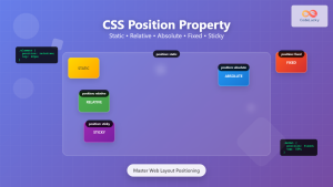
CSS Position Property: Complete Guide to Static, Relative, Absolute, Fixed & Sticky Positioning
The CSS position property is one of the most powerful tools for controlling element layout and creating sophisticated web designs....
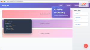
CSS Fixed Positioning: Complete Guide to Viewport-Relative Elements
CSS fixed positioning is one of the most powerful tools in a web developer's arsenal for creating engaging, interactive user...
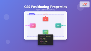
CSS Top, Right, Bottom, Left: Complete Guide to Positioning Offset Properties
CSS positioning offset properties—top, right, bottom, and left—are fundamental tools for precisely controlling element placement on web pages. These properties...
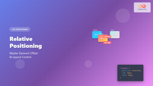
CSS Relative Positioning: Master Element Offset and Layout Control
Understanding CSS Relative Positioning CSS relative positioning is a fundamental layout technique that allows you to move elements from their...
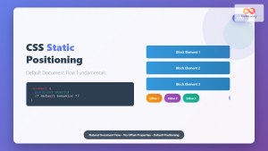
CSS Static Positioning: Understanding Default Document Flow and Layout Fundamentals
CSS positioning is one of the fundamental concepts every web developer must master. Among the various positioning methods available, static...

CSS position Property: Mastering Layouts in CSS
Understanding the CSS position Property: A Comprehensive Guide The position property in CSS is a fundamental tool for controlling the...
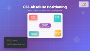
CSS Absolute Positioning: Master Element Placement with Containing Blocks
CSS absolute positioning is one of the most powerful tools for creating precise layouts and complex designs. Understanding how absolutely...
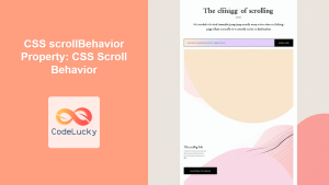
CSS scrollBehavior Property: CSS Scroll Behavior
Understanding CSS scroll-behavior: Smooth Scrolling Made Easy The scroll-behavior property in CSS allows you to define the scrolling behavior when...
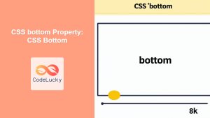
CSS bottom Property: CSS Bottom
Understanding the CSS bottom Property The CSS bottom property is a fundamental tool for controlling the vertical positioning of elements...
CSS Style top Property: CSS Top
Understanding the CSS top Property: A Comprehensive Guide The top property in CSS is used to specify the vertical position...

CSS Style right Property: CSS Right
Understanding the CSS right Property The CSS right property plays a crucial role in positioning elements within a web page....

HTML Element scrollIntoView() Method: Scrolling Element into View
HTML Element scrollIntoView() Method: Scrolling Element into View The scrollIntoView() method is a powerful tool in the arsenal of web...


