
CSS skew transforms allow you to distort elements by slanting them along the X and Y axes, creating dynamic visual effects that can enhance your web designs. This powerful CSS property is part of the transform family and enables you to create tilted, slanted, or diamond-shaped elements that catch the user’s eye.
Understanding CSS Skew Transformation
The skew() function in CSS transforms elements by distorting their shape along one or both axes. Unlike rotation which spins an element around a point, skewing stretches the element in a specific direction, creating a parallelogram-like effect from rectangular elements.
Basic Syntax
/* Single axis skew */
transform: skewX(angle);
transform: skewY(angle);

/* Both axes skew */
transform: skew(x-angle, y-angle);

/* Shorthand for single value */
transform: skew(angle); /* applies to X-axis only */
CSS Skew Functions Explained
skewX() – Horizontal Skewing
The skewX() function skews an element along the horizontal (X) axis. Positive values skew the element to the left, while negative values skew it to the right.
Example: Horizontal Skewing
.skew-x-positive {
  transform: skewX(15deg);
}

.skew-x-negative {
  transform: skewX(-20deg);
}
skewY() – Vertical Skewing
The skewY() function skews an element along the vertical (Y) axis. Positive values skew the element upward, while negative values skew it downward.
Example: Vertical Skewing
.skew-y-positive {
  transform: skewY(10deg);
}

.skew-y-negative {
  transform: skewY(-15deg);
}
skew() – Combined Axis Skewing
The skew() function allows you to skew an element along both axes simultaneously. You can provide one or two values: skew(x-angle, y-angle) or skew(x-angle).
Example: Combined Skewing
.skew-combined-1 {
  transform: skew(15deg, 5deg);
}

.skew-combined-2 {
  transform: skew(-10deg, 8deg);
}
Interactive Skew Demonstration
Live Skew Controls
Adjust the sliders below to see how different skew values affect the element in real-time:
transform: skew(0deg, 0deg);
Practical Use Cases for CSS Skew
1. Dynamic Headers and Banners
Skewed elements work excellently for creating dynamic headers and banner sections that break away from traditional rectangular layouts.
Dynamic Header Section
.skewed-header {
  background: linear-gradient(135deg, #667eea, #764ba2);
  transform: skewY(-3deg);
  transform-origin: top left;
}

.skewed-header h2 {
  transform: skewY(3deg); /* Counter-skew the text */
}
2. Card Layouts with Visual Interest
Apply subtle skewing to cards or content blocks to create more engaging layouts while maintaining readability.
Feature Card
Subtle skewing adds visual interest without compromising readability.
Another Card
Different skew angles create variety in your layout design.
.skewed-card {
  transform: skew(-2deg);
  transition: transform 0.3s ease;
}

.skewed-card:hover {
  transform: skew(0deg) scale(1.05);
}
3. Navigation Elements
Create unique navigation tabs or buttons using skew transforms to make them stand out from conventional designs.
.skewed-nav a {
  transform: skewX(-15deg);
  transition: all 0.3s ease;
}

.skewed-nav a span {
  transform: skewX(15deg); /* Counter-skew the text */
}

.skewed-nav a:hover {
  transform: skewX(-15deg) translateY(-2px);
}
Combining Skew with Other Transforms
CSS skew can be combined with other transform functions like rotate(), scale(), and translate() to create complex visual effects.
Example: Complex Transform Combinations
/* Multiple transforms are applied from right to left */
.complex-transform-1 {
  transform: skew(10deg) rotate(15deg);
}

.complex-transform-2 {
  transform: skew(-5deg, 8deg) scale(1.2);
}

.complex-transform-3 {
  transform: skew(15deg) translate(10px, -5px) rotate(-10deg);
}
Transform Origin and Skew
The transform-origin property determines the point around which the transformation occurs. This is particularly important with skew transforms as it affects how the element appears to bend or distort.
Transform Origin Examples
transform-origin: top left;
transform-origin: center;
transform-origin: bottom right;
.skew-origin-top-left {
  transform: skewX(20deg);
  transform-origin: top left;
}

.skew-origin-center {
  transform: skewX(20deg);
  transform-origin: center;
}

.skew-origin-bottom-right {
  transform: skewX(20deg);
  transform-origin: bottom right;
}
Performance and Browser Support
Browser Compatibility
CSS skew transforms have excellent browser support across modern browsers. They are supported in all major browsers including Chrome, Firefox, Safari, and Edge. For older browsers, vendor prefixes may be required.
Browser Support:
- Chrome: Full support (since version 36)
- Firefox: Full support (since version 16)
- Safari: Full support (since version 9)
- Edge: Full support (since version 12)
- Internet Explorer: Partial support (IE9+ with prefixes)
Performance Considerations
Skew transforms are hardware-accelerated when possible, making them performant for animations and transitions. However, consider these best practices:
/* Good: Hardware acceleration */
.optimized-skew {
  transform: skewX(15deg);
  will-change: transform; /* Hint for optimization */
}

/* Good: Smooth transitions */
.smooth-skew {
  transform: skewX(0deg);
  transition: transform 0.3s ease;
}

.smooth-skew:hover {
  transform: skewX(10deg);
}
Common Pitfalls and Solutions
Text Readability Issues
One common issue with skewed elements is that text becomes difficult to read. The solution is to counter-skew the text content.
❌ Poor Readability
✅ Good Readability
/* Bad: Skewed text is hard to read */
.bad-skew {
  transform: skewX(-15deg);
}

/* Good: Counter-skew the text */
.good-skew {
  transform: skewX(-15deg);
}

.good-skew span {
  transform: skewX(15deg);
  display: block;
}
Layout Overflow Issues
Skewed elements can overflow their containers. Use appropriate margins or container sizing to prevent layout issues.
/* Prevent overflow issues */
.skew-container {
  overflow: hidden; /* Hide overflow */
  padding: 20px; /* Extra space for skewed elements */
}

.skewed-element {
  transform: skewX(20deg);
  margin: 0 10px; /* Account for skew distortion */
}
Advanced Skew Techniques
CSS Animation with Skew
Create engaging animations using skew transforms with CSS keyframes.
@keyframes skewPulse {
  0%, 100% {
    transform: skew(0deg, 0deg) scale(1);
  }
  25% {
    transform: skew(5deg, -3deg) scale(1.1);
  }
  50% {
    transform: skew(-3deg, 5deg) scale(0.9);
  }
  75% {
    transform: skew(-5deg, -2deg) scale(1.05);
  }
}

.animated-skew {
  animation: skewPulse 2s infinite ease-in-out;
}
Responsive Skew Design
Adjust skew values for different screen sizes to maintain visual harmony across devices.
/* Responsive skew values */
.responsive-skew {
  transform: skewY(-2deg);
}

@media (max-width: 768px) {
  .responsive-skew {
    transform: skewY(-1deg); /* Less dramatic on mobile */
  }
}

@media (max-width: 480px) {
  .responsive-skew {
    transform: none; /* Remove skew on very small screens */
  }
}
Best Practices for CSS Skew
✅ Do’s
- Use subtle angles (5-15 degrees) for better readability
- Counter-skew text content to maintain readability
- Test across different devices and screen sizes
- Combine with transitions for smooth interactive effects
- Consider the visual hierarchy and ensure important content remains accessible
❌ Don’ts
<ul style=”margin:
Related Posts
CSS Style transformOrigin Property: CSS Transform Origin
CSS transformOrigin Property: Mastering Element Transformation Origins The transformOrigin property in CSS is a fundamental tool for controlling how transformations...
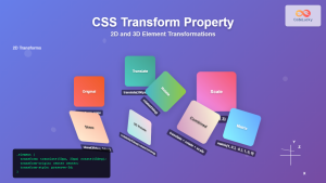
CSS Transform Property: Complete Guide to 2D and 3D Element Transformations
The CSS transform property is one of the most powerful tools in modern web development, allowing developers to manipulate HTML...

CSS Rotate: Complete Guide to Rotating Elements with Transform
CSS rotation is one of the most powerful and visually striking transformation effects available to web developers. The transform: rotate()...
CSS Transform-Origin: Master Element Transformation Reference Points
The transform-origin property is a powerful CSS feature that determines the reference point for element transformations. Whether you're rotating, scaling,...
CSS Style transform Property: CSS Transform
CSS transform Property: A Comprehensive Guide The CSS transform property is a powerful tool that allows you to modify the...
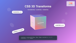
CSS 3D Transforms: Complete Guide to Translate3d, Scale3d, and Rotate3d Functions
CSS 3D transforms revolutionize how we create interactive and visually stunning web interfaces. By utilizing the power of translate3d(), scale3d(),...
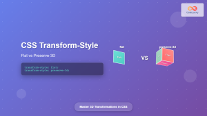
CSS Transform-Style: Complete Guide to Flat vs Preserve-3d for 3D Transformations
The CSS transform-style property is a powerful tool that controls how child elements are rendered in 3D space when their...

CSS Style perspectiveOrigin Property: CSS Perspective Origin
CSS perspective-origin Property: A Comprehensive Guide The perspective-origin property in CSS is used to set the vanishing point for 3D...
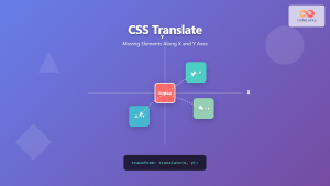
CSS Translate: Complete Guide to Moving Elements Along X and Y Axes
The CSS translate() function is one of the most powerful and versatile tools for moving elements on a webpage. Unlike...
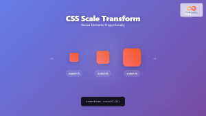
CSS Scale: Master Element Resizing with Transform Property
The CSS scale() function is a powerful transformation tool that allows you to resize elements proportionally without affecting the document...

CSS Gradients: Complete Guide to Linear Gradient Background Creation
CSS gradients have revolutionized web design by allowing developers to create smooth color transitions without relying on images. Linear gradients,...

CSS perspective Property: CSS Perspective
Understanding the CSS perspective Property The CSS perspective property allows you to give a 3D-positioned element some perspective. It defines...


