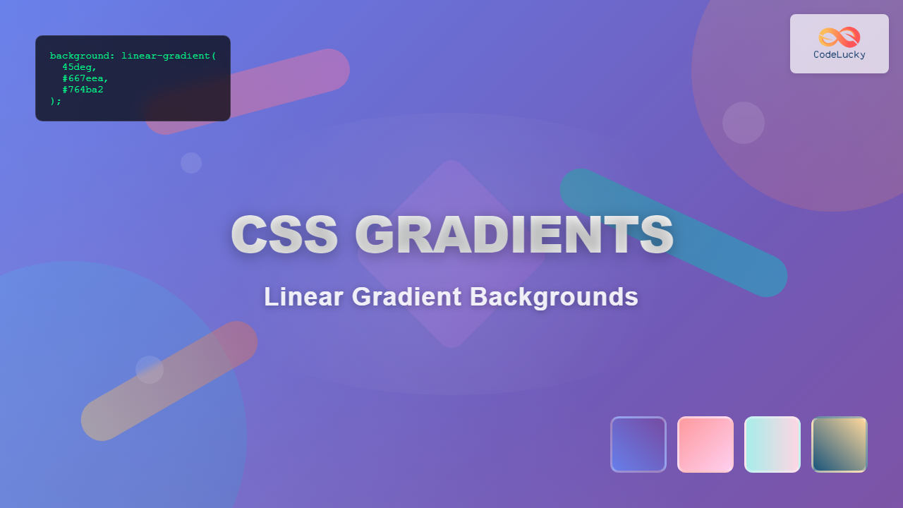
CSS gradients have revolutionized web design by allowing developers to create smooth color transitions without relying on images. Linear gradients, in particular, offer powerful capabilities for creating stunning background effects that enhance user experience while maintaining optimal performance.
What Are CSS Linear Gradients?
A CSS linear gradient creates a smooth transition between two or more colors along a straight line. Unlike solid colors or background images, gradients are generated by the browser, making them scalable, lightweight, and perfect for responsive designs.
Basic Linear Gradient Syntax
The fundamental syntax for CSS linear gradients follows this pattern:
background: linear-gradient(direction, color-stop1, color-stop2, ...);Simple Two-Color Gradient
Let’s start with the most basic linear gradient using two colors:
.basic-gradient {
    background: linear-gradient(#ff7675, #74b9ff);
    height: 100px;
}
Direction Control in Linear Gradients
Direction is crucial for achieving the desired visual effect. You can control gradient direction using keywords, angles, or specific directions.
Using Direction Keywords
CSS provides intuitive keywords for common gradient directions:
to right
to left
to bottom
to top
Diagonal Gradients
Combine keywords for diagonal effects:
.diagonal-gradient {
    background: linear-gradient(to bottom right, #ffecd2, #fcb69f);
}
Angle-Based Gradients
For precise control, use degree values. Angles start at 0° (bottom to top) and increase clockwise:
0deg
45deg
90deg
135deg
Multi-Color Gradients
Linear gradients can incorporate multiple colors for more complex effects:
.multi-color-gradient {
    background: linear-gradient(45deg, #ff9a9e, #fecfef, #fecfef, #a8edea);
}
Rainbow Gradient Example
.rainbow-gradient {
    background: linear-gradient(90deg,
        #ff0000, #ff8000, #ffff00, #80ff00,
        #00ff00, #00ff80, #00ffff, #0080ff,
        #0000ff, #8000ff, #ff00ff, #ff0080
    );
}
Color Stops and Positioning
Control exactly where colors begin and end using color stops with percentage or pixel values:
.positioned-gradient {
    background: linear-gradient(90deg,
        #667eea 0%,
        #764ba2 30%,
        #667eea 70%,
        #764ba2 100%
    );
}
Sharp Color Transitions
Create abrupt color changes by placing color stops at the same position:
.sharp-transition {
    background: linear-gradient(90deg,
        #e74c3c 0%,
        #e74c3c 50%,
        #3498db 50%,
        #3498db 100%
    );
}
Practical Design Applications
Button Hover Effects
Gradients excel in creating engaging button interactions:
.gradient-button {
    background: linear-gradient(45deg, #667eea, #764ba2);
    border: none;
    color: white;
    padding: 12px 24px;
    border-radius: 25px;
    transition: all 0.3s ease;
}

.gradient-button:hover {
    background: linear-gradient(45deg, #764ba2, #667eea);
    transform: translateY(-2px);
}
Card Backgrounds
Subtle gradients enhance card designs:
Gradient Card
This card uses a subtle linear gradient background that adds depth and visual interest without overwhelming the content.
Advanced Gradient Techniques
Layered Gradients
Combine multiple gradients using comma separation:
.layered-gradient {
    background:
        linear-gradient(45deg, rgba(255,0,150,0.5) 0%, transparent 100%),
        linear-gradient(-45deg, rgba(0,255,255,0.5) 0%, transparent 100%),
        linear-gradient(90deg, #667eea, #764ba2);
}
Text Gradient Effects
Apply gradients to text using background-clip:
Gradient Text
.gradient-text {
    background: linear-gradient(45deg, #667eea, #764ba2, #f093fb);
    background-clip: text;
    -webkit-background-clip: text;
    color: transparent;
    font-weight: bold;
}
Browser Compatibility and Vendor Prefixes
Modern browsers support linear gradients natively, but for maximum compatibility, include vendor prefixes:
.compatible-gradient {
    background: #667eea; /* Fallback */
    background: -webkit-linear-gradient(45deg, #667eea, #764ba2);
    background: -moz-linear-gradient(45deg, #667eea, #764ba2);
    background: -o-linear-gradient(45deg, #667eea, #764ba2);
    background: linear-gradient(45deg, #667eea, #764ba2);
}
Performance Considerations
CSS gradients offer several performance advantages:
- Smaller file sizes: No image downloads required
- Scalability: Perfect quality at any resolution
- Responsive: Automatically adapt to container sizes
- Cache efficiency: Defined in CSS, cached with stylesheets
Interactive Gradient Generator
Experiment with different gradient combinations using this interactive tool:
background: linear-gradient(45deg, #667eea, #764ba2);
Common Gradient Patterns
Sunset Gradient
Ocean Gradient
Forest Gradient
Fire Gradient
Troubleshooting Common Issues
Gradient Not Appearing
Ensure your element has defined dimensions and check for typos in color values or syntax.
Pixelated Gradients
This typically occurs with very short gradients. Increase the gradient length or use more intermediate color stops.
Color Banding
Add intermediate colors between your main colors to create smoother transitions.
Best Practices for CSS Linear Gradients
- Use meaningful color combinations that align with your brand or design system
- Test accessibility by ensuring sufficient contrast for overlaid text
- Optimize for performance by avoiding overly complex gradients with many color stops
- Provide fallbacks for older browsers using solid background colors
- Consider the context where gradients will be used and adjust intensity accordingly
Conclusion
CSS linear gradients provide powerful tools for creating visually appealing web designs without additional HTTP requests or file size overhead. From simple two-color transitions to complex multi-layered effects, mastering linear gradients enables you to create modern, engaging user interfaces that enhance the overall user experience.
Start experimenting with basic gradients and gradually incorporate more advanced techniques as you become comfortable with the syntax. Remember that the most effective gradients often use subtle color transitions that complement your overall design rather than overwhelming it.

