
The CSS scale() function is a powerful transformation tool that allows you to resize elements proportionally without affecting the document flow. Whether you’re creating hover effects, animations, or responsive designs, understanding CSS scale is essential for modern web development.
What is CSS Scale?
CSS scale is a transform function that resizes elements by multiplying their dimensions by specified scaling factors. Unlike changing width and height properties, scaling transforms elements visually while maintaining their original space in the layout.
Basic Syntax
/* Single value - scales both X and Y equally */
transform: scale(1.5);

/* Two values - scale X and Y independently */
transform: scale(2, 0.5);

/* Individual axis scaling */
transform: scaleX(1.2);
transform: scaleY(0.8);
Understanding Scale Values
Scale values determine how much an element is resized:
- 1.0 – Original size (no scaling)
- Greater than 1.0 – Enlarges the element
- Less than 1.0 – Shrinks the element
- 0 – Makes element invisible
- Negative values – Flips and scales the element
Basic Scale Examples
Let’s explore different scaling scenarios with visual examples:
Original (scale: 1)
Enlarged (scale: 1.5)
Reduced (scale: 0.7)
Scale on Different Axes
You can scale elements independently on X and Y axes for unique effects:
.scale-x { transform: scaleX(2); }     /* Width doubled */
.scale-y { transform: scaleY(0.5); }   /* Height halved */
.scale-xy { transform: scale(1.5, 0.8); } /* Custom X,Y scaling */
scaleX(2)
scaleY(0.5)
scale(1.5, 0.8)
Interactive Scale Effects
One of the most popular uses of CSS scale is creating interactive hover effects. Here’s a practical example:
Hover to Scale Example
.hover-scale {
  transition: transform 0.3s ease;
}

.hover-scale:hover {
  transform: scale(1.1);
}
Scale with Transform Origin
The transform-origin property determines the point around which scaling occurs. By default, elements scale from their center, but you can change this behavior:
/* Scale from different origins */
.scale-top-left {
  transform-origin: top left;
  transform: scale(1.5);
}

.scale-bottom-right {
  transform-origin: bottom right;
  transform: scale(1.5);
}Combining Scale with Other Transforms
Scale works seamlessly with other CSS transforms, allowing for complex effects:
/* Combining multiple transforms */
.complex-transform {
  transform: scale(1.2) rotate(15deg) translateX(20px);
}

/* Using transform shorthand */
.hover-effect:hover {
  transform: scale(1.1) rotate(-5deg);
}Animated Scale Effects
CSS animations with scale create engaging visual effects. Here’s an example of a pulsing animation:
@keyframes pulse {
  0%, 100% { transform: scale(1); }
  50% { transform: scale(1.1); }
}

.pulse-animation {
  animation: pulse 2s infinite;
}
Responsive Design with Scale
Scale is particularly useful for responsive design, allowing elements to adapt smoothly across different screen sizes:
/* Responsive scaling */
@media (max-width: 768px) {
  .responsive-element {
    transform: scale(0.8);
  }
}

@media (max-width: 480px) {
  .responsive-element {
    transform: scale(0.6);
  }
}
Performance Considerations
When using CSS scale, keep these performance tips in mind:
Best Practices:
- Hardware Acceleration: Scale transforms are GPU-accelerated for smooth performance
- Avoid Layout Thrashing: Scale doesn’t trigger layout recalculation
- Use Transitions: Add smooth transitions for better user experience
- Consider will-change: Use
will-change: transformfor complex animations
Common Use Cases
Image Hover Effects
Scale is perfect for creating engaging image galleries:
Button Effects
Scale transforms create satisfying button interactions:
Browser Support and Fallbacks
CSS scale has excellent browser support across all modern browsers. For older browsers, consider providing fallbacks:
/* Feature detection */
@supports (transform: scale(1)) {
  .modern-scale {
    transform: scale(1.2);
  }
}

/* Fallback for older browsers */
@supports not (transform: scale(1)) {
  .modern-scale {
    width: 120%;
    height: 120%;
  }
}
Advanced Scale Techniques
3D Scaling
For 3D effects, you can use scale3d() or scaleZ():
/* 3D scaling */
.card-3d {
  transform-style: preserve-3d;
  transform: perspective(1000px) rotateX(10deg) scale3d(1.1, 1.1, 1);
}

/* Z-axis scaling (requires 3D context) */
.scale-z {
  transform: perspective(500px) scaleZ(2);
}
Troubleshooting Common Issues
Common Problems and Solutions:
- Blurry text after scaling: Use
backface-visibility: hiddenor avoid scaling text - Layout shifting: Remember that scale doesn’t affect document flow
- Performance issues: Use
will-change: transformfor complex animations - Mobile scaling problems: Consider touch-action properties for mobile devices
Conclusion
CSS scale is a versatile and powerful tool for creating engaging, performant web interfaces. From simple hover effects to complex animations, understanding scale transforms opens up endless possibilities for creative web design. Remember to consider performance, accessibility, and browser support when implementing scale effects in your projects.
By mastering CSS scale, you’ll be able to create smooth, hardware-accelerated transformations that enhance user experience without compromising performance. Start experimenting with these techniques in your next project and watch your interfaces come to life!
Related Posts
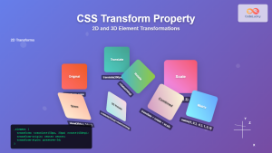
CSS Transform Property: Complete Guide to 2D and 3D Element Transformations
The CSS transform property is one of the most powerful tools in modern web development, allowing developers to manipulate HTML...

CSS Aspect-Ratio Property: Complete Guide to Maintaining Perfect Width/Height Ratios
The CSS aspect-ratio property revolutionizes how we maintain consistent width-to-height ratios in responsive web design. Instead of relying on complex...

CSS Resize Property: Complete Guide to User-Resizable Elements
The CSS resize property is a powerful tool that allows users to resize HTML elements by dragging their corners or...
CSS Transform-Origin: Master Element Transformation Reference Points
The transform-origin property is a powerful CSS feature that determines the reference point for element transformations. Whether you're rotating, scaling,...
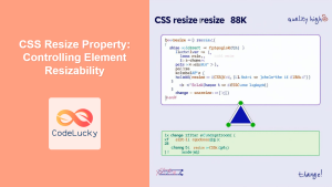
CSS Resize Property: Controlling Element Resizability
Understanding the CSS Resize Property: Controlling Element Resizability The resize property in CSS allows you to control whether (and how)...
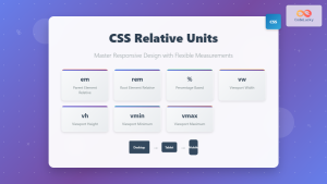
CSS Units: Complete Guide to Relative Units – em, rem, %, vw, vh, vmin, vmax
CSS relative units are the foundation of responsive web design, enabling websites to adapt seamlessly across different devices and screen...
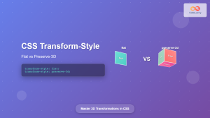
CSS Transform-Style: Complete Guide to Flat vs Preserve-3d for 3D Transformations
The CSS transform-style property is a powerful tool that controls how child elements are rendered in 3D space when their...
CSS Style transform Property: CSS Transform
CSS transform Property: A Comprehensive Guide The CSS transform property is a powerful tool that allows you to modify the...
CSS Style transformOrigin Property: CSS Transform Origin
CSS transformOrigin Property: Mastering Element Transformation Origins The transformOrigin property in CSS is a fundamental tool for controlling how transformations...

CSS Percentage Units: Complete Guide to Parent-Relative Sizing
CSS percentage units are fundamental building blocks for creating responsive, flexible layouts that adapt to different screen sizes and container...

CSS Width and Height: Complete Guide to Element Dimensions
Understanding how to control element dimensions is fundamental to creating well-structured web layouts. CSS width and height properties give you...
CSS Max-Width and Min-Width: Complete Guide to Responsive Width Constraints
When building responsive websites, controlling element widths is crucial for creating layouts that work across all devices. CSS provides two...


