Understanding CSS Resolution Media Queries
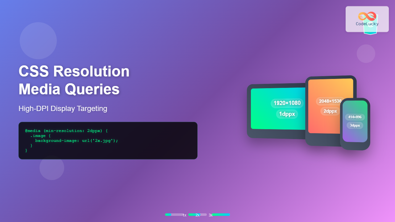
CSS resolution media queries allow developers to target specific display densities and create optimized experiences for high-DPI screens. With the proliferation of Retina displays, 4K monitors, and high-density mobile screens, understanding how to effectively use resolution-based media queries has become essential for modern web development.
Resolution media queries work by detecting the pixel density of a user’s display, enabling you to serve different styles, images, or layouts based on the screen’s capability to render fine details. This ensures your content looks crisp and professional across all devices.
The Resolution Media Query Syntax
CSS resolution media queries use the resolution feature with various units and operators. The primary syntax patterns include:
/* Minimum resolution targeting */
@media (min-resolution: 2dppx) {
  /* Styles for high-DPI displays */
}

/* Exact resolution targeting */
@media (resolution: 192dpi) {
  /* Styles for specific DPI */
}

/* Resolution range targeting */
@media (min-resolution: 1.5dppx) and (max-resolution: 2.5dppx) {
  /* Styles for resolution range */
}
Resolution Units Explained
CSS supports multiple units for expressing display resolution, each with specific use cases:
DPI (Dots Per Inch)
The traditional print-based unit, where 96 DPI equals standard screen resolution. Common values include 96dpi (1x), 192dpi (2x), and 288dpi (3x).
DPPX (Dots Per Pixel)
The most intuitive unit for web developers, directly corresponding to device pixel ratios. Values like 1dppx (standard), 2dppx (Retina), and 3dppx (high-end mobile) are common.
DPCM (Dots Per Centimeter)
Less commonly used but useful for international applications where metric measurements are preferred.
- 1dppx = 96dpi = 37.8dpcm
- 2dppx = 192dpi = 75.6dpcm
- 3dppx = 288dpi = 113.4dpcm
Practical Implementation Examples
Basic High-DPI Image Optimization
/* Standard resolution images */
.hero-image {
  background-image: url('hero-standard.jpg');
  background-size: cover;
  width: 100%;
  height: 400px;
}

/* High-DPI optimization */
@media (min-resolution: 2dppx) {
  .hero-image {
    background-image: url('hero-2x.jpg');
  }
}

@media (min-resolution: 3dppx) {
  .hero-image {
    background-image: url('hero-3x.jpg');
  }
}
Interactive Resolution Detection Demo
Live Resolution Detector
Your Display Resolution: Detecting…
Device Pixel Ratio: Calculating…
Resolution Category: Analyzing…
Advanced Resolution Targeting Strategies
Multi-Tier Resolution Optimization
For comprehensive coverage across different device types, implement a multi-tier approach:
/* Base styles for all devices */
.product-image {
  width: 300px;
  height: 200px;
  background-size: cover;
  background-position: center;
}

/* Standard displays (1x) */
@media (max-resolution: 1.5dppx) {
  .product-image {
    background-image: url('product-1x.webp');
  }
}

/* Mid-range high-DPI (1.5x-2x) */
@media (min-resolution: 1.5dppx) and (max-resolution: 2.5dppx) {
  .product-image {
    background-image: url('product-2x.webp');
  }
}

/* Premium high-DPI (2.5x+) */
@media (min-resolution: 2.5dppx) {
  .product-image {
    background-image: url('product-3x.webp');
  }
}
Combining Resolution with Device Type
Maximize efficiency by combining resolution queries with device-specific targeting:
/* Mobile high-DPI optimization */
@media screen and (max-width: 768px) and (min-resolution: 2dppx) {
  .mobile-banner {
    background-image: url('mobile-banner-2x.jpg');
  }
}

/* Desktop high-DPI optimization */
@media screen and (min-width: 1024px) and (min-resolution: 2dppx) {
  .desktop-hero {
    background-image: url('desktop-hero-2x.jpg');
  }
}

/* Print-specific high-resolution */
@media print and (min-resolution: 300dpi) {
  .print-logo {
    background-image: url('logo-print-high.svg');
  }
}
Performance Optimization Techniques
Progressive Image Loading
Implement smart loading strategies to balance quality and performance:
/* Low-resolution placeholder */
.progressive-image {
  background-image: url('placeholder-low.jpg');
  background-size: cover;
  filter: blur(5px);
  transition: filter 0.3s ease;
}

/* High-resolution reveal */
@media (min-resolution: 2dppx) {
  .progressive-image.loaded {
    background-image: url('full-resolution.jpg');
    filter: blur(0);
  }
}

/* Ultra-high resolution for premium displays */
@media (min-resolution: 3dppx) {
  .progressive-image.loaded {
    background-image: url('ultra-high-resolution.jpg');
  }
}
CSS-Only Icon Scaling
/* Vector icons for crisp rendering */
.icon {
  width: 24px;
  height: 24px;
  background-size: contain;
  background-repeat: no-repeat;
}

/* Standard resolution */
@media (max-resolution: 1.5dppx) {
  .icon-search { background-image: url('search-icon.svg'); }
  .icon-menu { background-image: url('menu-icon.svg'); }
}

/* Enhanced rendering for high-DPI */
@media (min-resolution: 1.5dppx) {
  .icon {
    /* Slightly adjust rendering for pixel-perfect alignment */
    transform: translateZ(0);
    -webkit-font-smoothing: antialiased;
  }
}
Browser Support and Fallbacks
Resolution media queries enjoy excellent browser support, but implementing fallbacks ensures universal compatibility:
/* Fallback for older browsers */
.responsive-image {
  background-image: url('standard-image.jpg');
}

/* Modern browsers with resolution support */
@supports (resolution: 1dppx) {
  @media (min-resolution: 2dppx) {
    .responsive-image {
      background-image: url('high-dpi-image.jpg');
    }
  }
}

/* Webkit-specific fallback */
@media (-webkit-min-device-pixel-ratio: 2) {
  .responsive-image {
    background-image: url('webkit-high-dpi.jpg');
  }
}-webkit-min-device-pixel-ratio or min--moz-device-pixel-ratio as fallbacks.
Testing and Debugging Resolution Queries
Developer Tools Testing
Most modern browsers provide tools for testing different pixel ratios:
- Chrome DevTools: Use device emulation to test various DPR values
- Firefox Developer Tools: Toggle responsive design mode with custom DPR settings
- Safari Web Inspector: Device simulation with Retina display options
JavaScript Detection Helper
/* CSS classes based on JavaScript detection */
.dpr-1x { /* Standard resolution styles */ }
.dpr-2x { /* 2x resolution styles */ }
.dpr-3x { /* 3x+ resolution styles */ }

/* JavaScript to add appropriate classes */
const dpr = window.devicePixelRatio || 1;
const dprClass = dpr >= 3 ? 'dpr-3x' : dpr >= 2 ? 'dpr-2x' : 'dpr-1x';
document.documentElement.classList.add(dprClass);
Common Pitfalls and Solutions
Over-Optimization Warning
Avoid serving unnecessarily large images to devices that won’t benefit from the extra detail. A 2x image might be sufficient for a 3x display if the viewing distance is typical.
Mixed Content Issues
Future-Proofing Your Resolution Queries
As display technology continues to evolve, consider these forward-thinking approaches:
/* Scalable approach for future displays */
@media (min-resolution: 4dppx) {
  .future-ready {
    background-image: url('ultra-high-def.webp');
  }
}

/* Container query preparation */
.responsive-container {
  container-type: inline-size;
}

@container (min-width: 300px) and (min-resolution: 2dppx) {
  .container-aware-image {
    background-image: url('container-optimized-2x.jpg');
  }
}
Best Practices Summary
Mastering CSS resolution media queries requires understanding both technical implementation and user experience considerations. Always prioritize performance by serving appropriately sized assets, use modern image formats like WebP when possible, and implement progressive enhancement strategies.
Remember that resolution targeting should complement, not replace, other responsive design techniques. Combine resolution queries with viewport-based media queries, flexible layouts, and semantic HTML for truly robust web experiences.
- Use
dppxunits for intuitive device pixel ratio targeting - Implement multi-tier optimization for different display categories
- Combine resolution queries with other media features for precise targeting
- Always provide fallbacks for broader browser compatibility
- Test across real devices when possible, not just browser emulation
By implementing these techniques, you’ll create web experiences that look sharp and professional across the entire spectrum of modern displays, from standard monitors to cutting-edge high-DPI screens.

