
Understanding CSS Relative Positioning
CSS relative positioning is a fundamental layout technique that allows you to move elements from their normal position in the document flow while preserving their original space. Unlike absolute positioning, relatively positioned elements maintain their influence on surrounding elements, making it an essential tool for precise layout control.
When you apply position: relative to an element, it becomes a positioned element that can be offset using the top, right, bottom, and left properties. The element moves relative to where it would naturally appear in the normal document flow.
How Relative Positioning Works
The key concept behind relative positioning is that the element’s original space remains reserved in the document flow. This means other elements behave as if the relatively positioned element is still in its original location, even though it visually appears elsewhere.
Basic Syntax
.element {
    position: relative;
    top: 20px;    /* Move down 20px */
    left: 30px;   /* Move right 30px */
}
Practical Examples of Relative Positioning
Basic Offset Example
Let’s start with a simple example showing how relative positioning moves an element while preserving its space:
.relative-box {
    position: relative;
    top: 15px;
    left: 25px;
    background-color: #ed8936;
}
Notice how the orange box moves down and right, but the blue box after it doesn’t move to fill the space. The original position is still reserved.
Negative Offset Values
You can use negative values to move elements in the opposite direction:
This text comes before the relatively positioned element.
This text comes after the relatively positioned element.
.negative-box {
    position: relative;
    top: -10px;    /* Move up 10px */
    left: -20px;   /* Move left 20px */
}
Interactive Positioning Demo
Try adjusting the offset values to see how relative positioning works in real-time:
px
px
px
px
Understanding Offset Properties
Top and Bottom Properties
The top and bottom properties control vertical positioning. When both are specified, top takes precedence in most cases:
Original position
top: 20px
bottom: 20px
/* Move down from original position */
.top-box {
    position: relative;
    top: 20px;
}

/* Move up from original position */
.bottom-box {
    position: relative;
    bottom: 20px;
}
Left and Right Properties
Similarly, left and right control horizontal positioning, with left taking precedence when both are used:
Original
left: 15px
right: 15px
/* Move right from original position */
.left-box {
    position: relative;
    left: 15px;
}

/* Move left from original position */
.right-box {
    position: relative;
    right: 15px;
}
Z-Index and Stacking Context
Relatively positioned elements create a new stacking context and can use the z-index property to control their stacking order:
.box1 {
    position: relative;
    z-index: 1;
    background-color: #e53e3e;
}

.box2 {
    position: relative;
    top: -50px;
    left: 30px;
    z-index: 3;
    background-color: #38a169;
}

.box3 {
    position: relative;
    top: -100px;
    left: 60px;
    z-index: 2;
    background-color: #3182ce;
}
Common Use Cases
Creating Overlapping Elements
Relative positioning is perfect for creating subtle overlaps or layered designs:
First Card
This card is in normal position
Second Card
This card overlaps the first
.card-overlapped {
    position: relative;
    top: -20px;
    left: 40px;
}
Fine-tuning Icon Alignment
Use relative positioning to make minor adjustments to icon alignment within text:
.icon-adjusted {
    position: relative;
    top: 2px; /* Fine-tune vertical alignment */
}
Best Practices and Tips
Performance Considerations
Relative positioning is generally performant since it doesn’t trigger layout recalculations for other elements. However, keep these points in mind:
- Use CSS transforms for animations instead of changing offset properties repeatedly
- Relative positioning maintains document flow, making it more predictable than absolute positioning
- Consider using CSS Grid or Flexbox for complex layouts before resorting to positioning
Accessibility Considerations
When using relative positioning, ensure your content remains accessible:
- Maintain logical tab order even when elements are visually repositioned
- Ensure sufficient color contrast for overlapping elements
- Test with screen readers to verify content is announced in the correct order
Common Pitfalls to Avoid
❌ Don’t Do This
/* Overly complex positioning */
.element {
    position: relative;
    top: 50px;
    left: 100px;
    right: 20px;  /* Conflicts with left */
    bottom: 30px; /* Conflicts with top */
}
✅ Do This Instead
/* Clear, purposeful positioning */
.element {
    position: relative;
    top: 50px;
    left: 100px;
}
Browser Support and Compatibility
CSS relative positioning has excellent browser support and has been stable across all major browsers for many years. It works consistently in:
- All modern browsers (Chrome, Firefox, Safari, Edge)
- Internet Explorer 6+ (with minor quirks in older versions)
- Mobile browsers on iOS and Android
Advanced Techniques
Combining with CSS Transforms
You can combine relative positioning with CSS transforms for more complex effects:
.transform-box {
    position: relative;
    top: 20px;
    left: 30px;
    transform: rotate(15deg) scale(1.1);
    transition: transform 0.3s ease;
}

.transform-box:hover {
    transform: rotate(15deg) scale(1.2);
}
Conclusion
CSS relative positioning is a powerful and versatile tool for fine-tuning element placement while maintaining document flow. It’s perfect for creating subtle design adjustments, overlapping elements, and establishing stacking contexts without disrupting the overall layout structure.
Remember that relative positioning moves elements visually but preserves their space in the document flow, making it ideal for minor adjustments and creative layouts. Use it judiciously alongside modern layout methods like Flexbox and CSS Grid for the most maintainable and responsive designs.
By mastering relative positioning, you’ll have better control over your layouts and be able to create more sophisticated and polished web designs with confidence.
Related Posts
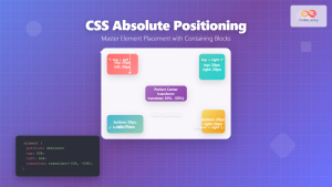
CSS Absolute Positioning: Master Element Placement with Containing Blocks
CSS absolute positioning is one of the most powerful tools for creating precise layouts and complex designs. Understanding how absolutely...
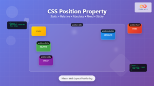
CSS Position Property: Complete Guide to Static, Relative, Absolute, Fixed & Sticky Positioning
The CSS position property is one of the most powerful tools for controlling element layout and creating sophisticated web designs....
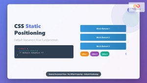
CSS Static Positioning: Understanding Default Document Flow and Layout Fundamentals
CSS positioning is one of the fundamental concepts every web developer must master. Among the various positioning methods available, static...
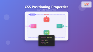
CSS Top, Right, Bottom, Left: Complete Guide to Positioning Offset Properties
CSS positioning offset properties—top, right, bottom, and left—are fundamental tools for precisely controlling element placement on web pages. These properties...

CSS Style right Property: CSS Right
Understanding the CSS right Property The CSS right property plays a crucial role in positioning elements within a web page....
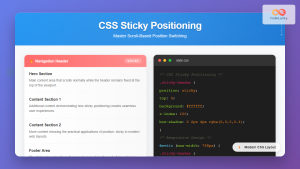
CSS Sticky Positioning: Master Scroll-Based Position Switching with Practical Examples
CSS sticky positioning is a powerful layout technique that combines the best of both relative and fixed positioning. It allows...

CSS position Property: Mastering Layouts in CSS
Understanding the CSS position Property: A Comprehensive Guide The position property in CSS is a fundamental tool for controlling the...
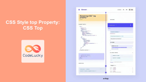
CSS Style top Property: CSS Top
Understanding the CSS top Property: A Comprehensive Guide The top property in CSS is used to specify the vertical position...
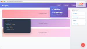
CSS Fixed Positioning: Complete Guide to Viewport-Relative Elements
CSS fixed positioning is one of the most powerful tools in a web developer's arsenal for creating engaging, interactive user...
CSS Style left Property: CSS Left
CSS left Property: A Comprehensive Guide The CSS left property is a fundamental tool for web developers, enabling precise horizontal...
CSS bottom Property: CSS Bottom
Understanding the CSS bottom Property The CSS bottom property is a fundamental tool for controlling the vertical positioning of elements...
HTML Element offsetLeft Property: Element Offset Left
Understanding the offsetLeft Property in HTML The offsetLeft property in HTML DOM is a read-only property that returns the distance...


