
In today’s digital world, creating web content that translates beautifully to print remains a crucial skill for web developers. CSS print media queries provide the foundation for crafting professional print layouts that ensure your web content looks polished and readable when printed. This comprehensive guide will walk you through everything you need to know about implementing effective print styles.
What Are CSS Print Media Queries?
CSS print media queries are specialized CSS rules that apply styles specifically when content is being printed or viewed in print preview mode. They allow developers to create entirely different styling for printed versions of web pages, ensuring optimal readability and professional appearance on paper.
The basic syntax uses the @media print rule to target print-specific styles:
@media print {
  /* Print-specific styles go here */
}
Why Print Styles Matter
Print styles are essential for several reasons. They improve user experience by providing clean, readable printed documents, reduce ink consumption by removing unnecessary graphics and backgrounds, ensure proper formatting for legal documents and contracts, and maintain brand consistency across digital and print media.
Without proper print styles, users often encounter issues like cut-off content, wasted ink on dark backgrounds, poor typography choices, and missing critical information that appears off-page.
Basic Print Media Query Implementation
Let’s start with a fundamental example of implementing print styles:
/* Screen styles */
body {
  font-family: 'Helvetica', Arial, sans-serif;
  background-color: #f0f0f0;
  color: #333;
  line-height: 1.6;
}

.sidebar {
  background-color: #2c3e50;
  color: white;
  padding: 20px;
}

.no-print {
  display: block;
}

/* Print styles */
@media print {
  body {
    font-family: 'Times New Roman', serif;
    background-color: white;
    color: black;
    font-size: 12pt;
    line-height: 1.4;
  }

  .sidebar {
    display: none;
  }

  .no-print {
    display: none;
  }

  /* Remove backgrounds to save ink */
  * {
    background: transparent !important;
    color: black !important;
    box-shadow: none !important;
    text-shadow: none !important;
  }
}
This example demonstrates key print optimization techniques: changing fonts to print-friendly serif typefaces, removing backgrounds to save ink, hiding non-essential elements like sidebars, and ensuring high contrast with black text on white backgrounds.
Advanced Print Styling Techniques
Page Margins and Size Control
CSS provides powerful controls for page formatting through the @page rule:
@page {
  size: A4;
  margin: 2cm 1.5cm;
}

@page :first {
  margin-top: 3cm;
}

@page :left {
  margin-left: 3cm;
  margin-right: 2cm;
}

@page :right {
  margin-left: 2cm;
  margin-right: 3cm;
}
This code sets the page size to A4 format, establishes consistent margins, provides extra space on the first page for headers, and creates different margins for left and right pages in double-sided printing scenarios.
Managing Page Breaks
Controlling where content breaks across pages is crucial for professional print layouts:
@media print {
  .page-break-before {
    page-break-before: always;
  }

  .page-break-after {
    page-break-after: always;
  }

  .no-page-break {
    page-break-inside: avoid;
  }

  h1, h2, h3 {
    page-break-after: avoid;
    page-break-inside: avoid;
  }

  .keep-together {
    page-break-inside: avoid;
  }
}
These rules prevent awkward page breaks that split headings from their content and keep related elements together on the same page.
Typography and Readability Optimization
Print typography requires different considerations than screen typography:
@media print {
  body {
    font-family: 'Georgia', 'Times New Roman', serif;
    font-size: 11pt;
    line-height: 1.3;
  }

  h1 {
    font-size: 18pt;
    margin-bottom: 12pt;
  }

  h2 {
    font-size: 14pt;
    margin-top: 12pt;
    margin-bottom: 6pt;
  }

  p {
    margin-bottom: 6pt;
    text-align: justify;
    orphans: 3;
    widows: 3;
  }

  blockquote {
    font-style: italic;
    margin: 12pt 24pt;
    page-break-inside: avoid;
  }
}
This approach uses serif fonts for better print readability, implements point-based sizing for consistent printing, prevents orphaned and widowed text lines, and ensures proper spacing between elements.
Handling Images and Graphics
Images require special consideration in print layouts:
@media print {
  img {
    max-width: 100%;
    height: auto;
    page-break-inside: avoid;
  }

  .print-hide-image {
    display: none;
  }

  .print-only-image {
    display: block;
  }

  /* Convert background images to content */
  .hero-section::after {
    content: url('path/to/print-friendly-image.jpg');
    display: block;
    width: 100%;
    height: auto;
  }
}
For screen display, you might hide certain images that don’t print well, while showing print-optimized versions.
Creating Print-Friendly Navigation
Navigation elements often need complete restructuring for print:
@media print {
  .main-nav {
    display: none;
  }

  .breadcrumbs {
    font-size: 9pt;
    margin-bottom: 12pt;
  }

  .print-nav {
    display: block;
    font-size: 10pt;
    margin-bottom: 18pt;
    border-bottom: 1pt solid #000;
    padding-bottom: 6pt;
  }

  /* Print URLs for important links */
  a[href]:after {
    content: " (" attr(href) ")";
    font-size: 9pt;
    font-style: italic;
  }

  /* Don't print URLs for internal anchors */
  a[href^="#"]:after {
    content: "";
  }
}
This code removes standard navigation, displays URLs for external links, hides URLs for internal page anchors, and provides print-specific navigation elements.
Interactive Print Preview Example
Here’s a complete working example that demonstrates print styling in action:
Sample Document
Demonstrating Print Styles
Introduction
This document demonstrates how CSS print media queries transform web content for optimal printing. Notice how the colorful header becomes black text, the sidebar disappears, and the typography changes to a more print-friendly serif font.
Key Benefits
Print styles provide numerous advantages including improved readability, reduced ink consumption, professional appearance, and better page utilization. These optimizations ensure that printed documents maintain their effectiveness and visual appeal.
Implementation Tips
When implementing print styles, always test with actual print preview, consider your audience’s printing habits, optimize for black and white printing, and maintain essential content while removing decorative elements.
Try it: Click the “Print This Page” button above to see the print styles in action through your browser’s print preview.
Testing and Debugging Print Styles
Proper testing is essential for effective print styles. Use browser developer tools to simulate print media, test with actual print preview functionality, print test pages on different paper sizes, and verify styles across multiple browsers.
Common debugging techniques include using browser print preview modes, temporarily applying print styles to screen media for testing, adding visible borders to understand element positioning, and testing with different zoom levels and page orientations.
Performance Considerations
Print styles should be optimized for performance and user experience:
/* Separate print stylesheet for better organization */
<link rel="stylesheet" href="print.css" media="print">

/* Or use media queries within existing stylesheets */
@media print {
  /* Minimize complex selectors */
  .content { font-size: 12pt; }

  /* Remove animations and transitions */
  *, *::before, *::after {
    animation-duration: 0s !important;
    animation-delay: 0s !important;
    transition-duration: 0s !important;
    transition-delay: 0s !important;
  }
}
Modern Print Styling Best Practices
Follow these best practices for professional print styles: use semantic HTML structure, implement consistent typography hierarchy, optimize for accessibility with sufficient contrast, test across different browsers and operating systems, and consider internationalization for different writing systems.
Additional considerations include providing print-friendly alternatives for interactive content, ensuring legal compliance for printed documents, maintaining brand consistency between digital and print versions, and optimizing file sizes for faster print processing.
Advanced Print Features
Modern CSS offers advanced print features for sophisticated layouts:
@media print {
  /* Headers and footers */
  @page {
    @top-center {
      content: "Document Title";
      font-size: 10pt;
    }

    @bottom-right {
      content: "Page " counter(page) " of " counter(pages);
      font-size: 9pt;
    }
  }

  /* Page counters */
  body {
    counter-reset: page;
  }

  .chapter {
    counter-increment: chapter;
    page-break-before: always;
  }

  .chapter::before {
    content: "Chapter " counter(chapter) ": ";
  }
}
Conclusion
CSS print media queries are powerful tools for creating professional printed documents from web content. By implementing proper print styles, you ensure that your content maintains its effectiveness and visual appeal when transferred from screen to paper. The techniques covered in this guide provide a solid foundation for creating print-optimized web content that serves your users’ needs across all media formats.
Remember to always test your print styles thoroughly, consider your audience’s printing requirements, and maintain the balance between functionality and aesthetic appeal. With these skills, you can create web content that truly works everywhere – from screen to print.
Related Posts
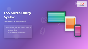
CSS Media Query Syntax: Complete Guide to Media Types and Features
CSS media queries are the cornerstone of responsive web design, allowing developers to apply different styles based on device characteristics...
CSS Screen Media Queries: Complete Guide to Responsive Monitor and Device Targeting
CSS screen media queries are the cornerstone of responsive web design, enabling developers to create websites that adapt seamlessly across...
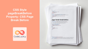
CSS Style pageBreakBefore Property: CSS Page Break Before
CSS page-break-before Property: Controlling Page Breaks The page-break-before property in CSS allows you to specify whether a page break should...
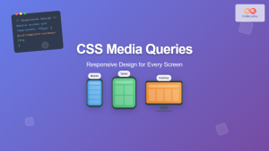
CSS Media Queries: Complete Guide to @media Rule for Responsive Web Design
What Are CSS Media Queries? CSS Media Queries are a fundamental feature of modern web development that allow you to...

CSS Syntax: Complete Guide to Rules, Selectors, Properties and Values
CSS (Cascading Style Sheets) is the cornerstone of web design, transforming plain HTML into visually stunning websites. Understanding CSS syntax...
CSS Media Query Operators: Complete Guide to and, or, not, only Keywords
CSS media query operators are essential tools for creating responsive web designs that adapt to different devices and screen conditions....
CSS Resolution Media Queries: Complete Guide to High-DPI Display Targeting
Understanding CSS Resolution Media Queries CSS resolution media queries allow developers to target specific display densities and create optimized experiences...
CSS Style font Property: CSS Font
CSS font Property: A Comprehensive Guide The CSS font property is a shorthand property used to set several font-related styles...
CSS Display Property: Complete Guide to Block, Inline, and Inline-Block Elements
The CSS display property is one of the most fundamental concepts in web development, controlling how elements are rendered and...
CSS Future: Complete Guide to Upcoming CSS Features and Specifications 2025
The future of CSS is incredibly exciting, with numerous groundbreaking features and specifications currently in development that promise to revolutionize...
CSS Style fontSize Property: CSS Font Size
CSS fontSize Property: Controlling Text Size The fontSize property in CSS specifies the size of the font. This property is...
HTML CSS: Styling Your Web Pages with Selectors, Properties, and the Cascade
Introduction Ever wondered how websites go from plain text to visually stunning experiences? The magic lies in CSS (Cascading Style...


